![[OLD – FALL 2016] 15-104 • COMPUTING for CREATIVE PRACTICE](https://courses.ideate.cmu.edu/15-104/f2016/wp-content/uploads/2020/08/stop-banner.png)
GRAPHICAL REPRESENTATION OF COMFORT AGAINST TEMPERATURE VARIATION ACROSS THE YEAR
How can climate data be packaged to make a visual impact, for example, in determining when to use air conditioning in a building? In this project, I propose to represent temperature variations by the hour for each month of the year for a location. At a glance, a comparison of average temperatures at a given hour of each month will be comparable. This will be an example of climate data representation limited to temperature variations and comfort. Other templates could be made for relative humidity and comfort and so on.
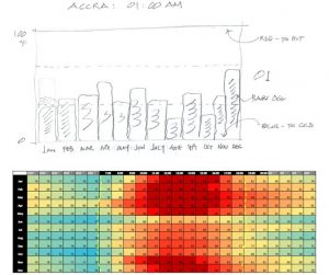
The temperature variations will be set against a background that is calibrated from extreme hot (red) to extreme cold (blue). A horizontal band in the middle of the platform will mark the range of temperatures where comfort is possible.
The coloured image below shows an attempt to project this information by excel in my earlier research work. It is a static image that requires elaborate explanation. I intend for the project to improve of the presentation technique.
I propose to use 12 bar objects with a functions that relate their height to a temperature. I hope to be able to link the temperature data into the file without time consuming retyping – this is one area that I am not yet sure about.