Project 7: Curves

sketch

/*Emma Shi
Section B
eyshi@andrew.cmu.edu
Project 7
*/

var nPoints = 100;
var theta = 30.0;
var rcolor = "red";

function setup() {
    createCanvas(400, 400);
    frameRate(10);
}

function draw() {
  background (random(0, 255));
  frameRate(10);

  push();
  for (var i = 0; i < 40; i++) {
    translate (width/2,height/2);
    rotate(radians(theta*mouseX));//rotates "images"
    drawRorschachCurve(i);
  }
  pop();
}


function drawRorschachCurve () {
  var a = map(mouseX, 0, width, 0, 50);
  var b = map(mouseY, 0, height, 0, 50);

  fill(rcolor);
  noStroke();
  beginShape()
  for (var i = 0; i < nPoints; i++ ) {
    var t= map(i, 0, nPoints, 0, TWO_PI);
    x = a*sin(t)*sin(6*t)*sin(t);
    y = b*cos(t)-a*cos(7*t);

    vertex(-x,-y);
  }
  endShape(CLOSE);
  //draws "Rorscharch image"
}

function mousePressed() {
  if (rcolor == "red") {
    rcolor = "pink";
  } else {
    rcolor = "red";//changes color to pink with mouse clicks
    }
  }

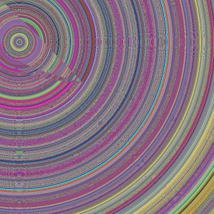
I initially made a heart curve and create a simple, dynamic image that enlarges the heart (widen/lengthen) and rotates the heart in response to the mouse’s movement. However, after playing around with the image, it turned into something completely different. The “heart” now resembles an image from a Rorschach test.

You can also click the mouse to change the object colors from red to pink. The background color changes automatically on the grayscale with every refresh of the frame.

Looking Outwards 7: How Y’all, Youse, and You Guys Talk

When I found out this week’s “Looking Outwards” topic was computational informational visualization, I immediately thought of a quiz I took a couple weeks ago from the New York Times. The quiz, titled “How Y’all, Youse, and You Guys Talk” asks participants 25 questions about how they speak. The quiz results are a personal dialect map, which shows three locations in the U.S. that are most similar to one’s dialect and also locations that are most dissimilar (red maps most similar, while blue maps most dissimilar).

This is my map -- I'm from Rochester (so it was pretty accurate).
This is my map — I’m from Rochester (so it was pretty accurate).
screen-shot-2016-10-10-at-11-07-08-pm
The map also shows questions where it was able to pinpoint a location.

The data for the quiz and maps comes from 350,000+ survey responses collected from August to October 2013 by Josh Katz, a graphics editor for the New York Times who developed the quiz. Many of the questions in the quiz are based on those in the Harvard Dialect Survey, a linguistics project begun in 2002 by Bert Vaux and Scott Golder.

I find this project really interesting not only because it was extremely accurate in pinpointing my home city (I’m from Upstate New York) but also because Katz just did a fantastic job with it. While I definitely don’t know exactly how this work was generated computationally, I would imagine there is some kind of combination of research/statistics/probability and more complex forms of “if/then” statements to construct the location heat maps. I also like it because it puts data in a way that is extremely easy to understand visually.

You can take the quiz here and see for yourself if it’s accurate!

Project 6: Abstract Clock

abstract clock

/*Emma Shi
Section B
eyshi@andrew.cmu.edu
Project 6
*/

function setup() {
    createCanvas(700, 300);
}

function draw() {
    background(0);

    var s = second();
    var m = minute();
    var h = hour();
    var space = 40;
    var startX = 5;
    var leftballX = 40;
    var leftballY = 240;
    var frameY = height/3.75
    var endX = 695;
    var rightballX = 660;
    var rightballY = 240;
    var outsideL = 270;
    var hballL = 240;
    var sballL = 190;
    var mballL = 215;
    var dir = 1;
    var speed = 3;
    var angle = 30;


    stroke(255);
    strokeWeight(4);
    line(startX, 5, endX, 5);//top border line

    for (var i = 1; i < 25; i++) {
        stroke(255);
        strokeWeight(1);
        line((i*25)+space, 5, (i*25)+space, hballL);//draws 24 lines connecting to balls

        if (h == i) {
        fill("blue");
        } else {
            fill(255);//fills the ball corrresponding to the hour as blue
        }
        noStroke();
        ellipse((i*25)+space, hballL, 15, 15); //draws 24 balls to represent 24 hours
    }

    for (var a = 1; a < 61; a++) {
        stroke(255);
        strokeWeight(1);
        line((a*11.6)-5, 5, (a*11.6)-5, mballL); //draws 60 lines connecting to balls

        if (m == a) {
            fill("green");
        } else {
            fill(255);//fills ball corresponding to minute as green
        }
        noStroke();
        ellipse((a*11.6)-5, mballL, 10, 10);//draws 60 balls to represent 60 minutes 
    }

    for (var b = 1; b < 61; b++) {
        stroke(255);
        strokeWeight(1);
        line((b*11.6)-5, 5, (b*11.6)-5, sballL);//draws 60 lines connecting to balls

        if (s == b) {
            fill("pink");
        } else {
            fill(255);//fills ball corresponding to second as pink
        }
        noStroke();
        ellipse((b*11.6)-5, sballL, 10, 10);//draws 60 balls to represent 60 seconds
    }
}

I originally had the idea to make a Newton’s cradle, with a colored ball within representing the hour in a 24-hour span, the outside ball bounces representing seconds, and the changing color of the bouncing balls representing minutes. Unfortunately, this idea did not pan out, but I nonetheless used the same sort of structure as the cradle and used sets of circles’ and having one circle in each set be a different color to make it easy for a viewer to tell time. The bottom row of circles represents the hour in a 24 span; the middle row of circles represents minutes in a 60 minute span, and the top row of circles represents seconds in a 60 second span.

Looking Outwards 6: Random Art

This image is called "panther tank"
This image is called “panther tank”

While looking for pieces that exemplified computation, randomness, and creativity, I stumbled upon a website called random-art.org. The website features a gallery of (literally) random art. All of the pieces are created from a computer program (ocaml) that generates an image based on whatever word a user types in. In other words, the name given to the picture is the starting point for the program to compute a formula that determines the image’s colors and pixels. However, the same word or name given always yields the same image, because it determines the same sequence of random choices that make up the picture.

This project is pretty cool (and random) because it takes a new approach to making computational art that makes it simple enough for anyone to take part in.

You can even make your own random picture here and upload it to the random art gallery!

Project 5: Wallpaper

My original idea for this project was to make a fabric pattern using florals (groundbreaking, I know!). For inspiration, I began by looking at prints from Lilly Pulitzer and Andy Warhol’s floral pop art.  However, as I began playing around with the code, the simple flower I started out with turned into an abstract “centerpiece” surrounded by ellipses that made rectangles around the sides. I ended up with a completely different deliverable, as you can see below.

sketch

/*Emma Shi
Section B
eyshi@andrew.cmu.edu
Project 5
*/
var petalL = 100;
var petalW = 40;
var rot = 45;

function setup() {
    createCanvas(600, 600);
    background("navy");
}

function draw() {

    for (var x = 0; x < 12; x++) {
        for (var y = 0; y < 12; y++) {

            var Petal = petalL * x;
            var innerL = petalL/x;
            var innerW = petalW*y;

            stroke("white");
            strokeWeight(2);
            noFill();

            push();
            translate(width/2, height/2);

            ellipse(0, 0, 25, 25);//center circle

            ellipse(Petal, 0, petalL, petalW);//petals of the right half of the inner "diamond"
            ellipse(Petal, 0, innerL, innerW);//inner petals of the right half of the inner "diamond"

            rotate(radians(rot));
            ellipse(Petal, 0, petalL, petalW);//petals of the upper right half 
            ellipse(Petal, 0, innerL, innerW);//inner petals of the upper right half

            rotate(radians(rot));
            ellipse(Petal, 0, petalL, petalW);//petals of the outer upper right half 
            ellipse(Petal, 0, innerL, innerW);//inner petals of the outer upper right half

            rotate(radians(rot));
            ellipse(Petal, 0, petalL, petalW);//petals of the upper right corner
            ellipse(Petal, 0, innerL, innerW);//inner petals of the upper right corner

            rotate(radians(rot));
            ellipse(Petal, 0, petalL, petalW);//petals of upper mid right
            ellipse(Petal, 0, innerL, innerW);//inner petals of upper mid right

            rotate(radians(rot));
            ellipse(Petal, 0, petalL, petalW);//petals of the upper left
            ellipse(Petal, 0, innerL, innerW);//inner petals of the upper left

            rotate(radians(rot));
            ellipse(Petal, 0, petalL, petalW);//petals of the mid left
            ellipse(Petal, 0, innerL, innerW);//inner petals of the mid left

            rotate(radians(rot));
            ellipse(Petal, 0, petalL, petalW);//petals of the lower left
            ellipse(Petal, 0, innerL, innerW);//inner petals of the lower left
            pop();
    }
        }
        noLoop();

}

Emma Shi – Looking Outwards – 5: Nike/Breathe Collection

One rendition of Parein's work
One rendition of Parein’s work
A close up of the mesh balls that make up the sneaker
Another rendition of Parein's work
Another rendition of Parein’s work
lo5-nike-1
A close up of Parein’s alternative rendition

These graphics are from an advertisement from Nike’s Breathe collection. The artist, Rizon Parein, is a 3D designer and illustrator from Belgium who has created a multitude of advertisements for Nike as well as other major companies such as Toyota, Samsonite, and Nespresso. His project captured my attention because it does an effective job of conveying the “breathability” and “bounce” of the Nike sneakers with the placement of the balls as the upper structure of the shoes. The balls look to be made of mesh fabric, which can be inferred as “breathable” in terms of shoe design.

However, what I admire most about the design of the shoe is Parein’s nod to minimalism — he uses only a few elements, but leaves just enough information so that the viewer can infer that he/she is looking at a sneaker.

You can review more of Parein’s work for Nike on his website.

Project 4: String Art

sketch

/*Emma Shi
Section B
eyshi@andrew.cmu.edu
Project 4 String Art
*/

function setup () {
    createCanvas(640, 480);   
}

function draw() {
    background("navy");

        var a = 0;
        var b = 640;
        var c = 480;
        var r = atan2(mouseY-height/2, mouseX-width/2);

   for (var i = a; i < 640; i += 10) { //starts at 0, adds 10 to i until 640

        noFill();
        stroke("yellow");
        strokeWeight(1.5);

     translate(width/2, height/2);
        push();
        rotate(r);
        ellipse(a, a, 10, 10);
        pop();
        angleMode(RADIANS);
        rotate(r);//rotates lines around the center ellipse when mouse is moved

        line(a, a, width-c, b); //second line from the bottom left
        line(a, a, b, i); //line closest to the bottom right
        line(a, a, -30, i+300); //line closest to the bottom left
        line(a, a, i+600, b); //second line from the bottom right
    }
}

For this week’s project, my original idea was to make a string art “circle” where lines from all corners of the canvas would come together to outline an empty ellipse, similar to an eye of a hurricane. However, after playing around with it, I ended up making lines that spun around a center ellipse. When the user moves the mouse up or down, the lines rotate quickly and form an outline of another ellipse, which changes in diameter as the mouse moves along the canvas.

Looking Outwards 4: Carolina

For this week’s focus on sound art, I chose to explore Jono Brandel’s (jonobr1) Android experiment collaboration with artist Kimbra on her song “Carolina.” The experiment is a mobile app that essentially takes the user through an animated digital road trip. As the song plays in the background, various shapes, figures, and lines appear against a white background, creating the illusion of the user driving by. The abstract shapes and colors are triggered by specific sound aspects of the song, such as instrumentation and pitch. The user can also pinch to zoom in and out and change perspectives in the app, in order to fully experience the digital road trip to Carolina. As for the coding part of the experiment, Brandel uses Three.js in order to code the actual music visualization. While I don’t actually know anything about Three.js, I would imagine it differs from p5.js for a bigger emphasis on animated computer graphics (and more complex graphics).


Carolina (July 22, 2015)

This project stands out to me because it not only puts music into a visual art form, but also takes into account the meaning behind the song for creating that visual. The variations in shape, color, placement, and movement are not just reflections of the sounds of the music, but also take into account artistic sensibilities as to what would count as an abstract road trip through Carolina.

For more information on the project, to get the code, or download it on Google Play, click here.


Project 3: Dynamic Drawing

sketch

/*Emma Shi
Section B
eyshi@andrew.cmu.edu
Project 3
*/

function setup() {
    createCanvas(640, 480);
}
function draw() {
    var ellipseR = map(0, mouseX, height, 255, 254);
    var ellipseG = map(0, mouseX, height, 203, 138);
    var ellipseB = map(0, mouseX, height, 2, 5);
    var backR = map(0, mouseX, height, 15, 139);
    var backG = map(0, mouseX, height, 19, 237);
    var backB = map(0, mouseX, height, 37, 255);

    background(backR, backG, backB);
    //background changes from navy to light blue as mouse moves across
    fill(ellipseR, ellipseG, ellipseB);
    ellipse(320, 240, 100, 100);
    //circle changes from yellow to orange as mouse moves across

    var xHeight = map(0, mouseX, height, 640, 480);
    var xWidth = map(0, mouseX, height, 640, 480);
    ellipse(width/2, height/2, xWidth, xHeight);
    //changes size (height) of circle 

    fill(255);
    rect(width-mouseX, height/500, 50, 50);
    rect(width-mouseX, height/8, 50, 50);
    rect(width-mouseX, height/4, 50, 50);
    rect(width-mouseX, height/2.67, 50, 50);
    rect(width-mouseX, height/2, 50, 50);
    rect(width-mouseX, height/1.6, 50, 50);
    rect(width-mouseX, height/1.33, 50, 50);
    rect(width-mouseX, height/1.14, 50, 50);
    //transition rectangles that change direction with mouseX

    fill(248, 221, 136);
    noStroke();
    angleMode(DEGREES);
    var rot = atan2(mouseY-height/2, mouseX-width/2);
    push();
    translate(width/2, height/2);
    rotate(rot);
    rect(130, 150, 60, 60);
    rect(-190, 150, 60, 60);
    rect(-250, -100, 60, 60);
    rect(-80, -250, 60, 60);
    rect(160, -170, 60, 60);
    rect(200, -10, 60, 60);
    pop();
    //changes rotation of rectangles around the circle

    }

For this project, I had for the screen to switch from an abstract, simplistic version of nighttime to daytime. As the user moves the mouse from left to right, the background changes from navy to light blue, and the “sun” (circle in the middle) changes from yellow to orange. The rotating rectangles around can represent craters of the moon or rays of sun.

I also took the idea of a changing “slide” (the column of rectangles that moves through the image) as a transition aide that allows the viewer to move from seeing the “night” to “day” (and vice versa).

Looking Outwards 03: 3D Print Gown

Wardrobing and jewelry designer Michael Schmidt teamed up with architect Francis Bitonti to create the world’s first fully articulated 3D printed gown. Using inspiration from Fibonacci’s sequence and the Golden Ratio/Spiral, the dress represents the merge between art (particularly pertaining to beauty) and mathematics. The gown itself is made up of nylon by Shapeways and thousands of unique components, which all pare down to 17 printed pieces dyed black and hand-adorned with over 12,000 Swarovski crystals. The gown was completely custom 3D printed to fit model Dita von Teese.

This project stands out to me because of its unique approach with transforming a mathematical formula for beauty into a tangible, ready-to-wear piece. The gown’s form adheres to and accentuates the contours of von Teese’s body, thus illustrating the makers’ attention to the gown’s ability to spotlight the beauty of not only the gown but of the human body. The project also highlights the possibilities of 3D printing, especially in regards to solving unique fitting problems and the ability to create a true “perfect fit.”