Sofia Syjuco – Looking Outwards 7

Ebb and Flow at the Box Office
Amanda Cox
February 24, 2008

A visual representation for domestic box office receipts in 2007
http://www.nytimes.com/imagepages/2008/02/24/business/24METRIC_GRAPHIC.html

Ebb and Flow at the Box Office by Amanda Cox is a project that I find very interesting. She has graphically represented the domestic box office receipts for films that opened in 2007, but in such a way as to be an art piece within itself. The work itself looks like the shifting silt in a river, that different qualities of soil have different colors or appearances, but all are slowly moving with the water, creating a beautiful pattern. I admire the aesthetic and artistic sensibilities of the work, and how despite its beauty, the graphical representation remains simple enough that it can easily be read and understood. The creator’s artistic sensibilities are manifest in the final form in that, while the representation retains some nod towards aesthetic considerations, the colors are muted and the communication of data remains the most important consideration.

Looking Outwards-07- Information Visualization-sehenry

The project that I chose was an interactive program that allows you to pick personal sources of information based on what you are interested in. So for me, I browsed through their choices and found a category called Life, The Universe, and Everything. Within the category, I chose weather and it relocated me to a weather map showing where wind, all over the country, is headed, in an interactive artistic weather map. Small white/grayish lines would follow a path deduced by the internet in multiple places, all over the U.S. The real art comes from the template where you are allowed to choose which subject to learn about. As your mouse travels around the screen different portions of the screen grow, shrink, and shift. The site kind of looks like a bookshelf full of album covers that you can flip through.That is why I like it. It looks very similar to something we know but is too abstract to label it as such.
Moebio Labs is a team of data scientists, developers, and designers and they work on projects that tie together large amounts of usable information.
Category Selection
moebio

Wind Map
moebio-2

Creator: Moebio
Website: Moebio.com

Looking outwards – 07 – JamesKatungyi

Artist: Moebio Labs

Title: Ross Spiral Curriculum

Year: 2015

Santiago Ortiz’s Moebio Labs developed an interactive data visualization tool for the Ross Institute Curriculum. The tool is a spiral that connects nodes at each stage of the curriculum. Each node contains information about a particular unit in each grade. Further, the units are interconnected across the grades. When one node is selected, it shows the details while the user is flown up and down the spiral to all other related units in the entire curriculum. All 12 grades are creatively captured in one form. I thought the search function would be important to such a tool but could not identify it.

The algorithms are not given – understandably – since it is a commercial venture. The spiral and accompanying ‘spiralets’ are a function of curve equations. I could not figure out how the 3 dimensional interaction works. I imagine that the graphic forms contain links to both the text and the other graphic forms.

The Ross Spiral Curriculum showcases Santiago Ortiz’s work in representing information across time creatively and interactively. Other projects in the works include a presentation of major historical events recorded by Wikipedia.

Isabella Hong – Looking Outwards – 07

In April of 2016, Stamen, a design company based in San Francisco, collaborated with the Dalai Lama to create the “Atlas of Emotions“. The project visually represents the emotions enjoyment, disgust, anger, fear and sadness as continents and was created in an attempt to guide the emotionally distressed to a state of calm.

Preliminary sketches of emotional exploration.

The five emotions were translated into visual continents via extensive sketching and brainstorming. The analogy of continents works such that each emotion also has a set of states which in turn can lead to triggers, actions and then moods. Here is an example of what everything looks like in combination.

"This is an example of a mood, a longer-lasting cousin of the emotion that causes the related emotion to be felt more frequently and intensely. It is not always apparent what triggers a mood."
“This is an example of a mood, a longer-lasting cousin of the emotion that causes the related emotion to be felt more frequently and intensely. It is not always apparent what triggers a mood.”

This project integrates the one common link of the human race – emotions. Emotions and their timing are what make us human. The “Atlas of Emotions” stresses the universality of feelings and represents them in an accessible manner. This task is extremely difficult and I admire the fact that Stamen was able to create a tangible representation of a vague concept.

Jess Medenbach – Looking Outwards 7

“Clouds” is an interactive documentary that was made by the interactive film company Scatter. In this documentary, the filmmakers used a depth kit using a kinect to take video footage of their interview subjects. They used a video editing program on top of OpenFrameworks where they had multiple coders take each interview segment and manipulate it in any way they chose.
Rachel Binx took this information and then messed with the data points of the subjects, messing with the mesh of the points as well tweaking the color.
What I think is interesting about this project is that they are attempting to take the form of documentary film and bringing it a step further into VR. They are also making more room for the coders using the footage to express the information in a more artistic way and play within the medium of media and interactive art. http://rachelbinx.com/CLOUDS-Interactive-Documentaryk

Jiyoung Ahn_Looking Outwards_07

windmap
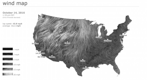
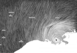
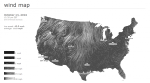
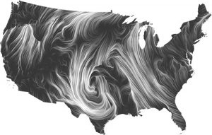
After searching for few websites, one of Martin Wattenberg’s  project ‘Wind map’ really seemed interesting. Wind map shows its current wind movement in United States. I really like the aspect of creating a whole new pattern every seconds by gathering data from the National Digital Forecast Database. These are near-term forecasts, revised once per hour.
wind_isaac_zoom

(Images from Hurricane Isaac (September 2012)

Although this wind map is createdas an art piece, Martin Wattenberg mentioned that it is interesting how this map is used for an actual map. Bird watchers have tracked migration patterns; bicyclists have planned their trips; and conspiracy theorists use it to track mysterious chemicals in the air.

By minimizing the color (white, dark grey), I think the random pattern was emphasized well, and it drives our attention to the movement and makes us to focus on it’s flexible movement.

Wind map is currently available through this link:

http://hint.fm/wind/

%e1%84%89%e1%85%b3%e1%84%8f%e1%85%b3%e1%84%85%e1%85%b5%e1%86%ab%e1%84%89%e1%85%a3%e1%86%ba-2016-10-14-1-47-34-pm

screen shot of the link

and you can see current wind moves and you can see the movement of wind. And also by telling the wind speed through the visual elements and its speed of movement.

Sihand – LookingOutwards 07 – Selfiecity

Selfiecity by Manovich

The millennial generation (that’s me!) is notorious for our signature narcissism: selfie-taking. While most people couldn’t bear with them, software researcher Dr. Lev Manovich are particularly interested in the styles of selfies across cities around the world. Dr. Manovich utilized what he calls “imageplots”, which are rich media visualization, to present the patterns he found in selfie-taking. In each imageplot, a distribution pattern is shown on the habits of selfie-takers’ poses, expressions, and more.

To better demonstrate the imageplots Dr. Manovich used, here are two examples of selfie patterns in New York City.

Gender and age profile of selfie-takers in NYC
Smile distribution of selfies in NYC by gender

There isn’t much information on what algorithm is behind these imageplots. My best guess would be a recognition algorithm that gathers data on quantitative selfie-taking habits such as the head tilt angle and the distance from face.

Learn more about Selfiecity

Learn more about Manovich

Simin – Looking Outwards 7

A Facebook Flower by Stamen Designs

A Facebook Flower by Stamen Designs

Facebook Flowers is a project by Rachel Binx and Stamen Design that visualizes how posts are shared on Facebook. Her animations show in less than a minute how single posts are distributed and redistributed in the Facebook community in the course of 3 months. Binx uses WebGL to turn data like gender, time since first shared and times posts have been shared into beautiful flower like images. After trying several ways to visualize this data Binx decided that having curves branch out of each individual could best exhibit the connections made through online interaction. The more shares a post gets the more branches it generates. Posts reposted at an earlier stage fade to white gives you the sense of time and the way different genders have different colors adds to the animation’s complexity and Dynamicity.

Experimenting with colors in Facebook Flowers by Stamen Designs

What’s interesting is that this project can tell stories in an abstract manner. In the flower of Marvin the Martian you can see at 10 seconds and 20 seconds there is a sudden burst at the original point. This tells you that there was someone very influential who reposted the image and caused a ripple of effects. In addition, the end of the video, which is 3 months in real time, everything goes white. The epidemic like post is no longer reposted and loses its popularity. It gives me a sense of how all it takes is an influential person to launch something to stardom and an equally short amount of time for this once omnipresent epidemic to lose its popularity.

Links

Rachel Binx on Facebook Flowers

Stamen Turns Facebook Sharing Into Intricate Digital Art

Data Visualization: Photo-Sharing Explosions

Marvin the Martian Facebook Flower by Stamen on Vimeo

Famous Failures Facebook Flower by Stamen on Vimeo


Looking-Outwards 07

Lisa Jevbratt created several visualizations of data sets, but the one that most caught my eye was “Migration” created in 2005. She essentially mapped out the “migration interface” of websites from 1999-2004, and represented them through these little blobs of color that reminded me of tie-dye.

This image is taken from Jevbratt’s migration website, and it depicts the change in migration for the different websites over the course of 5 years through the little blobs of color. If you follow the link below, you can see how if you click on one of the blobs, it will give you a set of data (IP addresses) that describes the said migration of the websites. 


The link to Jevbratt’s 2005 Migration project is here.

The study originated in 1999, but had to be updated in 2005 due to the growth of technology and the need to keep up with it. The image and link above are for the updated version, while information about the original can be found at the link here.

I could not find a lot about the algorithms used in this visualization, but according to the description of the original project (linked above), the websites were randomly generated and their images were recorded so as to map out “all web servers in the database.” Because this study took place over the course of a few years, it also analyzes the changes made to such websites and the database over time.

This visualization is unique both in it’s subject of study as well as in its method of representation. We typically assume that data should be neatly mapped out and displayed, but this contradicts that in it’s messy yet understandable representation.

Jihoonp_LookingOutwards_07

1

In 2013, Moebio Lab, lead by Santiago Ortiz, created a visualized map of all conversations made in Twitter in a week period of February 15th to 22nd. Moebio Lab is a team of data scientists who concentrate on exploring creative and effective ways of visually representing empirical and textual data. A lot of their work forms a cluster of various data according to parameters such as hierarchy and frequency.

2

In this project, the threads are representation of the relationship between tweeter users according to tweets, retweets, tags, and comments. In a big picture, they are barely legible in individual sense, but the density of the threads show which and which has stronger relationship to each other. As the clusters are zoomed in, we are able to figure out which users are directly related in what way. The representation allows for the users to read the global and local interaction in the web sense.

3

This is a useful resource that could be applied in specific to creating statistics of public census, individual profiling, and human networking, which are useful to government organizations, job hunt/head-hunters, and consumer analysis branch of corporations. It leaves a possibility for development, as it could be more powerful if combined with statistical graph representation of the data.

4