![[OLD – FALL 2016] 15-104 • COMPUTING for CREATIVE PRACTICE](https://courses.ideate.cmu.edu/15-104/f2016/wp-content/uploads/2020/08/stop-banner.png)
Flight Patterns

Aaron Koblin 2009

Aaron Koblin 2009
While browsing his website, I found Aaron Koblin’s visualization of flight patterns very interesting. Aaron is a great designer who has co-founded a virtual reality company called “Within” and had led the Google Data Arts team from 2008 to 2015. In his project “Flight Patterns”, he used data from FAA(Federal Aviation Administration) and mapped them onto the north American landscape. To do that, he parsed the data information and plotted them using the “Processing” programming environment. His data visualizes both in color and form. It is also extremely detailed even when zooming in closely. The flight routes naturally form clusters at where the airports are, making it visually compelling. In the animations, he presented a time lapse of the flight patterns, which lead the viewer to further visualize the information in a larger scale and in a new dimension(time).
Category: LookingOutwards-07
Shannon Case Looking Outwards – 07
Anna Powell-Smith is a web developer who specializes in data analysis and data visualization. She was frustrated with the way she was finding shoes while shopping online, so she created her own search engine for shoes online that can gather products from all across the UK. (view the site HERE). I really admire that she saw a problem with the way things were, so she invented a solution to fix it and help women who would struggle with the same issue. I don’t really know how the algorithm for this would work, but I would assume that it is similar to other search engines which optimize the results to answer exactly what the question asked it. I think that Anna’s artistic sensibilities are shown in the way that the page represents something that was bothering her, and the solution suits her own needs (as well as the needs of others). Her other work can be viewed on her website.

Michal Luria – Looking Outwards – 07
The Fallen of World War II / Neil Halloran
The project I chose for this week is the data visualization short documentary by Neil Halloran:
The fallen of World War II / Neil Halloran – a short film presenting the casualties of the second world war in comparison to others in the history of human kind. Source.
This fascinating short film presents data of the casualties of World War II in a visual way. It moves the data around to add information to the viewer. For example, the casualties, after a simple count, are divided into areas of war, where you can see the two sections one compared to the other, and then placed on a timeline for a better perspective on the order of things.
What I liked most about this work is that these data sets are available to all of us, yet it is perceived that war culture is extending and becoming dominant in our world. By comparing the data of WWII to other wars in history, it allows a new perspective on where things are headed.
The film takes a different approach, just by visualizing data. The key to this work is perspective, and perspective is seen better than it is heard. By allowing the viewers to visualize the data the message is clear.
ShanWang-LookingOutwards-07
Five Levels Deep, centered on category of History
The WikiViz, or the Visualizing Wikipedia project created by Chris Harrison was of particular interest to me. As a human edited entity and encyclopedia, connections between topics are really complicated and sometimes surprising. The comprehensive organization and visualization of these data are fascinating and sometimes revealing: it’s hard to believe how interconnected seemingly unrelated topics can be. Getting frustrated with GraphViz, Chris decided to build his own large-scale visualization project.
He demonstrated the progress in version 5 of this project in terms of graph layout algorithm, which allowed him to scale the enormous amount of vertices and edges (articles and article links) into a relatively manageable one with a shorter run time. For future improvement, he is still working on the collection of true page links with data directly from article content for a more accurate representation of Wikipedia’s true structure.
He had included some sample renderings of topics centered on different categories on his website.
Looking-Outwards-07-mdambruc-InformationVisualization
Pitch Interactive’s “Invisible City” 2010
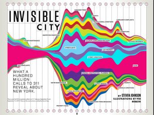
Visual Graph of Complaints of 34,522 calls
http://pitchinteractive.com/work/Wired311.html
Pitch Interactive has created a visual representation of complaints when they were filed over the course of one week on the 311 phone line for New York City, totaling up to 34,522 calls. This piece was shown in Wired Magazine and created in 2010. The NYC311 number was created to offer information about school closings and construction, but the visual representation cites complaints of “chlorofluorocarbon recovery” and “rodents”. I admire this visual representation of data because I feel it perfectly represents the aggressive nature of many irked callers. The obnoxious colors and obtrusive waves depict an image of a city of complainers. I also admire Pitch’s use of literal clocks to create a timeline as opposed to writing numbers, since it is an abstract look on time as well as aesthetically pleasing. In the NYC311 office there is a digital LED light screen which tallies the number of calls they’ve received throughout the day. I suppose that throughout the week that they were recording to create this graph, they simply created categories of complaints. Pitch Interactive then probably took the number of these complaints and created proportional waves that represented the number of complaints in a certain time of the day.
Looking-Outwards-07
Aaron Koblin uses design to visualize real world data. In the New York Talk Exchange, he is commissioned by the Senseable City Lab at MIT to display where New Yorkers (using the AT&T network) are calling around the world. The collection illustrates information flowing around the world from AT&T long distance telephone and IP data. I like the collection, particularly Global Encounters because it tracks real time data from around the world in a visually pleasing way. You can see how interconnected one city is to the rest of the world and see direct lines of communication throughout the world.
I could not find exactly how it worked, but I am guessing that it takes the coordinates of the two ends of communication and simply draws an arc around a sphere (shown as a globe) on a three-dimensional plane.
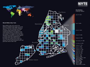
Graphs where people in NYC using the AT&T network call around the world and restricted area.
Diana Connolly – Looking Outwards 7
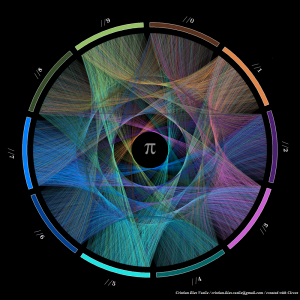
Flow Of Life Flow Of Pi, by Cristian Ilies Vasile
Flow Of Life Flow Of Pi is a digital artwork piece by artist Cristian Ilies Vasile. Vasile created this piece using the software called Circos, a circular visualization software. The piece visualizes a dataset by using an information graphic to represent the first 10,000 digits of pi. Each digit of pi is connected by a string to the following digit of pi. The numbers 0-9 represent all possible numbers that could occur within each digit, and thus are represented around the circumference of the circle and are given their own color in the infographic. When a line goes from one number to another, the fill color of the line goes from from the first number’s assigned color to the second number’s assigned color. I admire this piece because I think it is a beautiful way to visualize the complexity of pi. I am an illustrator myself and often think about ways to best represent an object or idea, and I appreciate the simplicity of the final image and how it represents such a vast number of digits all at once. The algorithm used to generate the work involved the Circos software which took in all of the 10,000 digits of pi and connected the digits with lines. The creator’s artistic sensibilities are manifested in the final form because the artist wanted to represent the vast number of pi’s digits in a simple yet beautiful way. I think that he succeeded in doing that, as the viewer is able to see the visualization of the patterns in pi’s digits as the individual lines between digits constructs its own web of connections.
Below is a link to an article written about this piece, as well as a few others of Vasile’s works:
https://www.visualnews.com/2013/07/09/the-art-of-pi-a-colorful-data-visualization/
Grace Cha-Looking Outwards-07- Information Visualization
Nicholas Feltron Personal Annual Report
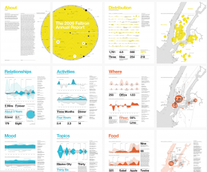
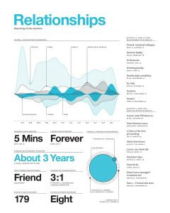
I found Nicholas Feltron’s data visualization brilliant and kind of really funny. He gathers rather random everyday data for an entire year and creates a personal annual data report. The particular one I chose to show was his 2009 annual report about his Relationships with people. From parents to old friends to new acquaintances, everyone who had a “significant” encounter with Nicholas in 2009 received an invitation to contribute to that year’s Annual Report.
I thought the subject of this data visualization was entertaining, and pretty clear enough to read. He chose to graph the data using wave like forms to detail his encounters. He states that used Processing to help his visualize his data and some other programs. I appreciate his adventure out of the standard bar graph to display an entertaining and visually pleasing spread.
Source: feltron.com
Sarita Chen – Looking Outwards 7
My post this week for Information Visualization is about an experimental musical landscape for mobile devices called Carolina. The application was made in collaboration with the musical artist Kimbra (of whom I am a big fan, which is a large part of why I chose this particular project). The app was made alongside her album release The Golden Echo. The application, which is for the Android, uses guitars, base, mellotrons and vocals for the sound aspect.
The app is actually more than just an app. It was developed as a packaged website, as the creator, Jono Brandel, developed and debugged the app with Google Chrome.
The app is divided into two parts:
- The introduction, which functions as a starting point to introduce users into the app and as a loading screen while the song loads.
- The visualization, which is the actual graphical aspect.
What I admire about the project is first that I think the application itself is a pretty cool idea. I’ve always been a fan of very spacey world like designs, and that is exactly what this app aims to create. I also think that the graphics fit Kimbra’s music pretty well, and the fact that this is an app that one can easily download to their Android and enjoy is nice.
The visualization is created using three.js, which is similar to p5.js in that they are both Javascript libraries used for animation and creative purposes. The visuals are triggered by different parts of the music.

(Pictured above are examples of the app. The visuals are supposed to replicate the music taking you on a journey.)
I think the creators artistic sense is clearly shown in these works, as his other works seem to be a lot of interactive, visualized projects.
You can download the app from the Google play store here.
Here is the coding and a more technical explanation of the code and creation process.
Kyle Lee Looking Outward 07
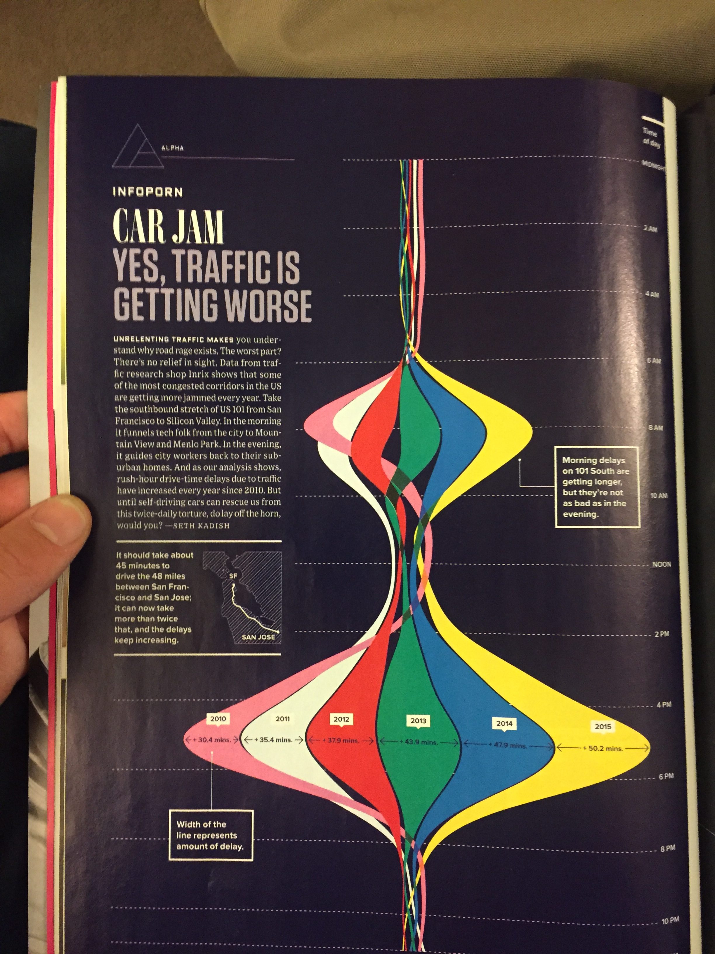
I found this infographic in Wired Magazine while I was in a waiting room at health services. Unfortunately this picture was the only documentation I was able to capture as I was unable to access the article later online. But this article by Seth Kadish, a data scientist at Chegg, discusses increasing traffic in the Bay Area, particularly along 101, the highway connecting San Francisco to San Jose.
I was originally drawn to this infographic since I’ve been a resident of the Bay Area my whole life, and live in Menlo Park, just about in the middle of 101. Needless to say that I have much first hand experience with the ridiculousness that is rush hour traffic in Silicon Valley.
I really like how dynamic this infographic is using the amount of color to show increasing idle traffic time over the years. It is certainly an unexpected representation of time. Although I admire how different this piece is, I did find it difficult at first to understand its representation. Its unusual depiction presents both things I like and don’t like.
I was unable to find how this information was collected. Furthermore, I wish there was more information on the impact of this increased traffic. So commutes are getting longer; so what? I think a few more statistics on how this traffic has impacted people or businesses would have made the article stronger. Maybe how much accumulated time per year does a person waste? or how much money do employees or companies waste from people losing time in traffic?