![[OLD FALL 2017] 15-104 • Introduction to Computing for Creative Practice](https://courses.ideate.cmu.edu/15-104/f2017/wp-content/uploads/2020/08/stop-banner.png)
“Making Information Beautiful”
This week, I was inspired by the work of David Wicks <sansumbrella.com>, who explores data visualization. I was struck specifically by his project “Drawing Water” <http://sansumbrella.com/works/2011/drawing-water/>, first because of its beauty and second because of how effective it is in helping people experience information in a new way.
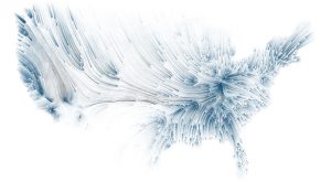
http://sansumbrella.com/works/2011/drawing-water/winter2011.jpg
“A representation of rainfall vs. water consumption in Winter 2001.”
In the print representation above, lines going from blue to black represent the general direction of rainfall toward where it is consumed. Although Wicks cautions that the pathways themselves are imagined, he uses real data: Wicks uses water consumption data from the United States Geological Survey and rainfall data from the NOAA National Weather Service. He inputs this information into code that visualizes rain sources going toward areas of water consumption.
<iframe src=”https://player.vimeo.com/video/24157130″ width=”640″ height=”360″ frameborder=”0″ webkitallowfullscreen mozallowfullscreen allowfullscreen></iframe>
“A video showing a dynamic and interactive representation of the Drawing Water project.”
This is fascinating, as it allows viewers to see and understand data that would otherwise be mere numbers on a page. Only scholars would be able to understand the information properly. But Wicks allows normal people to comprehend it through a printed image generated through computation.