![[OLD FALL 2017] 15-104 • Introduction to Computing for Creative Practice](https://courses.ideate.cmu.edu/15-104/f2017/wp-content/uploads/2020/08/stop-banner.png)
I find data visualization to be an interesting intersection between programming and graphic design/art as the better it is executed, the more likely people are to try to absorb the information given.
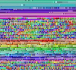
I chose to look at Fernanda Viegas’ chromogram, a data visualization piece that tracks what Wikipedia users (editors, not readers) search for. The algorithm tracks the first three letters of Wikipedia searches, and assigns a color to the string, resulting in a series of lines of blocked color that allows viewers to pick out repeated trends in editor activity.
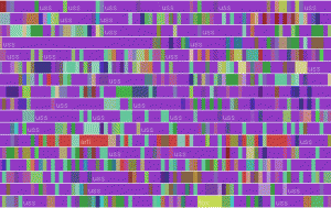
The above photo is an example of this, tracking the searches of a single editor who focused on naval centric articles. The purple is the string “USS”.
Link to the project