![[OLD FALL 2017] 15-104 • Introduction to Computing for Creative Practice](https://courses.ideate.cmu.edu/15-104/f2017/wp-content/uploads/2020/08/stop-banner.png)
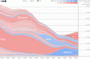
I chose this graph named Name Voyager which was developed in 2005 by Martin Wattenberg, which I thought was interesting and also practical. It basically generates a graph using people’s names, having it take more space based on their popularities. The user can type in a specific name and see how popular it was and is depending on the time period, and the interesting point is that as we type, the visualization shows, letter by letter, the overall popularity of the letters we’ve entered so far. It is interesting to observe what names get out of trend and what names get more popular. I feel like the algorithm here should be pretty simple, collecting the number data depending on names and placing them on a corresponding coordinate on a graph. I wouldn’t say that it has the most aesthetically pleasing visual, but I think it is good enough for something that has been developed in 2005.
http://www.babynamewizard.com/voyager