![[OLD FALL 2017] 15-104 • Introduction to Computing for Creative Practice](https://courses.ideate.cmu.edu/15-104/f2017/wp-content/uploads/2020/08/stop-banner.png)
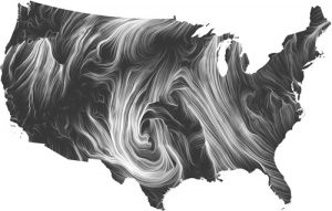
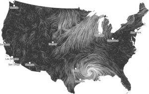
This is the Wind Map, created by Fernanda Viégas and Martin Wattenberg in 2012. It takes the current windspeed and direction of the wind currents in the U.S. in real time and presents them as whirling, organic lines. The denser the lines, the greater the windspeed. The data is pulled from the National Digital Forecast Database, and updates every hour. The simplicity of the design and the way it evokes the feeling of wind is incredible, as are the images this piece produces. Here is a screen capture of the map during Hurricane Isaac:
Here is the blog post.
And here is the live map.