![[OLD FALL 2017] 15-104 • Introduction to Computing for Creative Practice](https://courses.ideate.cmu.edu/15-104/f2017/wp-content/uploads/2020/08/stop-banner.png)
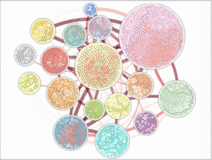
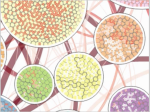 (Above are pictures of the Vorograph of Cody Dunne, Michael Muller, Nicola Perra, Mauro Martino, 2015)
Since this week’s topic was on computational information visualization, I tried to find a project where a custom software was made to collect and/or visualize a dataset, while still being colorful and fun. I stumbled upon the Vorograph of Cody Dunne, Michael Muller, Nicola Perra, and Mauro Martino.
The Vorograph presents three visualizations from IBM research that was developed to facilitate the research of epidemiologists through a combination of representations in population, movement, and disease spread at a local scale while also matching with a zoomable global scale. Although I don’t know the exact algorithms behind the artistic representation that is shown above, I do know that the data was put through a specific programming that rendered those images.
I admire the very intricate patterns and color detail that went into making those specific patterns. Each of the different circles have a simple yet unique pattern of its own. I admire this because the uniqueness shows the extra effort that was put into making all the different circles. The patterns also show the artists’ artistic sensibilities in how they chose to represent their different data, and the final presentation.