![[OLD FALL 2017] 15-104 • Introduction to Computing for Creative Practice](https://courses.ideate.cmu.edu/15-104/f2017/wp-content/uploads/2020/08/stop-banner.png)
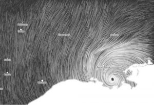
This is a project called Wind Map, by Martin Wattenburg. It takes in surface wind data from the National Digital Forecast Database once per hour, and generates these images based off of that information.
What I enjoy about this project is how it bridges the gap between informational and emotionally representative. Looking at these images, I can both see what the wind patterns were like in that moment and feel the emotion of that wind.
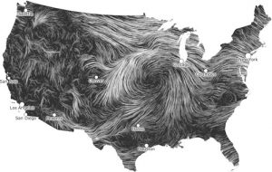
I believe that, when representing information, there is an opportunity to represent much more than just numbers. I almost feel like saying there is a humane obligation to representing more than just numbers… information has real impact in peoples lives, and thus has an emotional quality to it on some scale. Maybe a good example (though maybe a bit extreme) is death counts. Seeing a bar graph of death counts in different wars takes all of the humanity out of that information.