![[OLD FALL 2017] 15-104 • Introduction to Computing for Creative Practice](https://courses.ideate.cmu.edu/15-104/f2017/wp-content/uploads/2020/08/stop-banner.png)
For this weeks project, I chose a project with athenahealth. Fathom, a design firm focused on creating visuals that show data, partnered alongside athenahealth to create a visual showing how patients move through their healthcare network. The application divides patients’ interaction into four parts: practice, patient, orders, and payers.
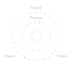
Practice includes initial patient exchanges with caregivers, patient includes the patient’s individual interaction with the online health portal, orders include orders and lab transactions, and payers include payer transactions like processing of insurance claims.
When in action, the application has a series of dots that appear and float around the screen between the various groups, changing colors according to the category and where it is.
I find this application very visually pleasing and creative compared to many other data displaying applications. It’s easy to revert to a graphical display of data, but this application uses a much more original visual. Standing alone, the application can easily catch peoples eyes and be a work of art. However, in reality it displays data in a way that shows relationships and connections between various areas of the healthcare network.