![[OLD FALL 2017] 15-104 • Introduction to Computing for Creative Practice](https://courses.ideate.cmu.edu/15-104/f2017/wp-content/uploads/2020/08/stop-banner.png)
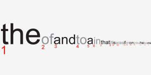
I chose to look at Jonathan Harris’s piece Wordcount, from 2003. It is a visualization of humans’ frequency of use of certain words. I really thought the concept was quite simple, but what made me begin to admire it more was when I read this section of Harris’s description: “The intention is for the user to feel embedded in the language, sifting through words like an archaeologist through sand, awaiting the unexpected find.” I realized that this was not just a list of data, but a clean visualization that users could explore and make connections within. I found my own curiosity growing as I wanted to discover the ranking of specific words. I love that the clean interface and simple concept leaves room for discovery. Since the project is very linear, I can assume that conditional statements were used to have the font size decrease as the ranking increased, from left to right. They also would need to be used to make the font fill change for every other word, alternating from black to gray. Wordcount was probably done similarly to the bar graph assignment. On his biography, it says that Harris is “exploring the ways in which humans use technology to shape their experience of life.” I feel that his fascination with human use of technology, but also of overall systems, is what inspired this piece, as language is a system that we have created (just like technology). This was a simple but effective piece for him to visually see patterns and relationships within human word use.