![[OLD FALL 2017] 15-104 • Introduction to Computing for Creative Practice](https://courses.ideate.cmu.edu/15-104/f2017/wp-content/uploads/2020/08/stop-banner.png)
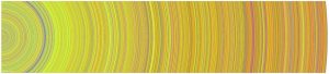
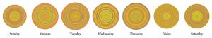
Through the Digg API, Chris Harrison was able to visually represent the most popular news stories of the day. Especially in today’s news cycle, there is so much content to absorb and process daily. With all that social media does to the news cycle, I wonder what those rings would look like in 2017 as opposed to 2007-2008. That was still a very busy and important era of the 21st century, but everything has grown and escalated since then. I admire how Harrison attempts to condense our everyday activity and attention into one artifact.
What I find interesting is how warm toned each circle is, which means there is a lot of “World & Business,” “Technology,” “Lifestyle,” and “Offbeat” Stories. However, the API is constantly being updated to better adapt to news stories, so the colors will change with that.