![[OLD FALL 2017] 15-104 • Introduction to Computing for Creative Practice](https://courses.ideate.cmu.edu/15-104/f2017/wp-content/uploads/2020/08/stop-banner.png)
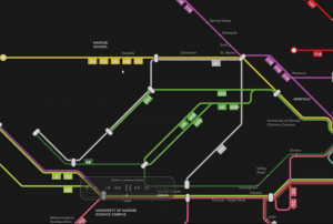
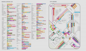
I am always very interested in how data can be used to create meaningful visualizations. So as I was browsing through the Eyeo Festival, I immediately spotted theSpeaker Sarah Williams and her project on the Nairobi Transportation System. Sarah William is a associated professor of technology and urban planning at MIT, and also the director of the Civic Data design Lab. So she started her presentation by introducing what is motivating her doing what she has being working on. With a strong interest in using data to facilitate urban planning, She promotes while we are massively collecting and researching data, we should pay more attention on how wecan use the data. Thus regarding the data visualization, she indicated that new visualization of data exposing pattern in the world and revolute the way people perceive information. And many examples was shown in her presentation specifically mapping systems. Williams also indicate there is legitimacy in map that “map is powerful, power is the ability to do work, which is what maps do, they work.” After introducing the motives and her research areas, Sarah Williams started to talked about the Digital Matatus project she did. Digital Matatus is a collaborative Mapping system for public transits in Nairobi. So in Nairobi, Matatus are the current loosely self-organized “bus” system. However due todiverse Matatus companies that lack of a uniformed organization, Nairobi people are having a hard time to make sense of the entire matatus system and navigate effectively through them. So Williams and her team collaborated with students from the University of Nairobi and collected data locally with the Matatus drivers and frequent passenger, who can identify different routes and stops. After the data is collected, they developed this visualization with color coded routes along with the GTFS compatible data structure. It is interesting on how they dealt with the huge chaotic data and draw the map diagrammatically along 45-90 angles so that the user will be able to make sense of directions much more easily. The map also become the official matatus map in Nairobi and instantly have many of the users from the local Nairobi citizens, so it is really inspiring that how a simple visualization would actually affect a community by facilitating a more efficient transportation system. On the hand, I really admire the fact that Williams make the data completely open to the public so that the government and other tech organization can build upon it. Base on the data, several digital application are made for easier access to the Matatus schedule as well as cash-free cards for faster payments. Overall, witnessing all the design process and changes being made in the Nairobi society, I am really inspired on how data and visualization can solve social problems in a such effective way.