![[OLD FALL 2017] 15-104 • Introduction to Computing for Creative Practice](https://courses.ideate.cmu.edu/15-104/f2017/wp-content/uploads/2020/08/stop-banner.png)
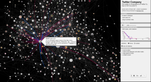
I found Hamza’s week 7 post about Santiago Ortiz’s (from Moebio Labs) visualization of Twitter connections. I agree with Hamza and Ortiz’s opinions that “data visualization is most effective not in the form of static charts and graphs, but as fluid, moving pieces of art”. There are certain types of information that should be visualized in a bar chart or pie chart, but when it comes to trying to visualize connections between subjects, it cannot be done in a numerical way. What’s interesting about the web about conversations between people at twitter is the fact that you can kind of imagine the personalities of people and the type of people they converse with. This may be because of common interests. Hovering over the circles with the person’s photo will show a blurb about the person.