![[OLD FALL 2017] 15-104 • Introduction to Computing for Creative Practice](https://courses.ideate.cmu.edu/15-104/f2017/wp-content/uploads/2020/08/stop-banner.png)
I think I want to base my project around something political, because I think art/design can be very political.
Here are two simple projects that help make politics most digestable and visible, and I think that is in the vein of what I want to do.
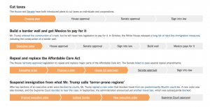
Trump Tracker by Viren Mohindra
This simple website tracks Trump’s promises and highlights them using a color code, depending on if he broke or kept his promise.
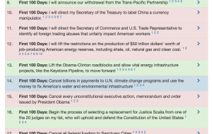
Tracking Trump’s Agenda, Step by Step
This is yet another web-based infographic by the New York Times. It shows a chronological timeline of the president’s actions and how they affect people of different populations. Each piece in the timeline links to an article about the specific event.
Both of these are simple web-apps with very primitive interactions. I appreciate how direct they are and how they make following politics more visual and more accessible. However, I think in order for them to be truly effective, they need to be more personalized to the person accessing them. I plan to move in this direction for my project.