Lookingoutwards -07

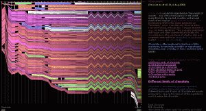
This is a project from Stamen. Name of the project is Facebook Flowers. The projects starts with George Takei sharing a picture on Facebook. After the initial share, shares that followed generates thread that continues as more shares occur. In the process, popular people are revealed as branching-off points of their own, and the process begins again. It is named flower because the visualization of data resembles the organism.

This project is particularly admiring on a fact that it converted the data that could be represented boring to interesting representation. It was always an interesting idea to record or see how fast and wide can social media spread information abroad. This project proves that social media is one of the fastest way to spread any thing to variety of people.

More dramatic case of sharing

jknip-SectionA-LookingOutwards-07

“Digg Rings” by Chris Harrison (2007-2008)

Between 2007 and 2008, Harrison grabbed the top 10 most dugg stories every day and rendered tree-ring-like visualizations based on the data. I really admire how each tree-ring created such different visual illusions and how certain colors/data categories are more prominent across each day of the week — Harrison describes that these variations occur as rings are cumulative. Randomness is unlikely to be found within this project, as the artist visualizes these rings based on real data. There may be some flaws in the algorithm as he notices that some days have fewer than 10 top stories, which is unusual. Harrison’s artistic sensibilities can be found in his choice of color palette, along with scale and presentation of the final rings. Each coded ring creates such different visual perspective depending on the scale it is shown.

http://www.chrisharrison.net/index.php/Visualizations/DiggRings

jiaxinw-LookingOutwards 07

Shipmap.org
by Kiln

Shipmap.org shows commercial shipping movements based on hundreds of millions of data points from throughout 2012. It was created by created by Kiln based on data from the UCL Energy Institute (UCL EI). UCL EI took data showing location and speed of ships and cross-checked it with another database to get the vessel characteristics. With this information, they were able to compute the CO2 emissions for each observed hour, following the approach laid out in the Third IMO Greenhouse Gas Study 2014. The designer took the resulting dataset and visualized it with WebGL on top of a specially created base map. The most impressive thing about this website is that it shows a high level of interaction with datas — such as you can select different time, ship categories and zoom in or out — and at the same time the map maintains the elegant visual appearance by using simple colors and movements.

For more information, please go to https://www.shipmap.org/

Looking Outwards 07 – Yugyeong Lee

Aaron Koblin is a digital media artist known for his innovative use of data visualization. Out of his many projects, eCLOUD is a “dynamic sculpture inspired by behavior of an idealized cloud.” Located in the San Jose International Airport,  hang from above, turning from transparent to opaque states to mimic the real time weather conditions of cities around the world. Based on the data collected from the National Oceanic and Atmospheric Administration, custom software, with use of algorithm, transfer electricity into the dynamic display to simulate cloud-like behavior. This project is admirable in transforming data into an architectural form that is integrated into the space to create an unique atmosphere. Through collecting the weather data and thereby turning something digital to embody natural characteristic, the artist articulate his sensibilities in visualizing data in a different perspective.

portfolio: http://www.aaronkoblin.com/project/ecloud/

mecha-lookingoutwards-07

Touching Air

For this week, I decided to look into the work of Stefanie Posavec, specifically her explorations with wearable data visualizations. Collaborating with information researcher Miriam Quick, Posavec created this piece titled Touching Air in 2014. The two collected data regarding large particulate (PM10) levels. Each necklace they created in this series was meant to visualize a week’s worth of data, with the size and shape of each piece representative of the amount of particulates in the air. The large, spiky piece in the image above represents the fact that there are a dangerous amount of particulates in the air–making the piece harmful to touch.

Posavec wrote that her decision to visualize this data using a necklace had to do with how these specific particulate levels are harmful to one’s heart and lungs. When I imagine data visualizations, my mind immediately thinks of graphs and other two-dimensional ways of visualizing data. Because of how this went against the norm of what I consider to be data visualizations, I felt that it was an interesting piece to dissect. I was inspired with how the communication of the data was representational of the issues that the subject brings about.

yoonyouk-lookingoutwards-07

This week’s looking outwards I focused on the work of Periscope, a company that focuses on data collection and visualization. Their goal is to send a message to their audiences and engage the public. Their visualization of data is very unique and provides a creative outlook data trends. For example, in data collection titled, “Most Negative Inaugural Speech in Decades.” I thought this data collection was unique in many ways – one being that they made quantitative data of facial expressions. Microsoft API was used to detect facial expressions while the presidents were speaking. A unique algorithm must have been crafted in order to detect facial expression and then determine whether it is positive or negative. They then combined all of the emotions into an arc like formation, creating a feather-like graph.

Above is the graph for President Trump’s inaugural speech. The graph shows a lot of negative emotions arising.

Rather than taking a typical approach of data visualization, such as a bar graph of a pie chart, the designers utilized a unique shape that still represented the appropriate data. When clicking on the individual strokes of the feather, users were able to detect the specific feelings felt during the speech.


daphnel-Looking Outwards-07

Atlas of Emotions

In 2014, the concept of creating an Atlas of Emotion through data visualization was created. Dalai Lama and Dr. Paul Ekman were inspired by their conversations with each other to create this Atlas. The concept for this was to create a map that would guide emotional travels and try to help them find their state of calm. The 5 main emotions considered are Anger, Sadness, Fear, Disgust and Enjoyment. I find this project very interesting and reflective of the creators themselves because although the map looks fairly simple, there was a lot of data put into this piece of work and it is a lot more meaningful than a regular map. I admire how much detail they put into the meaning of this map. Each of the five continents of emotion contain states which can lead to actions, triggers, moods and so forth. This project aims to bridge together the gap between the academic and personal.

mmiller5-Looking Outwards-07


Google News results by year appear in the physical bar graph, Centograph

Centograph is a dynamic physical bar graph made by Tinker in 2009.  Users type a keyword into a desktop computer connected to Centograph which then searches the Google News Archives for the number of times that word was used in articles since 1909.  Centograph then displays word usage by raising physical bars representing 10 year spans, giving a physical representation of the data.  Centograph is a permanent installation at St. Paul’s School for Boys, which is part of why I think it’s so cool — it’s made specifically for an educational setting.  By turning data from something esoteric into something tangible and cool, it helps to incite a level of interest in the areas of computation and data visualization, especially in students.

ashleyc1-Section C-Looking Outwards-07

history flow for “Abortion” page, versions equally spaced.
history flow for “Chocolate” page, versions equally spaced.


History Flow (2003) is a project by Fernanda Viegas in collaboration with Kushal Dave and Johnathan Feinberg which calculates and visualizes the changes of wikipedia articles. They calculated the changes by using tokens, or html tags in their program sentences to compare and capture changes in the articles. Although I don’t have access to the details, the Fernanda Viegas collaborated with IBM researchers. Their software was also able to determine who and at what age the author of the changes was and visualized these variants with different colors and sizes. Any time there is a black space, this indicates the article was vandalized or parts were blacked out which brings a lot of political undertones when seeing it in the context of a abortion wiki article.

This project is interesting because it brings up questions about censorship and the freedom to alter and edit text on a platform that is often referenced for the general public. From a visual standpoint, it’s also interesting to see the designs change and deviate significantly from the initial pattern and makes you think about what sort of conflict was going on and at what point can two (or more) authors of different opinions on a topic come together and agree what information is a determined fact to include in the article.

Artist Page:

http://bewitched.com/historyflow.html

Papers Written About Process:

http://alumni.media.mit.edu/~fviegas/papers/history_flow.pdf

http://hint.fm/papers/wikipedia_coordination_final.pdf

mjeong1-Looking Outwards-07-sectionA

“Smart Citizen Sentiment Dashboard Sao Paulo” by  Moritz Behrens. The installation is displayed on the media façade of the Galeria de Arte Digital.

Citizen Feedback to Visual Language

The project called Smart Citizen Sentiment Dashboard (SCSD) is an interactive media installation that translate set of data from the citizens into visual language. The screen is divided into three low resolution LED façades which are connected to the main computer through VGA connection. Data sets are collected through a number of workshops in which the artists invited citizens from Sao Paulo with different social and economic background.

The visualization of the data set is generated through RFID technology, facilitating on the ubiquitous Bilhete Unico travel card. The purpose of this project was to utilize this smart technology not only for travel purpose and allow citizens to express their opinion in the technology mediated urban realm.

Moritz Behrens succeeded not only in effectively translating the collected data into visual language but also in chose what kind of data they wanted to translate. Their decision to hear opinions from citizens deserves admiration since they newly opened a window for Sao Paulo’s citizens to have chance to express their feelings to public.


Link to Moritz Behrens