Bettina-LookingOutwards-07

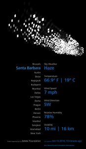
Screenshot of a person interacting with the project, “We Feel Fine”. Find the project page here, and the site itself here.

This interactive site, We Feel Fine, was made in 2005 and searches the internet every 10 minutes for expressions of human emotion on blogs and then displays the results these dynamic representations. Not only is the result beautiful, but this piece also helps connect people around the world by seeing others who share similar feelings as we are right now. I’d imagine to implement this, one would need to parse content from sites (perhaps use API’s?) but perhaps the logic would be similar to the concept of strings, and searching through each word in a string and matching them to words in emotion dictionaries. There could also be work with the d3.js library which is made for data visualization.

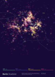
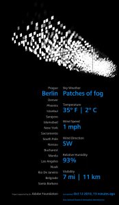
I also admire how this digital piece was also turned into a print piece. As a designer, I am always searching for how we bridge the gap between print and digital mediums, and this system seems to have either piece suit the medium quite well: the digital piece serves to collect and display data in real time, where as the print piece memorializes moments and interesting findings.

aranders-lookingoutwards-07

The 2013 project Stadtbilder by Moritz Stefaner is a representation of where cities are most bustling with activity. It is a nontraditional map that allows viewers to see various aspects of a city, such as food, nightlife, shopping, and music. I admire the innovative way that Stefaner viewed cities. It is a project that allows people to see where the fun activities of a city are and then find them with the street map overlay. The refined visual representation also adds to the appeal of the project. The algorithms that Stefaner used must have accounted for the geography of the cities, while creating the shapes and colors for the map. The project truly embodies the artist’s website name of “Truth & Beauty.” The project gives viewers information in a visually pleasing manner. link

link 2

alchan-Looking Outwards 07

(an example of the July 12, 2013 “Manhattanhenge”)

NYCHenge, created by the Carto team in 2013, is a project that visualizes how the sun aligns with the streets of New York City, inspired by the two times a year the sun lines up with the midtown grid of streets (“Manhattanhenge”). Sun-alignment is indicated by orange or red colors; the more red the color gets the more in-line the sun will be with that particular street. Users can explore the entire city of New York (not just Manhattan) across the entire year to find other, mini-henges or just figure out when the sun will shine in their faces as they’re driving down certain streets. It’s created with Open Street Maps, CartoDB tools, and the SunCalc javascript library to figure out the sun position.

I was drawn to this project because of its interesting focus, and the way it’s both interactive and relatively easy to understand. One downside to the simplicity of the map is that non-New-Yorkers will probably have trouble identifying the unlabeled streets, but the general gist of the project is still obvious.

afukuda-LookingOutwards-07

eCLOUD

eCloud by Aaron Koblin is a dynamic sculpture inspired by clouds and its behavior, displayed in the San Jose International Airport. The installation, made from polycarbonate tiles, can fade between transparent and opaque states, with its pattern transforming periodically according to real-time weather data from around the world. I find this work intriguing, as it takes an ambiguous natural phenomenon and attempts to abstract its behavior into a pixelated paneling system. From the example of different “states” of the installation, there seems to be an algorithmic system where the opaqueness (or lack of) of the panels are calculated according to the fogginess of the current weather. And the location of said opaque panels indicate the wind motion. It is an interesting idea to bring the outside into interior spaces; I can imagine it conveying a relaxing, pleasant mood in the San Jose airport.


Cloud conditions of San Jose & Berlin (respectively)

NatalieKS-LookingOutwards-07

In a project lead by Boris Müller and one/oneStudio NAND developed a map that was a visual landscape of fictional and poetic illustrations for the 14th Poetry on the Road festival in Bremen, Germany. The works of 25 different authors spanning 4 different languages created the computational basis for several generated media projects. For example, the image above: this is a visual map in which all of the works in the festival were represented in this unique form of computational media. This particular visualization was based on a “Conic Equidistant Project” so the distances were proportionally correct, as well as visual mapping, natural language processing, “Jan Rybicki’s TransVis research for detecting author finger­ prints,” and Yahoo’s geocoding service, among other distributions to establish connections between the different works.

I really admire this project for its application; this design ended up being used for the promotional poster – as a form of publications-art. It’s a unique way or representing other forms of art, while also having a practical use. It’s very cool to see how even works of literature, like poetry, can be represented through code and visual mapping.

ikrsek-Looking Outwards-07

Around the time of the most recent election, the wall street journal released a webpage that displayed examples of conservative and liberal facebook feeds side by side using programming to find such article/data that would apply to either category. To look at the information on each side and compare it brings to mind the power of the news that we find ourselves surrounded by – as well as the delicacy of words and the ability to completely warp our perception of events, or to manipulate an audience into feeling a certain way about a topic of discussion. In a sense it also brings about a sobering realization of the power of corporations like facebook, which are in control of the news that we see. Facebook itself has an immense amount of control and power in filtering the news on our timelines and in that regard also has a frightening amount of control over us and tend to keep us confined in an echo chamber with regards to the idea that the posts our friends or family make or share will tend to retain familiar values/morals. Projects like this, which give you access and understanding to different perspectives are necessity if we ever hope to overcome our differences to work together for the good of ourselves and fellow peers.

Here is a link to the website and a screenshot of the page:

http://graphics.wsj.com/blue-feed-red-feed/

Jdbrown – Looking Outwards 7 – Data Visualization

Here is a piece that I found a while ago – it’s a progressive visualization of all nuclear detonations since 1945 on the world map. It’s a very stark piece of work, especially given the accompanying soundtrack. While most of these detonations are tests, there’s something unsettling about the “co-ordinate-like visuals,” as if you’re in the room where they’re deciding whether or not to drop the bombs.

From what I can tell, the data set is comprised of dates and locations, with the geographic co-ordinates mapped onto a flat surface, then the algorithm goes through the timeline, and each time it hits a node corresponding to a bomb’s explosion, it draws a little reticle on the location of the explosion.

http://digg.com/video/nuclear-bomb-data-visualization

nahyunk1 – Looking Outwards 07

Out of the list one of the projects that particularly inspired me was Aaron Koblin and Chris Milk’s WITHIN. It was created for people to share personal stories or works in the form of virtual reality which also became a new way for viewers to experience works on a new level. Virtual reality, being a highly interactive and realistic form of expression, signified the creators’ purpose of WITHIN as creating a place for artists and people to express and interact within the area of virtual reality. When I downloaded and tried the app, I was able to download or stream videos of people and view them under a virtual reality setting and move and turn my phone around to see the surroundings and feel like I was really inside the story setting.

https://www.digitaltrends.com/virtual-reality/life-of-us-developer-interview-vr-multiplayer/
you can watch this but download the app to interact with the VR.