Sheenu-Looking Outwards-09

http://www.notcot.org/post/62386/

https://www.bmo200.com/

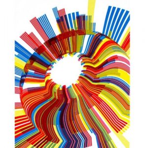
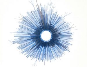
I came across yoonyouk’s first Looking Outwards from Section E and discovered this installation piece that captured my eye. This is an electric “fountain” created for the Bank of Montreal’s 200th Anniversary by BMO workers and artists Jennifer Marman and Daniel Borins. The idea of a “fountain” came to be because BMO wanted to grant wishes to it’s customers through tossing a coin.

How viewers can interact with this piece is by “tossing” a coin on their mobile devices. The piece senses the devices and responds through hundreds of “flip-up” plates that alter the color of the entire structure from white to blue. Numerous animated patterns and ripples can be made on the fountain stream and on the floor.

YoonYouk finds the project enjoyable since it successfully combines art, interaction, and software all in one great piece. She also enjoys how it uses flip-up plates to alter the structure rather than using electronic screens. I can totally agree with all her points. I found this piece enjoyable because of its easy-going interaction with viewers: there is no need to do something complicated. I can also agree that the use of flip up plates makes the piece truly different. If the piece used electronic screens, I believe the magic and uniqueness of the piece would disappear.

Overall, me and yoouyouk found this piece to be truly innovative, unique, and successful.

sijings-lookingoutwards-09

details | Chris Harrison

Link to the ClusterBall


This is a project chosen by Zining Ye. I found this project to be really interesting as I am also interested in the field of data visualization and HCI. I appreciate how he has demonstrated a clear instruction of how the project actually works that I feel very easy to access the whole project. One little suggestion I have is to have the pictures of the actual work to be a little bit larger so the details are better shown. When I was looking at it, I was connected to thinking about web and how our thoughts are also connected and weaving like individual threads. If I was to access this project, I would try to find some specific example of how these levels of Wikipedia category pages and their interconnections connect. Furthermore, I looked into this work on other websites other than Chris’ own website, expecting to find more interesting information of the project. It is demonstrated in “Visual Complexity” that the clustering component of this visualization is vital. As Chris explains: “The mere presence of information isn’t all that interesting; there is no context or relevance to be gleaned. However, the structure of information is revealing about where fields intersect and diverge, and ultimately about how humans organize information”.

Whole Look | Chris Harrison
Detailed Connections | Chris Harrison

Movie of the ClusterBall

mecha-lookingoutwards-09

Proteus

For this looking outwards, I decided to look into Allissa’s Looking Outwards post on the game Proteus. Ed Key released the game in 2013, allowing users to explore this generated world.

I really liked Allissa’s mentioning of the change in soundtrack depending on the user’s location as well as the time of day. While I did not actually purchase the game myself to play it, I liked the way Allissa described the features in the game in regards to randomly generated topography, flora, fauna, and structures.

While I do agree that the gameplay is slightly limited in the sense that what you can do involves walking around the world and listening to music, I think that is what makes the game so satisfactory. The calm and elegant simplicity of the design paired with the limited gameplay gave it its own aesthetic and atmosphere.

juyeonk-LookingOutwards-09

Credit to Ryu Kondrup and his post on The Mylar Typology by Paul Prudence

Title: The Mylar Typology

Artist: Paul Prudence

Year of Creation: 2017

Link to the Project: http://www.transphormetic.com/The-Mylar-Topology

Link to the bio of the Artist: http://www.transphormetic.com/Biography


While I was browsing through the Looking Outwards posts I came across multiple artworks that caught my attention. Among these, Ryu’s post on the audiovisual artwork titled The Mylar Typology by Paul Prudence seemed especially interesting for its unique concept and the high-tech methods that was used to create the artwork.

The Mylar Typology is a combination of an ever-evolving visual abstract landscape (that was created by closely filming the reflections on the Mylar sheets and distorting them) and the oscillating tones that are supposed to affect our brainwaves in a way that would make us feel relaxed. Both the oscillating visual art and the audio that are synchronized to each other work as stimuli to our brains by affecting the frequency, amplitude, and periodicity of the brainwaves that are shared by the optical and visual waves as well.

It’s interesting to me how the artist combined both the visual and the audio aid to double the effect that his work has on the audience. I had come across multiple ‘relaxing sounds that are good for studying and relaxation’ that incorporate oscillating sounds but none of them had a visual aid that is just as abstract and science-based as this one.

I also admire the high-technological aspect of the artwork; unlike most other artwork or music that is supposed to calm you down by evoking a peaceful memory or having a mild tone that is associated with a calm atmosphere, this artwork literally manipulates a part of our brain to make us feel relaxed. Without the help of the scientific studies on brains or modern technology that can detect the brain waves and produce them as well, this artwork could have not existed.


alchan-Looking Outwards 9

(Jakub Javora, Dark Forest, 2016)

I came across Jackie’s post on Jakub Javora’s work and was really drawn in by the style and slight animation. Though I’ve grown to be less impressed by how “realistic” something is rendered and more interested with different methods of stylization, I think that the level of realism works well in this piece. Like Jackie, also I really appreciate the narrative level the artist brought into the work. The glowing rectangle (doorway? light?) adds an element of mystery to the piece, which combined with the lighting and the movement of the deer work to create an overall atmosphere of mystery.

jwchou-LookingOutwards-09


A screenshot of NYCHenge. The red lines show the streets that align with the sun during ManhattanHenge.

A few weeks ago, my friend Allissa featured NYCHenge in her Looking Outwards post. NYCHenge is a product of Carto, a company that uses location data to help businesses.

It’s a really cool interactive map that displays ManhattanHenge, which happens with the sun’s position is lined up with the city’s east-west streets during sunset or sunrise. The map shows which streets line up with the direction of the sun on a particular day.

Allissa found the project interesting because of how particular and unique its goal was. I agree with her, because it’s often interesting to see projects about something relatively small and intriguing, because so many projects seem to focus on solving big, wicked problems.

I also love projects about mapping, and I’ve written some of my other Looking Outwards posts on projects that use mapping/geography.

Allissa said that non-New Yorkers would probably have trouble identifying the streets, and I fully agree. Another critique I have for the project is that for the tool to be more useful, they could incorporate sunset times and sunset forecasts. Obviously, if it’s going to be overcast, there’s no point to watch the sunset.


ashleyc1-Section C- Looking Outwards-09

Marius Watz’s Arcs04-00
Marius Watz’s Arcs04-01

I was really inspired by Hae Wan Park’s post from week 6 about Marius Watz and Jer Thorp’s collaboration for the Random Number Multiples Series curated by Christina Vassallo. This project was a computational collection in which Watz and Thorp created a program that would track how many times a specific word was used throughout the New York Times and visually display that information in cyclic shapes with lots of bold, layered colors. What is special about this project is that the final design was a screen printed poster.

The ‘Arc’ Series – Process of Screen Printing

I agree with Hae Wan that this project is interesting mainly because it’s a combination of computational information design and the traditional process of screen printing. I’d go further to explain that this relationship is needed because the conceptual inspiration came from physical newspapers and to reprint this information into a new physical form elevates the project to thinking not only about societal themes but also how we take in information today.

Jer Thorp’s Hope/Crisis

I disagree with Hae Wan when they say that this is just artistic expression. This process is unique because there’s this relationship to taking something digital and making it tangible and physical but I think Hae Wan should have talked more about the conceptual thinking behind the project because it does have some political undertones to it. For example, Je Thorp’s piece Hope/Crisis tracks how much the NY Times printed the words Hope and Crisis which is overwhelming just to see in amount but also makes you realize that we use the word hope more than crisis and has a sentimental reflection that despite living with current and recent devastations, humans still remain hopeful of a better future-something that’s conceptually interesting and equal to the unique process of creating this project.

Sources:

https://creators.vice.com/en_us/article/vvzxkb/random-numbers-screen-printed-generative-art-nyc-event

https://creators.vice.com/en_us/article/4x47bw/overcoming-manual-inadequacy-an-interview-with-marius-watz

What is Random Number?

http://blog.blprnt.com/blog/blprnt/random-number-multiples

Bettina-LookingOutwards-09-SectionC

I perused through my peers’ looking outwards to come across this fun web toy, frankenSimulator.

Above: screenshots of compositions I made on the interactive site.

As a designer with an art background, I’ve been toying with the balance of form and function in my work. Often I aim for my work to have a purpose and achieve a particular goal. But other times, I simply want to satisfy myself and make something fun and pretty. It’s delightful to come across a piece that simply seems pretty, but I could also imagine it having functional applications. Such types of work could be used for promotional events, branding a product, film, or company release. It could also be a “hook” for a more serious campaign.

I could see a piece like this using concepts of primitive/complex shapes as we’ve learned in class, as well as objects and animation with arrays that we’re beginning to learn.

Thanks to this peer’s post, I was able to also look into the studio behind this piece, Animade, who works on various interactive/motion pieces. As I’ve been getting more into animation and illustration this semester, I am happy to add this studio’s work to my repertoire of knowledge!

Above: screenshot of Animade’s work on their site

jiaxinw – LookingOutwards 09

Nayeon talked about this interesting project THE TRANSFINITE (2011) from Ryoji Ikeda, a Japenese sound and media artist in her LookingOutwards-04. (Here is the link to Nayeon’s post: https://courses.ideate.cmu.edu/15-104/f2017/2017/09/22/nayeonk1-lookingoutwards-04/)

This is the project video:

Nayeon mentioned that she was attracted by how Ryoji Ikeda has created a dimension for combining the sound and installation art together, and I would like to say I totally agree with it. The video is very immersive for me to feel the changing vision and audio inside the big art installation space. The vision went well with the sound, and the whole wide empty space created a feeling of the theater with all the media going on. Even the audience who just stood at or randomly walked by the installation, as an outsider I considered they were a part of the stage. One interesting point that Nayeon mention in her post is that ” In his work, sound, time and space are composed by a mathematical way so that physical features of sound could reach to audience’s perception and feeling”, and it is very surprising for me. I was impressed by how Ryoji Ikeda uses technology to help convey his ideas but give audience better experience at the same time.

THE TRANSFINITE by Ryoji Ikeda

Jdbrown – Looking Outwards 9 – Browns & Lozano-Hemmer

For the first interesting piece someone else has posted, I chose this work, posted by “HDW” and created by Daniel Browns. His work is really interesting – in particular this cover artwork that he did for William Gibson’s republished books. One of my favorite styles of geometric art is the “sprawling city” genre, used in Inception and Dr. Strange. So when I saw Browns’s work, I got very excited.

Another piece that I found interesting was Rafael Lozano-Hemmer’s work on this algorithm that randomly deletes 1–10 friends from your Facebook profile, once installed. What’s interesting to me about this piece is its simplicity – the concept being, “would you notice the absence of this person if they were deleted without your knowledge?” It’s an interesting interrogation into modern friendships – what does it mean if you never notice one of your friends missing? This piece starts to ask that question.

Josh