![[OLD FALL 2017] 15-104 • Introduction to Computing for Creative Practice](https://courses.ideate.cmu.edu/15-104/f2017/wp-content/uploads/2020/08/stop-banner.png)
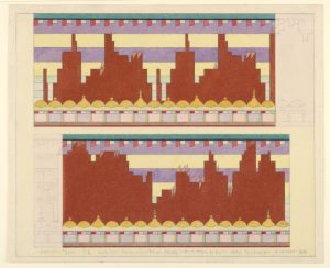
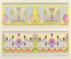
For this Looking Outwards, I decided to look into one of the projects that Ashley Chan wrote about. She decided to talk about some of the colorful illustrated works of John De Cesare – specifically about how he renders visual interpretations of musical scores through first studying music theory and creating a “complex algorithmic language” to interpret said musical scores. I’d say that I agree with much of her commentary on his work in the way it looks and acts as a visual representation of music – and the quote she gave from an analysis done on his work by Cooper Hewitt was extremely insightful regarding the way that he works. Particularly regarding her commentary on how Cesare’s work is unique from that of other artists who decide to visually represent score.
I’d venture to say however, that she left out some very fascinating information regarding the artist himself, for example the fact that he didn’t start doing this work until he was in his 60’s or so – he was born in Italy in 1890 and immigrated to the United States when he was a child. It should also be noted that De Cesare was not a musician, nor had he any musical training at the time he decided on doing this and that’s when he really dove himself into the deep history musical theory and the basics of such. As a notorious problem-solver, he couldn’t help but pick away at the complex idea of translating something entirely auditory into a visual art form, whilst still managing to maintain an aesthetically pleasing design and doing the score itself justice.
Link to the Looking Outwards:
https://courses.ideate.cmu.edu/15-104/f2017/author/ashleyc1andrew-cmu-edu/