![[OLD FALL 2018] 15-104 • Introduction to Computing for Creative Practice](https://courses.ideate.cmu.edu/15-104/f2018/wp-content/uploads/2020/08/stop-banner.png)
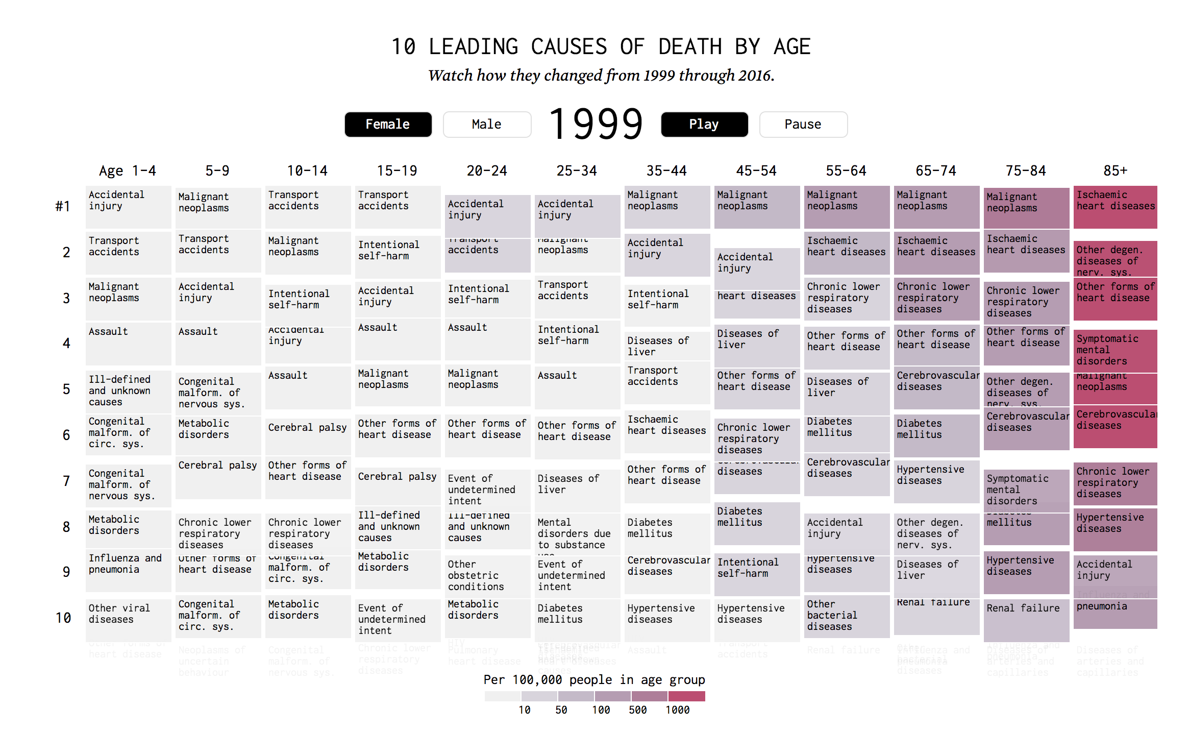
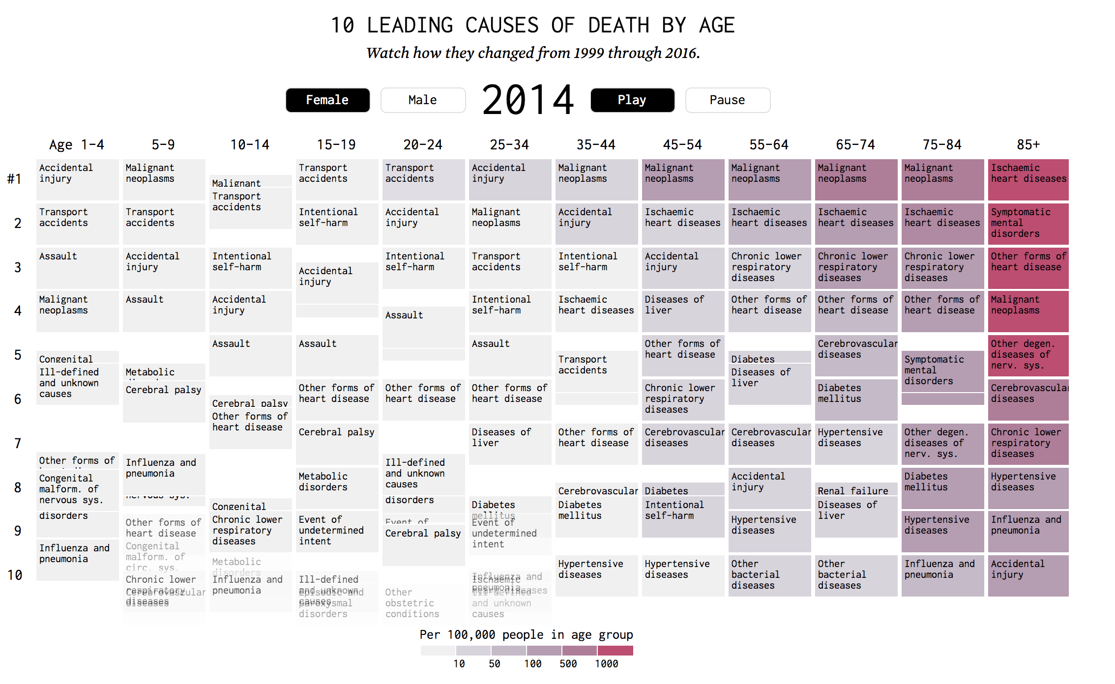
Source: https://flowingdata.com/2018/10/02/shifting-death/
I figured that I would put the source first this time, because WordPress’s size limit makes it very difficult to read what’s in the infographic- also because the infographic is animated. This week’s project that I would like to discuss is a very interesting information visualization. The project involves columns of different age groups and shifting rectangles that detail the causes of death according to how common it is. The rectangles shift over time as the project moves through the years. I admire this project quite a bit because the artwork’s portrays vast amount of information in such a limited space and does it quite elegantly. I admire it because with the usage of the project, people will be able to see highly relevant information that is otherwise difficult to find out about.
As for the algorithm that generated this work, I assume that there is a counting variable that counts specific input from the vast data there is. Also, there would have to be another sorting algorithm that ranks the most common causes of death. Lastly, there would be a draw function that animates the data in an interesting way.
The creator’s artistic sensibilities manifested into the final form when he is able to display so many aspects and dimensions of data into a single format. The data that the work describes, age group, gender, time-line, usage of color to represent the rate within age group, and causes of death. I think that there is true mastery within such simplicity.