![[OLD FALL 2018] 15-104 • Introduction to Computing for Creative Practice](https://courses.ideate.cmu.edu/15-104/f2018/wp-content/uploads/2020/08/stop-banner.png)
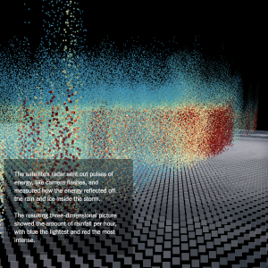
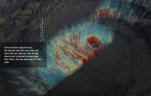
The New York Times published an interactive 3-dimensional map of the recent Typhoon Mangkhut, which slammed into the Philippines and south Asia mid-September this year. A combination of informational text, and visualization of rainfall and scale of the storm, the map changes as a user scrolls down the screen. Using data from a NASA satellite, the graphic takes advantage of scrolling down to zoom in and out of the storm, which is further broken down into squares or pixels, with red representing the most intense rainfall and blue representing the lightest rain. Produced by Yuliya Parshina-Kottas ,Karthik Patanjali, Jeremy White, Benjamin Wilhem, and Jon Huang, this visualization maps data sets from NASA into points in 3-D space, using color to represent concentration. This is most likely similar to the map function in p5, in order to translate one range into another. I’d like to know how to interact with objects beyond just an x-y plane, and I really enjoy the interaction with this specific data visualization.