![[OLD FALL 2018] 15-104 • Introduction to Computing for Creative Practice](https://courses.ideate.cmu.edu/15-104/f2018/wp-content/uploads/2020/08/stop-banner.png)
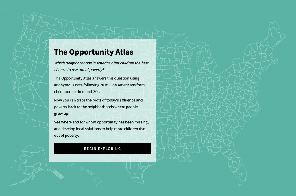
For this week’s looking outward, I am choosing to write about The Opportunity Atlas, a collaboration between Opportunity Insights and the Census Bureau. The map application was developed by Darkhorse Analytics.
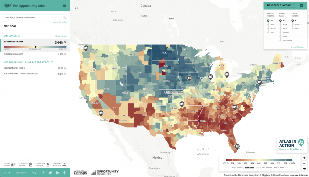
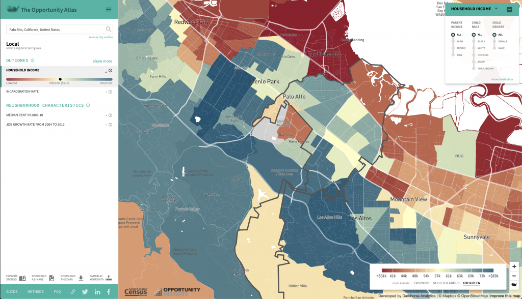
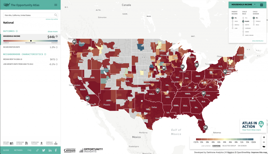
I really liked this project because I found it extremely interesting. I grew up in the Bay Area, where it isn’t uncommon to have a six figure salary coming from both parents–but I had a very different experience. It was really interesting just exploring the website, and seeing how different areas of the map, both in all of America and my hometown, had patterns. For example, my hometown is very affluent overall, but the town just next door is exactly the opposite.
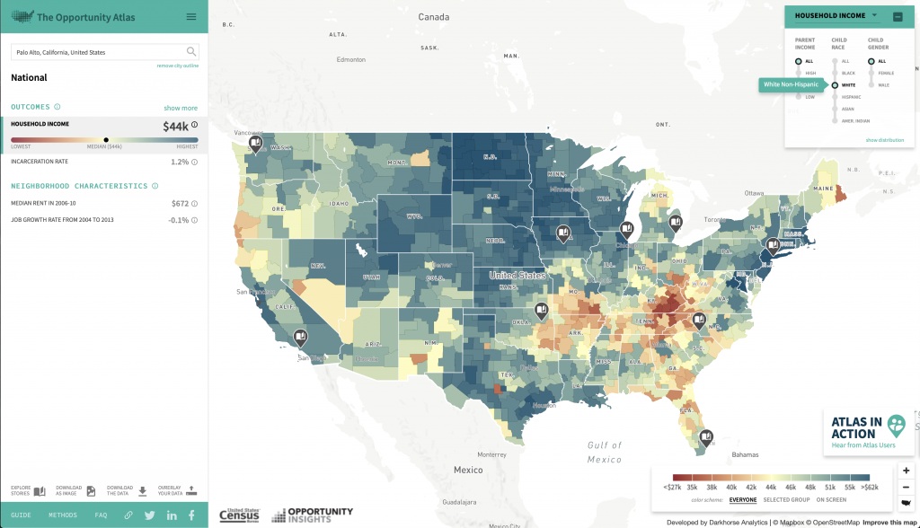
Another interesting part of this project was to look at racial differences. Overall in the country, when you compare household income from people who grew up in certain areas, the maps are extremely different for black people than they are for white people.
I thought that this project was not only interesting, but very important. It shines light on something that a lot of people don’t notice, simply because their hometowns are usually in a slight bubble. When everyone around you is at the same place, it is much harder to notice the advantages or disadvantages you might have. It’s really inspiring to me that they were able to compute to visualize this data, because of how important I believe this is.