![[OLD FALL 2018] 15-104 • Introduction to Computing for Creative Practice](https://courses.ideate.cmu.edu/15-104/f2018/wp-content/uploads/2020/08/stop-banner.png)
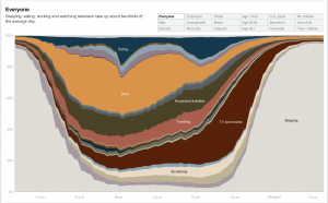
Created by Amanda Cox in 2011, this graph shows how different groups spend their day, broken down by different activities. Within the graph, you can select different groups and demographics to see the differences in how different groups of people spend their day. I find this data extremely interesting because it allows us to see how the activities change based on the group that you are looking at. It provides us a way to compare these different demographic groups that I have never thought of before. Although I am not sure how the artist accomplished this work algorithmically, I suppose that they gathered the data by asking a random selection of people from these different groups how they spend their day over a certain period of time. The creator’s artistic sensibilities are reflected in the final work through her choice of colors and the form in which the graph was displayed, for changing the type of graph used to display the data could easily change how it is perceived.