![[OLD FALL 2018] 15-104 • Introduction to Computing for Creative Practice](https://courses.ideate.cmu.edu/15-104/f2018/wp-content/uploads/2020/08/stop-banner.png)
I really liked Fathom’s project with Nike because not only is it visually stunning, but also it’s extremely interactive with the user. The charts break down a user’s daily movement and visualizes their active lifestyle. This is really cool because this feature is enhances the entire Nike+ FuelBand system. It creates a collaborative community aspect to the product that further engages the user
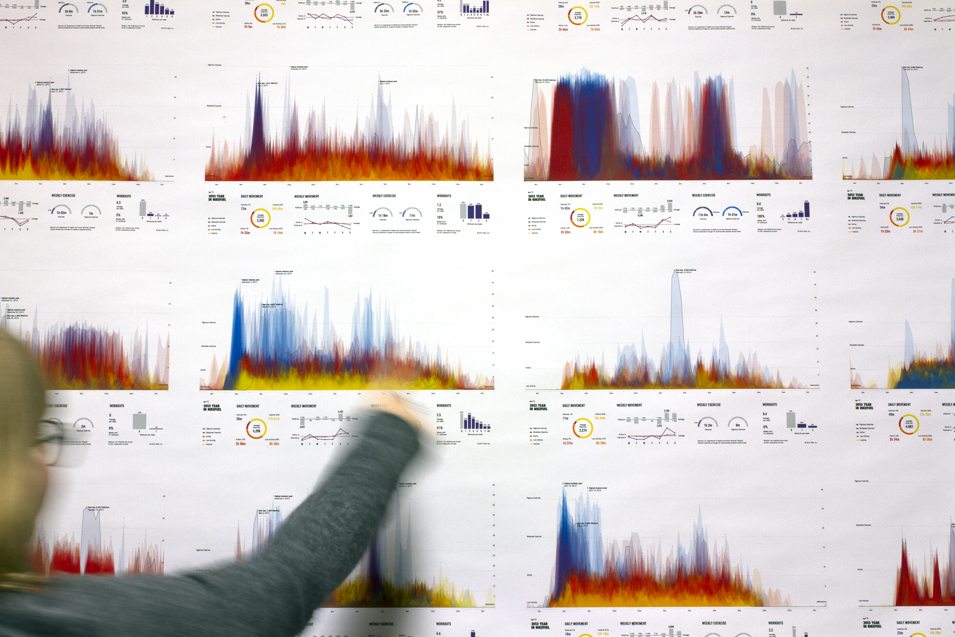
Additionally to the community aspect, the details and features of each graph are unique to the user completely.
The top of the poster serves as a unique “fingerprint” of a person’s behavior, routines, and lifestyle, while the bottom portion offers a detailed summary of their year in hard numbers.
No user will receive the same graph, thus the sharing aspect is further encouraged so people can share with their friends and compare.