LookingOutwards-07: Sec C Sophia Kim

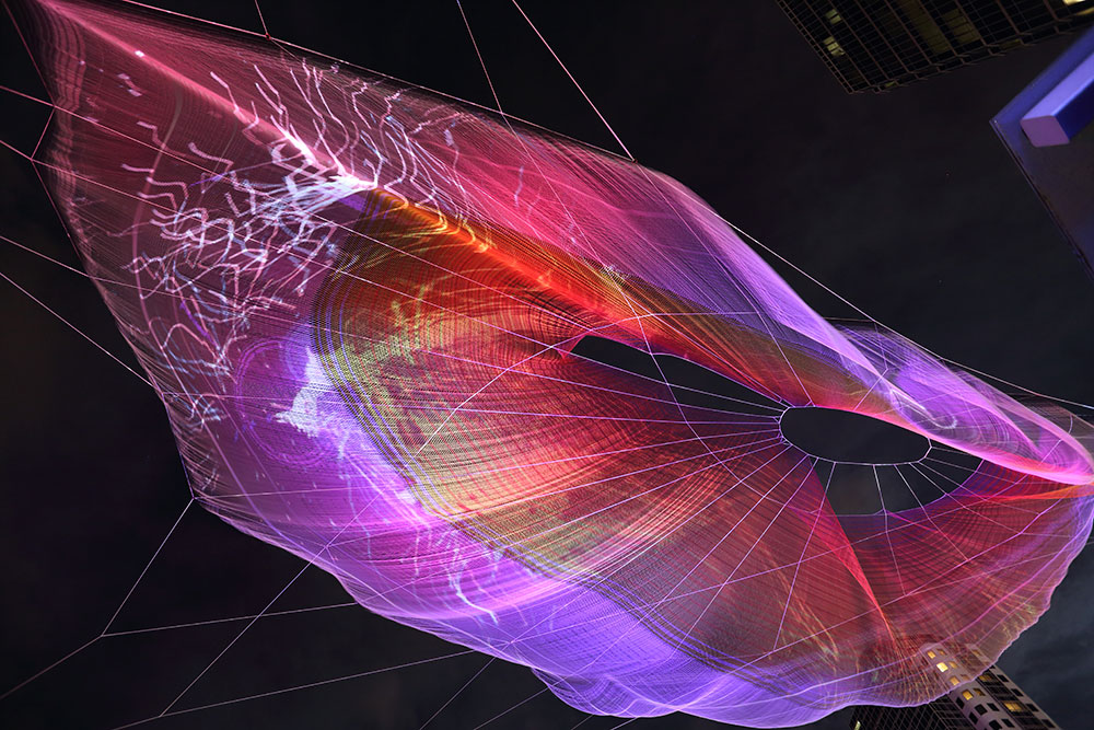
“Unnumbered Sparks” is an interactive sculpture that was created by Janet Echelman, Aaron Koblin and his team at the Google Creative Lab. This massive sculpture in the sky is mainly crowd-controlled, because the users are the ones who create the visuals, which are projected from their mobile devices. Ever since I studied fine arts and transitioned into design, I always had a passion for interactive, digital, and societal art. “Unnumbered Sparks” is a perfect example of the type of art I enjoy, combining digital and interaction. I love how Echelman and Aaron achieved their goal of making this project mainly run by the common people. Users are able to draw different lines and shapes with various colors just on their phone. I admire how each interaction a person has is very different and personal. Seeing their own art floating in the sky gives the user a celestial-like experience. Also, I enjoy how there are other elements like sound that is part of this experience, which also adds ambience to the environment.

This sculpture mainly uses a website that’s on a browser. This interactive art is very easy to use. The user only needs to connect to the WIFI to get access to a “remote control”-like website to draw. The Google Creative team used projection mapping to visualize the drawings. To allow this collaboration, the team used a program, which they created, called “Go.” It is similar to two coding programs: Python and C. “Go” is useful for high throughput networking. To create a 3D model, the team used Chrome and WebGL. These programs allowed the team to perfectly project onto the complex sculpture. With all these complex steps, all the designers had to consider other elements like weather, temperature, and wind change.

Audrey Zheng – Looking Outwards -07

ATD, an organization dedicated to community college student success, approached Graphicacy to help them analyze and visualize member college performance data collected over their ten year history. They wanted to create a conversation starter for their 2014 Dream Conference.

This is an infographic created by the company Graphicacy. I thought this start up was cool because they specialize in making information visual, persuasive and shareable. Starting with an in-depth discovery process, Graphicacy builds  websites and interactive applications, and produce data visualization and information graphics, motion graphic videos and data analysis. Their team specializes in open source solutions including Drupal, WordPress, and Angular.

The Center for American Progress asked Graphicacy to translate a report into compelling interactives. The report is about the economic benefits of closing the achievement gap between white students, hispanics, and blacks. They created an animated explainer video and interactive charts that show how pernicious gaps open even before a child’s first day of school.

There is something about the moving image that draws me to these statistics. It is much easier for me to visualize the difference between ethnic groups with the people, versus seeing a number (16 million). The chart allows me to toggle between ‘view as one group’ and ‘view as race’ and the people will run and change color.

this one lets you see the distribution as well

See more of Graphicacy’s work here.

Rachel Lee Looking Outwards 07 Section E

Artscope
Screen capture of Stamen’s SFMoMA Artscope (2009).

This week, the project I have chosen to explore is SFMoMA Artscope, an informational visualisation project created by Stamen. What I admire the most about this project is that it challenged my perception of what a map looks like– typically, I would think that a map would communicate information about a physical space, but what I found very interesting about this project is how it is mapping a collection of work irrespective of space, and arranging SFMoMA’s archive by acquisition date. Furthermore, I admire the fact that this project might allow people who do not have the oppurtunity to visit the museum to access the collection online, adding an element of inclusivity. Stamen built this project using their Modest Maps library, which is an open source toolkit that allows their designers and developers to quickly put together maps, specifically, maps that zoom and pan. I think Stamen was able to play around with artistic sensibilities, in conjunction with the brand of SFMoMA just by creating the map. This data visualisation tactic makes the artwork thumbnails seem almost collage like, and creates a bold visual language.


Alice Fang – Looking Outwards – 07

A screenshot of the article
View of the entire storm, from the article

The New York Times published an interactive 3-dimensional map of the recent Typhoon Mangkhut, which slammed into the Philippines and south Asia mid-September this year. A combination of informational text, and visualization of rainfall and scale of the storm, the map changes as a user scrolls down the screen. Using data from a NASA satellite, the graphic takes advantage of scrolling down to zoom in and out of the storm, which is further broken down into squares or pixels, with red representing the most intense rainfall and blue representing the lightest rain. Produced by Yuliya Parshina-Kottas ,Karthik Patanjali, Jeremy White, Benjamin Wilhem, and Jon Huang, this visualization maps data sets from NASA into points in 3-D space, using color to represent concentration. This is most likely similar to the map function in p5, in order to translate one range into another. I’d like to know how to interact with objects beyond just an x-y plane, and I really enjoy the interaction with this specific data visualization.

Looking Outwards – 07 John Legelis

Ingrid Burrington is an artist/scientist from New York City and the creator of the book Networks of New York . This project involved surveying New York’s infrastructure and researching the different networks that make up all its components. The research was compiled into a book that beautifully displays to the reader the networks that make up New York City.


Manhole Depiction from Networks of New York

This manhole drawing is one of many described ports to the physical internet. This particular manhole is part of the Empire City Subway Network.

Ingrid likely discovered all this information by simply observing her surroundings and then inquiring with the right experts to gain further detailed information. I admire this project because of its thoroughness and its unique angle on everyday objects. Ingrid’s obviously technical background applied to the physical world creates an outcome that portrays the ordinary as excitingly interconnected.

ChristineSeo- Looking Outwards – 07

A physical simulation was used to control organically moving lines and curves.
Abstract geometric shapes visualize raw sensor data without the involvement of humans.
Geometric textures form the baseline for reflections on the car’s beautiful surface.

Studio NAND wanted to capture the experience of driving through data visualization with light and motion. They used realtime video production to interact cars and humans together by projecting onto walls. They used speed, acceleration, heart rate, and sound to create textures, patterns and dynamic shapes to visualize the data. The installation was originally for Infinity, as they wanted to visually replicate the experience in the car: they wanted to focus on design and technology in order to communicate in meaningful and engaging ways. Studio NAND work with different teams in design and production to work with various clients and inventions.

I think it is very intriguing how the project shows something that are usually not visually represented. Experience is something that requires practical contact and encounter with the specific observation of the event. However, Studio NAND was able to take a step further to visualize the data into a beautiful artwork. I also think the interaction between humans are cars are interesting too, as humans have to drive the car in order for it to work; and having them interact physically through data (such as hear rate and acceleration) is very fascinating. However, I wish that instead of only two walls being used to protrude the data, there were more (front and back) to capture a greater sense of the experience. The project not only reaches beyond the expectations of the experience inside of the car, but also has a deeper meaning through the connection of technology and men.

https://nand.io/projects/infinity

Curran Zhang – LookingOutwards- 7

Coral City is a project produced by Craig Taylor that helps visualize a city in a non-traditional way. When we think about a map of the city, we would think about it as a drawing that shows the road, street names, and attractive spots. Craig on the other hand, wanted to use the raw data generate from a regular map and help produce geo-spatial analysis of the cities. Using this way of the representing the city, data such as political stability, crime rate, education, healthcare, and traffic are also used to not only represent the city but also assess how livable the city is.

Top 5 Cities with the Most Traffic

This project caught my attention because as an architecture student, the idea of mapping is used all the time in every project. The idea of map in our era is no longer the same, generic maps that we grew looking at. With the introduction of new technology and resources, map has taken a more informative and abstract way of being represented. Maps are something that should lure people into understanding the information that is presented.

Top Cities within Europe
Close-Up View of the Paris Coral City


Reference:

https://towardsdatascience.com/coral-cities-an-ito-design-lab-concept-c01a3f4a2722

Han Yu Looking Outwards 07

The information visualization project I found is called the Drought Monitor. It is a project by Pitch Interactive, an data visualization studio that presents data using the latest technology interactively. Their clients include some of the most acclaimed companies from multiple industries like Dow Jones, Wall Street Journal, Facebook and General Motors.

An Unprecedented Drought by Pitch Interactive in the 2015 issue of Scientific American.

The Drought Monitor was first started as a commissioned project paid by Scientific American in 2015. In that one of year’s issues, there was a graph of the frequency of unprecedented droughts in California. The graph plots data from the Palmer Hydrological Drought Index and highlights outlying points outside the general trend lines so the overall amount of unprecedented climates was clearly presented. In 2018, Pitch Interactive recreated the website and put data of California air moisture from 1895 to 2018. The graph follows the same design as the one in 2015 but becomes very interactive with viewers. Just by moving the cursor along the axis, data of general trend lines of each California region and specific data location is clearly presented. I am very impressed by the skillful application of information visualization by Pitch Interactive as it has made complex data instantly readable to any kinds of audience.

Screenshot of the interactive website Drought Monitor created by Pitch Interactive in 2018.

Carley Johnson Looking Outwards 07

A project called “Amsterdam SMS” developed for MIT Senseable City Lab and Salzburg University.

This project was created by Aaron Koblin, and is an interactive tool that traced texts sent through Amsterdam. The data was provided by KPN mobile, and built with Processing and OpenGL. It’s a visualization of data, and it changes over time (IE more texts sent as the day goes on, the data changes). Aaron believes that data processing is the future of art and story, not just for business and computational related work. He has worked on everything from music videos to VR games and has work showcased around the globe. I like this project because it mixes an artistic sensibility (found in the colors, dimension, and interactivity of the tool) with a sense of use. I could look at this piece of data processing and see how this could could be extremely valuable to a company, as well as to a consumer. As for the created software, the piece was built with Processing and OpenGL.

Shirley Chen-Looking Outwards-07

This project, called “Melting Memories”, is a series of digital artworks that create visual representation for EEG data collected on the neural mechanisms of cognitive control created by Refik Anadol Studio. It aims to explore materiality of remembering. Using computational method, this project allow the viewers to experience the aesthetic interpretation of motor movements inside human brain. The artist collects data on the neural mechanisms of cognitive control from an electroencephalogram, which measures the changes in brain wave as the result of activity and provides evidence for the function of brain.
The data is collected by instructing the participants to focus on specific childhood memories during the recording process. And the team transposes the EEG data t into procedural noise to generate aesthetic structures. This project is intriguing because the artists used computational method to collect and represent sets of abstract data relating to memories. With new technology and perspectives of exploring arts, the artists tried to visualize something that is intangible and vague. It provides the viewers with new perspectives and ways to learn the brain activity and also forms connections between the viewers and the artwork because the artwork is actually depicting the activity in human brain.


“Melting Memories” Project Created by Refol Amadol Studio

EGG Data Collection 

Visualizing EGG Data 


https://www.creativeapplications.net/vvvv/melting-memories-drawing-neural-mechanisms-of-cognitive-control/