Tanvi Harkare – Looking Outwards 07

A project that I found interesting is the Wind Map by artist Martin Wattenberg and Fernanda Viegas. Martin Wattenberg leads the AI research initiative at Google, and focuses on combining those aspects with art. These wind maps range from calm days to huge hurricanes. In terms of time, all the maps focus on wind patterns since 2012. One of the main points that we can get out of this is that whether there is a hurricane or slight winds, wind patterns can still look dramatic at a 2D level. The algorithm to create this artwork is purely done in JavaScript and html, and the comet like tails describe the specific wind pattern.

An image based off Hurricane Isaac’s wind patterns
An overall wind map of the United States

I thought this was an interesting project because earlier this semester, we had to do a similar project for our architecture studio. Using wind patterns and other climate data can help us design better buildings. You can view the full project here.

Erin Fuller-LookingOutwards-07

ibm flux, 2017

The digital art and design studio, onformative, was commissioned by IBM to create a permanent installation for the new IBM Watson IoT Headquarters in Munich last year. The result was a data-driven art installation visualizing the different facets of the Internet of Things and cognitive technologies called “ibm flux”.


video of ibm flux

From ribbons of light to responsive gradients, the visual content is data-driven and interactive based on real-time time input of various sensor inputs and weather forecasting and culminates in an upward motion with a pulse and positive momentum. The shape was inspired by the IBM Watson and realized by using thirty-two curved screens span over eight ribbon displays.

Close up of the fabrication

“flux” activates the space and demonstrates the significance of cognitive technologies and A.I. in our present world and future – reflecting the ideation, innovation, growth and creative power of technology.

Installation relating to exterior conditions

Looking Outwards – 07

Using Botanicus’s visualization to hem out an orchid

With this project, humans and other living plants can now interact with each other. I thought that this is incredible because it can be a start to next visualize a different data set for human interaction between each other through similar modes. In the making of this project, there had been a development of a touch sensor that is capacitive. It was able to create an electromagnetic field from a medium; which in turn, measures small disturbances surrounding and in the field. The program, SIGGRAPH 2012, was able to express contact between the two, visually through the use of sensors. An aurora-like interactive visual is triggered through gestures, both physically tangible and intangible through proximity, made from the engager to the plant. And the reason for this project was to create a space/tool in which interactive technologies are not manufactured, but living and real throughout the experiences with one’s senses.

Botanicus Interacticus: Interactive Plant Technology: Disney Research Pittsburgh | Dr. Ivan Poupyrev | 2012

Kyle Leve-LO-Week-07

An interactive project that focuses on computational information visualization that I find interesting is a program by Kim Rees that illustrates the path of space tourism. This project can be found on NBC News and it explains what the future process of people exploring space will be. It shows the full cycle of space tourism from liftoff, to journeying through space, to the descent back to Earth. What I noticed about this project is how well it is done and how much detail was put into it. As you go through each step, the points are placed at points regarding the height at which they take place. This allows for the user to visualize the whole cycle of the journey and understand just how much of an experience space travel will be. The software is easy to use and it provides a fun and interactive experience that correlates its design to the actual process.

http://interactive.nbcnews.com/virgin-galactic/

Link to the interactive project.

This undated image provided by Virgin Galactic shows Virgin Galactic’s first SpaceShipTwo, an air-launched suborbital spaceplane type designed for space tourism. It is manufactured by The Spaceship Company, a California-based company owned by Virgin Galactic. Space tourism companies are employing designs including winged vehicles, vertical rockets with capsules and high-altitude balloons. While developers envision ultimately taking people to orbiting habitats, the moon or beyond, the immediate future involves short flights into or near the lowest reaches of space without going into orbit. (Virgin Galactic via AP)

https://www.dailymail.co.uk/sciencetech/article-3447431/Space-tourism-projects-glance.html


Emily Zhou – Looking Outwards – 07

Tilegrams is an open source tool for creating statistically accurate maps. Data-representative tiles are arranged, shuffled, and colour-coordinated to visualize data.

US state map based on 2015 population data.

The Pitch Interactive team, led by Wes Grubbs, designed Tilegrams to employ a cartogram algorithm that balances geographic resemblance with statistical accuracy. The tool ingests a state-level dataset in order to output a cartogram which is them sampled to produce the tile elements––which inspired the name “Tilegrams” from tiled cartograms.

Tilegrams demo, 2016.

Primary design choices were implemented by the creators, allowing for the maps produced by the tool to remain visually consistent. However, drawing tools including drag to move and marquee selection give users the chance to customize and validate information.

I admire the fact that it can take into account a broad scope of data from all different users and produce attractive visualizations in every scenario. Tilegrams is currently being developed to accept beyond country-wide data with the cooperation of Google News Lab.

Alessandra Fleck – Looking Outwards – 07

For this analysis on data visualization artists, I wanted to look into the work of American scientist, Martin Wattenberg. With experience in working at IBM and co-leading Google PAIR, Wattenberg carries an interest in the different connections technology can make and the narrative and beauty that emerges from those connections. One such project that takes computation and captures the narrative/ storytelling of it that I find particularly interesting is Wattenberg’s Shape of Song exhibition.

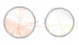
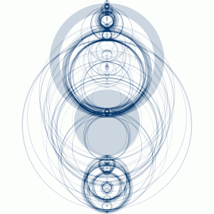
(The above image shows a matrix of Wattenberg’s entire Shape of Song collection. The program to create these intricate forms was written in Java)

The purpose of the Shape of Song exhibition was to create works through the connection of different characters in a musical piece. As seen in the image below these connection would occur in the form of arches, which vary in size and span according to the distance between relating parts in the musical composition. Wattenberg achieved these forms by implementing the music in the form of a MIDI file, which was then separated and analyzed in subsets of “tracks.”

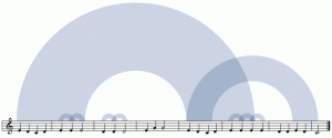
Once this process is done in several iterations through the course of the entire piece, the resulting work is a large set of connecting arches with different dynamic qualities.

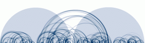
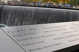
(The image above shows a diagram of the Goldberg Variations. The AABB structure of the composition can be seen in the way that the piece can be broken up into two separate parts.)

(The image above shows one completed work from the Shape of Song exhibition that captures the different connections and repetitions of musical components in Vivaldi’s Autumn, Four Seasons composition. )

What I find most interesting about this form of data visualization is the way in which it looks to find connections in something that seemingly has a set beginning and end. The way in which the data is visualized in this manner shows another interesting way of interpreting music and how it is structured by taking something that we hear and mapping it into something that we can see.


Read More:

http://turbulence.org/Works/song/method/method.html

http://www.bewitched.com/song.html


KadeStewart-LookingOutwards-07

Examples of the image that The Rhythm of Food can generate (Moritz Stefaner)

This project, The Rhythm of Food, is a visualization of google searches of food. The circle, going 360 degrees, maps to each month of the year, the color of the block represents a specific year, and the radius of the block is the number of google searches. So the farther the block is, the larger the number of google searches of that particular food in that month of the specified year. This leads to patterns that are easy to spot – for example, summer fruits are more often searched in, you guessed it, the summer.

This project is clean, beautiful, and informative. It also captures big patterns and small idiosyncrasies. “Sour Cherry” is not only a fruit, but also a song by The Kills that was popular in February of 2008. This small detail is captured by this visualization, illustrating how the project does an amazing job of capturing both the large and the small, and does so in a way that is easy to understand.

The Rhythm of Food

Min Jun Kim- Looking Outwards 7

Nathan Yau’s Shifting Causes of Death
Nathan Yau’s Shifting Causes of Death after few seconds

Source: https://flowingdata.com/2018/10/02/shifting-death/

I figured that I would put the source first this time, because WordPress’s size limit makes it very difficult to read what’s in the infographic- also because the infographic is animated. This week’s project that I would like to discuss is a very interesting information visualization. The project involves columns of different age groups and shifting rectangles that detail the causes of death according to how common it is. The rectangles shift over time as the project moves through the years. I admire this project quite a bit because the artwork’s portrays vast amount of information in such a limited space and does it quite elegantly. I admire it because with the usage of the project, people will be able to see highly relevant information that is otherwise difficult to find out about.
As for the algorithm that generated this work, I assume that there is a counting variable that counts specific input from the vast data there is. Also, there would have to be another sorting algorithm that ranks the most common causes of death. Lastly, there would be a draw function that animates the data in an interesting way.
The creator’s artistic sensibilities manifested into the final form when he is able to display so many aspects and dimensions of data into a single format. The data that the work describes, age group, gender, time-line, usage of color to represent the rate within age group, and causes of death. I think that there is true mastery within such simplicity.

LO7 Liz Maday

The 9/11 memorial in NYC

Jer Thorpe – 9/11 Memorial

The 9/11 memorial displays about 3,000 names inscribed into bronze panels surrounding two pools of water. The placement of these names may seem to be random, but they are actually specifically arranged according to an algorithm that was created by data artist Jer Thorpe.

The algorithm was built in Processing, and was made to accommodate requests by family members to have names meaningfully placed adjacent to other names, reflecting the relationships and connections between the victims. For example, the investment bank Cantor Fitzgerald was devastated by the attack, losing more than 700 employees and people associated with the company. On the memorial, all these names are listed together, encompassing large portion of the memorial. Even within this section, certain names are placed next to each other to indicate close relationships.

Visualization of the algorithm.

The algorithm works by first putting names into large clusters based on the adjacency requests. Then it figures out where to place these large clusters of names on the memorial, filling in the spaces.

I think this is an amazing example of how a program is able to reflect very human emotions and intentions while also utilizing a precision and complexity that is above human ability.

Emily Zhou – Looking Outwards – 05

Researchers at the University of California San Diego have found a way to improve “all that glitters” in computer graphics.

Algorithm demonstrated on the shell of a snail

The collective outcome is a more eye-catching suit for Iron Man, or a shinier shield for Captain America; but I admire the complex algorithm based on countless individual rays of light. The algorithm more accurately calculates and reproduces the way light interacts with surface details.

Previous computer graphics software have assumed that all surfaces are smooth at the pixel level, which is untrue in real life. This algorithm breaks down each pixel even further into what are called microfacets. The vector that is perpendicular to each microfacet is then computed in relation to the surface material. By combining this information at an approximate normal distribution, the surface is rendered in much higher definition.

I am excited to see this computer graphics software be applied to metal finishes for cars and electronics on HD screens.

Project Lead: Prof. Ravi Ramamoorthi
Article Source: ScienceDaily