![[OLD FALL 2020] 15-104 • Introduction to Computing for Creative Practice](https://courses.ideate.cmu.edu/15-104/f2020/wp-content/uploads/2021/09/stop-banner.png)
A digital design project that I enjoyed was Yuri Suzuki’s AR Music Kit project. This project was an Android phone application created in partnership with the Google Data Arts Team that essentially allowed users to create their own musical instruments. What I admired most about this project was its interactiveness and how usable it was (the demonstration video shows that children can even use it!) These aspects piqued my interest since I loved how it allowed for something rather complicated to be turned into something that is easy to use for all (with an Android, of course). This project was created by Suzuki with a team of 7 that was divided into designers and programmers. From what is given, I believe that to create this project, custom software had to be developed since it required developing the AR to recognize the music codes to produce their respective sounds. This project might have been inspired by the general growing popularity of DIYs and how almost everything now can be easily done through a smartphone. I think this project can lead to much more development on digital DIYs and provide more accessibility to a plethora of things that weren’t easily accessible before.
Category: LookingOutwards-01
LO-1
Architect/Author: Zaha Hadid Architects
The Guangzhou Opera House was built by Zaha Hadid Architects, officially open to the public in May 2010. However, the project idea was originally conceived in 2002, when a few architects and their firms, including Hadid, applied for a competition. While I was unable to find the exact computer program that Hadid and her colleagues used to formulate their design for the building, most architects use Grasshopper, a plug in into a 3D design interface named Rhino. This plug in enables the use of computational based design through commercially created ‘components’ that can be linked together. Components can also be created, however, and there are even open components in which one is able to insert Python-based code into them to reach a specified desired output. Many view Hadid as a trailblazer for the use of these technologies to create large scale buildings, as computer based design was just being realized into action when the idea for the building was being conceived. This has paved the way for many architects in the field of computational design, and while coding is not yet viewed as a ‘requirement’ to enter the field, projects like this one are definitely pointing towards that direction.
LO-My Inspiration
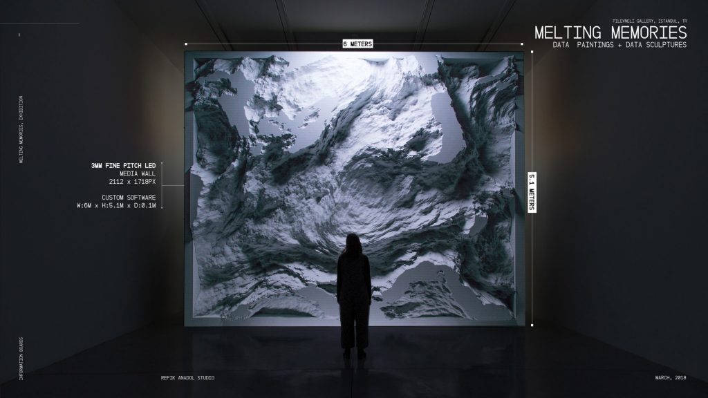
Melting Memories
I heard of Refik Anadol when my friends coerced me into attending one of his exhibits at the Wood Street Gallery in Downtown, Pittsburgh in February 2019. That installation involved being in an infinity room with light projections bouncing around the room.
This project is slightly different. Melting Memories is a data sculpture, mostly displayed on a LED media wall. Its purpose is to enable visitors to experience aesthetic interpretations of motor movements inside a human brain in the act of remembering. Data is gathered on the neural mechanisms of cognitive control from an electroencephalogram that measures changes in brain functions over time.
I admire that the artists were able to make data beautiful, something usually represented as just charts and numbers. Art is not always just paint and colors, but it could be able to represent something about the human race, and I find that fascinating. I also really admire how they were able to make something displayed on an LED screen look incredibly 3-dimensional. It makes it emotional.
From the Refik Anadol Studio, there were seven people involved in designing and developing the piece. Then they had someone for sound design, and two for software development. They had scientific support from UCSF / Neuroscape Lab members, and Adam Gazzaley, M.D., Ph.D.
The artist needed to utilize new technology to be able to gather neural activity using an electroencephalogram, and a 32-channel Enobio for data collection. They also needed to come up with a way of transposing EEG data in to procedural noise forms, so had to develop FieldTrip, an open source GPU library.
I think the project points to the future of data-driven art, that data is able to generate visually beautiful artifacts, making one rethink how one can process data and what we can learn from that. Then we could possibly project this on the facade of a building, or CNC it to make physical artifacts that are not necessarily existing digitally.
LO-1: Inspiration
One project I found particularly inspirational was the presentation and performance by the CMU Exploded Ensemble last spring. It featured real-time sound and visual editing with a lot of developed tools in Max for Live, as well as live musicians playing and editing their own sounds. The audio component was live improvisation while the visual component was editing of a piece of art which I can’t remember off the top of my head. I felt as though the performance and associated visuals really showed a future in digital performance in conjunction with acoustical instruments, since besides a few electric versions instruments in software are mostly midi-based, and combining technology with musical skill and creative talent could be a new form of music. I’ve based my minor around this possibility so I can combine my major in performance with my love of electronic music and sound editing. The performance was a large-scale project that was assembled over about a month in the Exploded ensemble class but fully improvisatory, and while the members of the ensemble collaborated on the creation of their scripts, they were not formally organized in the performance. I feel like the combination of modern musical talent and skill with the creative potential of digital sound design could be a new avenue for modern performance and is one I wish to explore and promote.
Performance website: https://subsurface.site/

Looking Outwards-01
https://wals.info/feature/1A#2/19.3/152.9
A computational project that I admire is the WALS database. It uses GeoJSON and a lot of linguistic data to compile an interactive map where you are able to see languages plotted on said map. I use this website almost daily to look up different features of languages and compare them to other languages around the world, and I am constantly in awe with how much information they have readily available about thousands of languages. As far as I know, the software for this project utilized existing libraries; however, I am not positive about this. The way this map was designed feels very influenced by paper maps and the experience of physically putting pins on them to note a location. Something that I appreciate is that their code is open source, so anyone can go in there and utilize what they have. This website is an extensive resource for any linguist, but I also think it has the opportunity to be even better. This map interaction is functional, but not the best design-wise. I’ve spent many hours thinking through ways to make this map even better (and I even tried it for a term project!), and I would love to learn more about GeoJSON to make this happen.
Dryer, Matthew S. & Haspelmath, Martin (eds.) 2013.
The World Atlas of Language Structures Online.
Leipzig: Max Planck Institute for Evolutionary Anthropology.
(Available online at http://wals.info, Accessed on 2020-09-06.)
LO 01 – Pole Position At the Game Academy
This particular reflection comes from my experience being a teaching assistant at the National High School Game Academy this past summer, a precollege program offered by Carnegie Mellon’s Entertainment and Technology Center. I had the pleasure of watching 100-or-so high school students compute and design video games from scratch, using information they learned over the past three weeks at camp. One of these games was a recreation of the classic arcade game, Pole Position, made by a group of five students. The games were created from scratch using C++ programming, Maya animation software, and implementation into Unity. What set Pole Position apart from the other 19 games presented was its cohesion and vision. The team recreated the mechanics of the arcade game perfectly, offering a zoomed-third person camera view of the vehicle. The first level had a vintage, warm color scheme that beautifully rendered a sunset, and that alone was enough to be considered stunning. However, when one advanced to the next level, the visuals flared and transitioned seamlessly into a retro, purple vibe surrounded by night-life cool toned hues. This breathtaking display of art direction merged with programming to away the breath of every TA watching the presentation, and many of us logged into Perforce just to play Pole Position on our free time. What was most impressive is that this team perfected this with only a week of work. We genuinely encouraged them to continue refining it beyond camp, and that such a recreation would do well in Steam, or on the App Store. Unfortunately, I cannot provide a link as it is currently unavailable, but I hope they continue revisiting their game, given how successful its first iteration was.
LO: My Inspiration
David McLeod – Wacom Cintiq Pro Visuals
David McLeod is a Australian digital artist who does mostly 3D animation and modeling and who I’ve followed on social media for multiple years.
As a lover and studier of architecture, I have always been fascinated with models, especially with varying textures.
What I admire so much about this piece is how he was able to really bring to life one of these models, which really opened my eyes to the power of digital art.
Much of his other art inspires me as well. McLeod does a lot of exploratory simulations with different materials and textures, which can be incredibly satisfying or incredibly disturbing.
I think that’s where this kind of art holds its power, in its ability to provide as close to a tactile experience as possible, which can facilitate visceral reactions and inform design and material choices. I could certainly see this kind of exploration coming closer and closer to reality by possibly incorporating virtual reality to create an experience that activates all sensory facets.
To my knowledge, David McLeod is a solo artist, who works from a studio in Manhattan.
I would guess that each project takes a week at the least to reach its final form.
He says that he uses mostly Cinema4D for his work, which is a commercialized software.
As far as inspiration goes, I think McLeod is influenced largely by surrealism.
I can definitely see a connection to Salvador Dali’s work, in terms of playing with material and the rules of reality.
Even some Picasso, although more rigid than McLeod, are reminiscent of his work.
And of course, legendary animators like Hayao Miyazaki, in his very texturally oriented anime work, as well as anime as a general animation style.
LO : My Inspiration
BIG?NYC is an installation by Danish architecture firm BIG (Bjarke Ingles Group). This project was a collaboration among several companies BIG, Times Square Alliance, Flatcut, Local Projects and Zumtobel. This installation with partially sandblasted acrylic tubes is illuminated with environmentally friendly LED lights. The piece aims to bring together people since when more people touch the sensor more energy is collected and converted into light, perfectly embodying the concept, “more people = more love”. Along with this the elasticity of the tubes makes them wiggle in the wind causing the heart to pulsate along with life in the city.
I admire how projects by BIG are rooted in a deep sense of connection with the environment around and how they foster community and inclusivity through their designs. This is a perfect example of multi disciplinary work as people from various backgrounds have had to come together to make this project successful.
LO-My Inspiration
This is where you would enter your blog essay.