![[OLD SEMESTER] 15-104 • Introduction to Computing for Creative Practice](https://courses.ideate.cmu.edu/15-104/f2021/wp-content/uploads/2023/09/stop-banner.png)
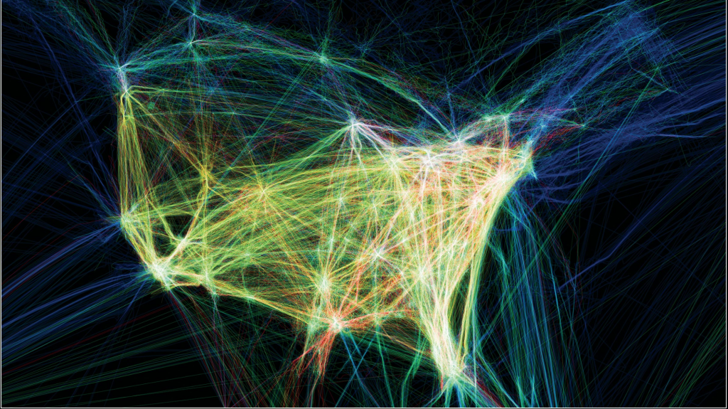
I really enjoyed the work by Aaron Koblin. Their work, “Flight Patterns” is very exquisite in terms of the visual elements. I really enjoy the glowing effect of the many lines. I also am fascinated by the idea behind. It basically maps the paths of air traffic over North America in colour and form. It was done using the Processing programming environment as they took data from the FAA. I enjoy the randomness of the lines and the abstract shape of North America that is created with line densities. I also like how the major destination are highlighted because of the number of lines starting and ending there. The artist has done a good job of preserving its cohesiveness while working that big of a data set.