 Introduction
After presenting our prototype last Friday, the team spent this week rescoping the project and worked on addressing the feedback we obtained from both the professors and our peers. Specifically, we realized there were a lot of features we needed to either cut or reshape, like our review system. Additionally, we decided to put the minigame at the forefront of our last few weeks of work, as opposed to the original plan of leaving it on the back burner. Combined with prioritizing UI and the feel of the game, we spent this week working on those two aspects and expect to finish implementing them in the coming week.
Prototype Feedback
Feedback for our prototype was mainly broken down into three chunks. As we expected, one of the big issues we were told was the visual and auditory components of the game. Playing the cammed demo, the auditory feedback UI that we had in the game was annoying and visually, it was still difficult to tell what was going on. Furthermore, there was not a lot of feedback of what was going on and it made the game boring. The team was told to consider putting in more sounds, like the sounds of the bakery, and visually showing customers come in and out in order to push the idea of a working bakery (and to make it more entertaining). Another large issue was that there is still nothing for the player to do during the shift. Therefore, we were told that we should probably prioritize the minigame in order to make the game more enjoyable. In terms of what kind of minigame would be doable in the timeframe, we were told that a Match 3 game may be the best bet. In general, it should be a type of game most people are familiar with and the experience should last about twenty to thirty seconds. The last big critique we got was the appearance and use of the monthly panel at the moment. The monthly panel does not give any warning about when payments are due and doesn’t give any information about the payments being made. Essentially, it’s forcing the player to do an action that may not be understood. The team was told to figure out how exactly the player would be forced to pay and what happens if they cannot make that payment and make that clear to the player.
Along with feedback from the instructors, the team also got feedback from our peers with different ideas for the game. Some of the things they were concerned about were how the financial literacy concepts were being taught and how the player interacted with the screen. Agreeing with the professors, they thought that the UI was a little bit awkward, with the auditory components being “alarming” and the lack of confirmation before the store shifted between the shifts and the break. Another thing they pointed out was the lack of tutorial within the first iteration of the day, stating that it was a bit confusing to follow without any additional instructions. In general, the comments pointed out that it was still unclear of what the player should do and the parts that we wanted the player to focus on (such as workstations) needed to stand out a bit more. However, they mostly agreed that the concepts behind the game were appealing, as well as the artwork, so the team just needs to tie everything together better.
Concept Rework
Taking into account the feedback from both the instructor and other members of the class and considering how much needs to be done in terms of debugging and tweaking existing aspects of the game, the team reworked the mechanics of the game a bit. One big thing that we changed was that we took away the unexpected events that we originally had planned to put in the game. This change is due to our time restraints and the changing priorities in our game, with the minigame now being at the top of the list. We want to use the minigame to emulate the player/owner “helping” various employees with their tasks. Therefore, if the game is expanded, each task could have its own minigame and the results of that minigame can be translated into bonuses for the player, whether it be money, ingredients, or reputation. We decided to also spend a lot of time reworking the UI instead of adding many more features to the game. For example, we had originally wanted customizable equipment and a storefront, but we decided that investing in better UI would make the player more attached to the game than some color options on equipment would. Also, to give the player more to do, we decided to create a trash collecting mechanism in the game. Player will need to pick up the trash as it builds up and if they do, they get some cash bonuses. Additionally, if they do not, their reputation and sales start to suffer. Regarding the review feedback system we had planned, we decided that we didn’t have the time to implement it, so we reshaped it to be a customer that comes in at the end of each week that the player has to click on before finishing the day. In this way, they are forced to see the feedback and how the store is doing.

Some features that we are adding/cutting from our game and a more detailed timeline for the next two weeks
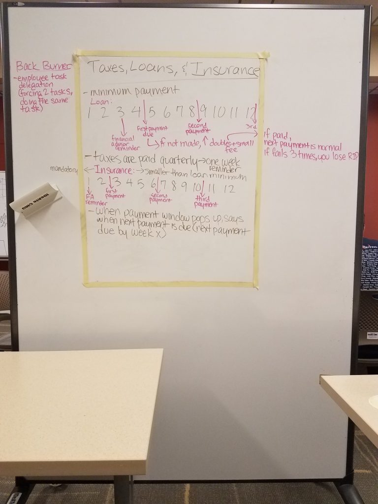
More detailed diagram of how loan, tax, and insurance payments work
Programming
Because the team reworked the minigame to be one of the highest priority features we want to have in the game, programming decided to split work between the minigame and the main game between the two programmers. For the main game, most of the work this week was focused on the UI. Programmers polished the UI to unify buttons, panels, etc. at least with programmer art until art assets are finished, in order to give the game a more cohesive and appealing feel. Some aspects of the lunch shift were also changed. Employees move to a lunch table during the shift and the shift is no longer timed. We made these changes based on the feedback received, where it doesn’t make sense for the lunch shift to be on a timer if the player is just having conversation with the employees. Now, afternoon shift only starts after the player has spoken to both employees. In this way, the player is forced to play through the financial literacy arcs to get through the game. Some feedback UI was updated as well. For example, UI feedback blinks only when an employee actually makes bread or sells bread now, as opposed to before when it blinked each time the energy bar decremented. Moving forward, the team wants to spend the next week completing the UI with the assets that artists create.
Minigame
This week, programmers started to research the types of minigames they could include to improve player experience. Originally, there was a debate between using a Match 3 game versus a Cooking Mama style game, the latter of which was attractive because it was relevant to how the business ran. However, after considering the options, a Match 3 game was chosen for a few reasons. First, it’s a more universal game type than a Cooking Mama style game, meaning that we would have to explain less to the player. Second, it’s easier to implement, as there are more open source projects to base the game code on, which was important to us given the time constraints we had in creating the minigame. Lastly, in terms of expanding the game in the future, a Match 3 game is more universally applicable than a Cooking Mama style game, especially if we cover more than just food-related businesses. Therefore, we went with a Match 3 game. Programmers were able to find an existing, fully-implemented Match 3 game in the Unity Asset Store called Cake Mania. The rest of the week was spent analysing the scripts to see how they could be modified to be incorporated into the game. Some of the things that need to be done to the game are making the grid smaller, making the time limit within the parameters of our game, and changing the art assets. Programmers have started to work on this and plan to continue doing so in coming week after figuring out the code. Below is a snippet of how the game looks having already started to tweak some aspects of it, like the board size.
Art
Artists spent this week working on two major components. With most of the in-store assets completed, artists turned towards working on the UI and collaborating styles between the different artists on the team. For the character sprites, we decided to redo them so that they work better with the full-size character assets. Additionally, this week, artists put final touches on the financial advisor sprite. The latter half of the week was spent starting to map out the UI in the main game. In making the UI, artists wanted to make something that was easily interpreted. Therefore, we decided to add a large clock on the bottom left to tell the player what shift they were on. Additionally, we used bars on top to keep track of stock, money, and reputation. Artists drew out diagrams of the UI layout for the main game and started to create the assets for it. In the coming weeks, artists want to focus on animating the sprites and creating the UI elements for the minigame and the monthly panel.
Updated sprites for the three main employees and the financial advisor
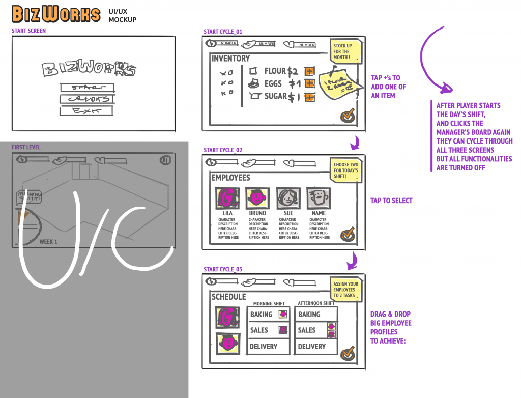
The plans for how we want the UI of the main part of the game to look like
Next Steps
For programming, programmers want to finish integrating the minigame, as well as finish implementing the functions in the monthly panel, mainly the tax and insurance payments. Specifically, in the next week, programmers also want to implement a start screen and make sure the saving function works. Some of the pieces that are on the back burner are the customer reviews and the trash collection in the main screen. Artists want to focus on polishing the sprites and in the immediate week, will focus on adding in all the UI elements into the game. Furthermore, we plan to make the trash assets and the delivery sprites in the coming week. Writing would like to finish all scripts in the next two weeks, including adding the fourth character, so that their dialogues could be put into the game and tested. Ideally, the team would like to start playtesting two weeks before the final checkpoint.