Written feedback on your clock projects has been kindly provided by Everest Pipkin (EP) and Claire Hentschker, two professional new media artists and CMU alumni. Everest and Claire reviewed your blog posts and ran the interactive projects you posted online.
Everest Pipkin is an American curator and multidisciplinary artist. Pipkin works in language, with code and on paper, and has taught computational new media and game design at Carnegie Mellon.
Claire Hentschker is a Brooklyn-based artist and designer working with site specific mixed reality and interactive children’s media. Hentschker is a creative technologist at the Cartier Innovation Laboratory.
axol
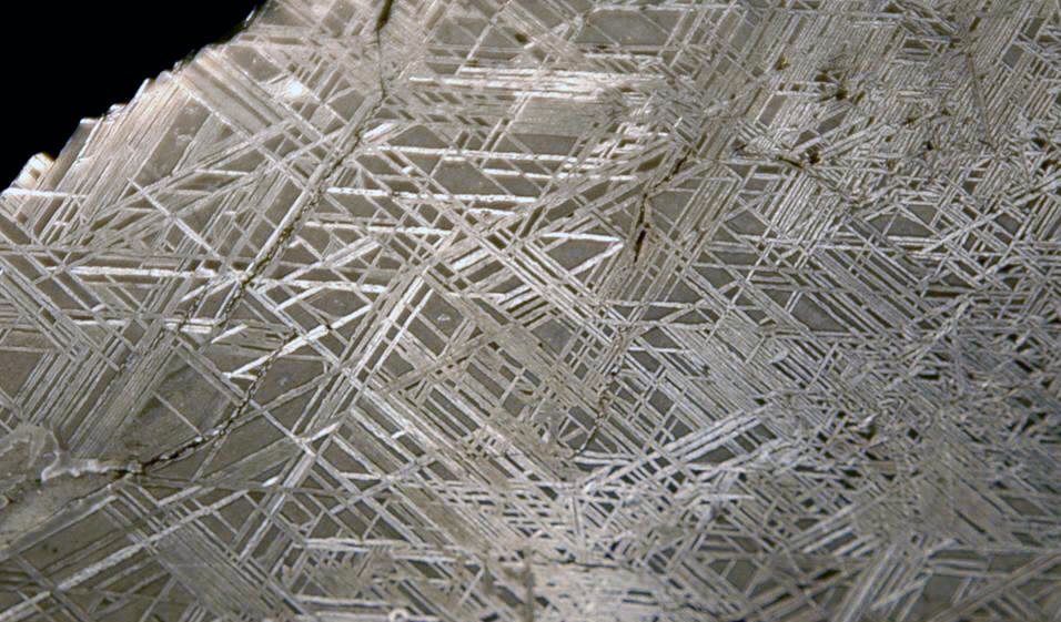
EP: Have you ever looked at the Widmanstätten patterns on iron meteorites? Its a very specific long nickel/iron crystal pattern, and it shares an almost spooky similarity to your clock patterns.
Relatedly, have you ever looked into wallpaper groups? If you are interested in this kind of rotating generative geometry, I think they are a fascinating area of study with a lot of possibility for the generative art space.
I do think some of the other ideas you mentioned in your blog post might be worse pursing on future projects too — regarding the cracked phone screen, if you don’t know it already, mobile repair culture is a really interesting read / zine about “right to repair” (google that concept if you want to read about litigation around being able to repair tech ourselves!); see this link.
CH: I really like your use of color and pattern and I really appreciate the concepts and references you mentioned in your post. I totally see the way the repeating patterns you linked influenced the final work. Definitely keep exploring these themes if they are doing it for you! Not sure if you’re familiar with this Bees and Bombs work but it might be worth checking out too for more inspiration.
gregariosa
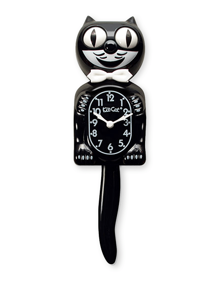
EP: I’m glad to see you taking on big problems like physics and motion and object oriented programming, all of which is hard and none of which should be taken for granted. That said, I agree that the end result falls a little flat for me – I can see through lines to things like desk toys, decorative wall clocks, those weird cat eye clocks, maybe even virtual pets? But I think fundamentally this is less of an investigation into what timekeeping can be and more of a reskinned watch. Then again, it is cute – and if you learned a whole bunch of stuff about programming motion, then that is something to be really proud of, and I’m sure it’ll serve you long term.
CH: I think these are so charming and lovely!! The rocking motion of the red dolls came out excellently. They are hypnotizing to watch. It wasn’t totally clear to me how to read this clock until I read your description, but blue faces representing seconds progressing was very legible. I think they did read as “stacking” more than “nesting” because of the animation. They remind me a bit of those “breathing gifs” that also have a very cyclical and calming nature to them. Check them out of you aren’t familiar! This is just one example but there are tons of gifs like this.
junebug
EP: Very elegant! I think a lot of this project’s power comes from its aesthetic sensibility, which definitely shows up in details like the careful color palette and the background text. Those choices let me buy into things that might otherwise distract me- for instance, the “tick” of the seconds moving everything along at once. I often find that this feels too digital, and that it needs a little fade or wiggle, something to situate it as an object- but with your other contextualizing aesthetic choices, that seconds-hand becomes more like the tick of a watch. (I’m not personally sold on the varying lengths of the spikes – but you can’t have it all). Did you ever see this impossibly expensive planetarium watch?
CH: Gorgeous! I really like that you drew inspiration from astrology and are playing with the aesthetic qualities of those charts in your design. I also found your clock to be one of the most legible and I was able to tell the time from it. This is maybe a tangent, but have you seen Giorgia Lupi and Stefanie Posavec’s project called “Dear Data”? While its not quite astrological charts, Giorgia and Stefanie sent each other hand drawn data visualizations on postcards about their lives, and the combo of care and analog plotting in their work reminds me of astrological charts, and your clock for some reason 🙂 Check it out here!
lampsauce
EP: A very stylish blog post, and a very stylish clock. I like the virtual pet vibe; I could very much see this running on a second monitor, clock or not. Have you seen Orb.Farm? It was the last thing I had running in the background on my spare monitor for a few weeks.
If you aren’t already familiar with the history of desktop assistants / pets / companions, it might be a useful place to go looking at things. Here are some contemporary ones, but they have a history that goes back to the 80s.
I don’t have too much else to say about the project – I feel like the movement is believable, the palette is considered, and the aesthetic is interesting. In some ways I’m less tied to the literal clock elements in there and would embrace even more abstraction.. but that might just be me.
CH: WOW! This came out so well!! I love how you were able to create the feeling of a living breathing organic thing out of clock input. I also really like that this has a unique and sophisticated visual style to it. The gradient in the green and the slight transparency in the red really gives a sense of depth and dimension. The idea of an evolving organic thing driven by variable input is lovely. it’s not quite the same, but check out the work of Design IO. They also do a really great job of making seemingly lifelike responsive organisms out of code.
marimonda
EP: Wow – hard to read, but beautiful too. Glad to see you getting a (potentially kind of basic) prompt and taking it seriously. I think you should be proud of this work – the way it reads, the way looks, and the way it keeps time. Always grateful to see work with generative text that is not meaningless. This very much knows the story it is telling.
I said this to someone else, already but I’m gonna repeat it here; obviously living on a pixel canvas was one of the core limitations of this assignment so no shade for doing it that way, but as you think about where this goes I’d encourage you to try to move it back to text: partly for screenreaders and accessibility, but also in my opinion it just like it rules to make something within the exact minimum viable interface of the web, no offscreen renderers required. You can manipulate the HTML DOM of a page with p5.js, so it’d be an easy port if you’re interested. Just a thought! Anyway this rules!
CH: This is a really lovely and moving project. A part of me wishes there was a tiny bit more context, maybe even just visual (through colors?) to set the mood about what these phrases were being generated from and who’s voice this is. I really appreciate your writing about wanting to find a way to approach this topic in a respectful manner. I think you did so very successfully.
miniverse
EP: Good on you for starting to work with Project Gutenberg, it is so often the go-to when you need large amounts of public domain text. You may have already run into this, but be sure to read through what it pulls… an archive mostly from the 1800s has unique problems.
I agree with your sentiment that working offline is sometimes really critical and I’m always excited to see compelling work that doesn’t need to connect to a database to run. More websites that run locally 2020 IMO.
The styling here is very strong here (it is very close to a choice I also made in a project once! — This one)
I do totally understand that an 800 x 600 pixel canvas was the core limitation of this assignment, but I’m generally less interested in text displayed as an image, and more interested in text living as html plaintext (partly for screenwriting accessibility, but also just like it rules to make something within the exact minimum viable interface of the web. (Check out the <mark> tag, speaking of). I think your code would translate easily from a pixel canvas to being literal strings on the page. But all in all I think this is a real winner.
CH: Awesome! I really love the idea of making the timeout of real time text input. I’m sorry the spotify idea didn’t work out, that would have been really cool too. I also really like your attention to detail in the graphic design, I get ~academic citation vibes~ from the yellow highlighted text on the serif font. That said I think I like the first version you showed better, where the text look more like one continuous poem, with the time highlighted in it. While I appreciate wanting to cite the sentences, I think I liked the version without citations better because my brain wanted to read it as one continuous poem generated by the current time. It also visually reminds me visually of Jenny Holzer’s work.
mokka
EP: This does what it says on the box – it is an abstract tool for telling time. But for me, one of the most interesting aspects of this project is how the fine lines interact with my screen to make moire patterns, how it becomes a physical object- just for a second, at the end of the minute. And in general, I’d like more physicality out of it, if that makes sense? It’d like to feel like it wasn’t just a geometric argument, ticking through the loop. I think a little bit of messiness or noise or even just some between frames would go a long way for me here.
CH: I like that you approached this as a purely visual and design exercise. I do think the composition of the elements on the clock could use some further consideration. For example the grey dots in the background right now get a bit lost for me, especially the ones that end up behind the grey bars on the sides. but I really like the orange circular element because the speed at which more spikes are added gives me a sense of time passing in intervals that legibly read as as a clock. Something about this design reminds me of wrist watches, especially the new digital ones. If you were to keep working on this it might be fun to use both analog design watches and contemporary “smart” watches as a visual reference to see what works for them.
OodBird
EP: I love this source material, and the collaged style you ended up with! It is so different than what p5 often engenders itself to, which is that sort of flat, math-drawn animation. I always like to see something that actually feels a little messy and handmade in code-based work.
All that said, the digitally drawn letters feel a little sickly against the focus and intensity of the illuminations. If I can be frank, what I really liked more than anything was the image you have in your blog post of all the buildings and windows collaged up together into a new building, and the fantasy version of this clock, for me, dispenses with the letters altogether and sees you using those building parts as the main elements – or something like that.
CH: The unique visual style you were able to achieve with this clock is really great! I also love the collage approach and how you drew inspiration from illuminated manuscripts. These almost remind me of Terry Gilliam’s animations from ‘Monty Python,’ have you seen those? There are tons more but I’ve always loved that style.
pinkkk
EP: Ha, the age old alarm clock problem of how to represent numbers and letters with a few limited shapes. Did you look up older digital clock displays at all? They make for interesting design artifacts for this kind of thing.
I general I find this interesting, but I’d encourage you to either lean into the letter-ness of this project- let them make acronyms and words, design for words and meaning to be associated with time- or to look for something with a less 1 to 1 relationship. I can memorize that a=1 and b=2, and so on, pretty quickly, and then all of a sudden I’m just… looking at a clock.
Also – what a tragedy you had to scrap the morphing letters! I feel like the interim space as they letters were morphing into one another was one of the most interesting bits. Relatedly, I’m gonna just spend the last bit of this comment to drop in a bunch of experimental / generative type stuff! Dig through:
- https://enfont-terrible.glitch.me/
- https://spacetypegenerator.com/
- http://fontmap.ideo.com/
- https://www.eliashanzer.com/phase/
CH: This is gorgeous. I love the simplicity of the design and the attention to detail in the animation, even if it didn’t make it into the final version. That said i actually like the ticking nature of the lettering in the final version more because it really has a clock-like feel to it. Have you seen the work of the studio DIA? they are a “design agency specializing in kinetic identities & typographic systems” Their work might be of interest to you.
Shoez
EP: I’m sure you’ve looked at bee dances (the waggle dance is the famous one) and dance step patterns, but in case you haven’t, I think both might be useful touchstones.
I’m also thinking about desire paths as metrics of time, as a sort of clock that fades and then regrows and then is trod down again… Did you know that the old animal crossing games also had desire path code built in? You could see the way you walked around your town slowly emerge, over months of playing.
In general I like this piece… I’m not so sure about the move to the bare feet, but I do agree with the move to the black and white palette – I think the feet border on being a bit silly, but keeping the color palette heavily constrained helps to shy away from that space.
CH: Great idea! And it seems like you were able to solve some interesting technical questions about how to render the footsteps. While I’m not sure I could tell the exact time from this work, I very much understand that this piece depicts time passing. When I think of footsteps fading over time, I think of environments like the beach or the snow. I noticed you talked about trying other color schemes in your post- I’d be curious to see how you could use color to depict ‘environments’ for the foot steps to live in.
sticks
EP: This is very stylish! But to be honest, I don’t have too much to say- this kind of clean design always leaves me a bit cold (personal style preferences) but I can recognize that this is one with a lot of polish. I do get the sense that this was designed for public display, and I think’d be effective at doing that with those big, shifting shapes. In general, though, in reviewing these I’m finding myself drawn especially to projects that really begin to wrestle with ideas of time, how you can keep it, how you can break it apart in different ways – and it is hard to hold a more standard clock against that kind metric without feeling like it loses something.
CH: I really love the colors you chose! The bright bold colors evoke a painterly feel and remind me some of my favorite abstract and minimal paintings. It’s really too bad that showing this in public didn’t work out because I think it would have scaled really well to a public outdoor location. I hope you are able to show it there in the future!
sweetcorn
EP: In general looking at all these, I’m particularly interested in the clocks that- rather than finding a new way of visualizing standard time (hours, seconds, minutes, etc)- instead think about dividing up spent time into new units, or keeping time in new ways. This project does exactly that and that makes it feel fresh and exciting to me!
That said, I do think there is probably a more elegant way to calculate the time from now than the “for _ number of friends” metric. What I’m guessing this does, is it looks at the prep time (say, 30 minutes), then looks at the dinner time (in 2 hours), then looks at how many people that recipe feeds (4), then says- okay, you can make the recipe 4 times in 2 hours, 4*4 = 16, 16 friends. Right?
But – this just isn’t how cooking works! It is silly and semantic, but it breaks this illusion for me. You’d never make a recipe 4 times in a row. You’d make it once, with 4x the ingredients, and it’d take maybe 20 minutes longer.
So I wonder if there is another way you can think about this – adding up recipes, for instance. Or, inverting the equation – instead of picking a mealtime, pick a time in the future – even just the next hour mark, then pick a recipe that takes 35 minutes. Then one that takes 34 minutes. Then one that takes 33 minutes. You could say something like “You have time to make Oatmeal Cookies before your family gets here at 4 am” or something?
Anyway, these are just silly examples but they get at my fundamental point here which is that I love the weird world you’ve crafted with this but I want the internal logic of the world to hold up enough that I can enter it without pausing to think.
CH: This is such a lovely idea! Conceptualizing time as how much you can cook for people before the next meal is such a great idea. While I love the absurd quantities of food (and friends you can feed at the next meal), I think I wish the recipes themselves corresponded to the time of day. i.e. absurd amounts of breakfast food in time for breakfast and so on. I also really like the font and over all old school recipe aesthetic.
tale
EP: This is such a simple idea, but I don’t think I’ve ever seen anyone tell time on an abacus before? To be honest, it kind of broke my brain trying to go from normal decimals to time measurements to a base 4 abacus and back again. In a good way! I think it is a really effective and weird way to visualize a clock- but I’d for you to think about not just alternate ways to visualize our standard seconds/hours/etc, but maybe to continue thinking about new ways to break up the day- say, into different base systems. The abacus is a really interesting tool for timekeeping because it changes the rules of not just how we visualize counting, but what is counted!
CH: This turned out so well! I really like how you drew inspiration from the abacus. I also really like your attention to detail, and how the background changes color depending on the time of day. I could totally see myself becoming both aware of the time by reading this clock in public, or just letting myself lose track of time by watching the cubes spin. Have you seen Bees and Bombs work? it might be worth checking out, because he also uses really nice clean lines to make looping gifs and animations
Toad2
EP: Excited to see folks pulling apart ideas of cyclical time, and I think this also a compelling approximation of 3d rotation in 2d space. Have you ever looked at planetary orbital patterns? I think they might be a useful reference for you, especially as mapped through 3d space.
I’m also reminded of SAD lamps and other seasonal affect / general mood improvement devices, like meditation apps… All of which are a little weird and a kind of fascinating to me. 1 degree to the left and they’d be art objects as is!
I noticed the comment in your code about the color popping bug – I agree, this could generally use a little polish – it is so simple and focused that things that pop out like that pull against the calm surface in general for me.
CH: This looks great! and I have to say your code comments really made me laugh. Though I might have to agree with you that the colors could be improved, (or you could really lean into the monsters inc look and add some hair simulations :))
yanwen
EP: If you don’t know it already, I suggest you check out Dan Shiffman’s Nature of Code book and website for lots more nature simulations, including flocking behaviors.
This also reminds me, in some ways, of cellular automata – if you don’t know it, read about rule 110, which is turing complete and therefore could also be a clock…
There is actually an elegance to clock with only 4 measurements – its like the old joke with the rock hanging outside on a rope that tells the weather (If the rock is wet, it’s raining, etc.)
But, like you said in your post, I think there is room here for a little more granularity, as opposed to the four discrete programs that hard reset into one another. I’m interested in seeing you work on this code to make discrete mayflies- so the individual entities change behavior slowly over time. I love the idea of knowing it is 2:45 because of the way they are moving, just a little different than they did at 2:15… like how I know it is 6:30 when my cat starts demanding dinner.
CH: I really love this approach and the way you thought about time and a clock as relative to the mayfly. What is a day to us, is a whole life cycle for a fly and playing with that in a clock is really clever. Have you seen this piece by Damien Hirst called A Thousand Years? It’s kind of gnarly and features a dead cow head (tw) but I love the piece because it plays with time and the life cycle of flies and death in a much darker and kind of absurd way (which I am a sucker for). Check it out if you are ok with some mild gross and gore! http://www.damienhirst.com/a-thousand-years. The sculpture contains a dead cow head, which rots, attract flies, which then fly up to the top of the sculpture where they hit a fly zapper and then fall and die and the whole cycle continues on for the duration of the piece.
For everybody:
EP: The big unifying thing through all of these was how hard you clearly all worked, and how many of you were trying out new things or learning about calculus or xml files or whatever. Great to see that, and great to get to see all these projects. Thank you!