
From the very beginning, I wanted to do something related to typography since I am a graphic/communications design major. My previous attempt involved me actually coding up complex typographic shapes, which actually not surprisingly, given my current computational skillset, I ended up with truly ugly looking type.
With Golan’s guidance, I scratched my previous exploration and started fresh. This time I learned that even simplicity is extremely hard to control well.
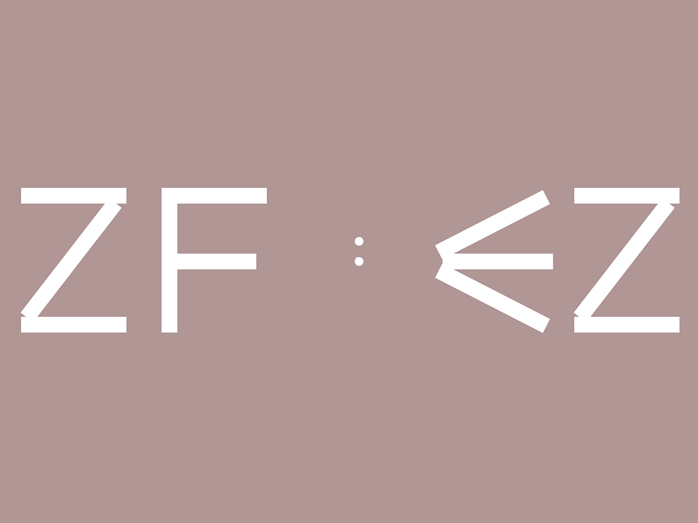
My final approach uses 10 letters from A to I to denote the numbers {0,1, …, 9}. One challenge Golan suggested was to limit my choice of graphic shapes that I can use to build the letters to make it interesting.

A to I + Z

@12:34
Aside from my interest in typography, I also really wanted to take this project to practice my basic drawing and animations skills. How can I construct 9 letter with only 3 rectangles?
By limiting my graphic shapes, the opportunity for smooth interpolation between the letters arose. Even though it took my forever to get to here, and I am still not satisfied with the occasional glitches, but overall, I learned a ton of basic skills through this project.


@07:45
There is definitely a lot lacking that I can keep working on and improve on, and I hope someday that I can actually design and implement my own generative / computational typography.
@06:50
___________________________________________
After receiving feedback, I realized that my animation is not as good as it should be, and the letters will form ACAB at 13:12 in the afternoon. So I expanded my alphabet to A to L, and now the hour can be represented by a single letter. I also added the seconds digits so it’s less boring to look at. Unfortunately, I do not have time to improve my animation before the final deadline, therefore I took out the animations.
