Introduction
Previously, Team Lynne interviewed Lynne to get a sense of what device would help her in her daily life. (Link to the interview documentation: https://courses.ideate.cmu.edu/60-223/s2020/work/interview-with-lynne/) We concluded that the best remedy for her arthritis pain in the hands were to rest her hands when not working and doing daily tasks. We came up with a device, a foot keyboard with four arrow keys, that will work both as an entertainment device as well as a device that would assist her when using her computer. We came up with different variations on its form and this post documents the question we answered: looks-like, feels-like, and/or behave-like of the foot keyboard for Lynne.
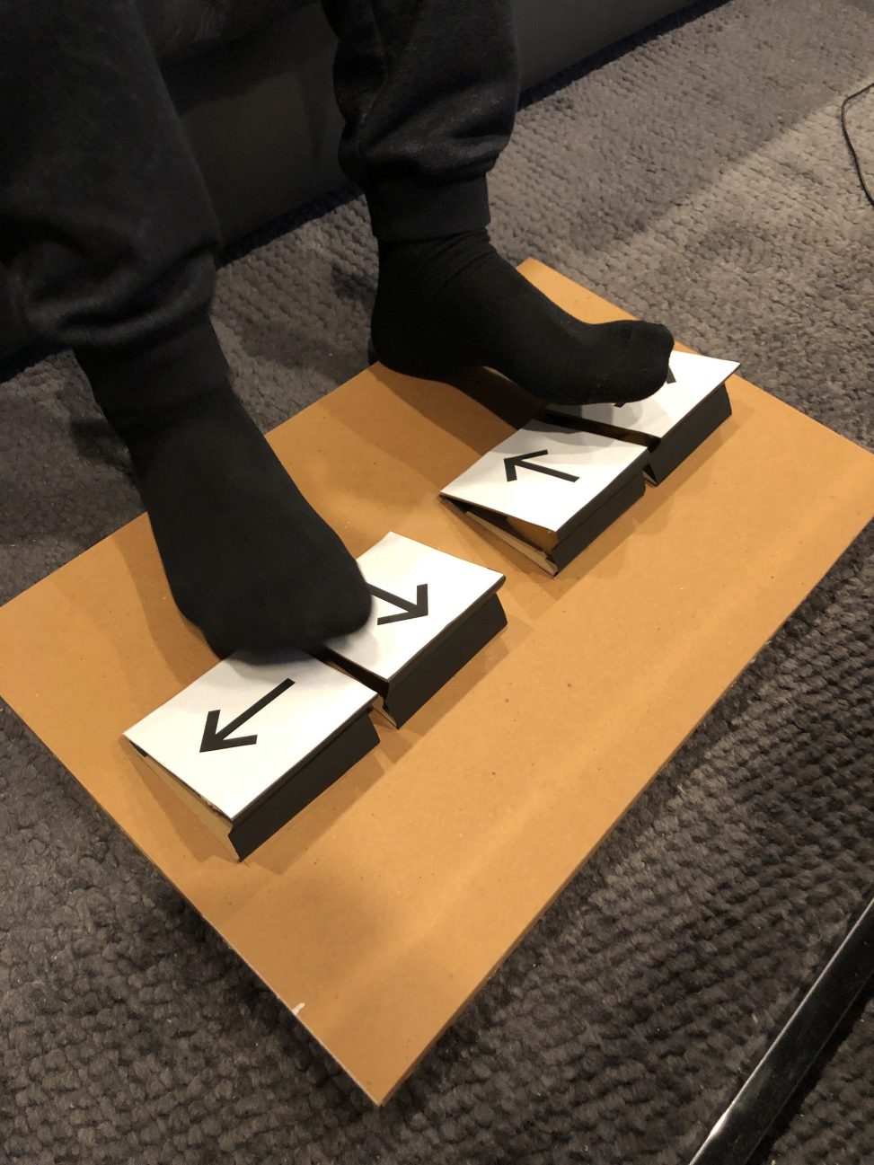
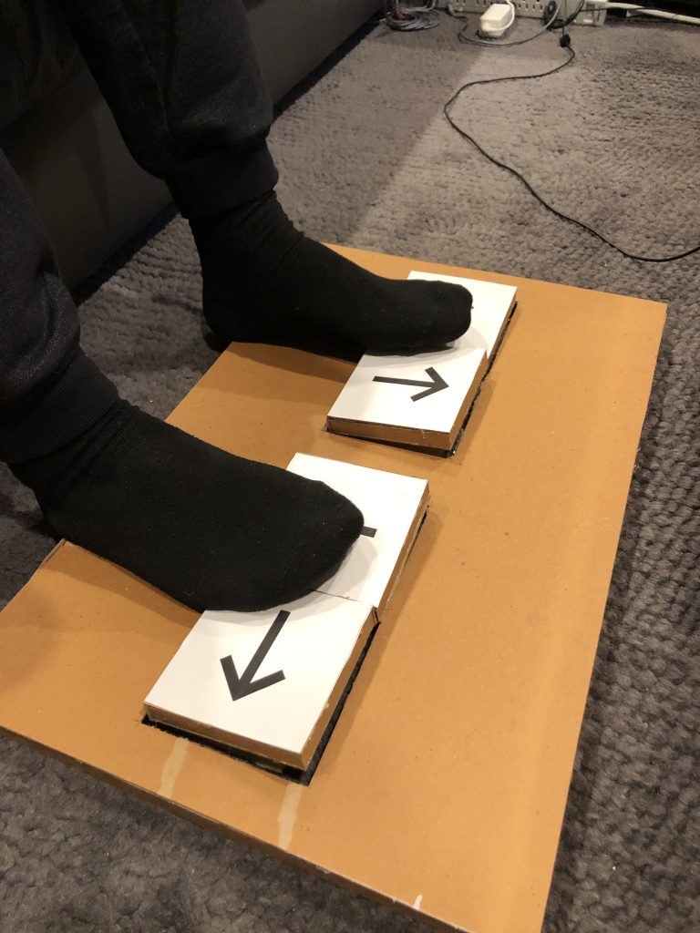
Sue’s Prototype
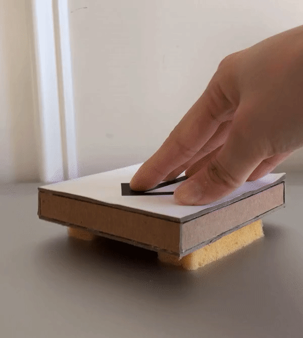
This prototype was designed to help answer the design question: How would the user experience be if the Foot Keyboard had IR sensors as user input?
The prototype was meant to approximately look-like and behave-like a Foot Keyboard with infrared sensors as “keys”. The components were all cut from cardboard and could be assembled by fitting tabs and slits together. Two different arrangements of IR sensor keys were tested (keys in a diamond shape and aligned in a row) and the entire prototype could be converted to and from a ramped form. The IR sensor experience was simulated by pressing keys on a keyboard when the user hovered their foot over the center of a key.
Images of Final Prototype
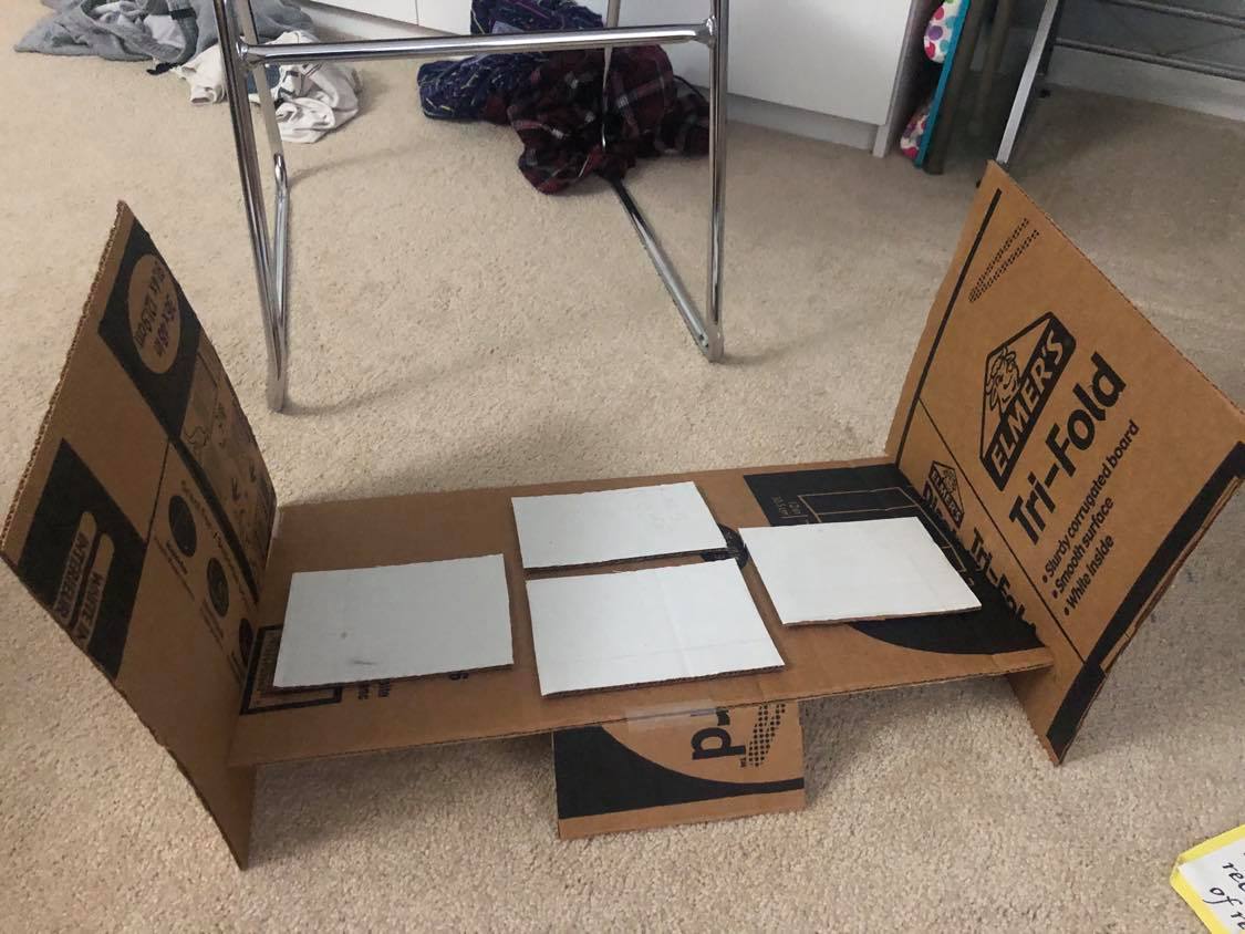
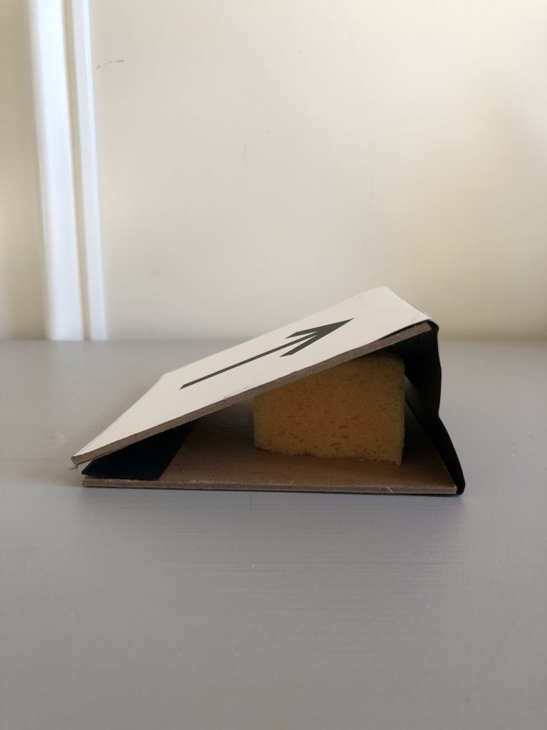
The main components of the Foot Keyboard are the main body housing the four keys, wall attachments to enclose the keyboard, and fold-away pieces to incline the keyboard.
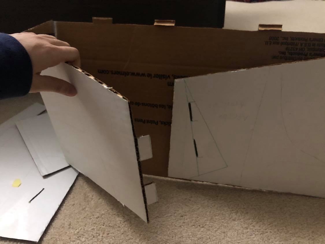
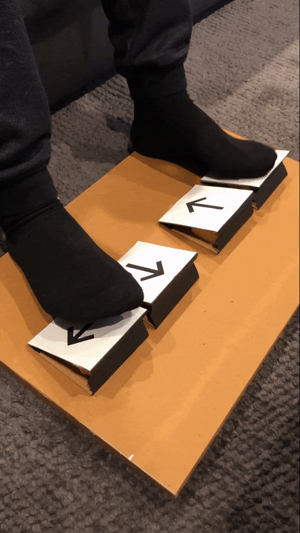
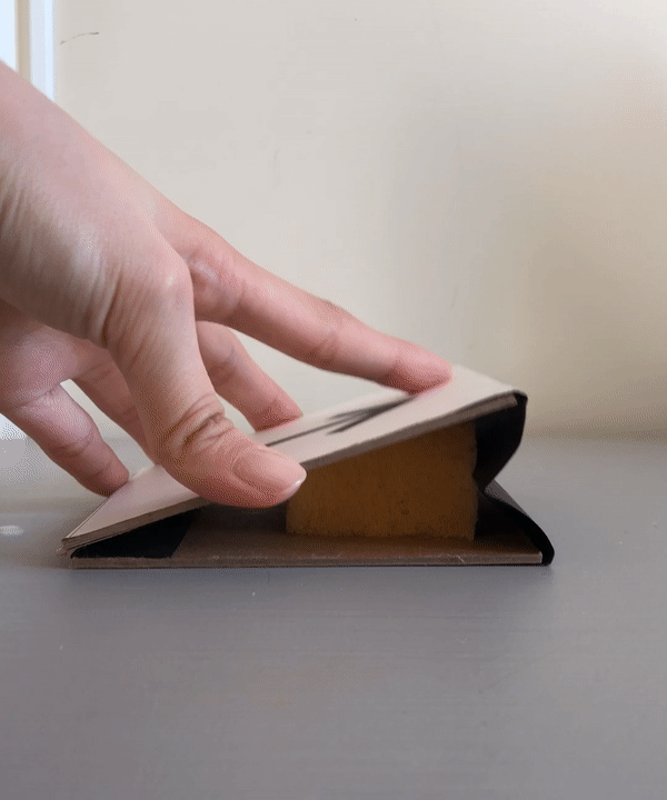
Tabs of the back pieces can be fit together to add an incline to the keyboard
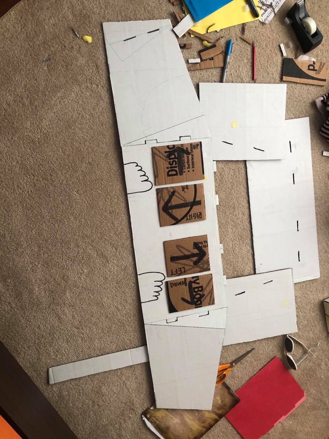
Shown are the individual pieces laid out. These pieces could be laser cut in a similar pattern from wood.
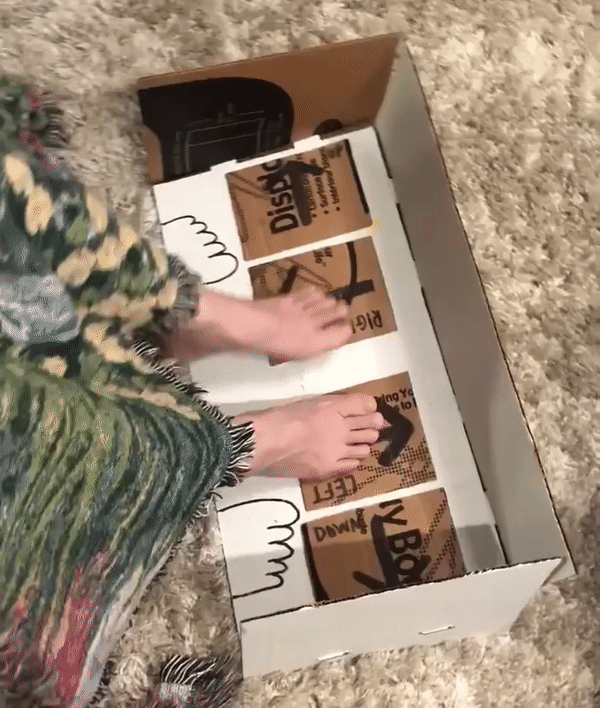
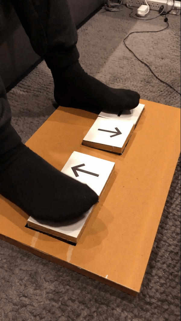
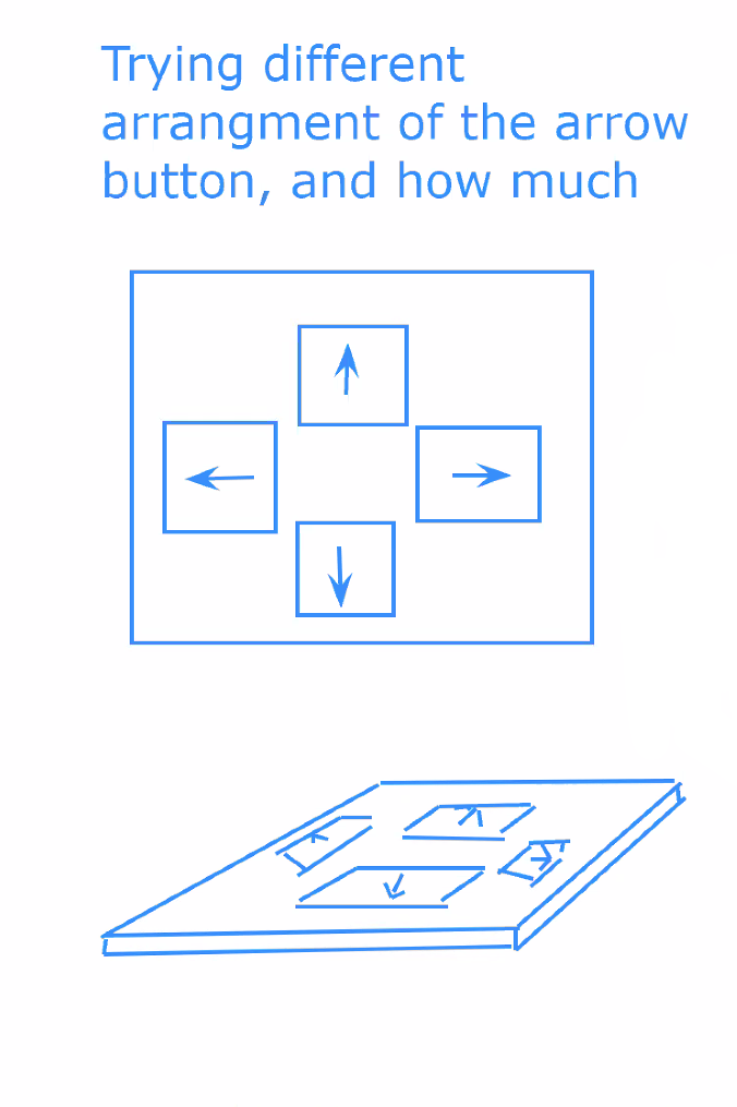
With the keys aligned in a row, the user could easily move their feet side to side to “press” the four keys.
Prototype Development and Feedback Process Images
An initial cardboard prototype lacked stability and failed to answer questions about possible laser-cut patterns.
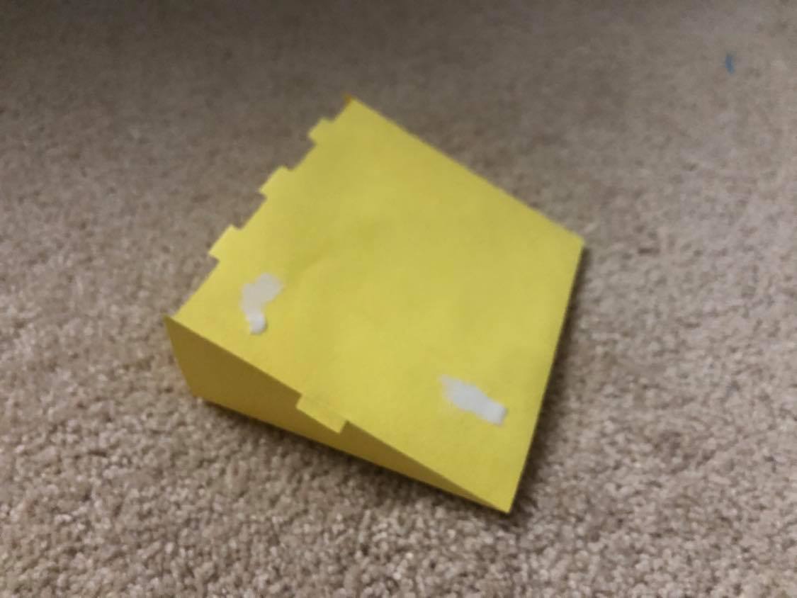
Creating a mini “proto-prototype” out of paper gave insight on the shape of the pieces on a smaller scale
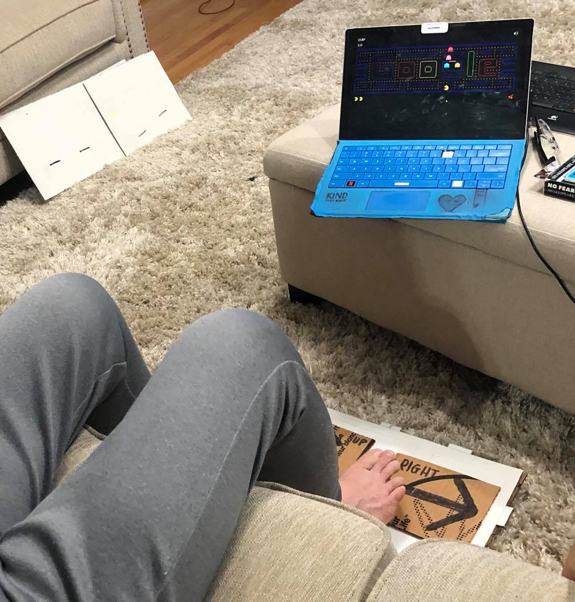
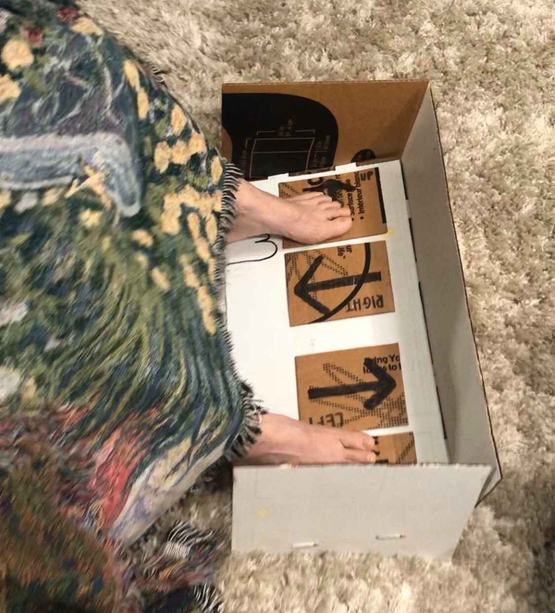
During the feedback process, we simulated the user playing Pac-man using the Foot Keyboard by pressing the laptop arrow keys when the user hovered over a key.
I received both in-person feedback from my mom and online feedback from Lynne.
My findings from my mom are the following: The row alignment for the keys and a ramped keyboard is more comfortable for the legs. Pushbuttons seem better than IR sensors due to their physical feedback that a button has been pressed. The built-in Simon Says game is not very fun. A cover will be more effective than the walls in keeping Lynne’s dog from the keyboard.
Feedback from Lynne was as follows: The size of the keys can be reduced to fit her small feet (size 4.5 – 5) and buttons should have texture, possibly in the form of engravings, so the keyboard can be used more easily without looking at the keys. A full cover over the keyboard will prevent Mendy from chewing on her toes. She is optimistic about playing Simon Says, as she likes “fast and rapid” memory games.
Moving forward, we will be taking almost all of the feedback into consideration. For example, we will shrink the key size, use pushbuttons for the keys, and align the keys in a row. We will be continuing with having Simon Says as the built-in game, taking Lynne’s optimism over my mom’s feedback.
Hojung’s Prototype
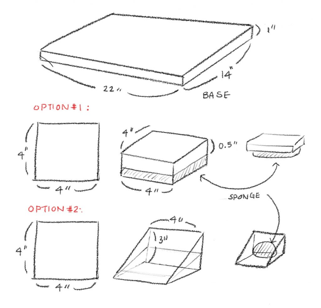
These two prototypes focused on the structure of the buttons and were designed to help answer: What button layout/structure would be the most comfortable for the user?
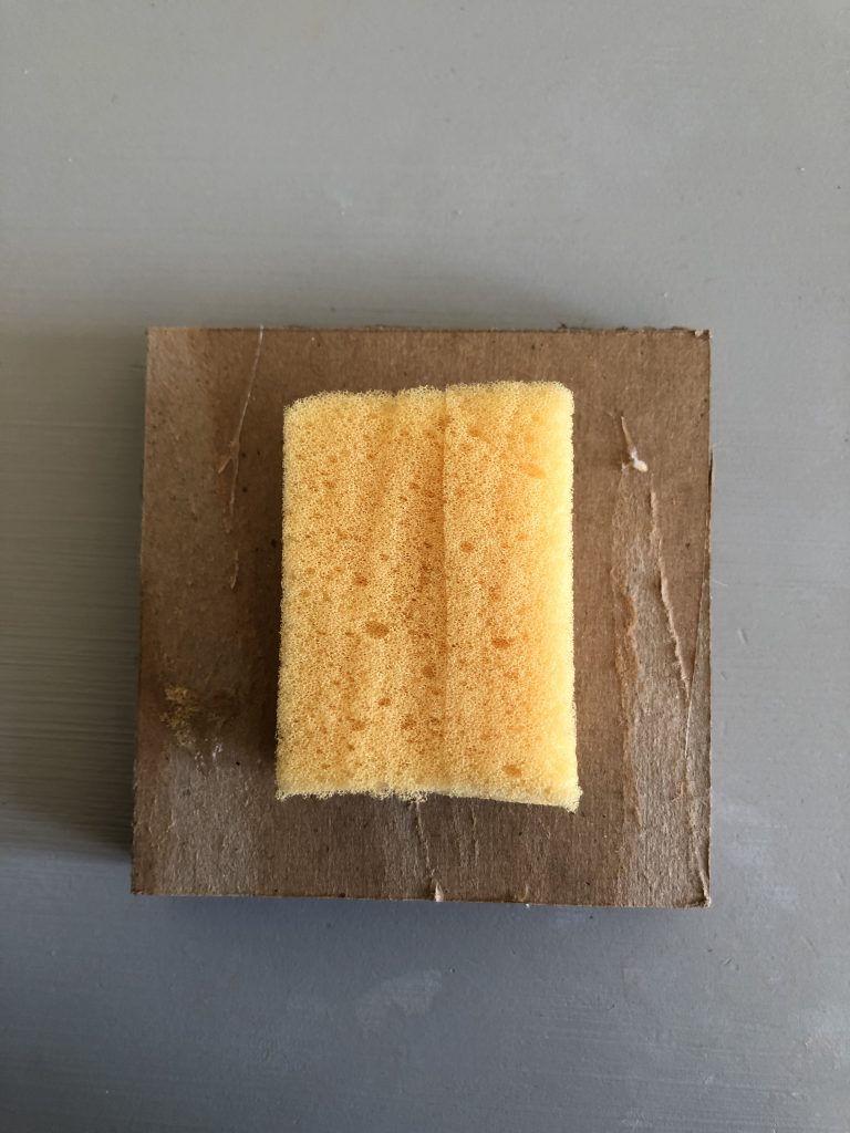
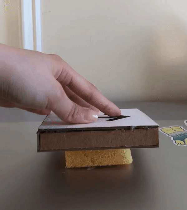
This prototype was meant to approximately show look-like and feel-like for the Foot Keyboard. Two different prototypes were made with differently structured buttons, one flat and one angled, to test out comfortability when in use. The components of the prototype were made with cardboards and sponges to simulate a button press. The arrangements of the arrows were in a line to decrease the movement between each press. The buttons were placed on a 1 inch raised platform designed to incase the Arduino and its wires.
Images of Final Prototype
Foot Keyboard with flat button design compared to male shoe size 8
Foot Keyboard with flat button design simulated

Foot Keyboard with angled button/gas pedal design compared to male shoe size 8
Foot Keyboard with angled button/gas pedal design simulated
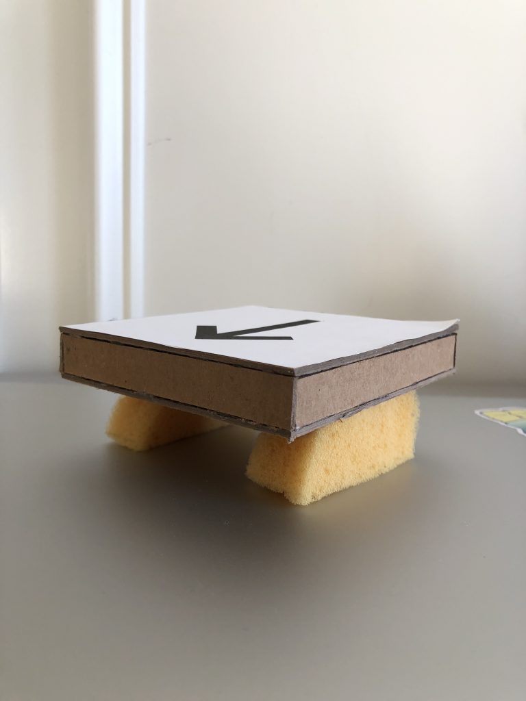
Detailed: Use of two sponges to simulate button press for the flat button design
Detailed: How one flat button design works individually
Detailed: Use of one sponge to simulate button press for the angled/gas pedal design with a hinge made out of black paper
Detailed: How one angled button design works individually
Prototype Development and Feedback Process Images
Initial design plan during the team meeting session
Blueprint and measurement of the individual buttons and the base
Initial placement of the sponge on the flat button design: center sponge placement ended with unbalanced distribution of weight making the button wobbly
Initial placement of the sponge on the flat button design: center sponge placement ended with unbalanced distribution of weight making the button wobbly
The two options of the foot keyboard button layout were tested by my dad who is familiar with arduino and designing. The first option, the flat button design was met with many critiques but a comment that came up often was, “It’s uncomfortable.” Specifically, the flat button design creates a situation where the user has to lift up the whole leg in an uncomfortable foot position, unnatural to the resting positions, which creates tension in the leg. In addition, because the button is big and the gap between the buttons were wide, the user is required to move the leg side by side in a wide range of motion creating an unnecessary amount of work. The second option, the angled design, was met with a better initial impression. It was the most comfortable out of the two shown designs, however, the gap between the button and the size of the button also created the same problem as before. My dad suggested that a more rectangular design resembling the gas pedal on cars would do the trick to easing up unnecessary movement between the buttons.
The two options of the foot keyboard button layout were shown to Lynne. Lynne was happy with the design of the two options, but was leaning towards the angled button since it looked more comfortable. In addition, she mentioned that the scale of the button might be too big for her tiny feet size of 4.5 – 5. Lynne also mentioned that the device will be used when she is on a recliner, which suggested that we as a team needed to think about the angle of the button if used with an angled platform design shown in Achilles’s prototype.
Overall, with the critique and suggestions, it is prominent that the size of the button should be reconsidered and made smaller in addition to leaning towards the angled button design of the foot keyboard. The critique was as predicted, and it provided great feedback on improving the design of the button.
Achilles’s Prototype
This prototype was designed to answer the question, how would this device look like?
Fusion 360, a 3D modeling software, was used to design this prototype. This prototype was an approximately 14in x 10in wedged platform containing four raised buttons with arrows engraved on each button. The arrow buttons were placed in a diagonal/square configuration. The device was modeled to look like transparent green acrylic.
Images:
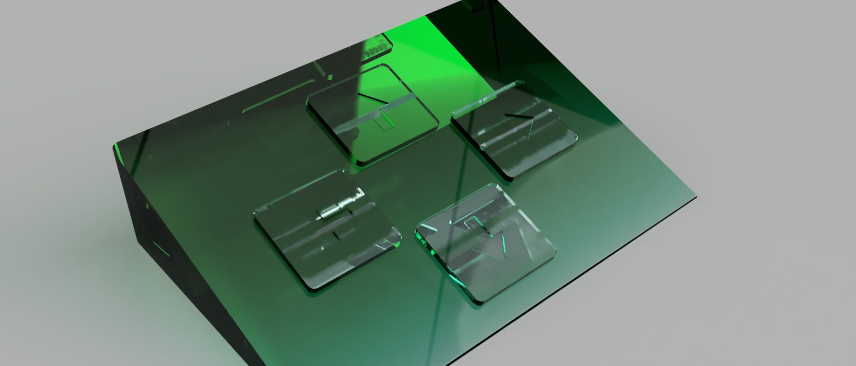
Rendered image of the prototype
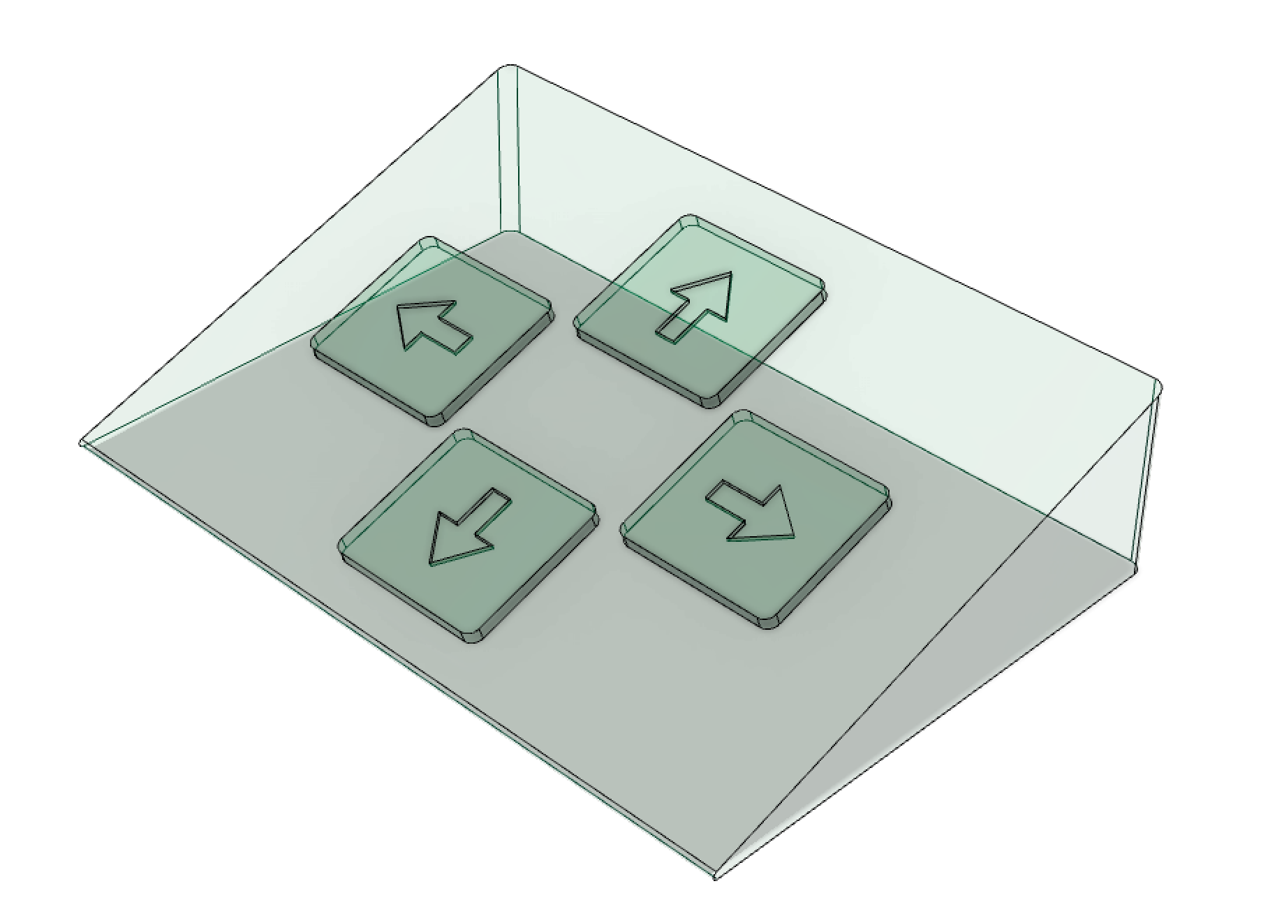
Clearer look at the button configuration and engraving of this prototype
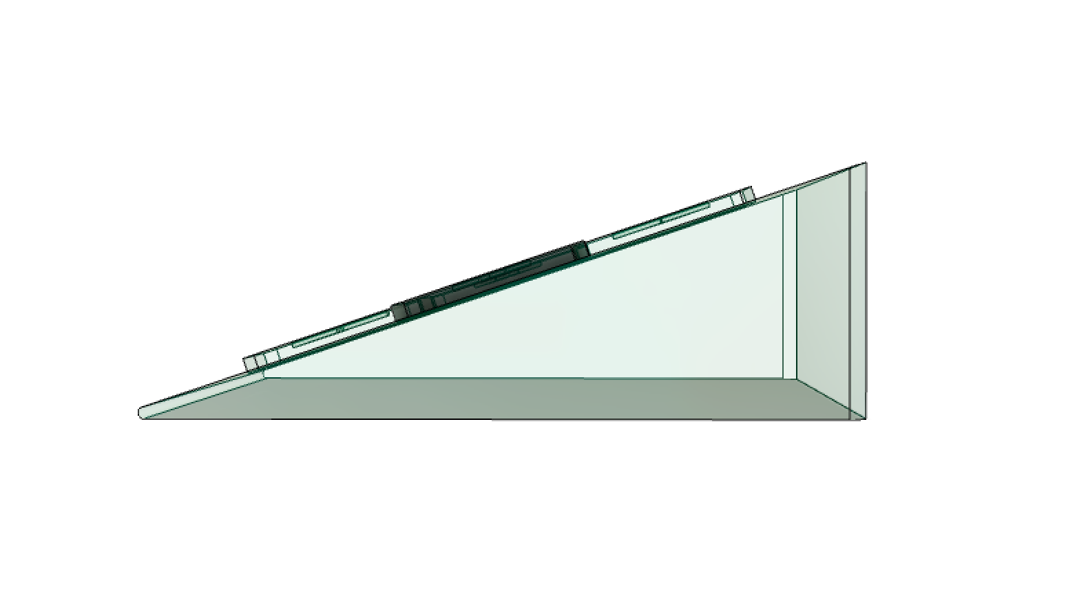
Angled shot of the height of the wedge shape of this prototype
I designed a prototype of our device that would have a wedged structure with four flat but raised buttons in a diagonal square configuration. Overall this was a very simplistic design and didn’t include very many of the more detailed design elements that will be included for the final project.
I received feedback from my sister on this prototype. Some of the feedback she gave were on the size of the device, the buttons on the device, and the incline of the wedge structure of the device. For the size, it was initially difficult to gauge how large or small it should be, so I opted to make it on the smaller side, having the top of the device be 14in long and 10in wide. The buttons themselves were around 2.5in by 3in big. The feedback I got from my sister was that this sizing was likely too small to actually be able to maneuver around and press with your feet. However, from Lynne, we found out that overall our device should be smaller than we anticipated because she has small feet and a smaller size would likely be more comfortable for her. Other feedback from my sister was that the device should have an adjustable incline rather than a static one, to account for different seating positions and comfortability of the person the device was intended for. I thought this was a good idea since we have no idea what is the optimal angle for the incline to be stationed, so having the choice to adjust it as needed would be the perfect solution for this issue.
One feedback that I thought didn’t need addressing was one on the type of buttons. Originally this machine was intended for something like Dance Dance Revolution, which not only has up, down, left, and right buttons, but it also has diagonal buttons. My sister commented that this should include diagonal buttons, but for the sake of this project, as its main function was to be connected to a computer, the diagonal buttons wouldn’t be necessary.
With prototyping our device, I found a lot of difficulty deciding the sizing and specific angles of every piece necessary to build it. I think, moving along with our final device, this prototype was a good insight on how the structure should be created and how the angle of the incline and size of the device can make a difference in how the user can enjoy it.
Conclusion: Moving Forward
The process let us focus on important aspects of the device and guide us towards the right direction for the final device design. It also gave us a feel of how the device will function in real life and not just from our imagination.
The main challenge of prototyping remotely was encountering unanswered questions. When unsure about Lynne’s exact situation (e.g. the exact size of Lynne’s chair), we made assumptions and continued with prototyping, as to not bombard Lynne with a chain of emails. Coordinating between team members also proved slightly challenging in making sure everyone had the same visualization of the intended final device.
From the critique we got from Lynne and others, we concluded on using an angled button design for the foot keyboard instead of the IR sensors. Lynne also commented that she has small feet and is planning to use the device on a recliner, so we changed up the design to fit her needs. We concluded that the button will be smaller than in the prototypes and will have an engraved arrow to indicate the arrow even without being seen. The button would also be laid in a row, with a maximum 0.5” gap in between for easy movement. We also concluded that the size of the keyboard should be maximum the width of her recliner. We decided that the foot keyboard should move with the recliner, so we designed to add an elastic band that would be slipped into the recliner in addition to having a non slip grip at the bottom so it would stay put.
In another iteration of this prototyping process, we could have more combinations of features. One that we did not address this time around was a prototype with an inclined body as well as our “gas pedal” like buttons. The structure of our device has been in debate as to which would allow for more comfort and ease of usage, and this was one combination we were unable to test but have considered for our design.
Comments are closed.