With having very limited exposure to plotters, I was not sure what to expect to see while browsing #PlotterTwitter. However, I was still very surprised at the variety of kinds of pieces people were making, with as many abstract pieces as there were realistic as well as the different shapes, lengths, and weights of the strokes used. I also liked to see that people were taking what their plotters made and adding their own traditional work on top (or plotting on top of their work) because it reminded me of the topic of authorship of the works. One piece that I liked in particular was the piece below by Sean Puckett (@PhotoPuck on Twitter) because of how smooth the lines were. It was very easy to let my eyes naturally follow each curve, and each curve led to an eye-like shape that along with the curves made the piece feel very organic and alive. The organicness of the piece contrasted with the fact that it was created by a machine was also very intriguing.
More eyes? Rollerball on A4. #plottertwitter #PatreonArtist pic.twitter.com/Vw5ETGiUB9
— art for sale (@PhotoPuck) August 28, 2021
 #PlotterTwitter showcased really impressive AxiDraw artwork overall, where each artist shared unique styles and approaches towards creating intricate linework. For me, I noticed that after looking through many of the AxiDraw drawings, the line harsh and defined line quality becomes a bit repetitive, where the drawings become stiff, and have that static quality. I became more interested in works that moved beyond spinograph variations and moved past the machine-like quality.
Jakub Antolak's "Figura 63" was one which I thought stood out from the other AxiDraws. The texture, due to the variation in line-width and density between strokes, feels organic, almost like a close-up view of muscle fibers or a microscopic view of cells. I think a lot of this is caused by the intricate cross hatching with a super-fine pen, that when overlapped, creates the illusion of "thicker" and "thinner" strokes. I think it's also interesting how the piece is symmetrical, where the image is mirrored across the diagonal line that runs from the upper right corner to the lower left corner. I wasn't able to notice that the image was symmetrical at all at first glance, where the organic nature and the crisp linework allows your eyes to become lost in its form.
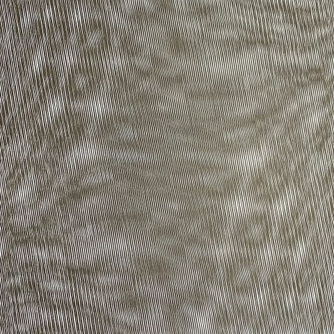
#PlotterTwitter showcased really impressive AxiDraw artwork overall, where each artist shared unique styles and approaches towards creating intricate linework. For me, I noticed that after looking through many of the AxiDraw drawings, the line harsh and defined line quality becomes a bit repetitive, where the drawings become stiff, and have that static quality. I became more interested in works that moved beyond spinograph variations and moved past the machine-like quality.

Jakub Antolak's "Figura 63" was one which I thought stood out from the other AxiDraws. The texture, due to the variation in line-width and density between strokes, feels organic, almost like a close-up view of muscle fibers or a microscopic view of cells. I think a lot of this is caused by the intricate cross hatching with a super-fine pen, that when overlapped, creates the illusion of "thicker" and "thinner" strokes. I think it's also interesting how the piece is symmetrical, where the image is mirrored across the diagonal line that runs from the upper right corner to the lower left corner. I wasn't able to notice that the image was symmetrical at all at first glance, where the organic nature and the crisp linework allows your eyes to become lost in its form.