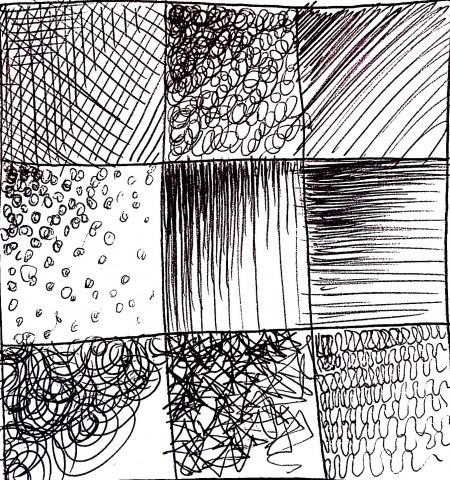
With the first and third designs, I found that it was actually more difficult than I thought it would be to accurately depict the percentages, as sometimes the tweaks I made would end so that the darkness would increase exponentially instead of linearly like how I wanted it to. The second hatch looks more like a pattern or a tile than a hatch, as the attention is drawn more towards the flower shape that resulted from the overlapping circles than it is towards the changes in value. The fourth hatch would have been more hatch-like and less tile-like if the spaces between the squares were even, but after spending too much time on it I decided to reroute and add randomness, as seen in the fifth. This is in fact me giving up, but I think I like the random one better anyway (whether that be because it made my life easier or because I actually appreciate the aesthetic, I do not know).