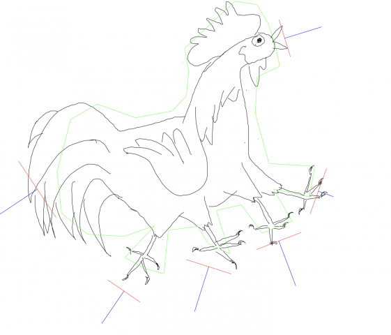
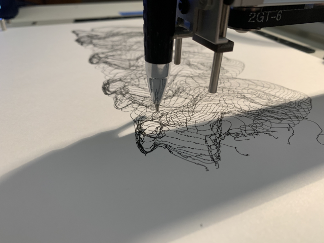
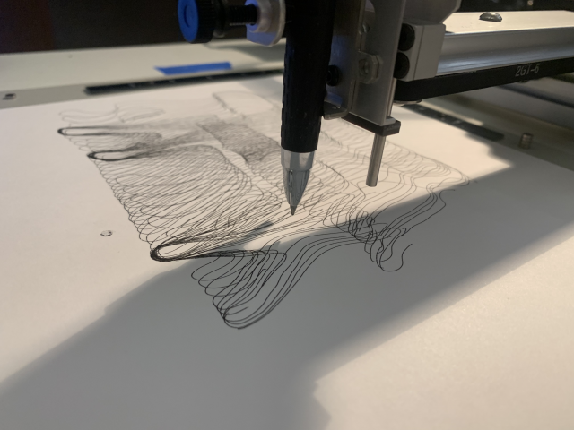
My final project, “Antagonistic Drawing Robot” (I haven’t picked a better name yet) is a drawing app that allows you to collaboratively draw with a robot. When something is drawn on the app, the plotter may copy your mark… or add its own spin on it. When the drawing is finished, you will come away with a piece in both the robot’s “style” as well as your own.
This project is still in progress since I was not able to work in an efficient way with my past restraints. I will be finishing it hopefully next semester as a side project in Golan’s 60-212.
Inspiration
My project was heavily inspired by Sougwen Chung’s work in exploring artistic co-creation with robotic units.
Chung’s work, however, uses machine learning to create the robot’s improvisational drawing techniques. Nonetheless, I spent quite a long time researching her practice and how it explores the relationship between human and machine through this form of mark-making.
In contrast to Chung’s work, I am not using machine learning. My project also lies more in the realm of a funny/surprising drawing app than the type of gestural, elegant art that is Chung’s work. I am trying to tap into the robot’s “personality,” which considers the idea of robots often being seen as the antagonist in the future of human life. This is where the concept of an antagonistic drawing tool comes in. An example of this, and another inspiration for my project, is fugpaint created by Ben Fry. The tools in the drawing app “misbehave” or act in ways you wouldn’t expect a normal paint tool to act. The robot in my project will do the same, misbehaving in ways that endow it with a certain mischievous personality.
I hope to get to a point where the robot is making more sophisticated marks so that the final piece can stand alone, like in Sougwen Chung’s work.
Process
Coming soon.
Takeaways
This project was honestly extremely frustrating and difficult for me. Compared to how much time and effort I put into making it work and get to a somewhat solid point and the current outcome, it is very unsatisfying for me. I learned a ton, which makes it worth it, but I cannot let this project go unfinished with how much time I put into it. It is not where I want it to be, but I hope I can make it the project I originally imagined at some point next semester.
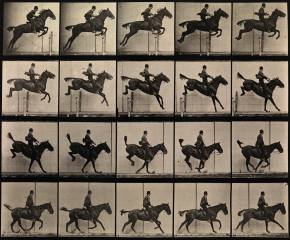
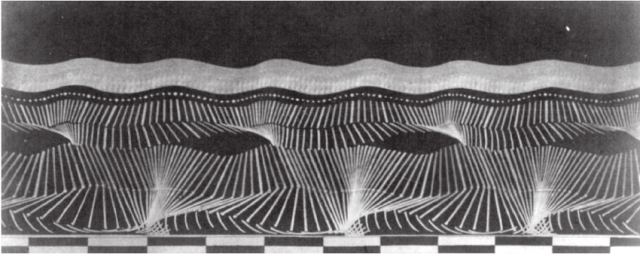
This project takes walk cycles and converts them to traces of motion.
Inspiration
The project was heavily inspired by Eadweard Muybridge’s captures, which tracked how the human (and horse) form moves in space.
Étienne-Jules Marey was another inspiration, specifically his traces of human locomotion.
However my project is more aligned with Harold Edgerton’s series that focuses on outlines, as it becomes more about the form than the movement of joints.
Process
In order to make this project, I used Detectron2 for segmenting outlines. A sample segmentation.
Once I had the outline alpha, it was fairly simple to convert it to an SVG using the potrace library. From that point I began playing with what motion works best.
Outlines from a video of a group doing the YMCA dance.
After several attempts, I realized that the walk cycle, which has a strong history in animation and drawing, would be a good subject for the series. The next step was to tune movements and sample rates to see what would look best.
I ended up deciding that sampling a straight on walk from every frame looked best.
Tracing motion was also a nod to my architectural training, as depicting motion in this fashion is an exercise many architecture students partake in during their technical education.
Takeaway
This project was a confidence booster in some ways and frustrating in others. When I first decided what I actually wanted to make, I was overwhelmed and had no idea if I could even pull off getting outlines. Funny enough, the outlines were the easy part, but the small details, like dotted lines which ended up mooshing together from blotted ink, were hard. I’m happy with the outcome, but there are definitely places I can still take it.
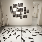
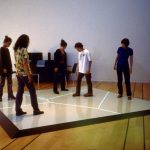
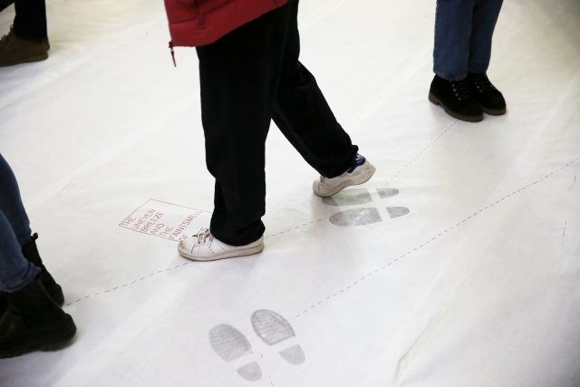
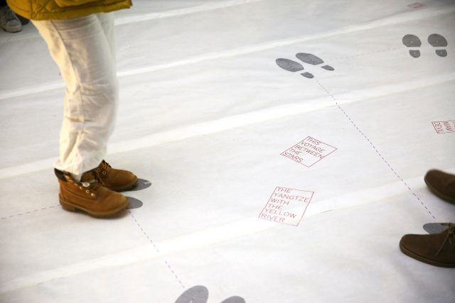
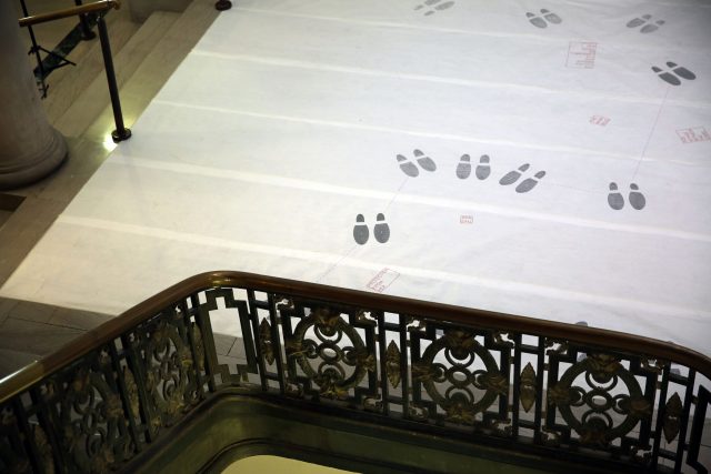
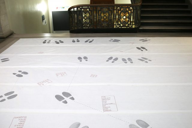
17′ x 14’4″ floor installation containing 7 17′ x 30″ sheets of paper containing generated and plotted party text-objects and shoes connected by paths.
Inspired by interactive floor-based works such as Clifford Owens’ Anthology (inspired by Warhol’s Dance Diagram) and George Snibbe’s Boundary Functions. Also inspired by Jenny Holzer’s work surrounding text, particularly her Truisms.
Clifford Owens, Anthology
Jenny Holzer, Truisms
George Snibbe, Boundary Functions
This work is situated in a larger body of my party-planning work, where party is a general term for community event (including birthday parties, funerals, family meals, mass, etc.).
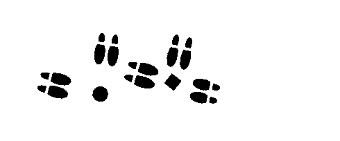
Early experiments with abstract (non-textual) party objects at a smaller scale.
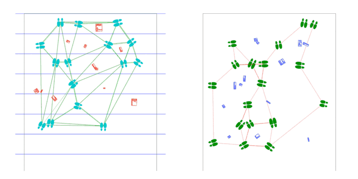
Shoes are placed by poisson-disc distribution and party objects are placed at voronoi vertices of these shoes. Shoes face the nearest party object and party objects face the average direction of the group of shoes facing them.
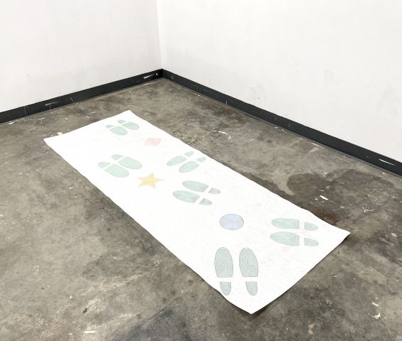
Later shift to text-based party objects at a larger scale.
Scaled-up program supports arbitrary length, as the USCutter supports any length fed by roll, as well as arbitrary width, as an arbitrary number of plots may be laid side-by-side. Installed on the first floor of CFA in a high traffic area.
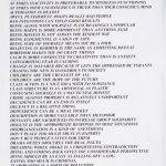
Text is pulled from a previous project of mine: Objects of Desire, a list of 18,336 things that are in some way desired, as determined by natural-language-processing techniques on all of Project Gutenberg.
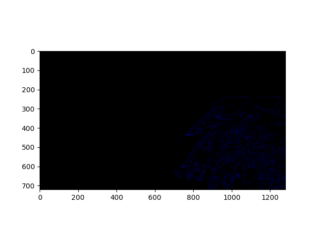
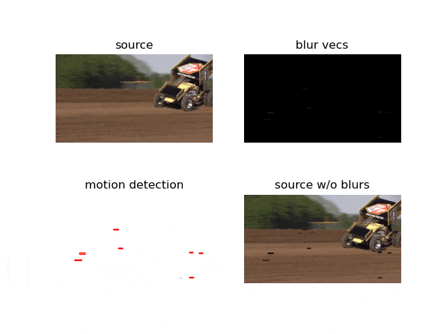
fast-moving object capture
Experimentation with an open-cv-based algorithm for fast-moving-object detection loosely based on this paper. Boxes placed around detected fast-moving objects.Using this algorithm, I wrote a program which sorts a given video’s frames by the speed of the objects in each. The fastest-moving frames come first. I suppose we get the most excitement in the smallest amount of time this way. The number above each frame is the calculated speed of objects in it.
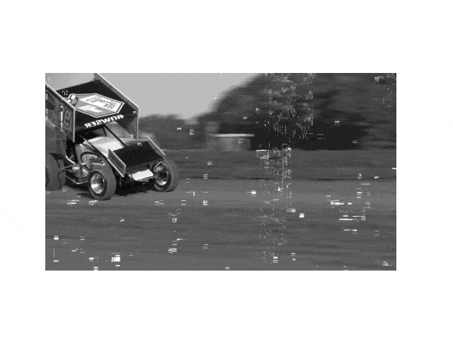
carl bowser
I plotted the found fastest frame of a clip of Carl Bowser (Turner’s sponsee) racing.
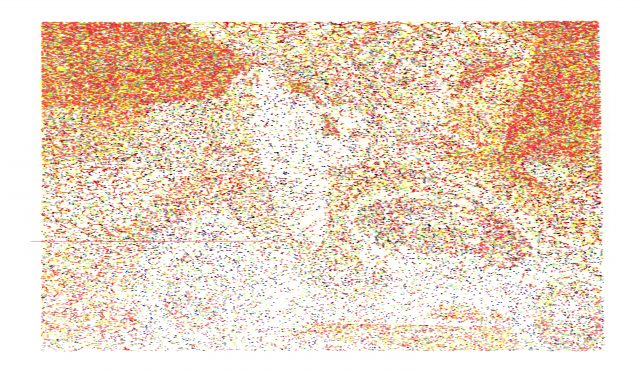
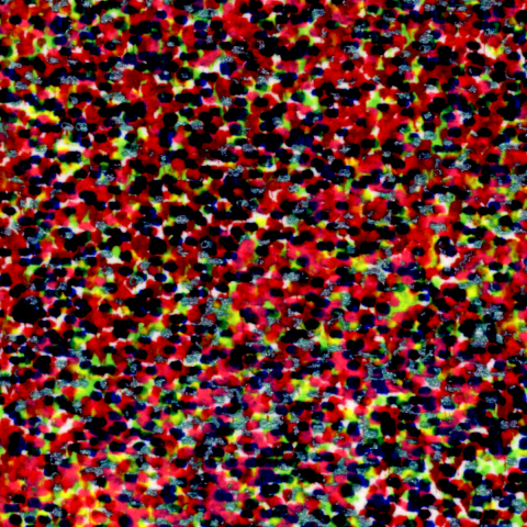
Here, I randomly chose a number of points and (incorrectly) assigned one of six pens (RGBCMY) on the HP7475A.
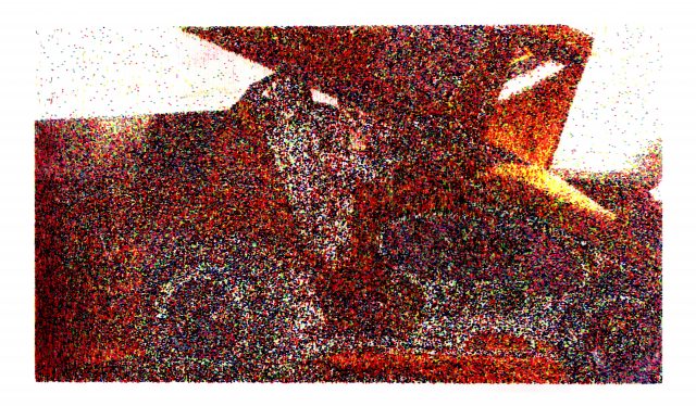
I resolved most of these color issues in my second attempt. Since marks made are larger than the image’s pixel size, the order of pens matters more than I had expected.
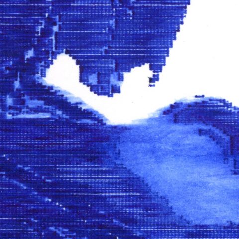
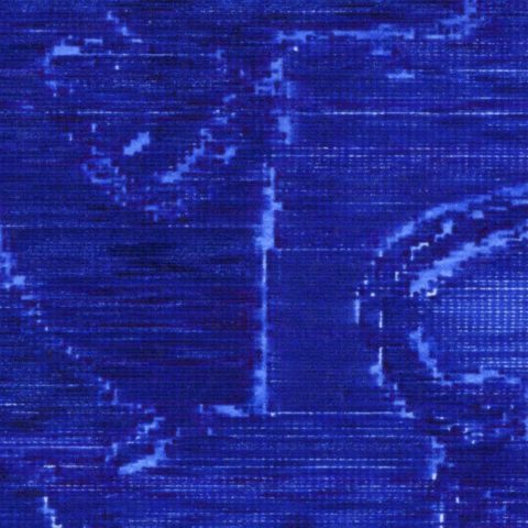
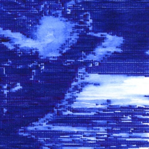
Instead of stippling the motion-blurred images, I decided to further utilize the material conditions allowed by the plotter by removing the areas containing blurs from the images, as shown below. The value of each pixel corresponds to the number of times the pen passes over it. The blank areas were then manually blurred by carefully brushing with water.
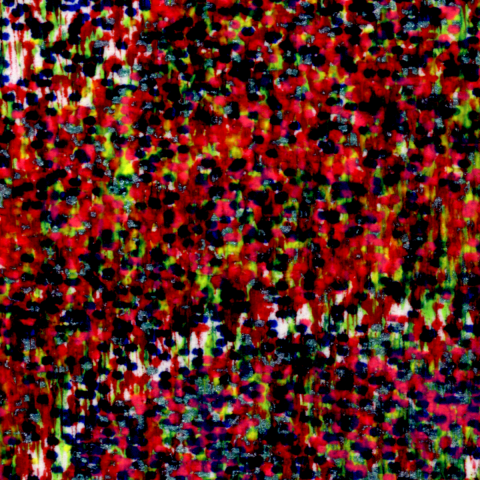
Further in this direction, I experimented with using line detection in the motion-blurred areas to render streaks as lines in the direction of the motion.
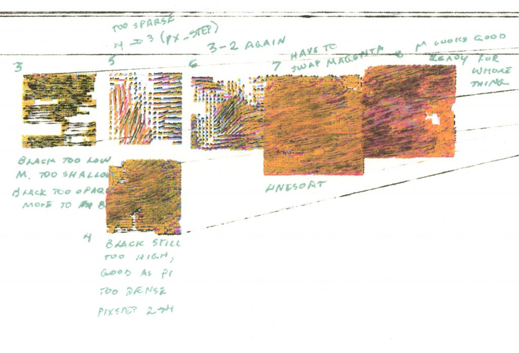
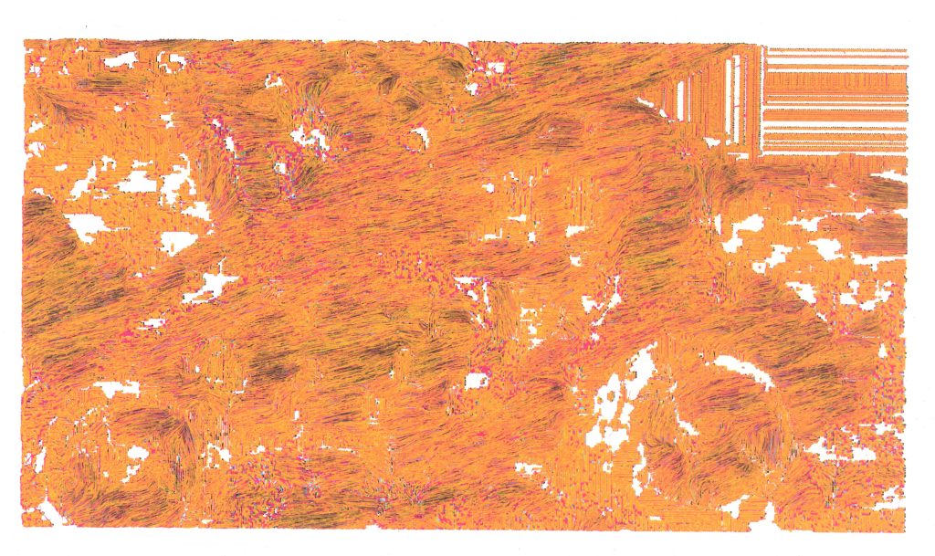
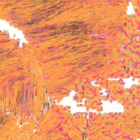
I changed directions completely when Golan showed me optical flow, which tracks the motion of points from one frame to the next. I used this, along with CMYK color mapping on the flow lines’ average underlying colors to plot the following test swatches and frame.
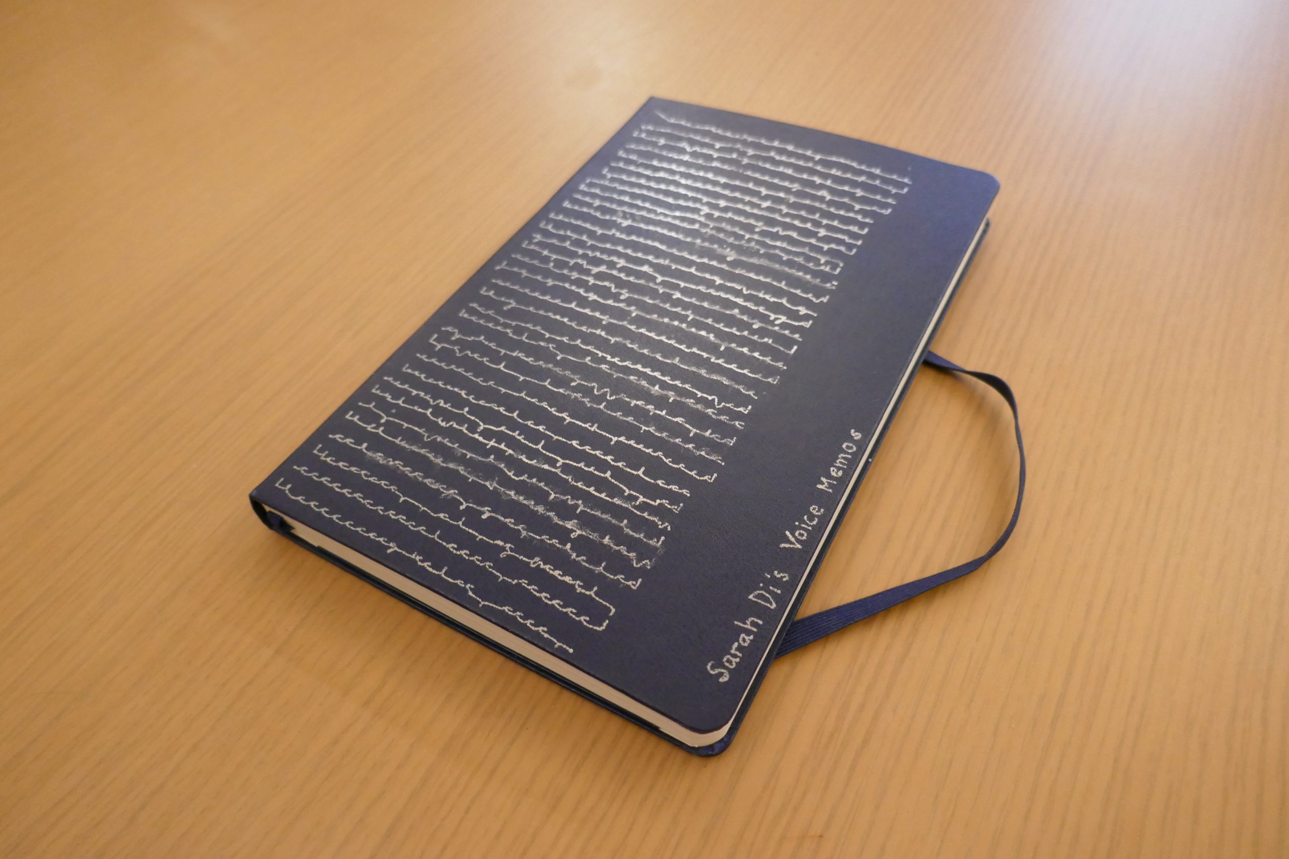
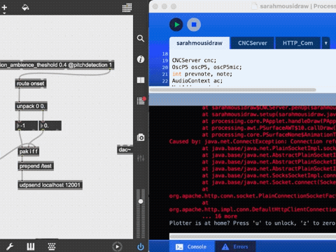
This system transcribes your pitch into a plot in realtime.
Some inspirations.
This idea was primarily inspired by the music synced tracks made by people in the Line Rider community such as this track created by DoodleChaos, which took them 3 months to complete by hand and this track by Rabid Squirrel, which took them a whole 18 months to complete (I highly recommend watching this one).
After hearing Golan talk about asemic writing systems, I began to reevaluate my idea as an archival practice rather than a visual accompaniment. Sweetcorn also suggested that I take a look at cursive shorthand, and I was particularly blown away by tersive shorthand and zhong hua yu zi(中华语字).
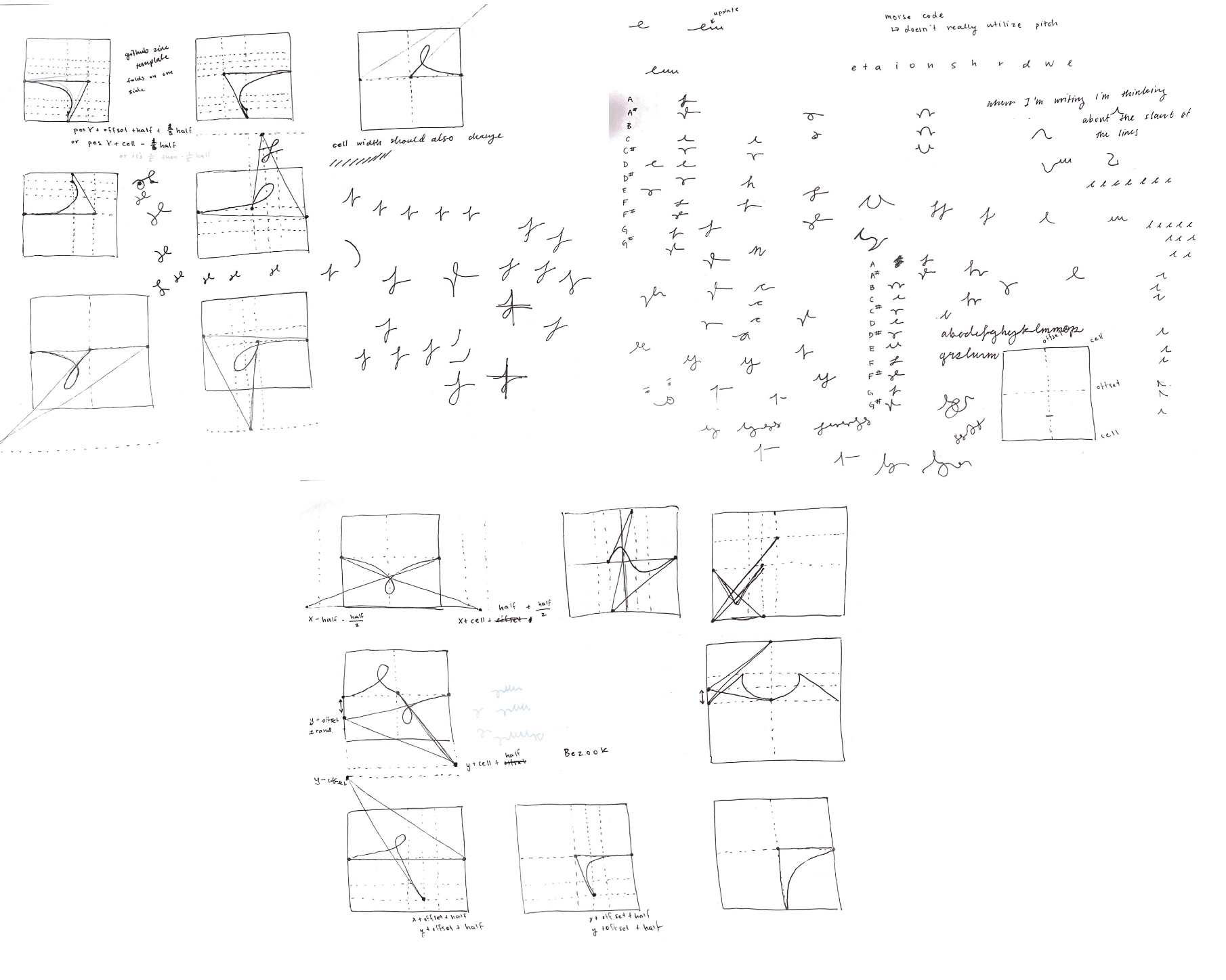
Process.
I first got Max MSP’s monophonic pitch detection working to send pitch data to Processing.
The patch sends over the note detected relative to C. This means, for example, that if it detects a D it will send over 1 as opposed to a B where it will send over a 12.
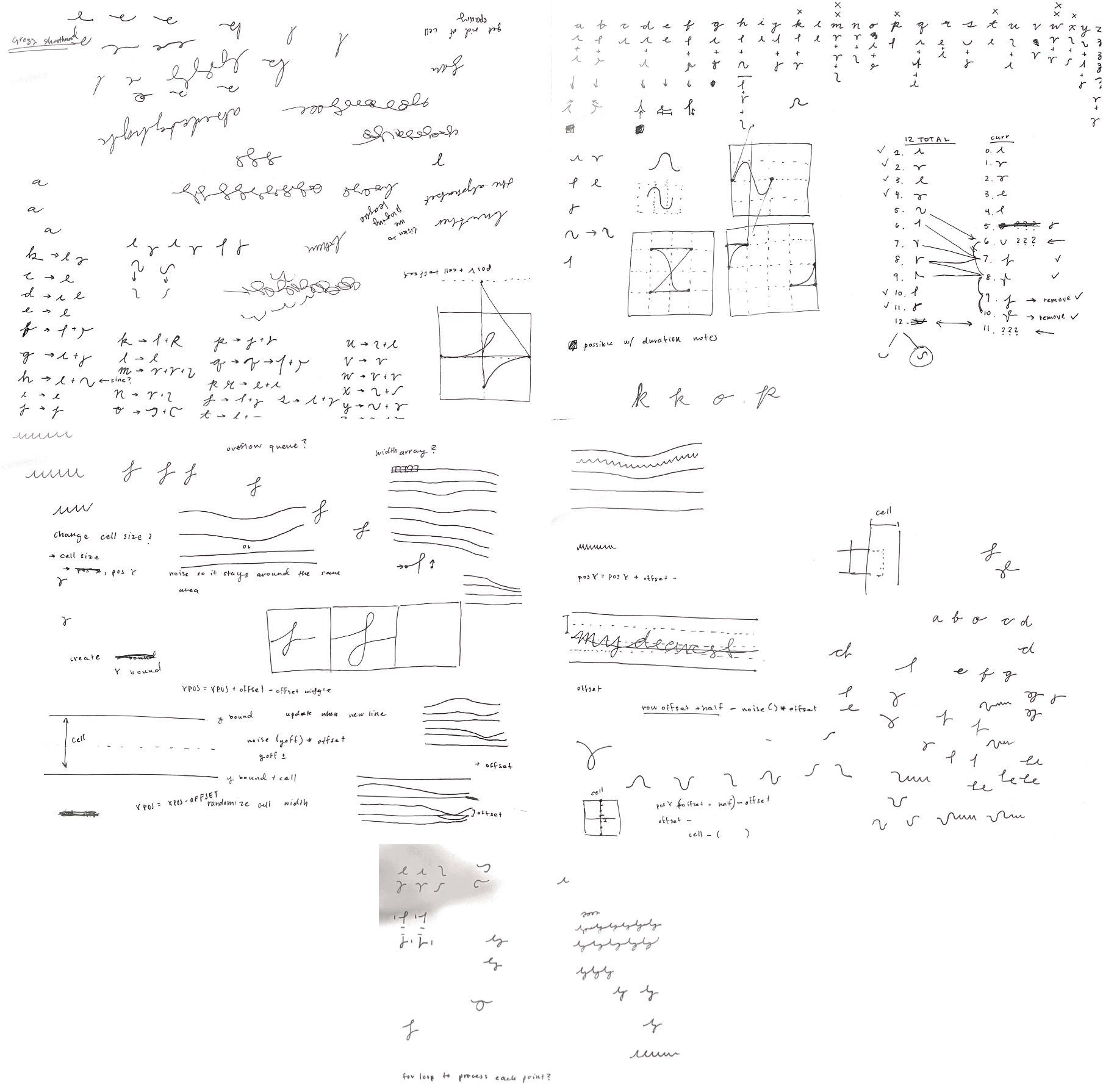
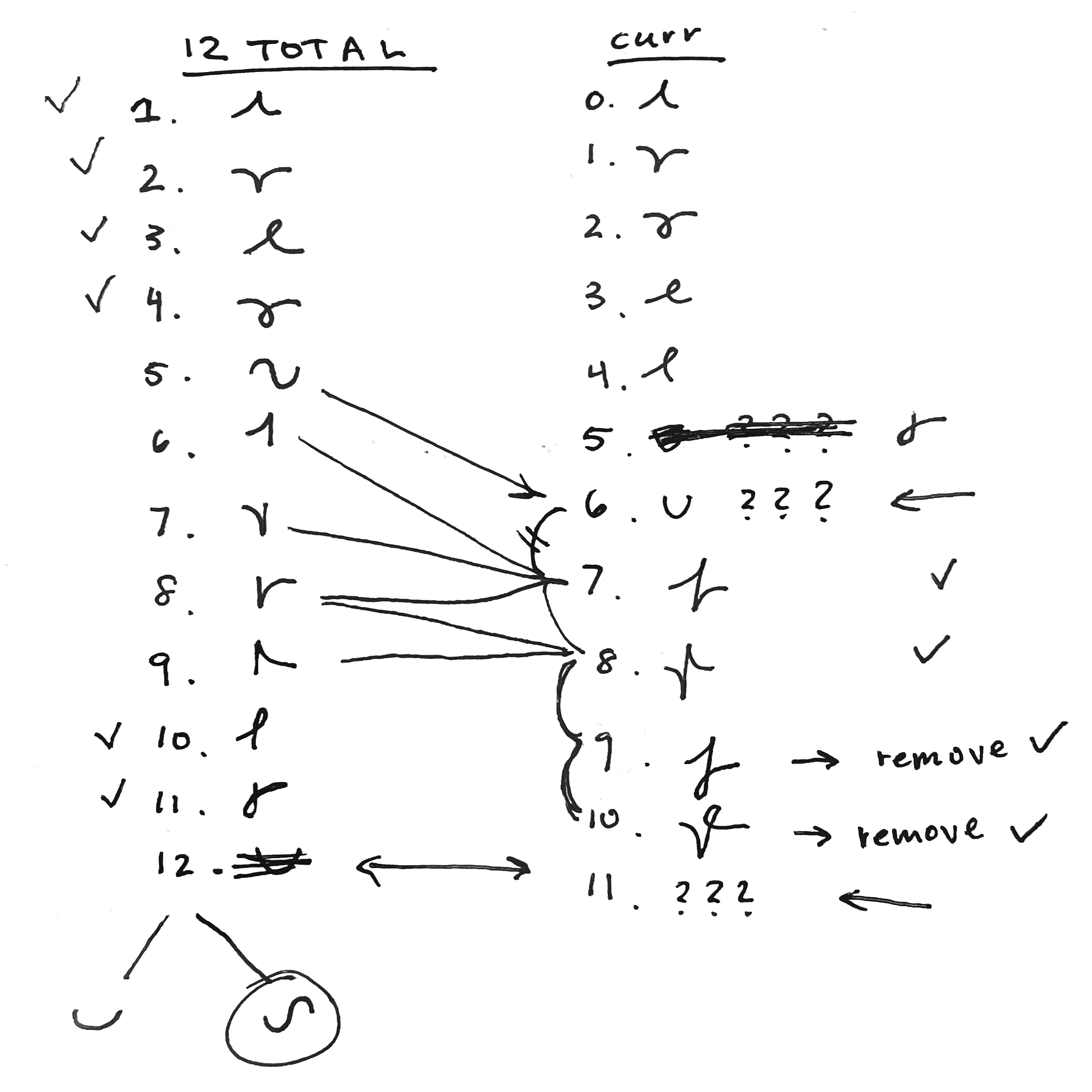
I then began drafting an alphabet for my processing sketch. My first impulse was a draft a geometric alphabet consisting of 12 different symbols. I think one issue I encountered was trying to figure out which features I wanted to preserve, such as pitch, duration, octave, whether it was an incident or not, and dynamics. At this stage, I was influenced by my familiarity with traditional Chinese musical notation (工尺).
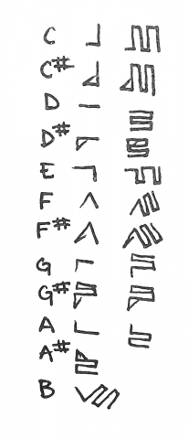
Ultimately, I settled on this alphabet.
Each note corresponds to a symbol. I ignore flats in favor of sharps, and indicate that a note is a sharp with a serif.
To preserve duration, every time my program reevaluates the current pitch, it adds a small snaking line, so that the length of the snake tacked onto each symbol represents how long that note was held.
Rests are denoted by whitespace, but the length of rests are ignored.
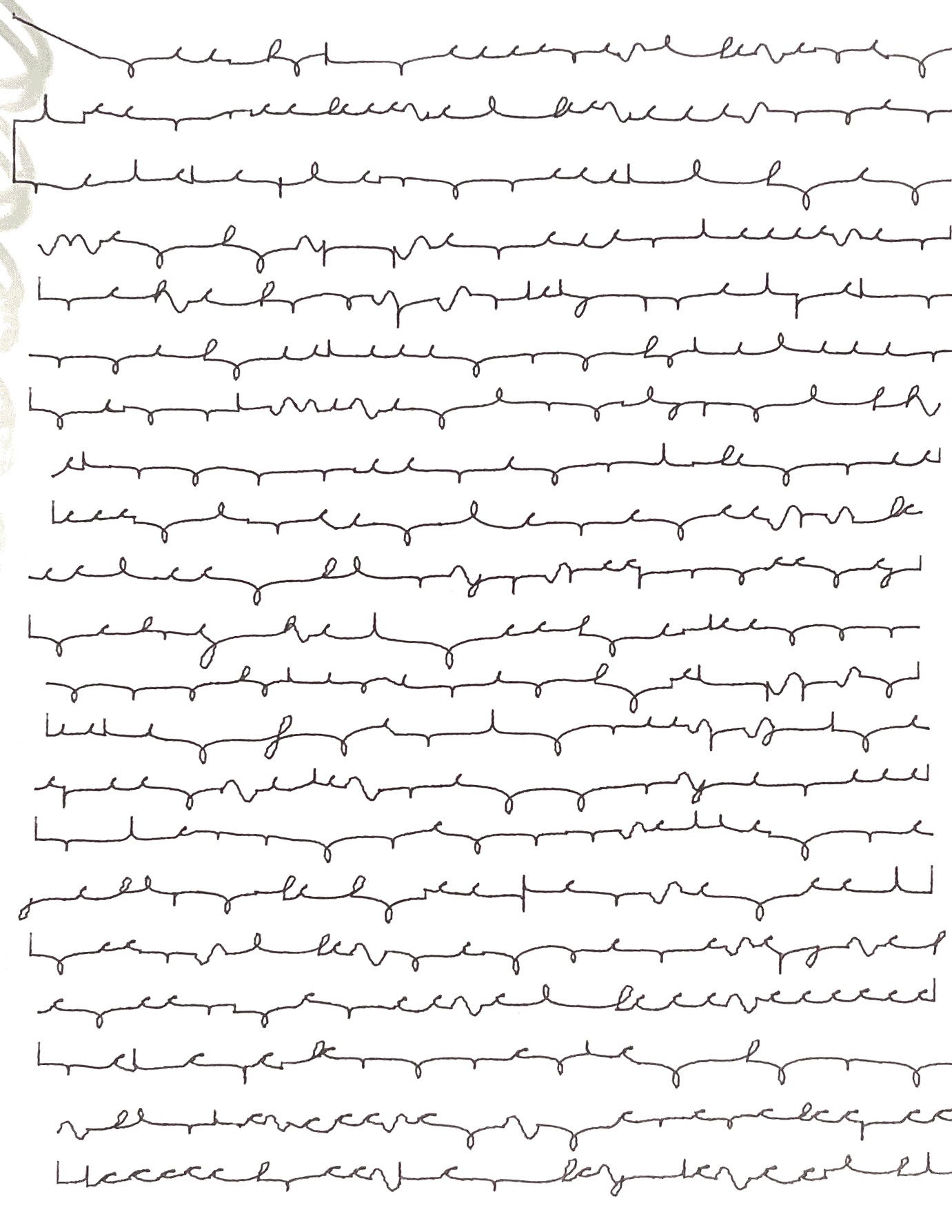
vvv These are some plots that used this system.
< ^ The bottom three plots (and this close up shot) highlight the amount of variation (chaos?) that can be achieved by changing the frame rate. Processing usually calls draw() at 60 fps, but this created too many unpredictable symbols for my preference.
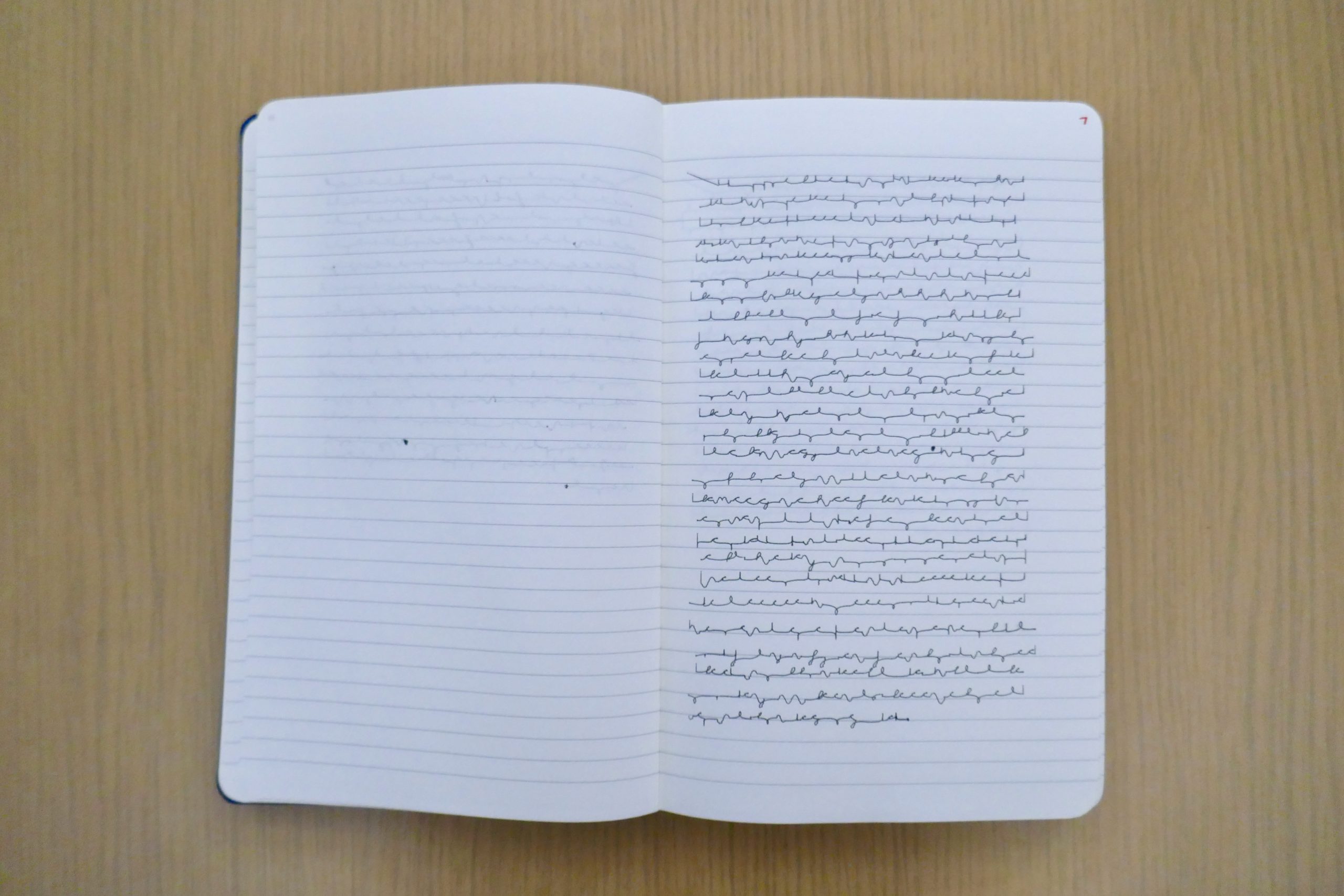
At the end of a plot, I wanted something I could still decipher.
Additionally I originally plotted my symbols from left to right, similar to how I write. This however made the Axidraw fall out of sync with my pitch, since it needed time to go to the next line. This was fixed by plotting the symbols in boustrophedon (left to right, then right to left, alternating), which minimized the distance.
Even with this fix, I was still unsatisfied with the Axidraw’s ability to keep up with me. This was mostly due to my initial alphabet, since each of the symbols had a different start position which added more moving time in between pitches. I also didn’t like how distinct each symbol was, since I didn’t think pitch should look as “blocky” as what it became on paper.
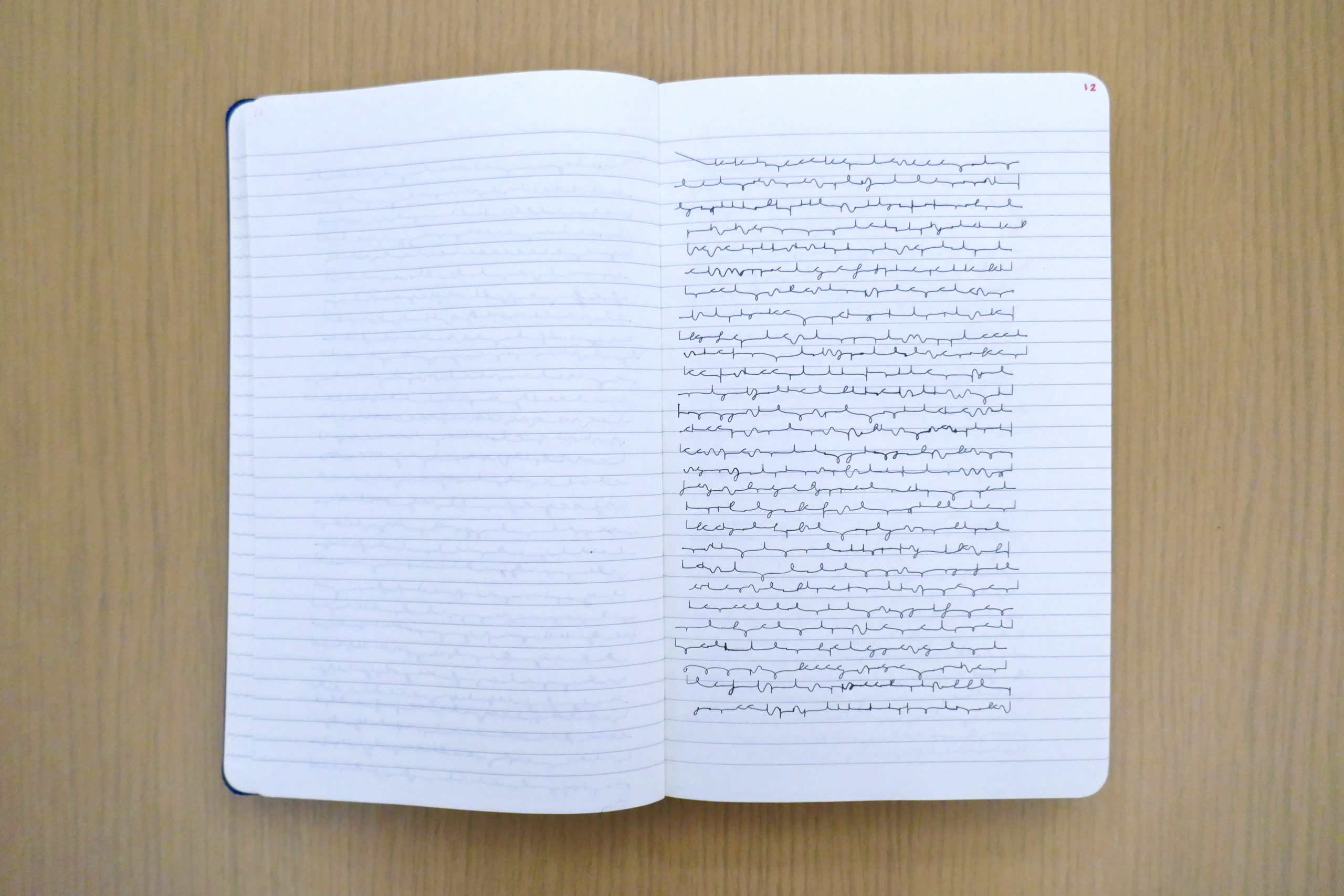
To fix this, I revised my alphabet to look more organic and to standardize the starting position. I did this through playing around with bezier curves.
After drafting more symbols, I finalized another alphabet.
Instead of drawing “snakes” to denote duration of pitch, I switched to drawing little spikes. Each symbol starts and ends at the same place. I also added in noise to the individual symbols and to the Axidraw’s plotting direction to give the plot a more handwritten quality.
< Here’s a plot with the new alphabet
More documentation.
Takeaways.
I learned a lot about how structuring a working pipeline (Max MSP to OSC to Processing to CNC server to Axidraw). I feel more knowledgeable about what resources are available for and the current limitations of pitch detection, which will help me immensely with future audio related projects experimentation. I still have more in plan for this project, such as adding in generated computer-generated lyrics using pronouncing.py, and additional support for quick changes in pitch.
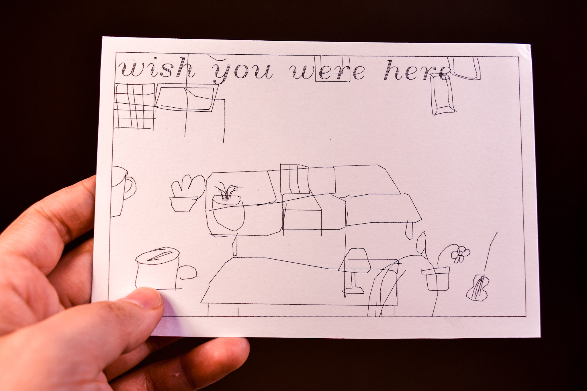
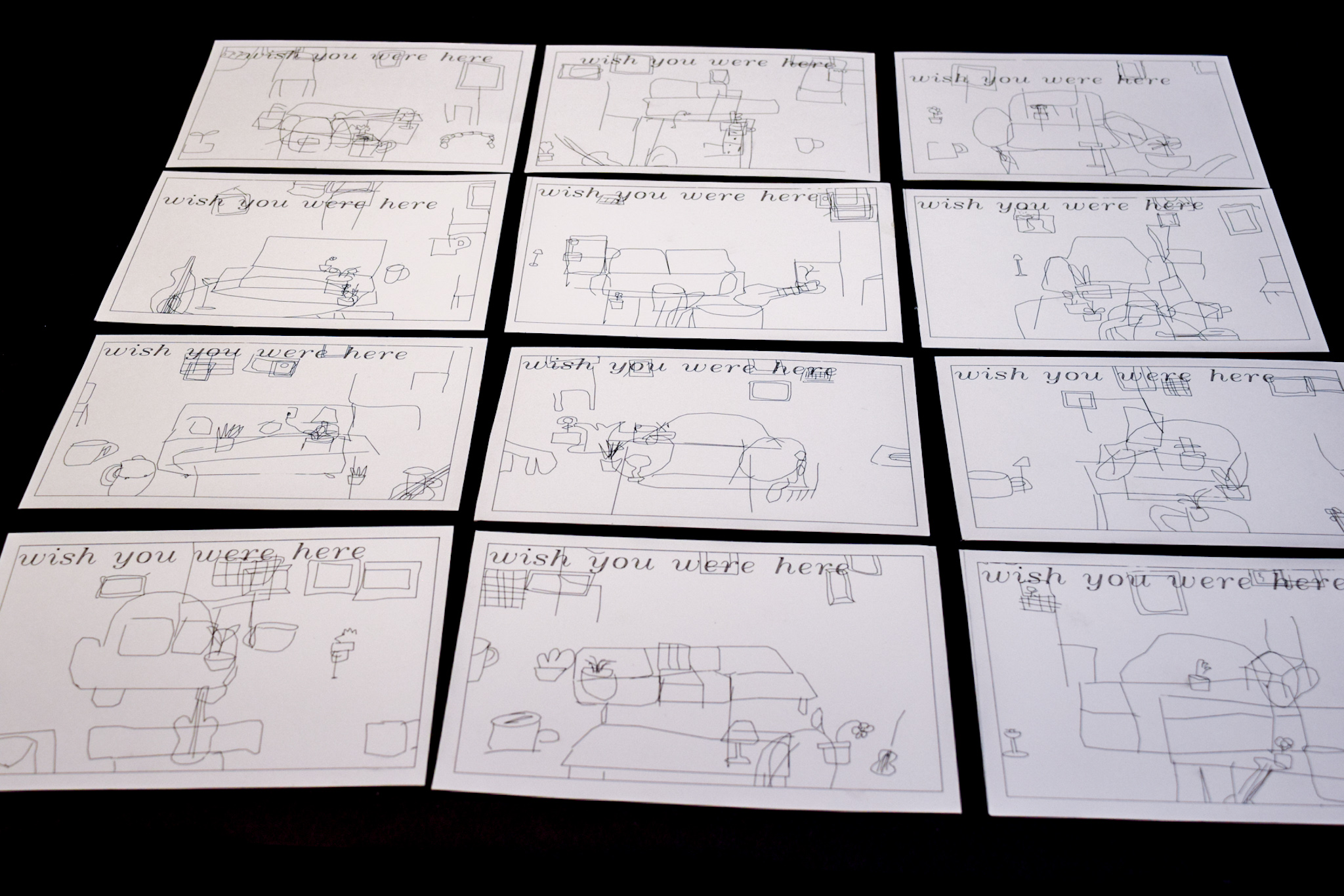
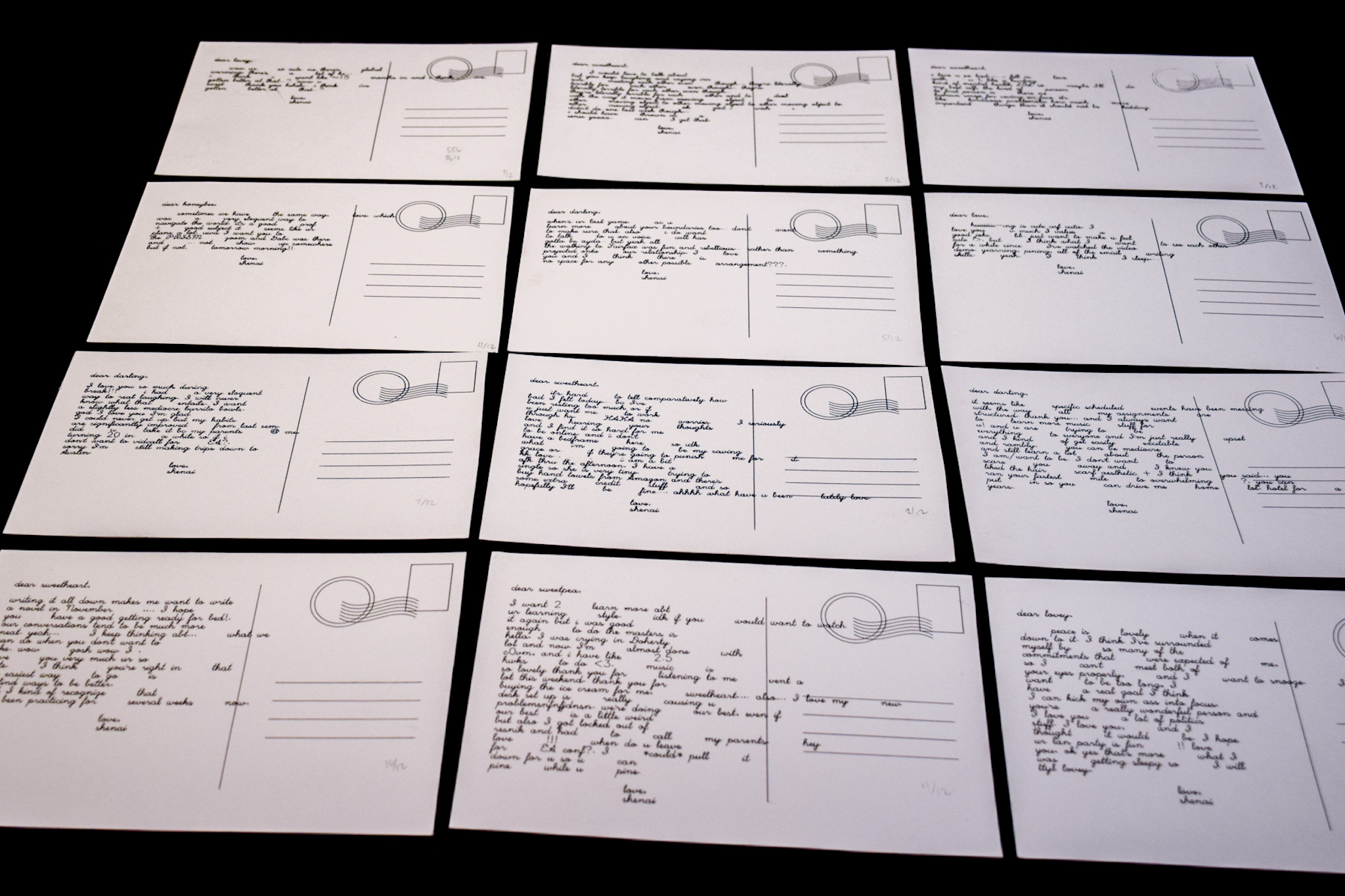
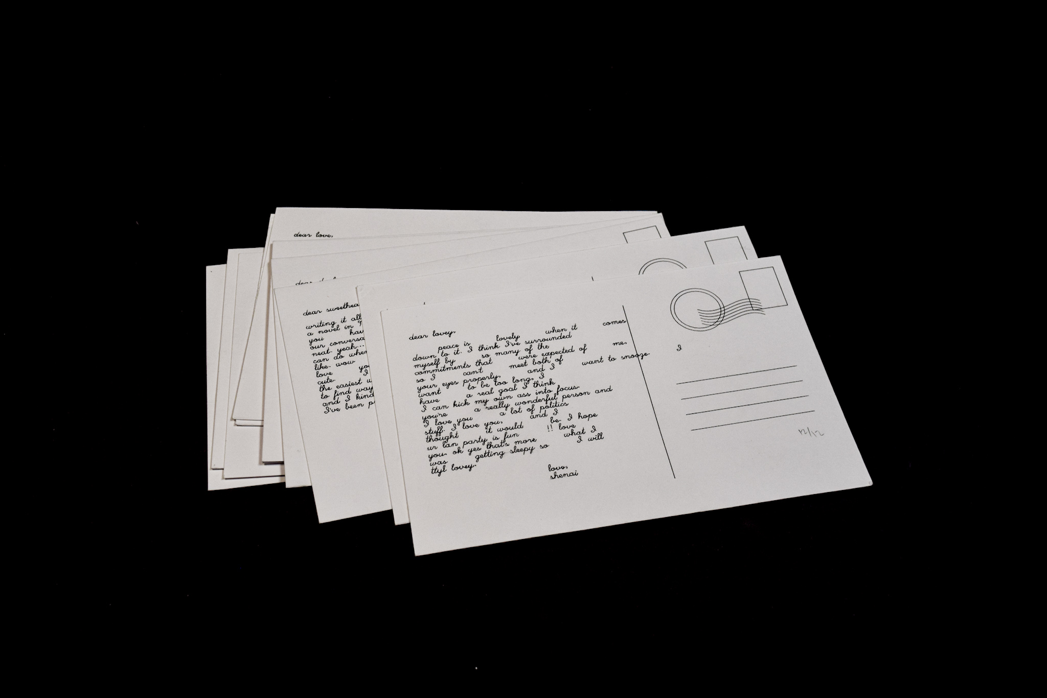
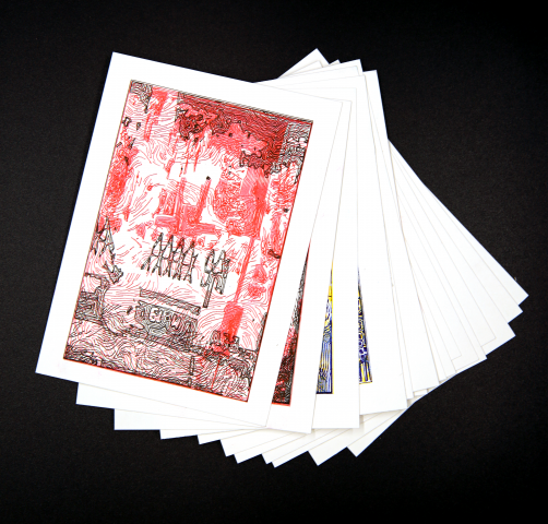
My final project for this class was a set of 12 generative love-letter postcards, with the images on the front created by composing elements from the Google Quick, Draw! dataset into a “living room”, and the text on the back created by Markov Chains trained off of ~ 33,000 messages I’ve sent to my partner over the past year.
Inspirations & Ideation
At the onset of this project, I knew I wanted to create some kind of data-driven small multiples work that inspired by the care I have for my partner.
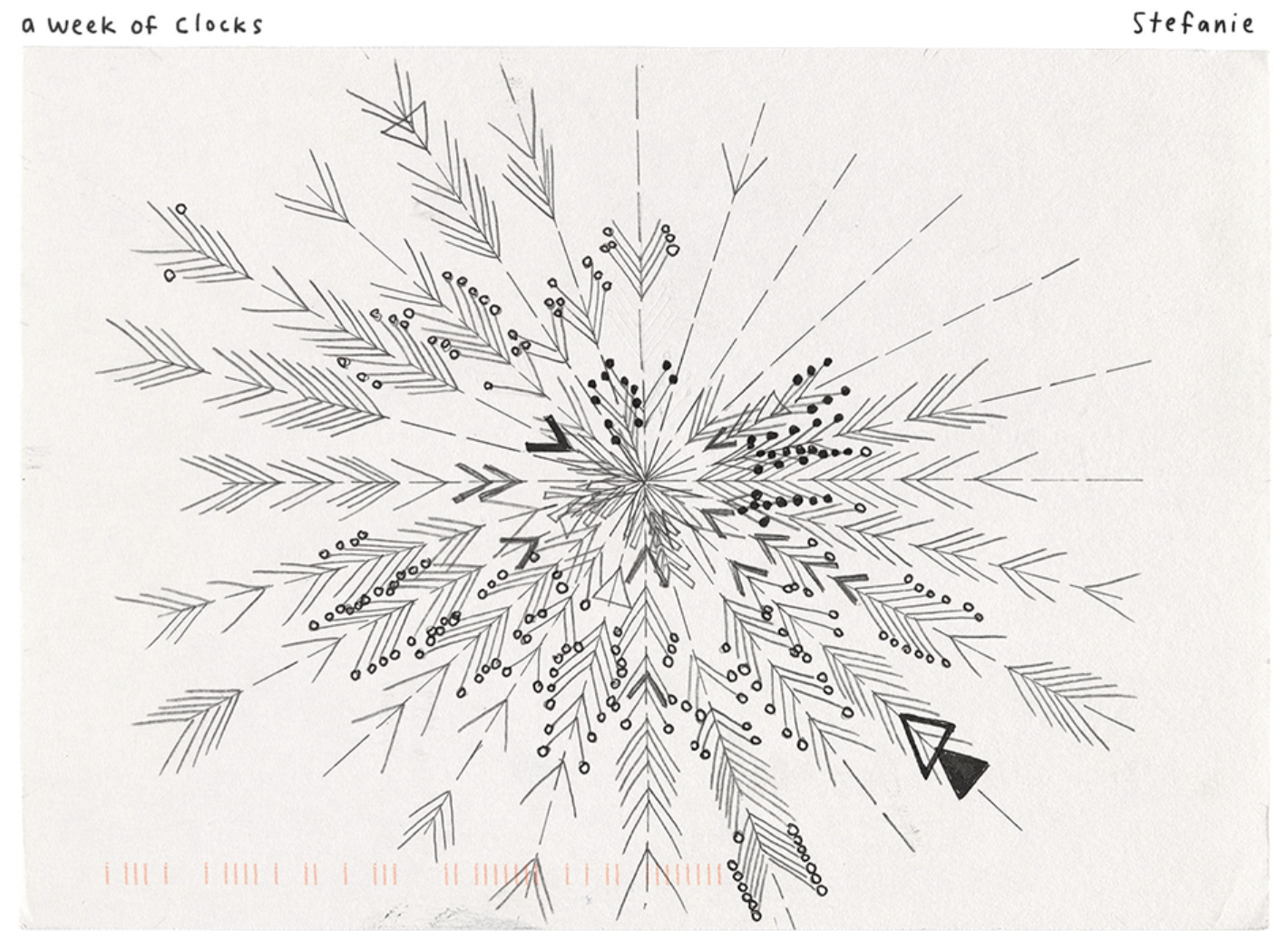
I was really touched by Lukas’ work for our mid-semester critique (2021), where he plotted a massive amount of zigzagging lines reflecting texts between him and his girlfriend. I had also enjoyed Caroline Hermans’ project exploring attention dynamics with linked scarves (2019), and “Dear Data” by Giorgia Lupi and Stefanie Posavec (2014–2015). All three projects exhibited the power of data to tell a story.
“dear data”
These projects helped convince me that data visualization is uniquely suited to tell the story of a longer-term, committed relationship—not in the manner of poets, with their manic, myopic focus on the singular rapturous moments, but in a fashion that underscores how a healthy relationship is built up of small, consistent gestures, day in and day out. (I hope my saying this doesn’t constitute an “interpretation” of my work; I only state it to illuminate why I decided on the tools I used to make the project.)
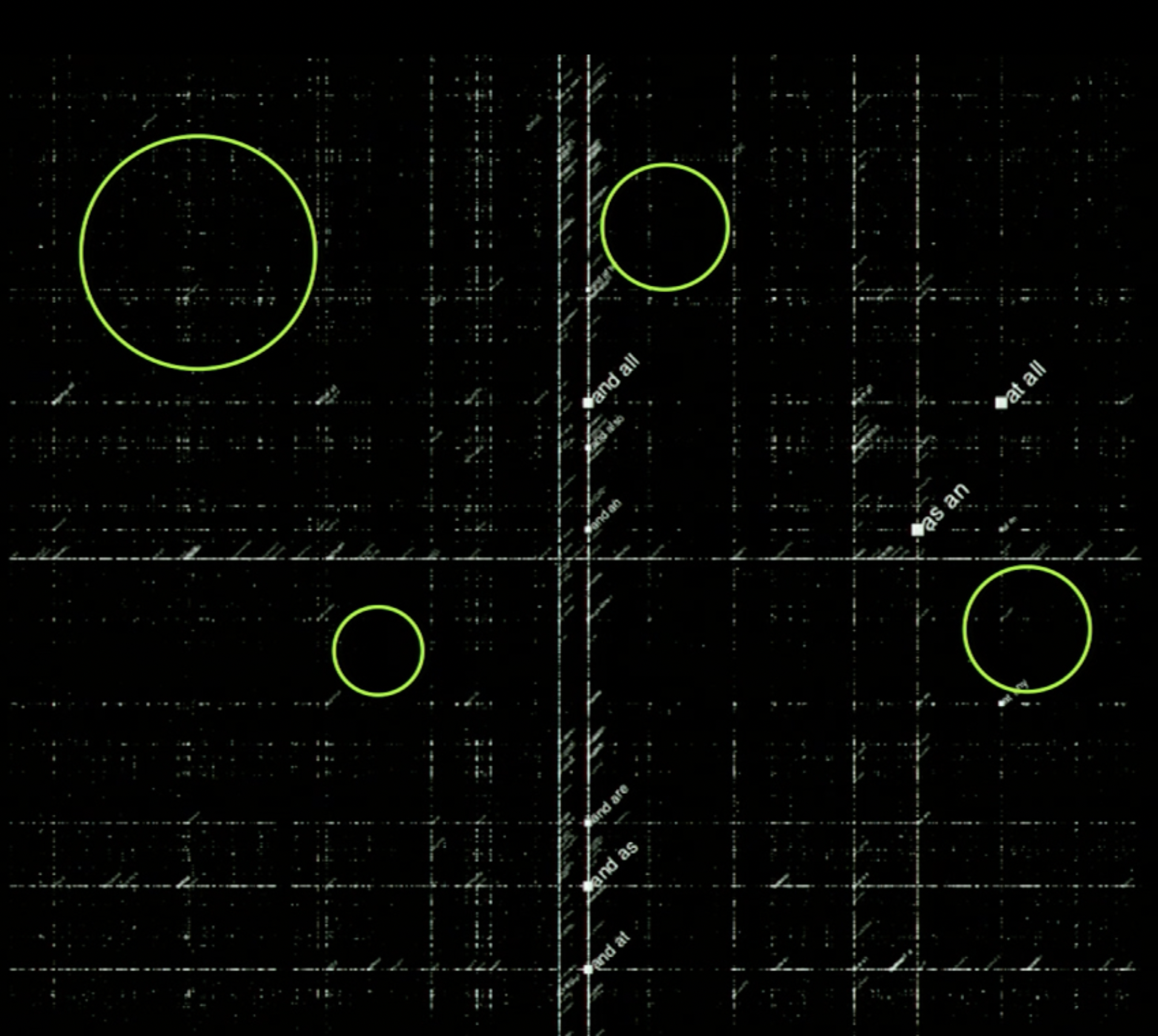
Since my project was composed of essentially two sections (the front and back of the postcards), I first explored how and why to generate text from a corpus of text messages. To aid me on my discovery of the why, Golan recommended Allison Parrish’s Eyeo 2015 talk, which I thoroughly enjoyed. I liked the analogy she drew between unmanned travel and exploration of strange language spaces. She posited that, in the same way a weather balloon can go higher and explore longer without the weight of a human, generative language can go into novel spaces without the weight of our intrinsic biases towards familiar meanings and concepts. I then learned the how from one of Parrish’s Jupyter Notebooks, where I gained the technical skills to train Markov Chains based on accumulated corpus of text.
Parrish’s diagram of “unexplored language spaces”
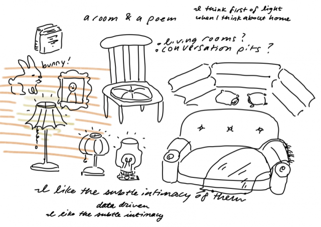
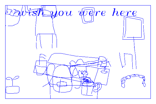
In my journey to brainstorm fronts for the postcards, Golan introduced me to the Google Quick, Draw! dataset, where users doodle different categories of objects (i.e., couches, house plants, etc.) in order to help researchers train ML classification models. I found the dataset oddly charming in its visual imperfections, and I loved how it provided a survey of how users think of different objects (how round a couch is to them, what kind of house plant they choose to draw). Additionally, I’ve always been intrigued by the concept of building a home and understanding the components (people, objects, light) that define a home. I thought generation from such a widely sourced database might be an interesting way to explore home construction without being weighed down by past personal connotations of home, or even traumas surrounding home. And so I decided on creating little living rooms as the front of the postcards.
potential parts of a home
Process
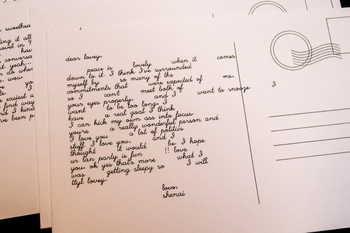
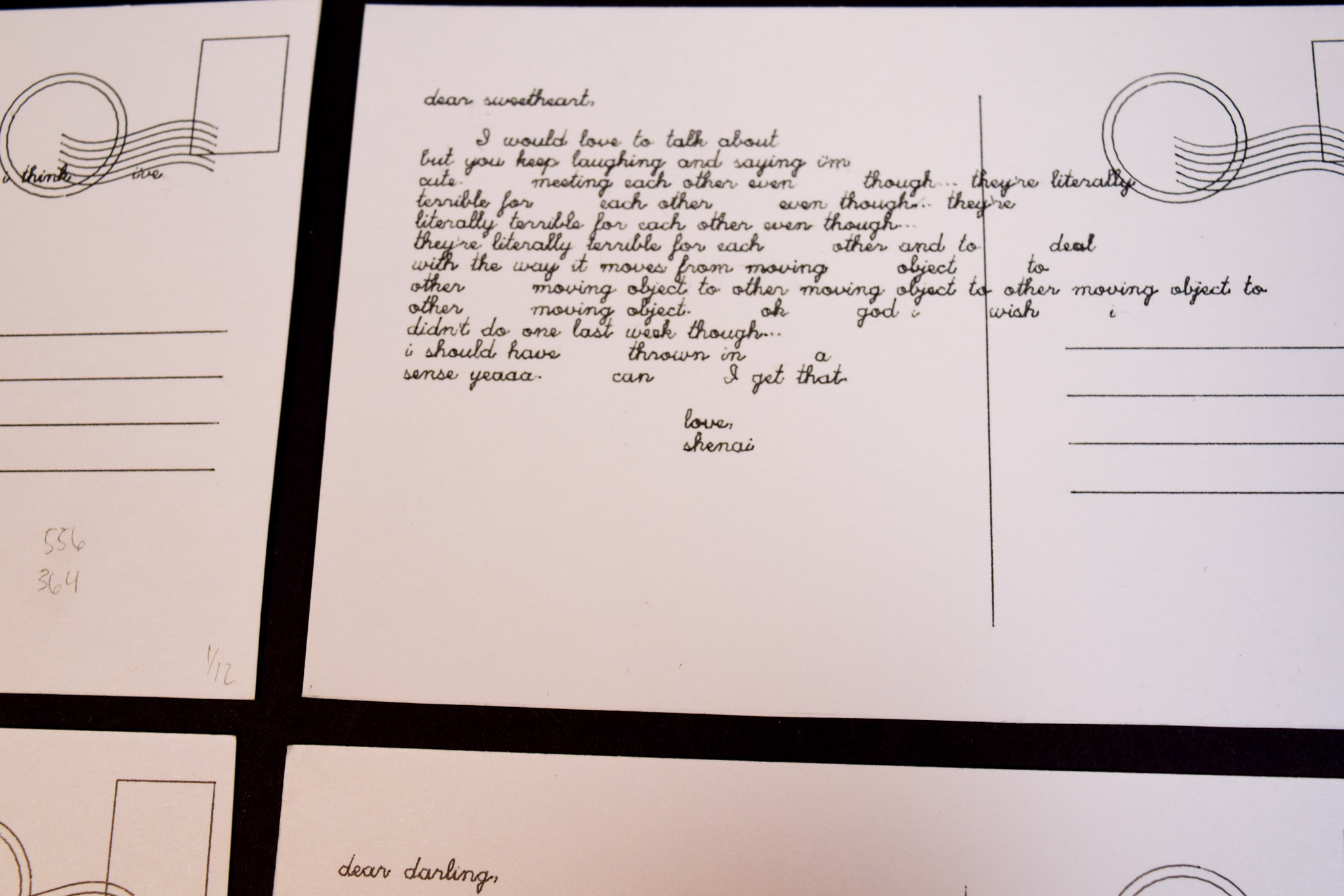
For the text of the postcards, I requested my message history data from Discord (yeah, yeah), which provided me with large .csvs of every message I’d ever sent through the platform. I picked out the .csv corresponding to my partner’s and my DMs, and manipulated it using Pandas, a process which included cleaning out non-ascii characters and sensitive information, and depositing lines of text into twelve different .txt files, the first of which held only messages from November 2020, the second of which held messages from November–December 2020, and so on until the twelfth held all messages from November 2020–October 2021. I processed the data in this manner in order to create twelve different paragraphs, each generated from a model trained on progressively more data, and composed of sentences that held words such as “love”, “sweet”, “want”, and so on, to give them the “love-letter” characteristic.
The progression of the twelve cards isn’t as clear as I hoped it’d be, but the first few postcards are still distinct in some ways from the last few, influenced by how much information each postcard had access to:
from 2 monthsfrom 12 months
For the generative living rooms, I downloaded large .ndjson files of objects from the Quick, Draw! dataset I thought would go nicely into a living room, and randomly picked instances to place in random locations with random sizes (the latter two parameters limited by certain ranges). This was done in Python with the vsketch and vpype modules:
I then spent a few hours plotting double sided postcards, as shown below:
Further Documentation
(.svgs of all the text sides of the postcards are posted under the cut)
Takeaways
Though I ultimately like what I created, I am unsatisfied by some elements of the final product. I found it difficult to create living rooms with what I felt was an appropriate balance of charm and order—the ones I ended up with feel overly chaotic and uneven in composition. Furthermore, I am disappointed that the progression of the paragraphs isn’t as clear as I hoped it’d be. I think to make it clearer I’d have to understand a little more about different models for text generation.
Overall, this project taught me how to use numerous tools/workflows (manipulation of .csvs, .ndjson/.jsons, data management and cleaning, generative image toolkits like vksetch, learning about naïve ML models, etc.). However, I am most thankful for the ideation process and how the project made me think about technology as a tool to express concepts/emotions that might be otherwise difficult to convey. I want to continue using the creative and technical skills I gained from this project to go forth and make new pieces like it!
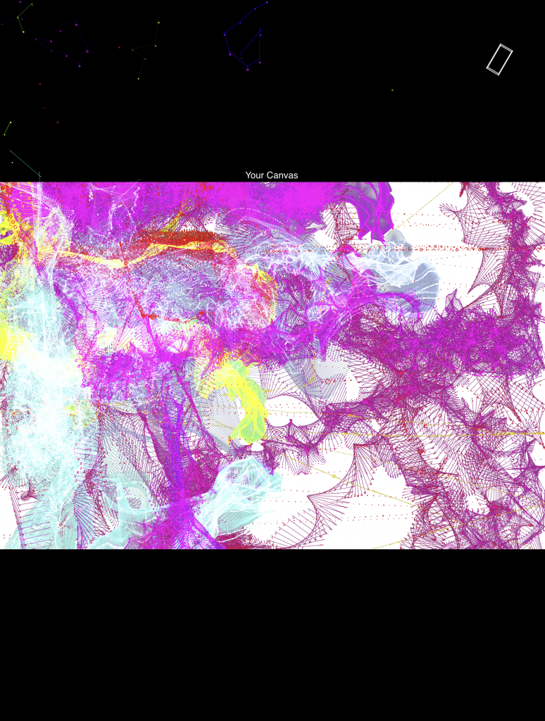
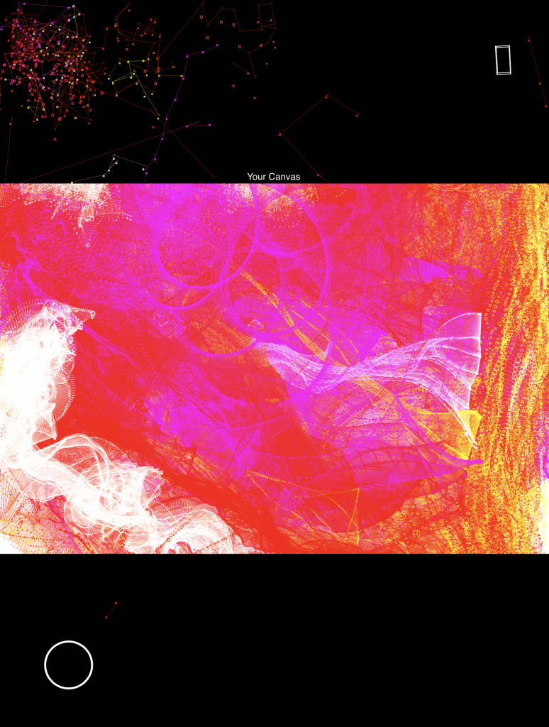
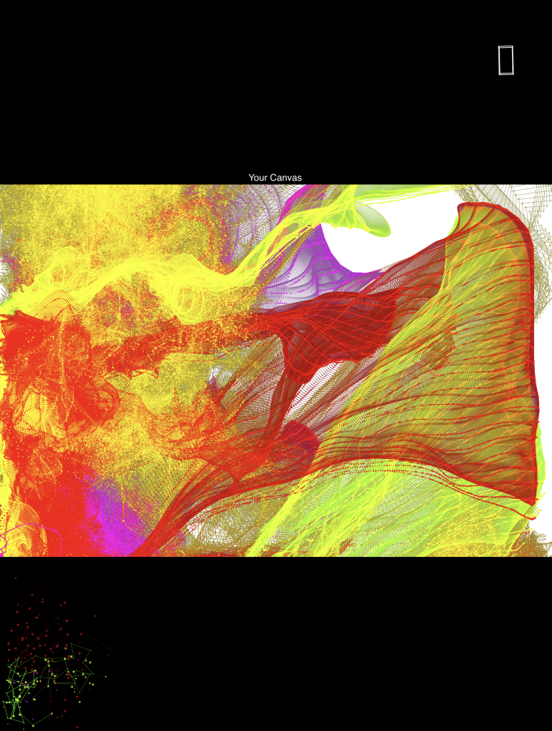
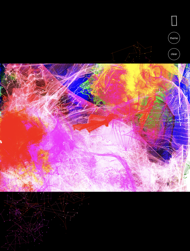
Jittery, an interactive drawing app that generates lines that draw for you. Glitch + Phone Sensors + p5.js
Inspirations

Initially, I was inspired by Inkspace, a drawing app created by Zach Lieberman that lets users draw in 3D, where swiping horizontally and vertically across the screen “rotates' ' the canvas to another dimension, while keeping previous marks in other planes. I was interested in creating a drawing tool that allows one to create 3D forms, and approached it in a different way.

I was intrigued by the idea of being able to generate lines and mechanisms that draw for you. Fourier drawing machines was another inspiration, where a couple of circles attached together can create intricate, and accurate drawings. I decided to do something in this ball park, creating drawing mechanisms and tools that are simply lines connected to one another, but have a unique behavior that shows in how fast they travel (different “masses” travel at different speeds) and how much energy they possess (altering the damping of each mechanism).

I was also interested in the concept of painting and mark-making with a non-traditional medium like a bouncy ball, where applying paint on the ball and having it roll around on a canvas was another idea that I could implement. The ball moves on it’s own, but is ultimately controlled by the user in the way he tilts or shakes the canvas, or how he applies forces to the ball that leaves different marks, such as bouncing the ball on the canvas (create harsher marks) or rolling the ball slowly (generates fainter marks).
How it worksThe user decides where these “jittery”, drawing tools exist on the screen; placing them on the canvas portion of the screen results in instantaneous marks that are left behind as the generated drawing tools meander and travel based on the device orientation. When drawing off-canvas (black portions of the screen), you can see the form of the drawing tool much clearer, where drawing marks aren’t created. By rotating, flipping, tilting, and shaking the device, the user is able to control the direction and speed that the generated line-mechanisms move, resulting in different stroke-widths and patterns that are left as marks on the canvas. Using the device’s accelerometer data, forces are applied to the drawing physics, mainly the tilt angle (affects the magnitude of the force) and direction of the tilt (decides the direction of the force). Shaking the device generates circles that take the shape of the drawing tool, where the size of circles drawn are based upon how vigorously the device was shaken (force applied on the device in the z-plane).
Process

A large part of the problem was perfecting the physics that the drawing mechanisms moved in. On a basic level, the drawing mechanisms are essentially springs that move and rotate with forces applied to it. Using a template created by LingDong Huang, I was able to access the device’s accelerometer data, along with the current orientation and position of the screen, and had different forces applied to the way the springs moved across the screen. For example, tilting the screen downwards applies a gravity-like force, where the springs fall towards the bottom of the screen.

Adjusting the appearance of the drawing mechanisms (the springs) was another part that needed to be sorted out. I decided to stick with a set of 3 color themes (warm colors, cool colors, and a combination) and wanted to figure out: What kind of marks look best? I initially enjoyed thicker lines, but realized that smaller lines and marks can generate much more complex shapes, specifically drawing “Fake-3D” forms that can create forms that look like topographic maps or 3D models of flowers.
Initial Version with larger drawing mechanisms and marks
In the final form, I implemented buttons to clear the canvas and change colors, which I felt were important additions for a more functional drawing app. I placed those two buttons under the accelerometer diagram in the top right corner of the interface.
Looking back, I’m quite satisfied with the way the drawing project turned out. I’m impressed by the visuals that can be created (3D forms), and the way the physics turned out. Though, the art and marks generated look mathematical, and can pass off as “too random” or “too repetitive”. In the future, I’m interested in adding more features to the project, and changing the forms so that they look more intentional, and less mathematical. I hope to create more recognizable 3D forms, as in its current stage, the marks left are still quite abstract and look similar. Adding more variation, through color choices and controlling the personality of the drawing machines would really benefit the drawing app.
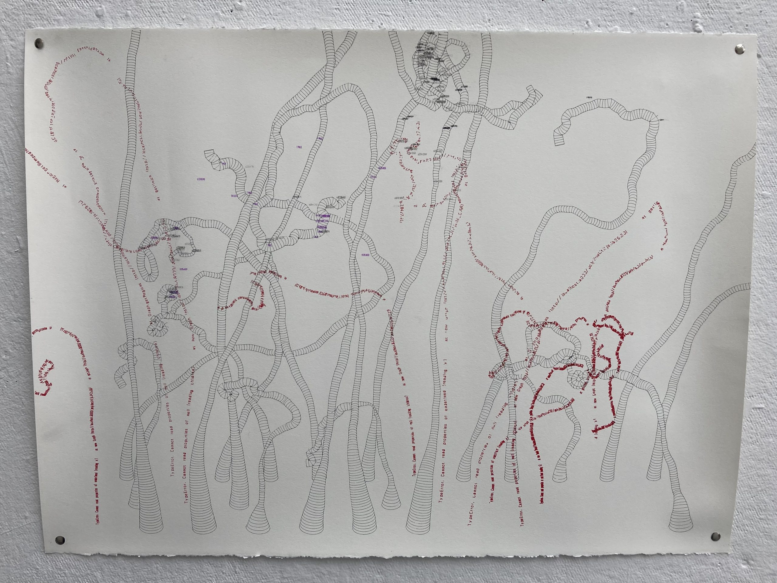
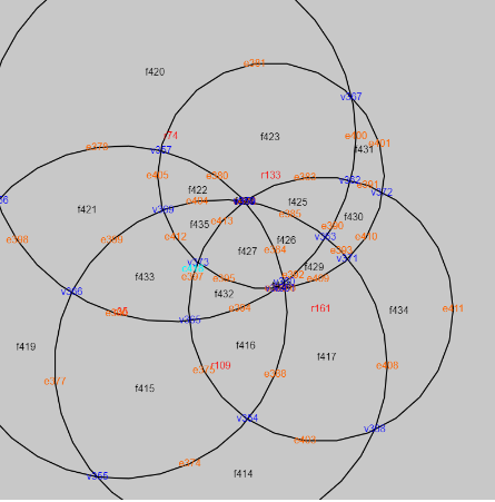
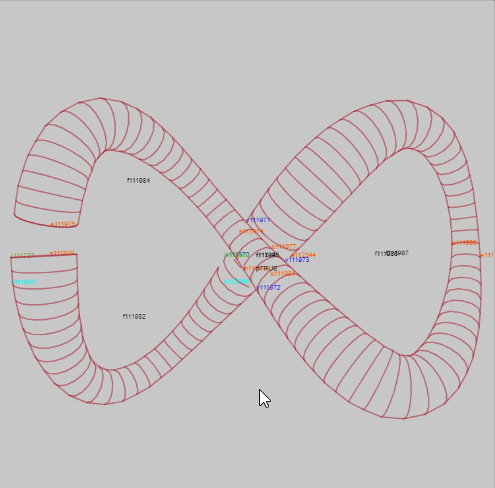
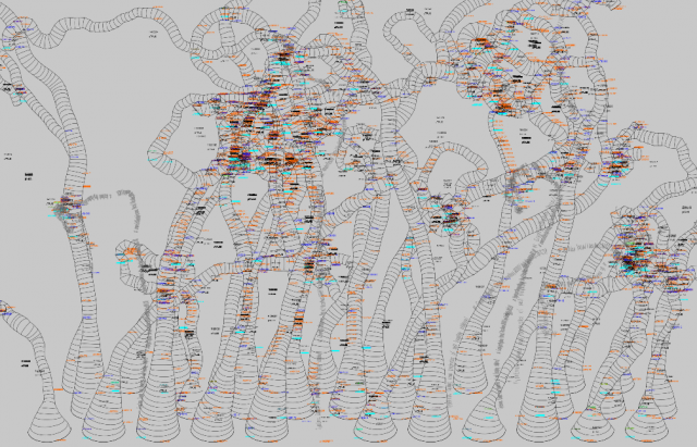
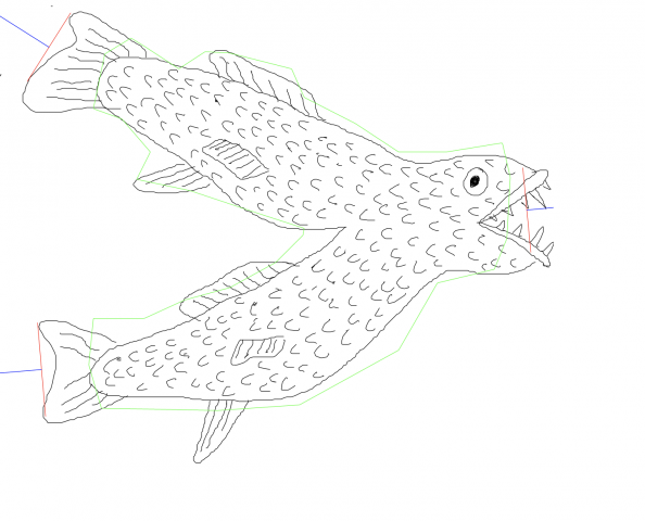
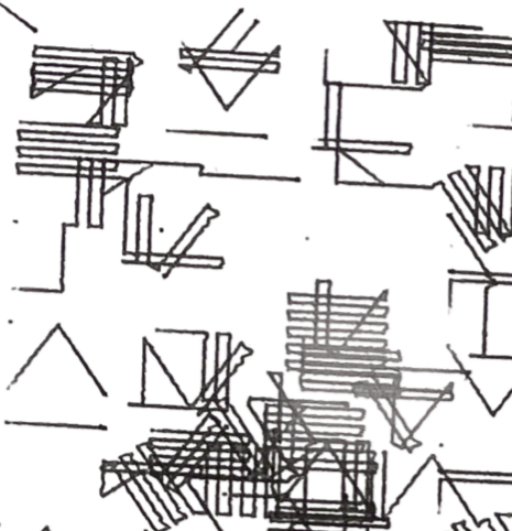
“Bug Noodles” consists of overlapping noodle tubes. The code generated a grid of noodles, and for each tube that threw an error, the error text and stack trace was drawn instead of the noodle. Some of the debug information was drawn too: the graphs that were computed to calculate the intersections/unions/differences of the noodles have vertices/edges/faces, which were drawn with pencil/charcoal/pen.
For this project, I initially wanted to use something like this as inspiration:
One aspect of it I noticed was all the overlapping tubes. So I set out to create a boolean library of my own to create arbitrary mutually and overlapping objects (and self overlapping). Here were some of my progress images and debug views:
I basically ran out of time for my original idea, because the boolean library was still too buggy for the original concept to really be feasible with only a few days remaining. Instead, I embraced the debug views that I had been steeped in for about a week (and had admittedly become fond of), and plotted those.
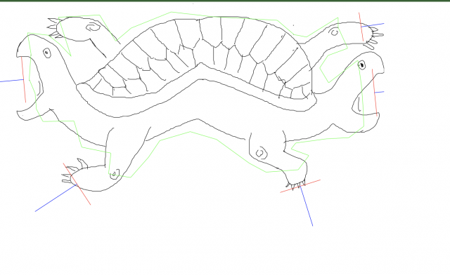
The drawings are saved as JSONs with a few key attributes: lines for the drawing, orient lines and their labels for how to assemble the drawing, polygon border for the edge of the drawing,
I then take these jsons and put them into a diff program for producing an assemblage.
The assemblage program does the following
load the drawings
randomly select a drawing to put it down
then it goes through the “orient lines” of that drawing, which serve as attachment guide, and then randomly selects a new drawing to attach at that place.
the program automatically orients the new drawing to fit the attachment from the old drawing. It uses the polygon border to prevent new drawing it placed down from touching old drawings. The “LIMB” label is accompanied by a few others to help determine what kind of opening should be fitted.
It keeps trying to place drawings until it fills all the openings
In the debug view below, it shows the green “polygon border” and the red and blue “orient lines” which direct how the drawings get assembled
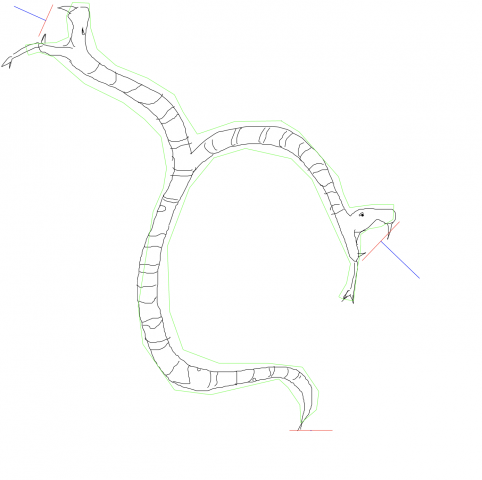
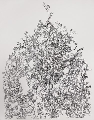
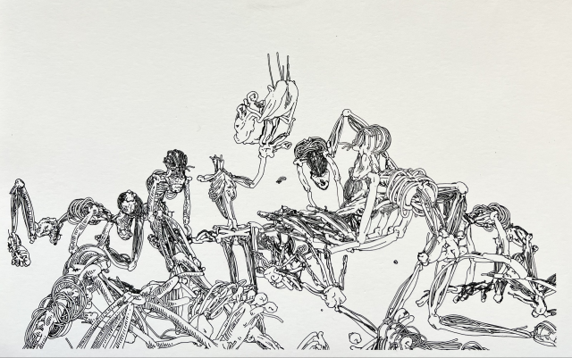
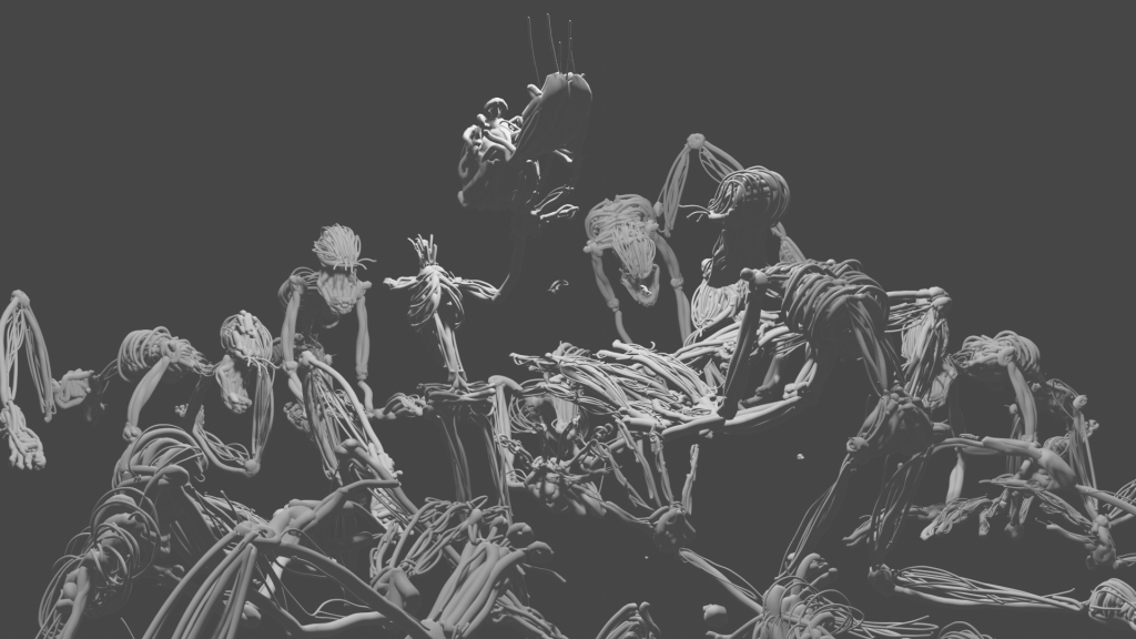
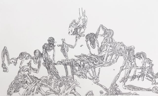
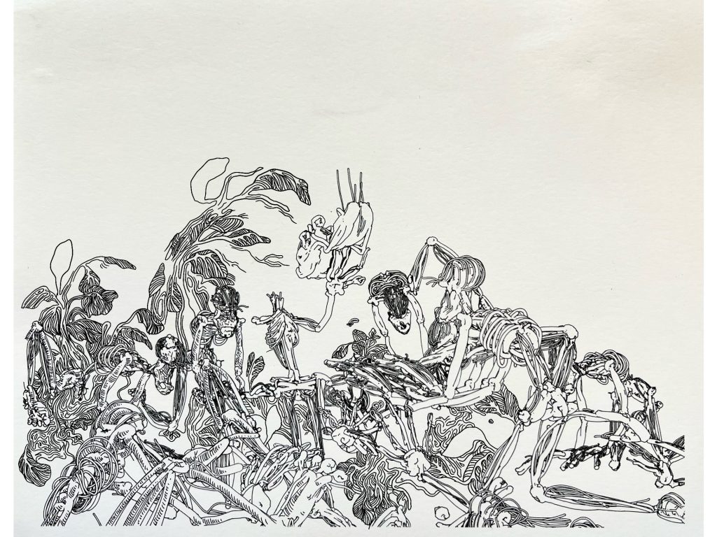
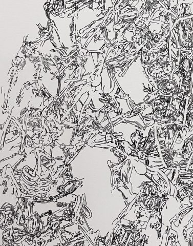
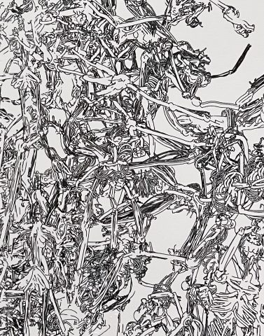
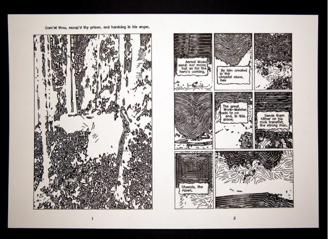
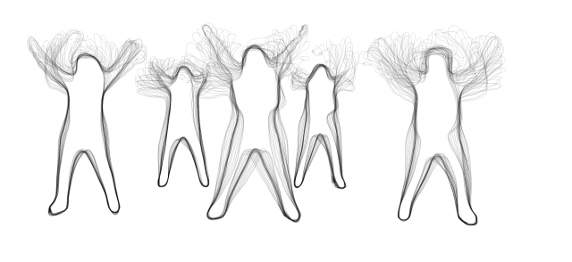
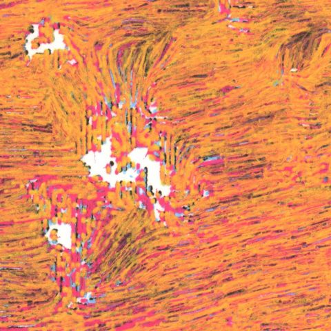
My final project for this class was a collection of several different plots of these skeleton-esque creatures in assorted configurations.
Inspiration
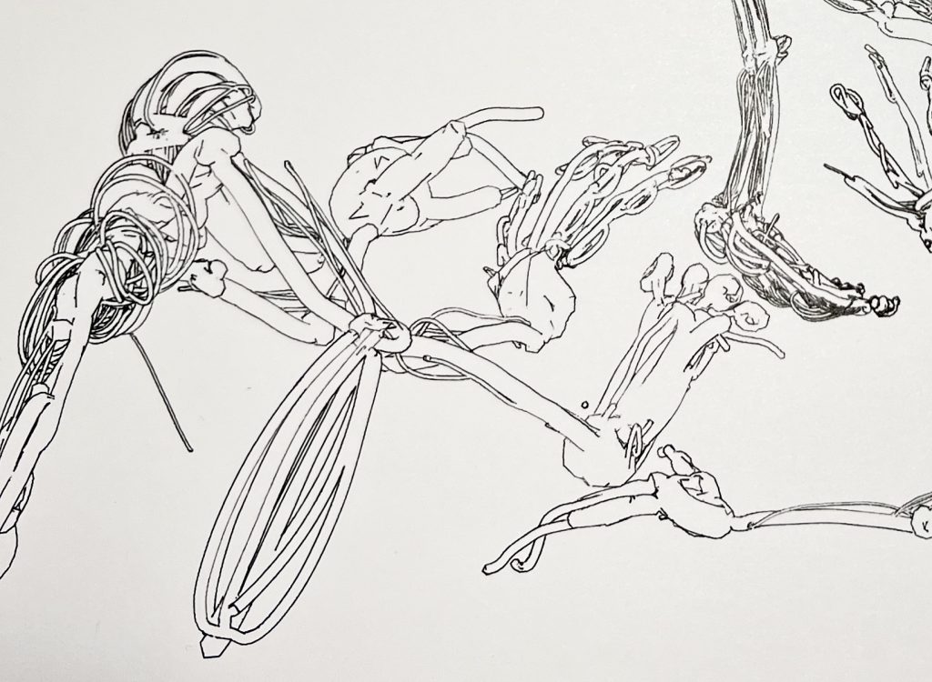
I am very drawn to artworks with busy, indiscernible compositions. Annabelle Gao’s Bicycle piece is a great example of this. What strikes me with these kinds of artworks is that most of its greatness/value is only found after some time has been spent appreciating the fine details.
I have also been interested in depictions of pain, longing, and any other pessimistic emotion. Kay Seyoung Lee’s hellscapes, specifically Harvest(2021), is another notable inspiration piece for me. The warped perspective is very intriguing, and I considered including this element in my pieces as well. I also love how non-distinct the subjects are.
Process
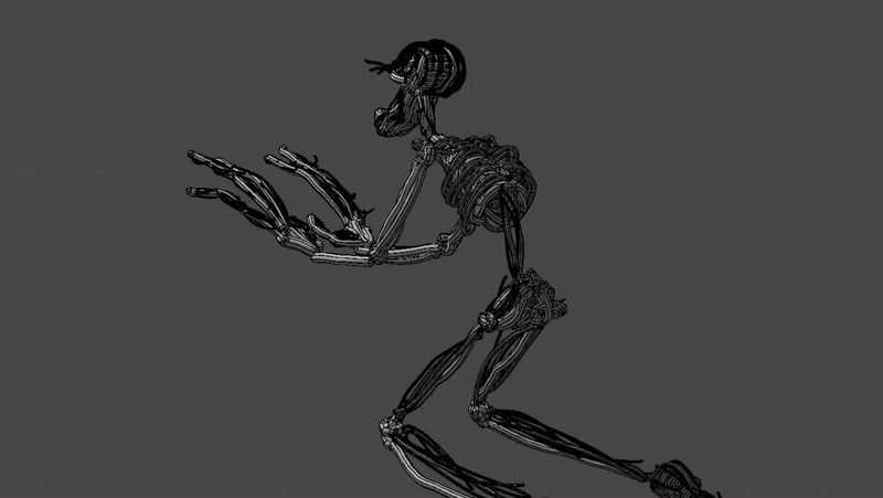
The piece began with my discovery of the Google Tiltbrush (discovery facilitated by Golan Levin). My practice usually lies in the realm of 3D CGI. However, drawing in VR gives what most 3D programs cannot do in that it allows for the act of drawing in 3 dimensions. This could be seen as a hindrance, but using this feature to my advantage, I created a skeleton-like creature made up of thin tube-like ropes:
From the Tiltbrush application, I was able to export my creation into Blender. Here I was able to set up a compelling composition.
Then I exported this as a plottable SVG.
Lastly, I took the same pen the plot was done in and added some detail. This was an intriguing idea to begin with, but I got carried away. The problem here is that it missed the busy, indiscernible effect and went more towards unfinished looking. The business looks accidental here placed next to the overbearing white space.
Another thing I was considering was drawing outside of the lines of the subjects in the background. This was an interesting idea as it further blends the distinction between machine-drawn and hand-drawn lines. However, my main qualm with this was that the objects I was drawing in the background did not match the original skeleton subjects. While perhaps visually similar, they themselves turned the story of the piece and made it confusing and wrong.
For my final composition I took care to achieve my desired busy effect, done with the help of Shiva Peri and Nikolas Diamant. The subjects were piled using physics in Blender. In a sentimental moment, or because I liked the white space, or maybe just because I was in a rush, I stopped the plot before it finished. This resulted in a nice variation of tone in the bottom half of the image to make the contrast between the top and bottom less intense.
More Images
Final Takeaways
This project was influential for me personally in that it allowed me to explore the usage of machines in the drawing process without having to code. I was able to familiarize myself with one new medium rather than two at once. It also forced me to be very uncharacteristically precise and intentional with my materials, something I had to learn the hard way(evidenced by my many failed plots). Another influential aspect was the usage of Tiltbrush as a part of my creative workflow.
I appreciate that the ambiguity of the precision of the linework contrasted with the manmade feel of the subjects themselves hints at the process I went through to actually make the piece; However, I wish it was a little more clear. Overall, the entire process was very inspiring, and I am excited to see where these new mediums take me.

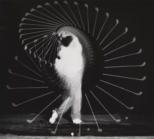


 Using this algorithm, I wrote a program which sorts a given video’s frames by the speed of the objects in each. The fastest-moving frames come first. I suppose we get the most excitement in the smallest amount of time this way. The number above each frame is the calculated speed of objects in it.
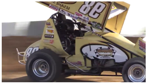
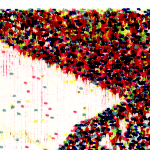
 The value of each pixel corresponds to the number of times the pen passes over it. The blank areas were then manually blurred by carefully brushing with water.
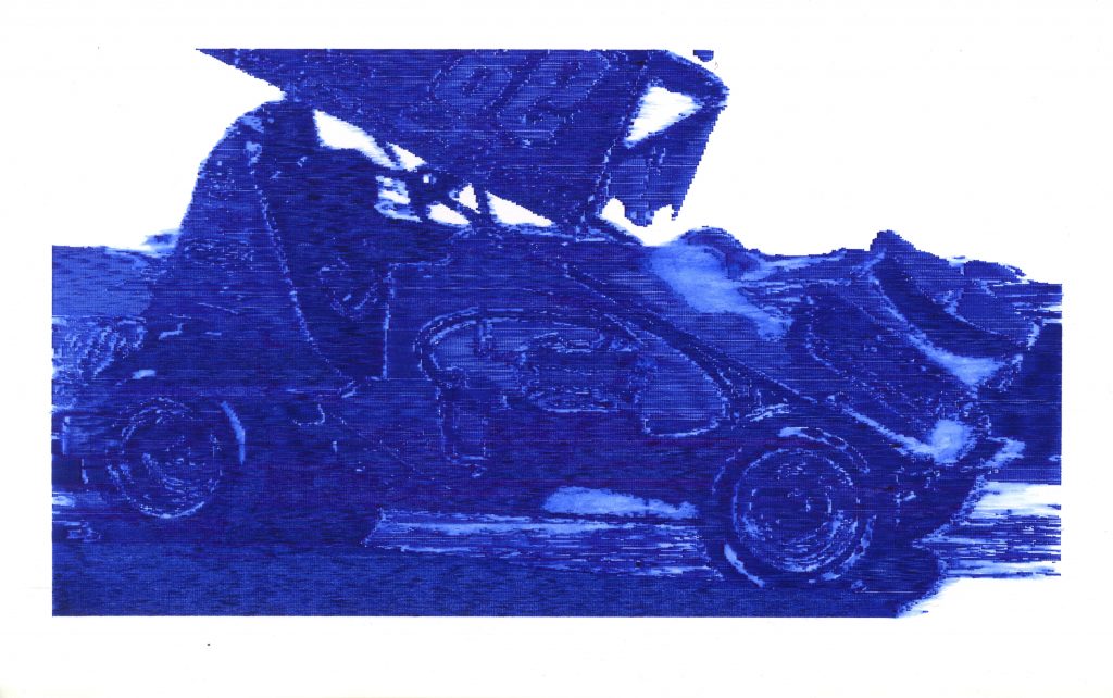

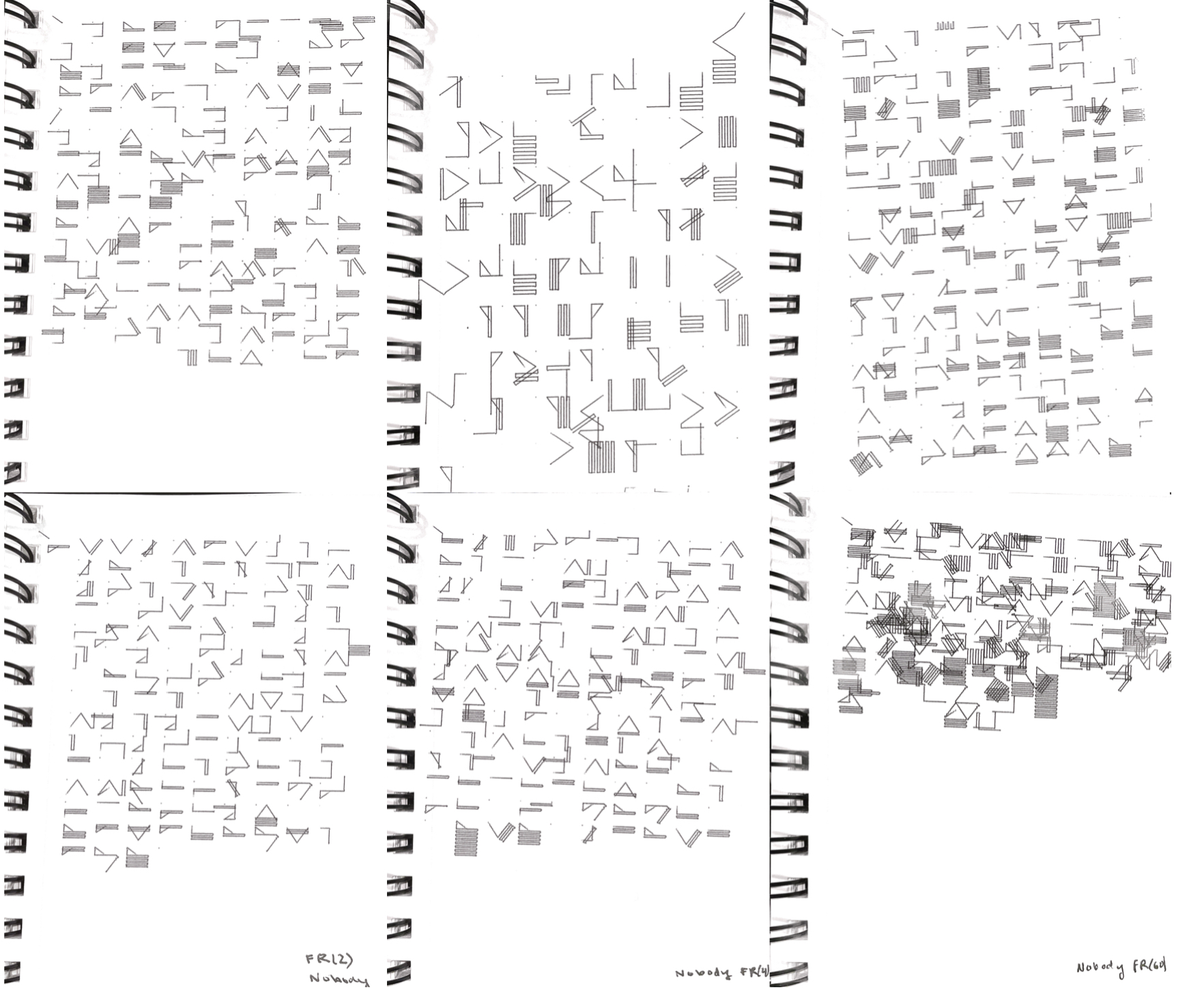
 < ^ The bottom three plots (and this close up shot) highlight the amount of variation (chaos?) that can be achieved by changing the frame rate. Processing usually calls draw() at 60 fps, but this created too many unpredictable symbols for my preference.