Title: History City
Description: Your browsing history says a lot about you. What if there was a way to visualize it? Take a look at all the pure (and not so pure) things you’ve been up to in a city-like visualization of your history.
60-461/761: Experimental Capture
CMU School of Art / IDeATe, Spring 2020 • Profs. Golan Levin & Nica Ross
Title: History City
Description: Your browsing history says a lot about you. What if there was a way to visualize it? Take a look at all the pure (and not so pure) things you’ve been up to in a city-like visualization of your history.
Title: History City
Description: Your browsing history says a lot about you. What if there was a way to visualize it? Take a look at all the pure (and not so pure) things you’ve been up to in a city-like visualization of your history.
What is Your Project: a history visualizer that builds a city based on the type and frequency of sites you visit.
What Makes Your Project Interesting: we’re never used to looking back at our browsing history because of how its portrays a darker, more secret side of us that we wouldn’t show others. Normally we want to forget/clear our history, but instead of running away from our browsing history, we can now visualize it.
Contextualize Your Work: visually I was inspired by the Three.JS app Infinitown (https://demos.littleworkshop.fr/infinitown) that tried to produce a bright, low-poly city that would stretch on forever. Rather than just random building placement, I wanted to use data to help generate the city.
Evaluate Your Work: The resulting work looks visually impressive, although with more time I would like to focus on city diversity (getting more distinct cities when you input more distinct browsing histories).
Documentation:
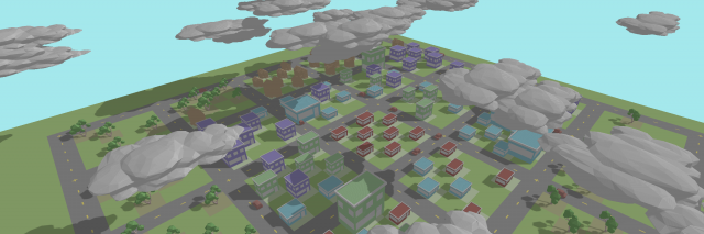
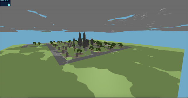
Loading a city with a high pure value.
Loading a city with a low pure value.
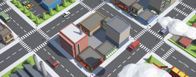
Clicking on assets to view what sites they are backed by.
The Process:
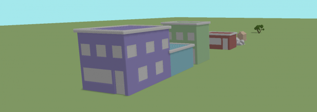
Given a JSON of a person’s browsing history, the parsing script initially cleans up entries by grouping together link for the same domain name and accumulating site frequency. On a second pass, the script tries mapping each url to an asset type [“building”, “house”,”tree”] depending on the contents of the webpage. The script scrapes the inner html and extracts the top K unique words that frequently occur in the site that don’t occur in other sites. Using these words and a synonym dictionary, the script maps the url to an asset type depending on the connotation of these words:
“building” – corporate, shopping, social media
“house” – personal, lifestyle
“tree” – learning, donating
After the mapping is computed, the Three.JS interface loads an instance of each asset. For each url, the corresponding asset is placed, and its size is determined by its frequency. Using Three.JS’s ray-tracer, we can compute the cursor intersection with an asset. On the instance an asset it hovered over, a portion of its material will turn to an orange highlight, and clicking the asset will open a new tab with the url that asset represents.
Roads are generated around 5×5 cell regions. Starting in the center and moving in a spiral motion, each new asset it placed in the initial center 5×5 region while not overlapping with any other asset. If no room exists after a set number of tries, then it moves to the next 5×5 region. This continues to expand the city the more url’s there are to load.
A purity variable captures the ratio of buildings + houses to trees. A more pure city will have no clouds/pollution and no cars on the road polluting. A non-pure city will be dark and have a lot of polluting cars on the road with a lot of dark clouds covering the sky.
For the visualizing aspect, I got a simple city layout woking in Three.JS. Based on some prior browsing history parsing, I was able to figure out which websites associated to what objects (skyscrapers, windmills, trees, houses, etc.). The size of the objects are determined based on the frequency each link was visited, and clicking on the object will open the site, so you know which sites were visited frequently.
For the future, I would like to make the city more customizable to a person’s history.. I would also like to spend more time on parsing the browsing history, ultimately reducing it down to a purity parameter. Some examples I have are changing the cloud density, background and land color, light color and strength based on on the purity of the browsing history
My April plan is to make a final project that attempts to visualize someone’s browsing history as a city. It is difficult to say how far I’ll get in this (especially considering all my other courses ramped up in difficulty, so I haven’t been able to think much of this course in the past two weeks). At the very least from my talk with Golan, I would like to spend a substantial amount of time parsing and finding meaning representations of a person’s browsing history. More than half of this project is figuring out what the data means, what the trends and frequencies are, and overall what this says about the person. I’d like to focus my efforts on trying to (from a high level) classify and describe a person’s browsing history using as few descriptors as possible. From there I can work out the visuals such as how I want to display elements of the city (such as buildings, trees, roads, etc.), but even if I do not get to this stage it is alright. I want to spend more time in the planning aspect and carefully understanding and analyzing the data I’m working with rather than jumping to the visual sides of things.
Some attempts I may try at data analysis:
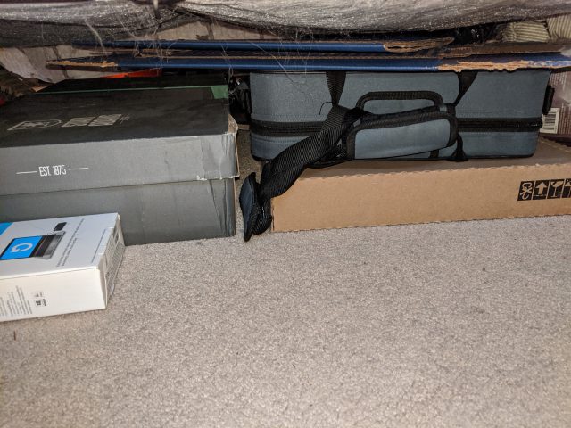
After taking a flash photo under my bed, I realize how much old packages, shoe boxes, and a clarinet that I have under my bed. Maybe one day during this self-isolation I’ll take out the clarinet and give it a try…
I’ve known types of videos like this Tetris video, but never knew that these forms of videos were known as pixillations. Another cool video I stubbed upon recently was this Gatorade ad where they were able to trigger water droplets falling to create the shape of a human in a running pose, and stitch these poses together to make a human walk cycle.
I think it would be cool to have a capture system that would stitch together frames of people moving left to right in a walk cycle, but each frame switches to a taller person. The person could be walking in a 3Q motion that is away from the camera, so that they appear to get smaller, yet since the capture system would switch to frames of taller people, their height would stay relatively constant during the duration.
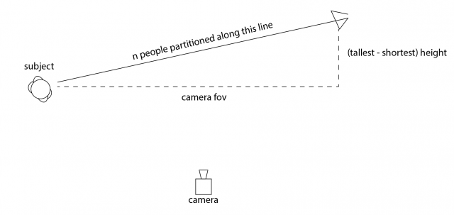
Above is a sketch of the mechanism, where each person would have a walk cycle video of them stepping on the same footholds (for alignment purposes), and in post-processing a frame frame each person can be taken to create the walk cycle.
3 Ideas I had for the project:
Population Flux is a typology machine that measures the different population trends of people in rooms and how people tend to move in and out of rooms (individual/group) in order for viewers to see how busy rooms are at certain times. I built a machine that would save the relative times when people would enter a given room, and use a graphics API to visualize the data.
Check out the GitHub Repo here.
– Setup – [TLDR Shorter Setup Description in Discussion Section]
The entire operation only requires 3 terminal launches! (serial port reader, web socket connection, localhost spawning). A roadmap of the communication layout is provided below.
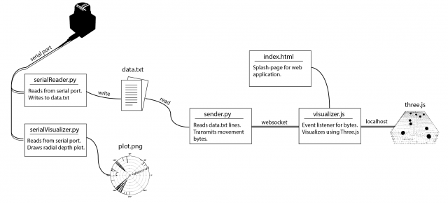
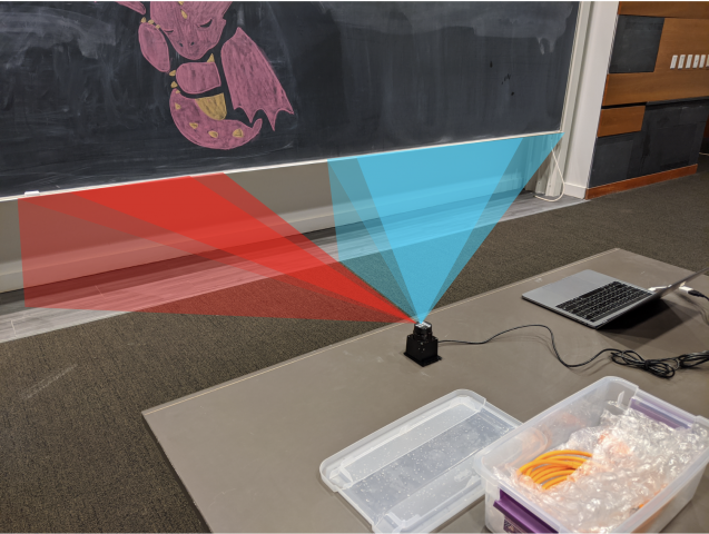
The involved setup was a Hokuyo URG Lidar connected to a laptop. The Lidar provided a stream of ~700 floats uniformly around 270 degrees at a rate of 10 times a second. In order to capture the data, I used the pyURG library to read directly from the serial port of the USB-hub where the Lidar was connected to. Unfortunately the interface is written for python2 and required substantial refactoring for python3 (the serial library that pyURG uses requires users to send bit-encoded messages with python3, which requires additional encoding/decoding schemes to get working with python3).
On startup, the program averages 10 captures in order to capture the room’s geometry. While the program reads from the Lidar, any data captured will have the initial room’s geometry subtracted from it so that all distances are negative (this is based on the assumption that the scene’s geometry does not change over time).
When a person walks at degree angle d in front of the Lidar, then region around d will return closer distances than before, and the resulting data after subtracting the scene’s geometry will be a wide negative peak at degree d. In order to get this exact location d, the data from each frame is sequentially parsed in an attempt to find the widest peak. Thus, at each frame, we can capture the location (in degrees) of any person walking in front of the Lidar.
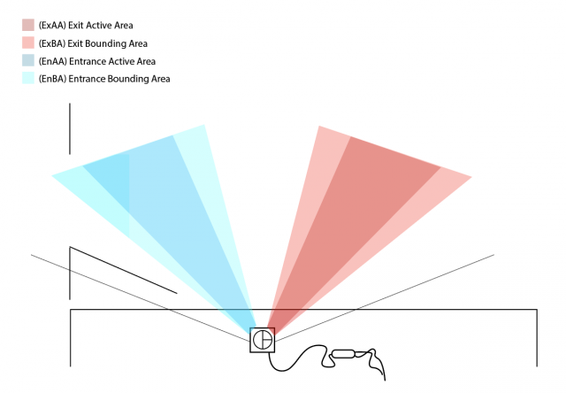
The next step is to determine the direction of movement, as it can be used to determine whether a person enters or exit a room. The Lidar’s view was discretized into 2 regions: the Entrance Active Area (EnAA) and Exit Active Area (ExAA), each containing a range of valid degrees that the area encased. When the user walked into EnAA, the program would push onto an entrance queue the timestamp of the detection, and when the user walked into ExAA, the program pushed the timestamp onto the exit queue. When both queues had at least one value on them, the first values were popped off and compared. If the enter timestamp was less than the exit timestamp, then the program would write the action as an “enter”. Otherwise, it would be written as an “exit”, along with the most recent timestamp of the two.
The biggest errors that would arise from this is getting multiple entrance timestamps added to the queue everytime a person stood in EnAA. To resolve this, a few steps were taken:
The resulting data was written to a text file in the form “[path,timestep]” where path was a boolean [0,1] indicating an enter or exit, and timestamp was the frame number in which the detection was made. Another python file would then read from the text file. It would then connect over web socket to the javascript visualization file and send over a series of bits denoting the number of enter and exit movements at any given timestep. The python script would do this by keeping track of the time of execution of the program, and anytime the timestamp of a particular datapoint was surpassed by the program’s time, then that point (0 for enter, 1 for exit) was added to the data stream and sent over web socket to the javascript file. This would allow users to replay pre-captured data in realtime, or speedup the playback by scaling up/down timesteps.
The javascript visualization was done in Three.js. Using a web socket listener, any incoming data would trigger the generation of new spheres that would be animated into the room. This way, viewers could see not only the number of people, but at what points people enter/exit the room, and if they move individually or all at once.
– Data –
The following data was captured over ~1-1.5 hour periods to measure the population traffic of rooms at different times.
Studio Space (Class-time) [30x speedup]
Studio Space (Night-time) [30x speedup]
– Discussion –
For this assignment I plan on measuring the population density of different rooms on campus. Such information would provide us with how crowded certain rooms are during the day and what rooms people tend to prefer at what times. This app also has applications in assisting people trying to find free rooms for studying.
The “machine” for this project would be a pressure plate that is configured at the entrance of a room in front of the door. When people walk into or out of the room, the pressure plate would detect the footstep of the person. The problem then arises as to whether the pressure denotes an ‘enter’ or ‘exit’ movement. Since most people walk with the back of their foot hitting the ground before the front, then the direction of pressure would indicate the type of movement.

This information would then be sent to a computer which would visualize the data. A translucent building schematic with red dots would indicate the presence of people in a room. While we would not know the exact location of these people in the room, we would still know the population density, which is useful for estimating which rooms are crowded at what times. Ultimately this resource can give students and staff an average indication as to when what rooms are free and/or have available working spaces, while also giving us information to multiple questions such as:

The inspiration for this project was mostly from spy movies where they would use a translucent grid to track people with red dots (The above image is from a video game [Jedi Fallen Order] but has the same premise). The idea sounded really unique, and I wanted to see how well I could emulate this given just a computer and pressure plate.
A great example of non-human photography is the following paper on Computational Imaging on the Electric Grid (http://www.dgp.toronto.edu/ACam/). Using a high-speed camera, researchers were able to sync the frames with the changes in the electric grid. They discovered that instead of providing power to every house in a city, the electric grid instead switches between 3 different groups, providing power to one group at a time to not overload energy throughput. The switch between groups is so quick 1/1000 of a second, that we never notice that our lights are actually flickering.
New technology, as stated by Zylinska, indeed advances our ability to capture non-human photography. Every year, vision conferences are able to find new ways to detect objects invisible to the human eye because of new sensors that can sense past human ability. The saying that technology helps us see the world in a new way is true in that technology strengthens or gives us new senses. The world is full of data, and new technology helps us collect it.