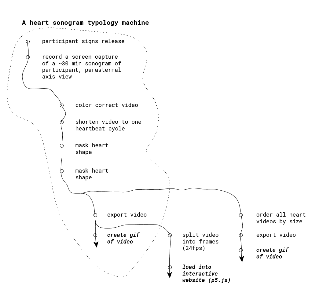
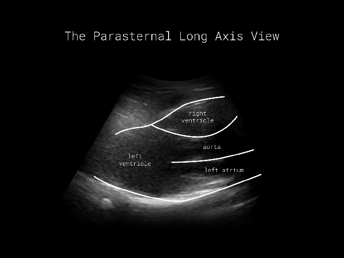
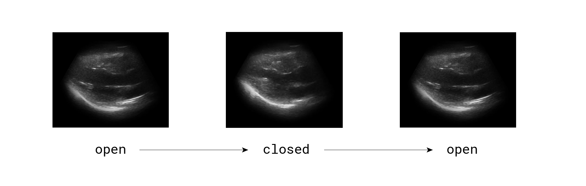
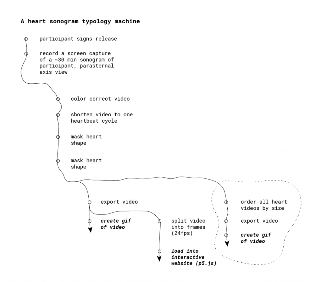
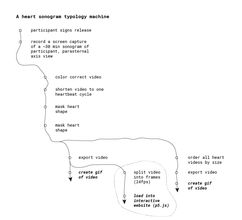
15 Bricks


Summary

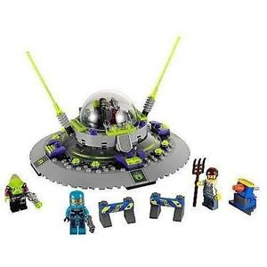
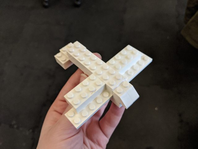
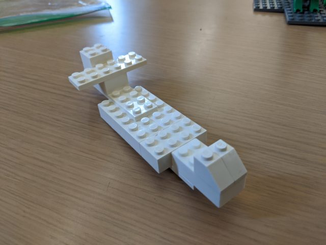
“15 Bricks” is a partial typology of Lego airplanes that are built with the same 15 Legos. These were obtained by asking different CMU students to build an airplane using all of the pieces in a set I chose. I gave 20 people the same 15 Lego pieces and asked each of them to use all the pieces to build an airplane. With so little to work with, they had to reduce the shape of a plane to its most important features, and each person had a unique approach.

Development Process

Initial Ideation/Planning

Of all the typology examples in lecture, I was particularly inspired by the ones that involved many people each contributing something creative, like Kim Dingle’s “The United Shapes of America.” I think these can serve as indirect portraits of the individual participants while also revealing patterns in our collective thoughts about something. I brainstormed things I could ask people to do and/or materials I could ask them to work with, and I landed on Lego as a fun, accessible medium that’s well suited for 3D shapes.

My initial vision as described in my proposal was that I would have a large (hopefully effectively limitless) pool of Legos that participants could use. I then would ask each one to build a spaceship, and I’d record a video of their construction process. I expected highly varied ships, and to really let people’s creativity run wild. Under this scenario, Lego would be simply the medium people were using to construct their spaceships, and it would be the theoretical spaceship designs that were ultimately being recorded and compared in the typology. That didn’t make as much use of the unique properties of Lego as I’d have liked, so I moved away from it and towards the version I ended up using: one where the limited Legos pose a very tight constraint on their construction.

Playtesting and Fine-Tuning Procedure

Now I had to make a few decisions, including what I was going to ask people to make and what bricks I was going to give them to do it. I decided on the first answer in a discussion with Golan. We went with “airplane” because it’s a fairly simple, familiar, and well-defined shape. Unlike, spaceships or cars, there isn’t too much variance in commercial plane design, so I can be pretty sure that most participants have the same thing in mind when they begin (though it’s okay if not all do). This would make it easier to meaningfully compare people’s constructions.

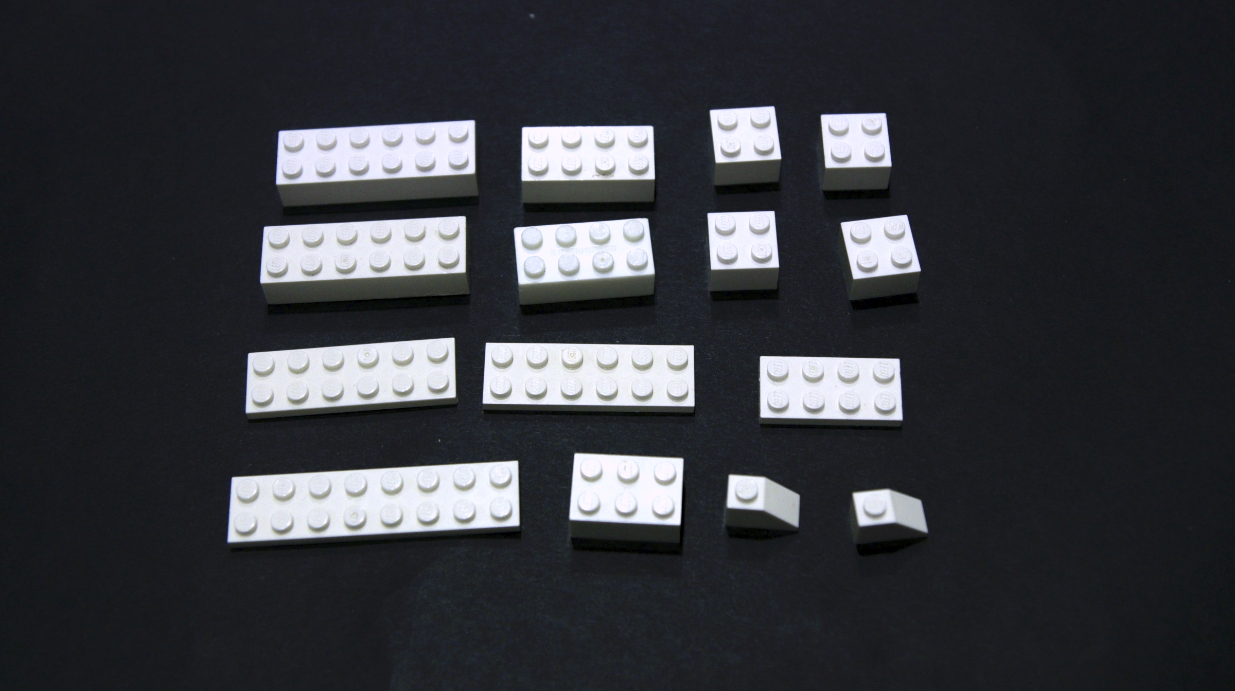
As for what Legos to use, I started by creating a sample set from a box of Legos Golan loaned me. I had a few heuristics in mind: if I believe that a certain piece would only be used one way by everyone (ie. a wheel or windshield) then it was off limits. I wanted to stick to pretty classic, blocky Legos. I also used only white pieces so color was a factor; I wanted people to focus on shape. I also wanted the set to have enough pieces that I got highly varied solutions (can you imagine how boring the 2-piece solutions would be?) but few enough that people had to sacrifice some details.

At about this time, I decided that I wanted to require that all Legos be used in the final construction. I thought that as long as this didn’t significantly hamper people’s creative freedom, it would be a lot more satisfying. The results become “ways to rearrange these same Legos into airplanes” instead of just “many Lego airplanes.”

A potential Lego set I was considering.
A beautiful biplane made by a pilot participant.
This pilot participant forgot to include wings on his airplane.

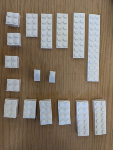
I tried out my brick set on many people before finding the one I ended up using. One very long flat piece from the original set was used by everyone as part of the wings, so it was no longer interesting, so I removed it. I also reduced the number of bricks slightly, as most people were finishing with bricks to spare and struggling to find uses for the leftover ones (I liked a little bit of this, as it gave me interesting features like wing flaps, exhaust trails, and wheels made out of bricks. But it got to be too much with some of my sets). I was also very pleased with my preliminary results, since the airplanes I was getting looked quite different from each other.

Interestingly, after I decided on my 15-brick set, I found this video of a similar 15-brick Lego building experiment (in this one, participants are given 15 random bricks and told to make anything they want, something I definitely did not want to do). So I guess I’m not the only one who found that to be a pretty good number!

Data Collection

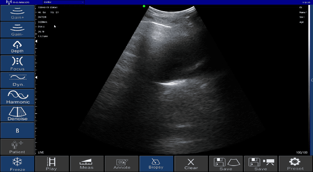
When I first started collecting my airplane designs formally, I wasn’t sure how I would present them. So, just to be safe, I thought I should capture the entire building process, in case I wanted to display the videos of every plane being created or make a list of all the steps people took.

My very enticing CUC table

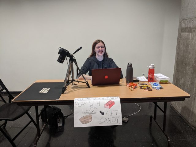
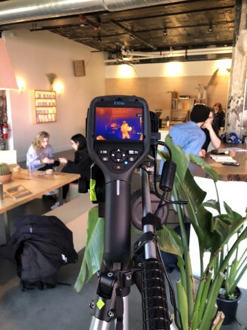
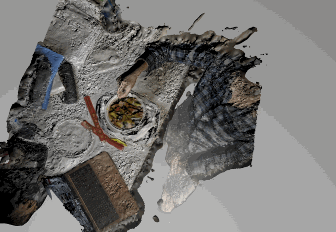
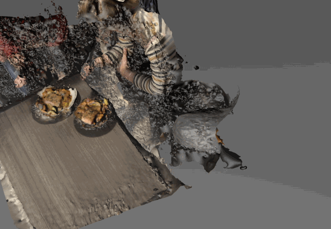
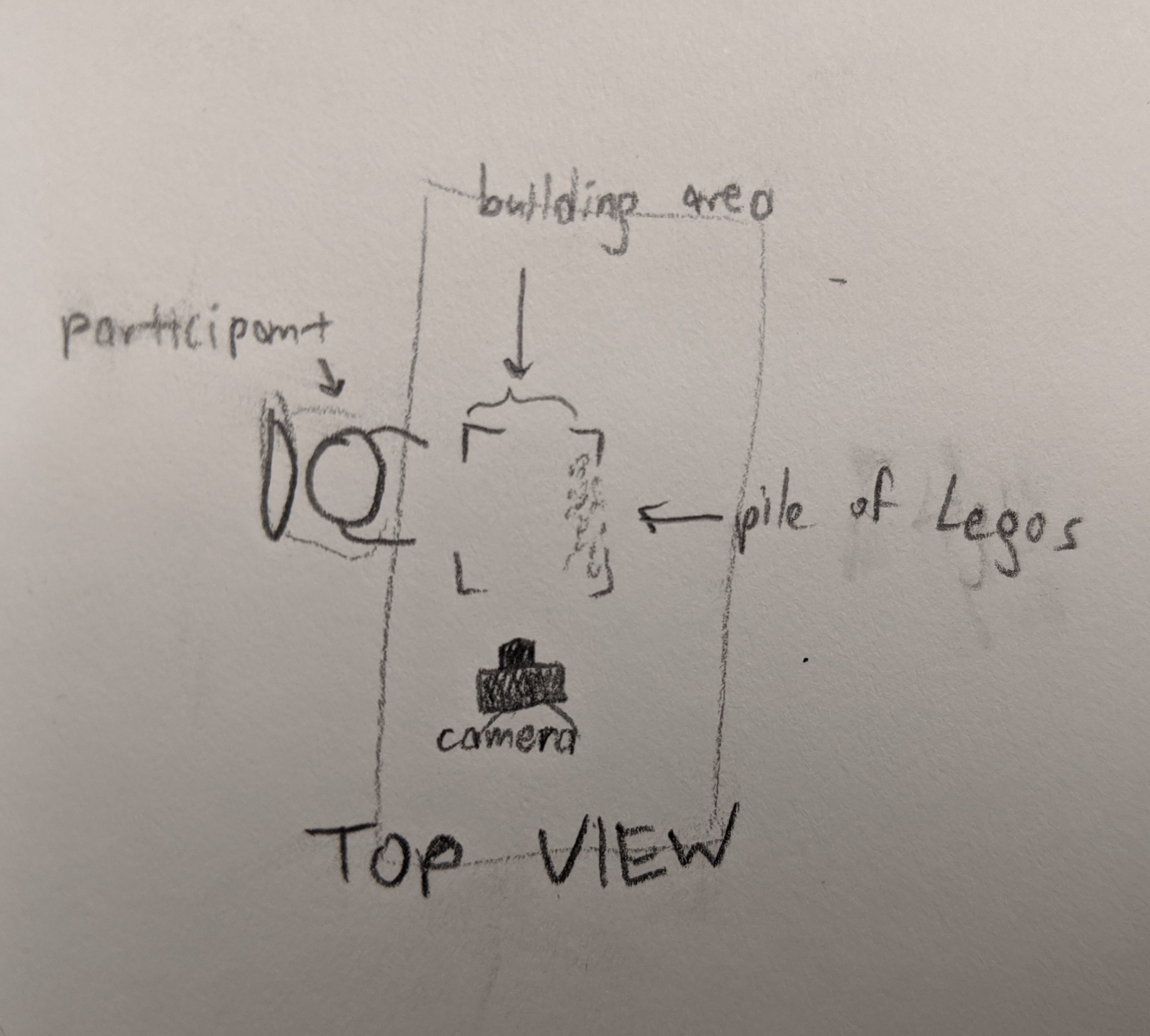
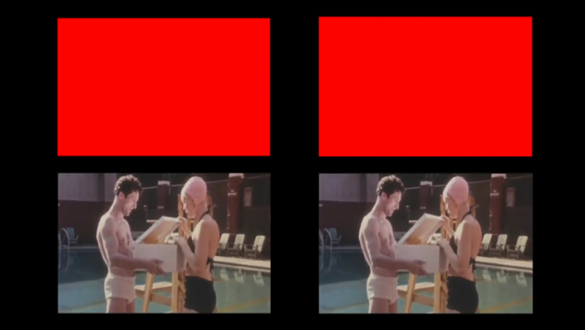
I set up a table in the University Center with the very enticing poster “Play with Lego, Get Candy.” I had a camera set up pointing at the Lego-building area, and I would record any time someone was building anything. I also had people sign a release saying I could use their design in this project and optionally use the footage of their hands in my documentation (which I ended up not doing). I got about fifteen volunteers this way. Some of them found very creative approaches to the problem that weren’t considered “valid” Lego constructions. Initially, I allowed people to do this, but I later decided that I shouldn’t, so a few contributions had to be thrown out.

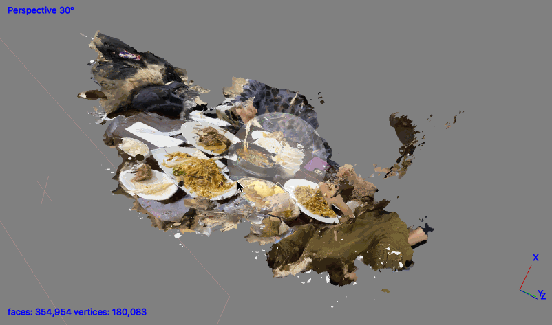
Once I knew that all I was going to need from people was their plane design (not the footage of their hands), collection was even easier. I’d carry around my little bag of Legos, and when I had a moment, would ask the people around me to make airplanes with them. Then I’d photograph every angle of the planes that were made. After this, I had a total of 20 valid airplanes.

Encoding the Airplanes

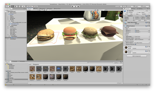
In my initial research for this project, I came across Mecabricks, an in-browser tool for designing Lego models. It has thousands of Lego bricks that you can use, a great interface for moving them and snapping them together, and it’s totally free. Best of all, it has an extension for Blender that lets you animate and render nearly photo-realistic images of your Lego models (if I had bought the paid version, I could have chosen just how scuffed up I wanted the surface of the bricks to look, and how many fingerprints they had on them–how cool!). If you want to make a Lego animation for some reason, I can’t recommend this enough. My only complaint is that the documentation for some features is pretty poor.

Me using Mecabricks in a browser

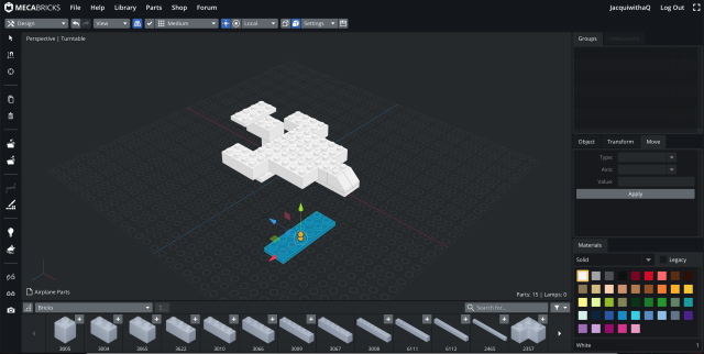
I decided to model and render people’s airplanes in Blender because I wanted their contribution to be not the physical figure they created, but their design. Mecabricks models let one uniquely describe a Lego creation with no extraneous detail–exactly what I wanted. It also allowed me to render them all with exactly the same lighting/camera conditions, which is always good for a typology. Finally, it’s a format that people can potentially explore in 3D (Mecabricks has a model-sharing website for this), without the loss I would incur doing something like photogrammetry. The only downside of this decision is that it meant I had to learn Blender, which while probably valuable was not very much fun.

Animating in Blender

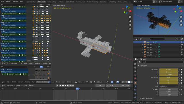
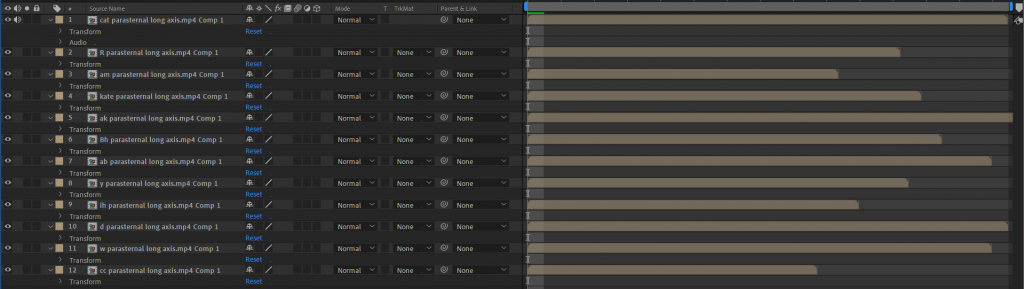
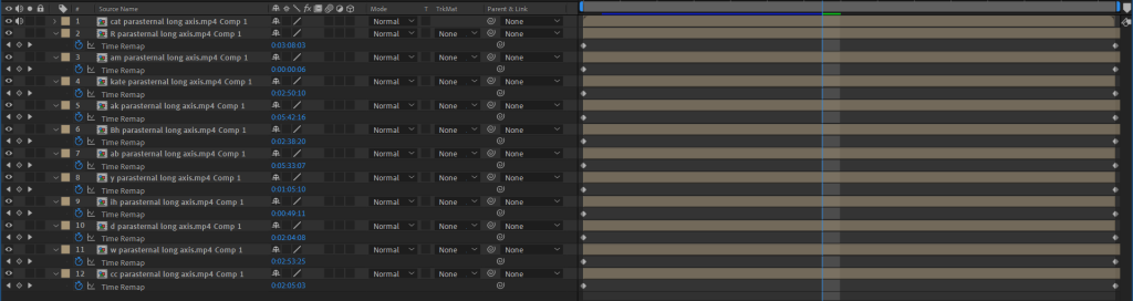
After I put all the models in Blender, I had the idea of animating transitions between them to really drive home the combinatorial element of this: it’s all the same blocks being rearranged every time. I ordered the airplanes based on my own subjective preferences, putting two next to each other when they had something interesting in common that I wanted to highlight. Then I animated all of the bricks moving, which took WAY longer than I thought, but also was pretty rewarding! I find the resulting video (top of this post)  extremely satisfying to watch.

Claimed a row of computers for rendering

Results and Discussion

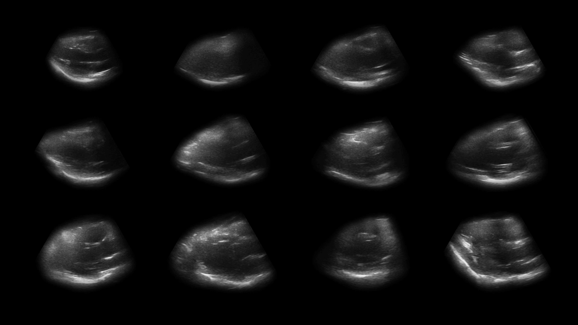
Below is an image of all 20 rendered airplane designs, ordered by participant first name.

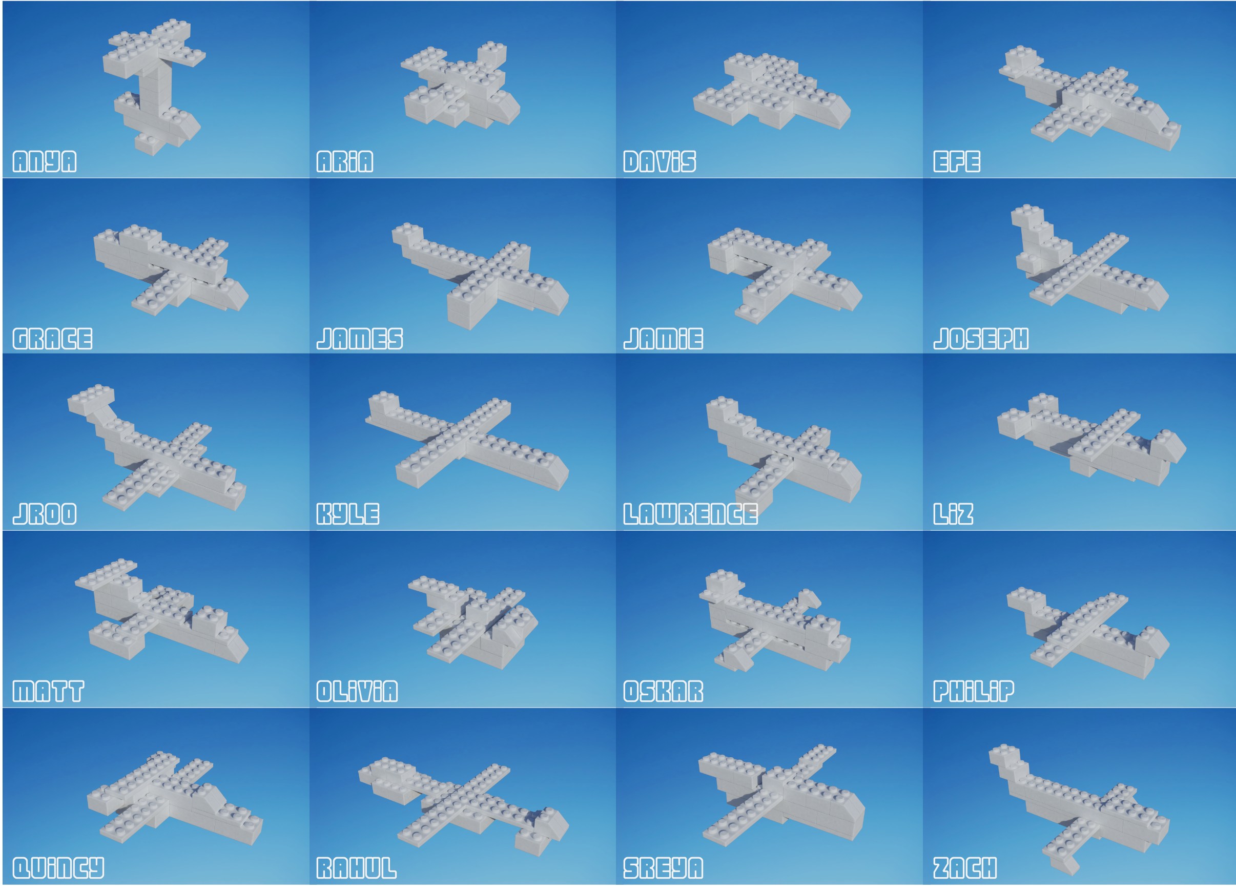
I have really enjoyed comparing and contrasting them so far. Here are some things I’ve noticed:

  • Most people used the small sloping bricks as the nose of the plane, but a few did put them on the wings or tail.
  • Many people used the two 2×6 flat bricks as the wings, but they were also popular as support bricks for the body of the plane. The 2×8 flat brick was a common substitute, but some people made their wings out of thicker pieces.
  • People had pretty different approaches to the tail end of their airplanes, with many adding some small crossbar, some making a very pronounced tail, and some just letting their airplanes taper off.
  • People LOVE to make their airplanes symmetric. 19 of the planes are symmetric up to overall shape, and 18 of these are symmetric even down to the exact Lego (somewhat impressive given the fact that I included some odd-sized Legos with no matching partner).
  • A few categories of airplane have emerged, like those that are just plus signs, or those that are triangular.

The similarities/patterns above are especially evident in the animated video, I think. You can, for example, watch the slope pieces sit there near the front for many planes in a row.

I’m really happy with this project, but I do wish there were a little more to it. I would love to try this again with a different prompt. Maybe I can get 20 people each to make a Lego chair? Or maybe I can keep scaling down the number of Legos and see at what point they converge with many people making the same thing? Hopefully I can pursue this in the future–I’ve had a lot of fun with this project so far!

Blink

Pre Warning: This post contains flashing images.

Disclaimer: I do not own any of the footage used, they are the property of the associated film studios listed below:

The Godfather (1972)- Paramount Pictures, Raging Bull (1980) – United Artists, The Matrix (1999) – Warner Bros., Whiplash (2014) – Sony Pictures Classics, Jaws (1975) – Universal Pictures


For my Typology machine I wanted to explore Walter Murch’s theory (as proposed in his book In The Blink Of An Eye) that if a film captures its audience that the viewers will blink in somewhat unison. Taking this, I expanded it and asked a series of questions:

1.) Will the audience blink in unison?

2.) Does Genre/The content of the film affect the rate at which people blink?

3.) Are there specific moments/edits you would expect the viewer to blink on?

4.) To what extent can the frames that one misses when one blinks summarise the watched scene?

How did I do it? 

Using Kyle McDonald’s BlinkOSC, I set up as below (just in a different space):

I had four participants watch the footage for me. These four cases were all recorded in the same room, I was sat on the same side of the table as them about 3 feet down so that they couldn’t see my screen but so that I could see the monitor and make sure the face capture was stable. I had Blink OSC modified so that whenever the receiver monitored a blink it would save a PNG of the frame at that instance they blinked, on top of this I had another version of the receiver going which oversplayed a red screen whenever someone blinked which was screen recorded.

I had the viewers watch 5 clips in this order:

1.) The opening sequence of The Godfather (1972) (WHY? This was edited by Walter Murch, so as to test Murch’s theory on his own work)

2.) The montage sequence from Raging Bull (1980) (WHY? Raging Bull is largely considered one of the best edited movies ever (according to a survey by the Motion Picture Editors Guild) and I chose this montage sequence not only as a very specific kind of editing, but also as a kind of editing that is fairly familiar to people (the home video))

3.) The bank sequence from The Matrix (1999) (WHY? A very action heavy scene with not only person but environmental destruction)

4.) The ‘Not Quite My Tempo’ sequence from Whiplash (2014) (WHY? Not only a very emotionally heavy scene, but also a scene from a contemporary movie lauded for its editing)

5.) The shark reveal scene jump-scare from Jaws (1975) (WHY?  A jump-scare, and another movie lauded for it’s editing)

They watched these will slight breaks in-between (time not only for me to setup the receiver for the next scene, but also for the viewers to somewhat emotionally neutralise).

The Results 
Firstly: Will the Audience blink in Unison?

The short of it: no.

At no point in any of the five clips did I have all 4 people blink together, I had a couple instances of doubles. I sorted these out by editing the videos into a 4 channel video and then scrubbed through for all the instances overlapped blinks happened. [The videos are too large for this website but they will live here for interested parties.]

Godfather:

Raging Bull:

The Matrix:

Whiplash:

Jaws:

Does Genre affect blinking?

To crutch the numbers on this:

For the Godfather I had an average of 109 blinks, over a 6:20 minute video = 0.29 blinks per second

For Raging Bull I had an average of 48 blinks, over a 2:34 minute video = 0.31 blinks per second

For the Matrix I had an average of 79 blinks over a 3:18 minute video = 0.4 blinks per second

For Whiplash I had an average of 80 blinks over a 4:21 minute video = 0.3 blinks per second

For Jaws I had an average of 17 blinks over a 1:24 minute video = 0.27 blinks per second

From this I can make the somewhat tenuous conclusion (I need to do the actual mathematics) that Action does indeed cause us to blink more.

Are there specific moments or edits you expect a viewer to blink on?

I would hazard a tenuous no.

The ‘jump-scare’ from Jaws:

The chair throwing scene from Whiplash:

While in this second case it is harder to distinguish an exact moment, I feel that the communal (/only 2 real responses at a time) is somewhat of a factor in deciding that there is no definitive communal moment when everyone blinked.

Summarising the scenes?

Now we get into a much more subjective domain. The below gifs are from all the collected blink frames.

We can conclude a individual’s sentiment of what was missed:

or

The shared communality of what is missed. (These are all presently different speeds, but I will re-edit them later)

On top of this, we can also scale this up to the original frame rate, which at a level explores notions of linearity and indeed the functioning of our eye.

Then there is a collectiveness of individual viewed content that I feel also spells a potentially interesting discourse in comparing our individual collectiveness of what we view through what we missed.

Going further:

1.) I had the stark realisation after I had recorded all my content that all of the clips I choose were predominantly male filled.  Thelma Schoonmaker (Raging Bull) and Verna Fields (Jaws) were both the main editors of their respective movies, but I feel this isn’t enough of a hallmark to balance it out. As such more varied/inclusive content rage should be a must going forward.

2.) This also in turn spells an interesting notion towards different contents of drama that might be worth looking at, ie how different kinds of emotion might affect how we blink.

3.) I feel more abrupt jump-scares would be worth looking at/Horror as a genre overall. The jump-scare itself has evolved a fair amount through time, and the contemporary horror might be worth comparing to older horror.

4.) All of my clips were viewed on a monitor and in singular format and then compared. While more indicative how the impact of how technology has affected how we view film today, I feel the idea of the group aura that is a part of viewing film in a cinema is worth looking at. This would entail a much more large scale capture, and mostly like a re-orientation of the technology I use.


Typology of Lenses

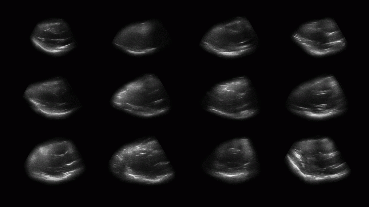
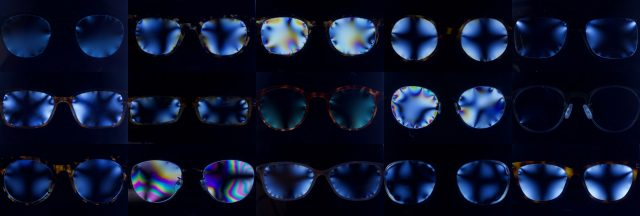
Many people are completely dependent on corrective lenses without knowing how they work; this project examines the invisible stresses we put in & around our eyes every day. 
I have worn glasses since I was 5 years old, and contacts since I was 8, but I’ve never stopped to think about their construction. In learning about polarized light, however, I realized that transparent plastic is not perfect; in fact, it is subject to stress that can be seen clearly when place between two perpendicular polarizing filters.
Source: Google Images
The goal: view the stresses in corrective lenses.
I: Contact Lenses
What are the stresses on my contact lenses? Is there a difference in stress between a fresh pair and a used pair? 
I wear daily lenses, which means I throw them out every night. Rather than throw them out, I saved my used contacts for a week, so I could compare their stresses with fresh ones.
The Machine
The machine was pretty simple:
  • Soft contact lenses (used & unused)
  • Linear polarizing filters (2)
  • DSLR with macro lens
  • Light table

I was excited to use polarizing filters because of how clearly they highlight points of stress; I hoped to see the tiny stresses in the things I put in my eyes every single day.
So I put a contact lens between 2 filters and…nothing happened.
Thus entered the experimentation phase.
Experiments
First, I did some research – why did this not work? Despite the objective “failure,” it was honestly really fascinating to learn how contacts are built.
Next, I tried a bunch of ideas:
  • What happens if you squish it? Stretch it?
  • Let it dry out & shrivel up?
  • Let it dry out and shatter it?
  • What about in the packaging?
At least the packaging looked pretty cool!
stretched, dried, and shattered lenses next to a hard plastic “fake” lens (which worked properly)
Somehow, even shattering the lens did not constitute “stress” for it. Crazy, right?
II: Glasses
Luckily, I had also brought my glasses as a backup plan.
What are the stresses on my glasses lenses? What do lens stresses look like for different people, types of frames, prescriptions, etc.? 
The Machine: 
  • Glasses (15 distinct pairs)
  • Linear polarizing filters (2)
  • DSLR with macro lens; fstop 8 & lowest ISO setting
  • Light table
process sketch


These photos were immediately more interesting. The hard plastic of the glasses made for better results with the polarization filters, plus the frames themselves exert those stresses.
To me, the most interesting part of it was not the stresses of a single frame, but in the comparison. Different frames show stress in drastically different ways. Some key interesting ones:
No imperfections at all, save for a tiny dent in the lower left. (Might be because of how the lens is attached – it rests in a little metal shelf, rather than screwed directly into the frame)
Wire frames tended to yield some more colorful results:
Thank you to everybody who donated your glasses to the cause – I really appreciate it!
III: Insights & Reflections
  • Glasses are a proxy for people. There’s a story to each lens/frame/wearer. Everyone apologizes for their glasses being dirty.
  • We put a lot of trust on glasses without knowing how they really work. They are not as perfect as we think.
  • “Experimental capture” is no joke – it truly is an experiment.
  • I succeeded in keeping it simple. Throughout my masters program, I’ve learned the importance of “doing one thing well” rather than trying to do it all. Especially in this class, there’s a lot of pressure to use all of the tools. I’m grateful I made a relatively low-tech machine; this helped me learn, adapt, and focus on the storytelling.
  • I failed in anticipating some of the challenges that could arise – I gave myself enough time for plan A but could have left more for plan B.
  • Selecting which frames to photograph is part of the machine. With more time, I could have been more strategic about location and context for choosing subjects.
IV: Future Opportunities
Now That I’ve learned a lot about lenses (for better and for worse), I’m curious about their imperfections. How might I visualize the stresses I found? Does this stress affect what the viewer actually sees?
Seam Carving
Seeing these distortions through the polarizing filters, I was immediately reminded of a funhouse mirror.
Source: Google Images
Thanks to a suggestion from Kyle, I learned about Seam Carving and explored this a bit. Seam carving is usually used for resizing an image without losing “important” data; it preserves the spaces with the most “energy” and algorithmically carves away the less valuable things in between.
For scaling down, this pretty much looked like a “crop.” Not very interesting here. But for scaling up, I started to see some fun distortions.

UV Experiments
In trying to figure out why the polarizing filters didn’t work, I also learned that some contacts have UV blockers. Here’s what a few different brands look like under UV light:
source: google images
With a UV camera, some interesting future experiments could arise. If I took a UV self-portrait, what would my eyes look like?

The Virtual Artifact Gallery

This virtual gallery  displays tangible objects captured from real life, accompanied by their mundane and iconic representations from popular video games.


I originally had an idea to curate a similar gallery, which would include samples of real textures alongside their renderings in different styles of illustration. I wanted to capture the process of reconstructing tangible perception in a medium as abstracted as illustration. I eventually found that the variations between styles weren’t cohesive enough to create the type of collection I wanted, so I thought of collecting 3D models, specifically low-polygon models created for video games. This type of modeling is a medium that is abstracted enough by its limited detail, and can assume endless varieties of recognizable forms. It also incorporates some of the gestural aspects of illustration that I was trying to capture, through both the applied image textures and the virtual forms themselves.

I thought of using video game models for my typology when I was browsing  The Models Resource looking for models to use for a different experiment. The Models Resource  is a website that hosts 3D models that have been ripped from popular video games. I first noticed that a lot of the models had been optimized for speed and had interesting ways of illustrating their detail with a limited amount of information.

The following are some of the titles from which I sourced models:

  • Mario Party 4 [2002] – Wario’s Hamburger
  • SpongeBob SquarePants Employee of the Month [2002] – Krusty Krab Hat
  • SpongeBob SquarePants Revenge of the Flying Dutchman [2002] – Krusty Krab Bag
  • Scooby-Doo Night of 100 Frights [2002] – Hamburger
  • Garry’s Mod [2004] – Burger
  • Mario Kart DS [2005] – Luigi’s Cap,
  • Dead Rising [2006] – Cardboard Box
  • Little Big Planet [2008] – Baseball Cap
  • Nintendogs Cats [2011] – Cardboard Box, Paper Bag
  • The Lab [2016] – Cardboard Box
  • Animal Crossing Pocket Camp [2017] – Paper Bag

I decided to use photogrammetry to bring physical objects as seamlessly as I could into virtual space. I wanted to contextualize these artifacts which had been stripped from their intended contexts alongside virtual objects which we might consider to be “more real” due to being representations of photography, rather than abstract visualizations.

I think that this collection of hamburgers is the most jarring, as it frames a convincing representation of something commonly ate and digested as the plastic and rigidly designed product it truly is. The bun of this McDonald’s double cheeseburger was stamped by a ring out of a sheet of dough, the patty was stamped into a circle by another mold and the cheese was cut or sliced into a regular square – all automated processes of physical manufacturing done with the intent of assembling this product for somebody’s enjoyment.

I noted that many of the examples I found were mostly or entirely symmetrical. I think this symmetry reflects our physical ideals of the products we interact with and consume. A virtual object can exist in an absolutely defined state, rather than existing as the expression of this definition which is only similar enough within manufacturing tolerances. These manufacturing tolerances exist in most of the objects we interact with, and even the food we consume. We seem to use symmetry to indicate the intentionality of an object’s existence, which coincidentally or not, is also used for making most organic bodies. When a video game character is designed asymmetrically, it is usually done so deliberately to call attention to some internal imbalance or juxtaposition.

In retrospect, the disruptions of the photogrammetry – especially in the empty box model – seemed to manifest the essence of our fleeting, tangible perceptions of certain objects compared to others. The items that served as packaging for a product, to be discarded or recycled, are missing information as if easily forgotten.


Sciurious

My typology machine is a system for capturing ‘human speed’ videos of squirrels in my back yard interacting with sets that allowed for their behaviors to be anthropomorphized in a humorous and uncanny manner. It was important to me that the sets and the animals interactions felt natural but off, playing with the line between reality and fiction.

I used the Edgertronic high frame rate camera to capture these images, and over the course of 4 weeks have trained the squirrels in my yard to repeatedly come to a specific location for food.

Initial question: what lives in my backyard? what brings them out of their holes? and can I get them to have dinner with me?

Inspiration

Typology

Project link: https://www.lumibarron.com/sciuridaes
instagram @sciuriouser_and_sciuriouser

Process

Bloopers:      https://www.lumibarron.com/copy-of-sciuridaes

Sets Images:

Set Up:

Observation window set up – 100ft Ethernet cable leading from camera in greenhouse to laptop – image projected onto an external monitor for larger view and to allow other work to be done while waiting for the squirrels to make their way to the table.

an initial table set up – while still attempting to get the squirrels to sit in chairs. Soon realized that this was not feasible. Squirrels are incredibly stretchy.

Challenges:

One of the greatest challenges arised from the limitations of recording time and processing/saving to memory card speed capabilities of the Edgertronic. At a full resolution image (1280X1280) at 400fps the longest possible recording time capped at 12.3 seconds. The then processing time for this footage took just over 5 minutes. This heavily limited the amount of footage or interaction captured, as often once the video was done saving to memory, the squirrel was long gone with much of my tiny china in tow.

I ended up setting the image capture time to a shorter amount – approx. 2 seconds. This made for a significantly faster processing time and more opportunities to capture multiple shots of a squirrels interaction with the set. This also meant, however that if an interaction was captured too soon or too late, the interesting/looked for interaction was often cropped short or missed entirely. With this camera a motion tracking trigger system would not have been a useful tool to use for this project.

Another limitation/challenge was the dependency on very bright light for good images on with the high frame rate recording. Clouds, indirect sunlight, shadows from trees, too little sunlight all significantly darkened the images. I was not able to find a set up for the external light that kept it safe from the elements for an extended time and successfully lit the set as well. Footage had to be taken in a limited time window and luck of weather played a very large part in the success of the images.

Initial ideation:

Project Continued

This is a project that I will be continuing to work on throughout the semester for as long as the camera is available. The squirrel feed has attracted deer recently and I would like to begin to play with sets for different backyard creatures at different frame rates (from insects to deer, chipmunks and groundhogs). This is a project that I have enjoyed doing immensely and I have set up a system that allows me to maintain my other work activities while simultaneously observing the animals.

24 Hour Thermal Time Lapse

24 Hour Thermal Time Lapse captures the thermal flow of spaces people actively inhabit and present the 24 hour long findings in 2 minute compressions that would otherwise be invisible across both time and temperature.

Joseph Amodei
MFA Video/Media Design in the School of Drama


My project was a process of using the technology of thermal capture and employing it over an entire day to create time lapse observations of spaces full of human activity. I often begin my work with a specific pointed conceptual and political outcome, and here I wanted to disrupt my normal way of working by forefronting a capture process that observed spaces of interaction and showed them in a manner that would not be otherwise visible – through the movement of temperature and through the cycle of an entire day compressed into two minutes. The spaces I captured were a costume production shop, a design studio, KLVN coffee shop, and the space outside of my studio window which is a street on a bus line on the edge of Pittsburgh and Wilkinsburg.

Thermal Capture System at KLVN Coffee:

Thermal Capture System at KLVN Coffee Thermal Capture System at KLVN Coffee

My Thermal Time Lapse Capture System:

Thermal Capture System

My process developed through the technical hurdles and limitations of discovering how to capture space over 24 hours. I used the FLIR E30bx Thermal Camera in conjunction with the media design software Millumin to stream the footage into a Mac Mini, from there I recorded the output. This meant i needed my setup to be connected to constant power and to be in a fixed position. This limited my work to spaces where I could safely leave such a capture system running undisturbed and in a safe and dry location.

In the end I think these images are somewhat interesting , and are not visible without this machine situation I arranged. When I consider remaining opportunities for this project, I think there could be a more narrow frequency of places that I could record. I also would have loved to figure out how to record outdoor, too. To that end, picking a process/subject that had the risk of being uninteresting was part of my goal for myself and I am happy I took the time to explore thermal, timelapse and the potentially banal.


Sonogram portraits of heartbeats

When sonogram is used as a device for portraiture, what nuances in the motion of the heart can be seen across people? When people encounter a sonogram-enabled view of their heart, it’s usually in a scary, small, cold room. Our relationship is a clinical one; terrifying and disembodying.

source: Oklahoma Heart Hospital

However, there is value in re-encountering the heart outside of a medical context. Contact with hidden parts the body can become, as opposed to an experience of fear, can be one of joyful exploration. We can observe our hearts moving with rhythm and purpose; a thing of beauty. Conversely, we can appreciate the weird (and meaty) movement that is (nearly) always there with us. A collection of hearts help us explore the diversity in this motion.

Check out the interactive —> cathrynploehn.com/heart-sonogram-typology

Toolkit: Wireless ultrasound scanner, by Sonostar Technologies Co., Adobe After Effects, Ml5.js

Workflow

I created three deliverables for this project, using the following machine:

In developing this process, I encountered the following challenges:

Legibility. Learning how to operate a sonogram and make sense of the output was a wild ride. I spent several hours experimenting with the sonogram on myself. Weirdly, after this much time with the device, I became accustomed to interpreting the sonogram imagery. In turn, I had to consider how others might not catch on to the sonogram images; I might need to provide some handholds.

Consistency. Initially, I was interested in a “typology of typologies,” in which people chose their own view of their heart to capture.  I was encouraged instead to consider the audience and the lack of legibility of the sonograms. I asked myself what was at the core of this idea; relationship with body. Instead of act choosing an esoteric/illegible sonogram view, the magic lie in the new context of the sonogram. Further, I realized it’d be more compelling to make the sonograms themselves legible to explore the motion of the heart across different bodies. That’s where the playfulness could reside.

Reframing the relationship our body. Feedback from peers centered around imbuing the typology with playfulness, embracing the new context I was bringing to the sonogram. Instead of a context of diagnosis and mystery, I wondered how to frame the sonogram images in more playful. One aspect was to shy away from labeling, and to embrace interactivity. Hence, I created an interactive way to browse the typology.

Once I focused on a simple exploration of the motion of the heart, the process of capture and processing of the sonograms became straightforward, allowing me to explore playful ways of interacting with the footage.

Deliverables

Looping GIF of single hearts


First, I produced looping video for each person’s sonogram. Some considerations at this stage included:

Using a consistent view. In capturing each sonogram, I positioned the sonogram to capture the parasternal long axis view. You can view all four chambers of the heart, can easily access this view with the sonogram, and can see a silhouette of the heart.

Cropping the video length to one beat cycle. One key to observing motion is to get a sense of it through repetition. In order to create perfect looping gifs, I cropped the video length to exactly one beat cycle. I scrolled through footage frames, searching for where the heart was maximally expanded. Each beat cycle consists of an open-closed-open heart.

one beat cycle

Masking the sonogram to just the heart. Feedback made it clear that the sonogram shape was a little untoward. Meanwhile, the idea of labeling the chambers of the heart for some made the sonograms sterile. For these reasons I masked the sonogram footage to the silhouette of the heart. Thus, the silhouette provided some needed legibility without the need to label the heart. Further, I it was easier to compare hearts to one another by size.

Here’s the final product of that stage:

a complete heart sonogram loop

Looping GIF of all hearts, ordered by size

Next, it was time to compare hearts to one another. As I put together a looping video of all the sonograms, I considered the following:

Ordering by size. One cool relationship that emerged were the vast differences in heart size across people. Mine (top left) was coincidentally the smallest (and most Grinch-like).

Scaling all heart cycles to a consistent length. At the time of sonogram recording, each person’s heart rate was different. As I was seeking to explore differences in motion, not heart rate, I scaled all heart cycles to the same number of frames.

remapping all videos to the same length in After Effects

Differences in motion. With all other variables held consistent, neat differences in heart motion emerge. Consider the dolphin-like movement heart in the top row, second column to the jostling movement of the heart in the top row, fourth column.

All heart sonograms, synchronized by beat cycle, ordered from left to right and top to bottom by size.

A interactive to explore heart motion

A looping video does the trick for picking out differences in motion. Still, I wondered whether more nuanced and (hopefully) embodied ways of exploring of a heart’s pumping movement existed.

As I edited the footage in After Effects, I found myself scrolling back and forth through frames, appreciating the movement of the heart. The scroll through the movement was compelling, allowing me to speed up/slow down movement. An alternative gesture came to mind: a hand squishing a perfume pump.

The “squishing” hand gesture was inspired by these scenes from The Matrix: Revolutions, in which Neo resurrects Trinity by manually pumping her heart (I think):

Perhaps because portraiture via sonogram is heavily discouraged by the FDA, sonogram-based inspirations were sparse.

So, after briefly training a neural net (with Ml5; creating a regression to detect hand movements using featureExtractor) with an open/closed hand gesture, you can physically pump the hearts with your hand on this webpage.

I also tried classification with featureExtractor and KNNClassifier, although it seemed to choke the animation of the hearts. The movement can also be activated by scrolling, which is neat when you change speed.

A note about tools

Hearts repeat the same basic movement in our bodies ad infinitum (or at least until we die). Thus, a looping presentation seemed natural. In terms of producing the video loops, using After Effects and Photoshop to manipulate video and create gifs were natural decisions for the sonogram screen capture.

Still, I’m exploring ways to incorporate gesture (and other more embodied modes) in visualizing this data. An obvious result of this thought is to allow a more direct manipulation of the capture with the body (in this case, the hand “pumping”the heart. Other tools (like Leap Motion) exist for this purpose, but the accessibility of Ml5 and the unique use of it’s featureExtractor were feasible paths to explore.

Final thoughts

In general, I’m ecstatic that I was able to get discernible, consistent views of the heart with this unique and esoteric device. Opportunities remain to:

Explore other devices for interaction with heart. Though my project focused making the viewing of the data accessible to anyone with a computer, device-based opportunities for exploring the sonogram data are plenty. For example, a simple pressure sensor embedded into a device might provide an improved connection to the beating hearts.

Gather new views of the heart with the sonogram. What about the motion of the heart can be observed through those new angles?

Explore the change in people’s relationship to their bodies. Circumstances prevented me from gathering peoples reactions to their hearts in this new context. Whereas this project focused on the motion of the heart itself, I would like to incorporate the musings of participants as another layer in this project.

Explore other medical tools. Partnerships with institutions that have MRI or other advanced medical tools for viewing the body would be interesting. MRI in particular is quite good ad imaging heart motion.

MRI of my heart

Typology of Fixation Narratives

A typology of video narratives driven by people’s gaze across clouds in the sky.

How do people create narratives through where they look and what they choose to fixate on? As people look at an image, there are brief moments where they fixate on certain areas of it.

Putting these fixation points in the sequence that they’re created begins to reveal a kind of narrative that’s being created by the viewer. It can turn static images into a kind of story:

The story is different for each person:

I wanted to see how far I could push this quality. It’s easy to see a narrative when there’s a clear relationship between the parts in a scene, but what happens when there’s no clear elements with which to create a story?

I asked people to create a narrative from some clouds. I told them to imagine that they were a director creating a scene, where their eye position dictates where the camera moves. More time spent looking at an area would result in zooming the camera in, and less time results in a wider view. Here are five different interpretations of one of the scenes:


I used a Tobii Gaming eye tracker and wrote some programs to record the gaze and output images. The process works like this:

  1. An openFrameworks program to show people a sequence of images and record the stream of gaze points to files. This program communicates with the eye tracker to grab the data and outputs JSONs. The code for this program can be found here.
  2. Another openFrameworks program to read and smooth out the data, then zoom in and out on the image based on movement speed. It plays through the points in the sequence that they’ve been recorded and exports individual frames. Code can be found here.
  3. A small python program to apply some post-processing to the images. This code can be found in the export program’s repository as well.
  4. Export the image sequences as video in Premiere.

There were a couple of key limitations with this system. First, the eye tracker only works in conjunction with a monitor. There’s no way to have people look at something other than a monitor (or a flat object the same exact size as the monitor) and accurately track where they’re looking. Second, the viewer’s range of movement is low. They must sit relatively still to keep the calibration up. Finally, and perhaps most importantly, the lack of precision. The tracker I was working with was not meant for analytical use, and therefore produces very noisy data that can only give a general sense of where someone was looking. It’s common to see differences of up to 50 pixels between data points when staring at one point and not moving at all.

A couple of early experiments showed just how bad the precision is. Here, I asked people to find constellations in the sky:

Even after significant post processing on the data points, it’s hard to see what exactly is being traced. For this reason, the process that I developed uses the general area that someone fixates on to create a frame that’s significantly larger than the point reported by the eye tracker.

Though the process of developing the first program to record the gaze positions wasn’t particularly difficult, the main challenge came from accessing the stream of data from the Tobii eye tracker. The tracker is  specifically designed to not give access to it’s raw X and Y values, instead to provide access to the gaze position in a C# SDK that’s meant for developing games in Unity, where the actual position is hidden. Luckily, someone’s written an addon for openFrameworks that allows for access to the raw gaze position stream. Version compatibility issues aside, it was easy to work with.

The idea about creating a narrative from a gaze around an image came up when exploring the eye tracker. In some sense the presentation is not at all specific to the subject of the image; I wanted to create a process that was generalizable to any image. That said, I think the weakest part of this project is the content itself, the images. I wanted to push away from “easy” narratives produced from representational images with clear compositions and elements. I think I may have gone a bit far here, as the narrative starts to get lost in the emptiness of the images. It’s sometimes hard to tell what people were thinking when looking around; the story they wanted to tell is a bit unclear. I think the most successful part of this project—the system—has the potential to be used with more compelling content. There are also plenty more possible ways of representing the gaze and the camera-narrative style might be augmented in the future to better reflect the content of the image.


Jú – 局 – Gathering

Digital portraits of meal gatherings–or 局 in Mandarin–where Chinese international students forge a temporary home while living in a foreign place.

Eating is a cultural biological process. For people who live far away from home, food-oriented, communal rituals can serve the purpose of identity affirmation and cultural preservation. In any culture, food is a big deal. In my culture, which is Chinese culture, having meals with friends and families is a quintessential part of social part. When young Chinese people find themselves living abroad for an extended period of time, food gatherings become even more important, since it is our way of creating a sense of home for each other while being so far away.

The word 局 means “gatherings” in general. 饭局, for example, are food gatherings, whereas 牌局 means gatherings where we play cards together.

Image result for 局 汉字

全国茶馆万千,谁能脱颖而出成为百佳?

中国茶馆历史悠久,在漫长的演变中,从一个单纯的饮食场所,发展为近代市民独特的社会公共空间。图为中国茶馆一景。

In my life, we use this word a lot, almost every day when we ask each other to get food together again. It highlights a communal feeling, and emphasizes that food is always about coming together–“family-style,” using the American term here, is the only style. We rarely split portions before we eat. Even strangers would reach into the same dish with their chopsticks. Perhaps it is because this type of etiquette and implied trust that I reply so much on these food gathering to find a sense of safety and comfort.

I want to explore ways to capture these feelings of togetherness and comfort in these food gatherings.

Process

I want to experiment with photogrammetry because I was drawn to the idea of digital sculptures–freezing a 3-dimensional moment in life, perhaps imperfectly. There was a lot of other open questions that I didn’t know how to approach as I started the process, however. How would I present these sculptures? How should I find/articulate the narrative behind this typology? Would my Chinese peers agree with my appreciation and analysis of our food culture? I carried these questions into the process.

My machine/procedure:

  • on-site capture
    • I asked many different groups of friends whether I can take 5 minutes during their meals to take a series of photos. Everybody, even acquaintances whom I didn’t know so well said yes!
    • During the meals, I asked them to maintain a “candid” pose for me for 2 minutes as I went around to take their photos.
    • (I also recorded 3d sound but didn’t have time to put it in)
  • build 3D models in Metashape

  • Cinema 4D
    • After I built the models,  I experimented with the cinematic approach to present them. I put them into cinema 4D and created a short fly-threw for each sculpture.
    • I recorded ambient, environmental sounds from the restaurants where I captured the scenes
Media Objects

Reflection
  • On the choice of photogrammetry
    • The sculptures look frozen, messy, and fragmented. I see bodies, colors, suspense, a kind of expressionist quality (?). What I don’t see are details, motion, faces, identity.
      • Embrace it or go for more details?
    • I need to be more careful with technical details. A lot of details are lost when transferring from MetaShape to cinema 4D.

  • On presentation
    • Am I achieving the goal of capturing the communal feeling?
    • What if I add in sound?
    • The choice of making this cinematic? Interactive?
  • On more pointed subject matters
    • What if I capture special occasions, like festivals, not just casual, mundane meals?


Remnant of Affection

‘Remnant of affection’ is a typology machine that explores the thermal footprint of our affective interactions with other beings and spaces.

For this study, I have focused on one of the most universal shows of affection: a hug. Polite, intimate, or comforting; passionate, light, or quick; one-sided, from the back, or while dancing. Hugs have been widely explored compositionally from the perspective of an external viewer, or from the personal description of the subjects that intervene in its performance (‘Intimacy Machine‘ Dan Chen, 2013). In contrast, this machine explores affection in the very same place where it happens: the surface of its interaction. Echoing James J. Gibson, the action of the world is on the surface of the matter, the intermediate layer between two different mediums. Apart from a momentaneous interchange of pressure, a hug is also a heat transfer that leaves a hot remnant on the surface once hugged. Using a thermal camera, I have been able to see the radiant heat from the contact surface that shaped the hug and reconstruct a 3d model of it.

The Typology Machine

Reconstructing the thermal interchange of a hug required a fixed background studio setting due to the light conditions and the unwieldy camera framework needed for a photogrammetry workflow.  After dropping the use of mannequins as ‘uncanny’ subjects of interaction in the Lighting Room at Purnell Center, the experiment was performed on the second floor of the CodeLab at MMCH.

First, I asked a different couple of volunteers if they would like to take part in the experiment. Although a hug is bidirectional, one of the individuals had to take the role of the ‘hugger,’ standing aside from the capture, while the other played the role of ‘hug’ retainer. The second one had to wear their coat to mask their own heat and allow more contrasted retention of the thermal footprint (coats normally contains normally synthetic materials, such as polyester, with a higher thermal effusivity that stores a greater thermal load in a dynamic thermal process).  Immediately after the hug, I took several pictures of the interaction with two cameras at the same time: a normal color DSLR with a fixed lens, and a thermal camera (Axis Q19-E). Both were able to be connected to my laptop through USB and Ethernet connection, so I could use an external monitor to visualize the image in real-time and store the files directly on my computer.

Studio setting

Camera alignment

One of the big challenges of the experiment was to calibrate both cameras so the texture of the thermal image could be placed on top of the high-resolution DSLR photograph. To solve this problem, I used an OpenCV’s circles grid pattern laser cut onto an acrylic sheet that showed every circle as a black shadow for the normal camera, and simultaneously, placed on top of an old LCD screen with a lot of heat radiation, showed every circle as a hot point for the thermal camera.

Calibration setting with OpenCV Circles Grid pattern

After that, the OpenCV algorithm finds the center of those circles and calculates the homography matrix to transform one image into the other.

OpenCV homography transformation

The subsequent captured images were transformed using the same homography transformation. The code in Python to perform this camera alignment can be found here.

Machine workflow

The typology machine was ultimately constituted by me. Since the Lazy Susan was not motorized, I had to spin the subject to obtain a series of around 30 color and thermal images per hug.

Capture workflow (Kim and me)

I also had to placed little pieces of red tape in the subject’s clothes to improve the performance of the photogrammetry software to build a mesh of the subject out from the color images (the tape is invisible for the thermal camera).

Yaxin and Yixiao
Kim and Kath

Thermogrammetry 3d reconstruction

Based on the principles of photogrammetry and using Agisoft Metashape, I finally built a 3d model of the hug. Following Claire Hentschker‘s steps, I built a mesh of the hugged person.

3D Reconstruction out of color images

Since the thermal images have not features enough to be used by the software to build a comprehensible texture I used first the color images for this task. Then, I replaced the color images with the thermal ones and reconstruct the texture of the model using the same UV distribution of the color images.

Photogrammetry workflow

Finally, the final reconstruction of each hug is processed to enhance the contrast of the hug in the overall image with Premiere and Cinema 4D. Here the typology:

A real-time machine

My initial approach to visualize the remnant heat of human interaction was to project on top of the very same surface of the subject a thresholded image of the heat footprint. The video signal was processed using an IP camera filter that transformed the IP streaming into a Webcam video signal, and TouchDesigner, to reshape the image and edit the colors.

Initially, that involved the use of a mannequin to extract a neat heat boundary. Although I did not use this setting at the end due to the disturbance that provokes to hug an inanimate object, I discovered new affordances to explore thermal mapping.

I hope to explore this technique further in the future.

Breath