Final Weaving – Wilson Ekern
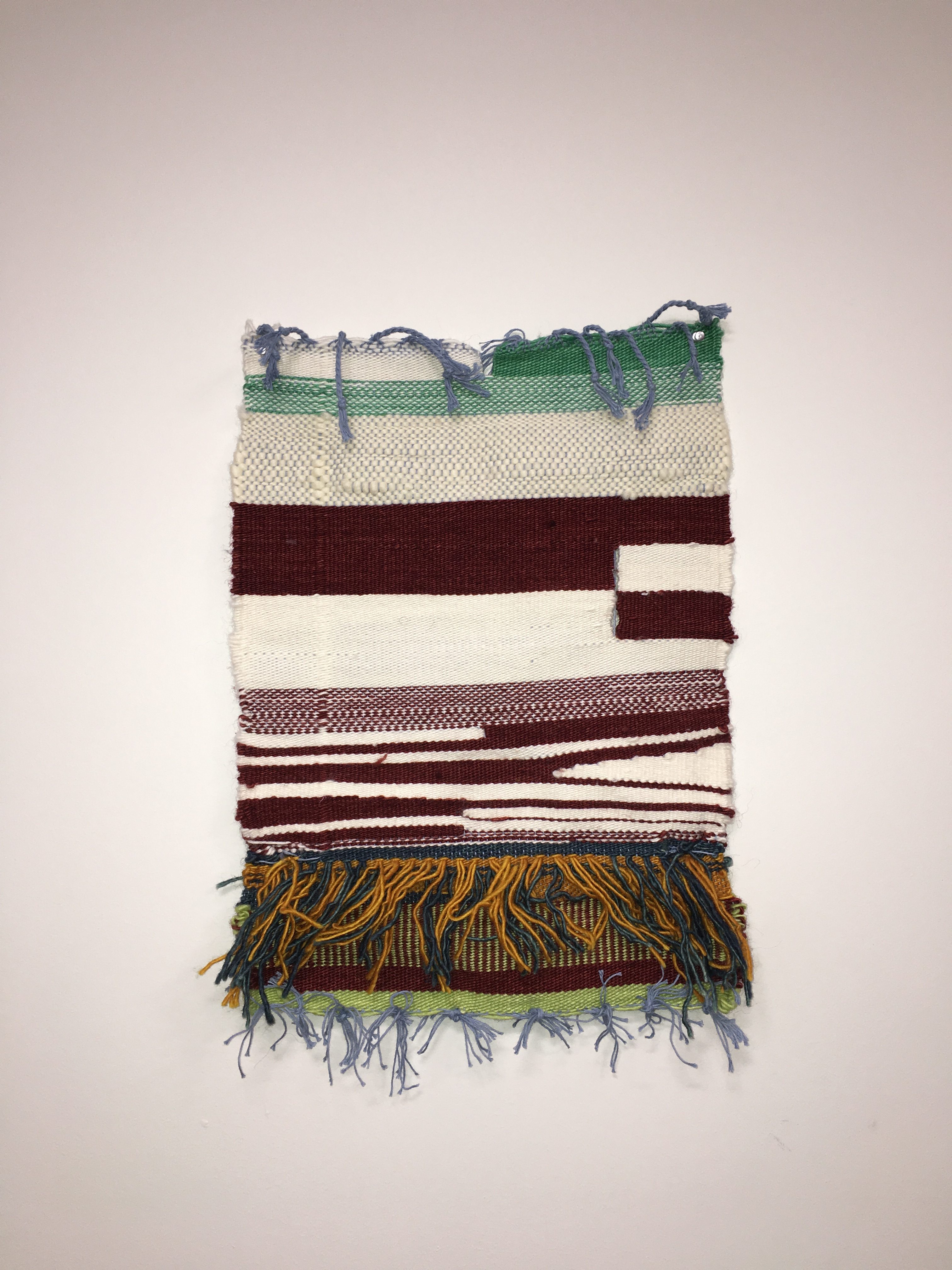
Sample

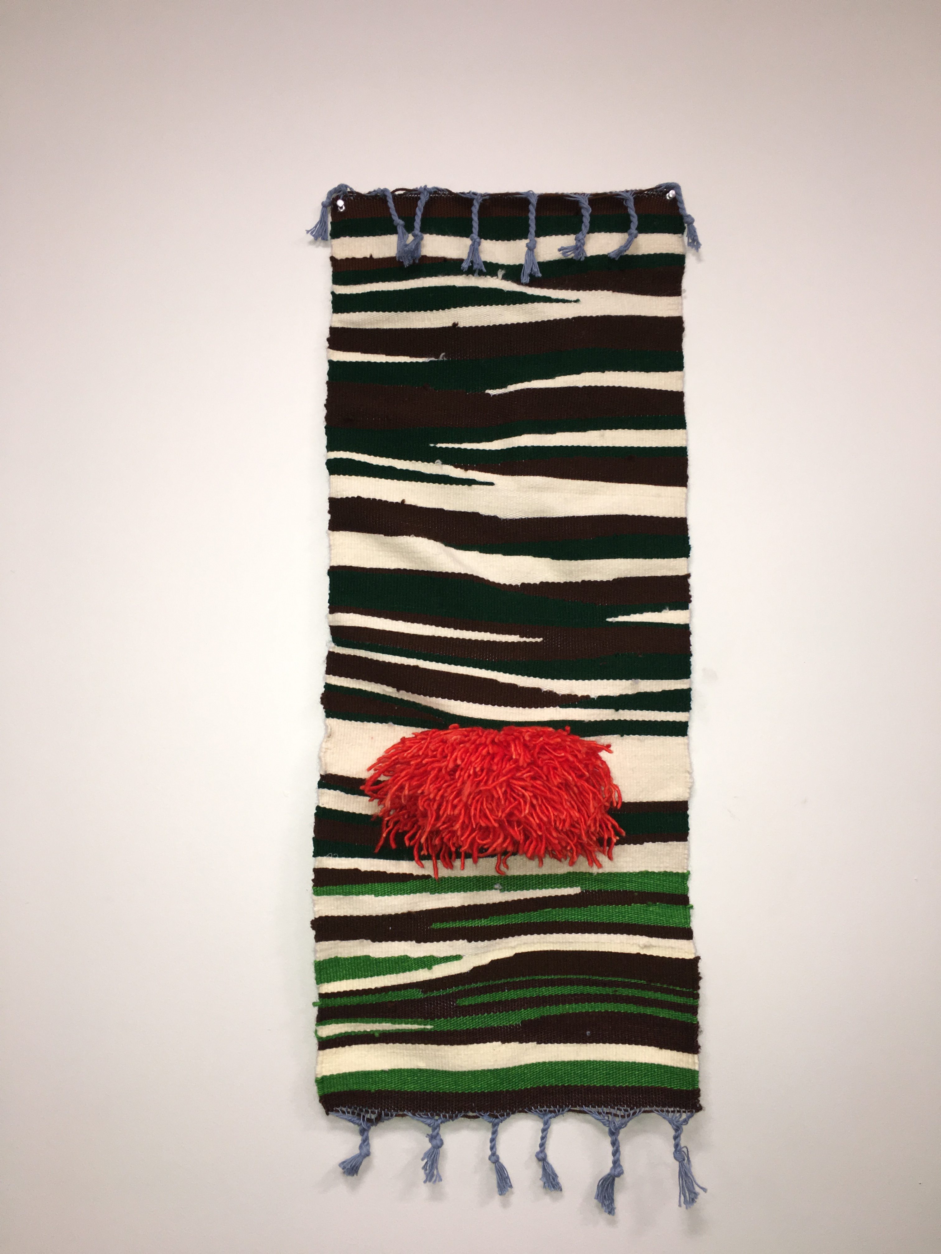
Final
Intention
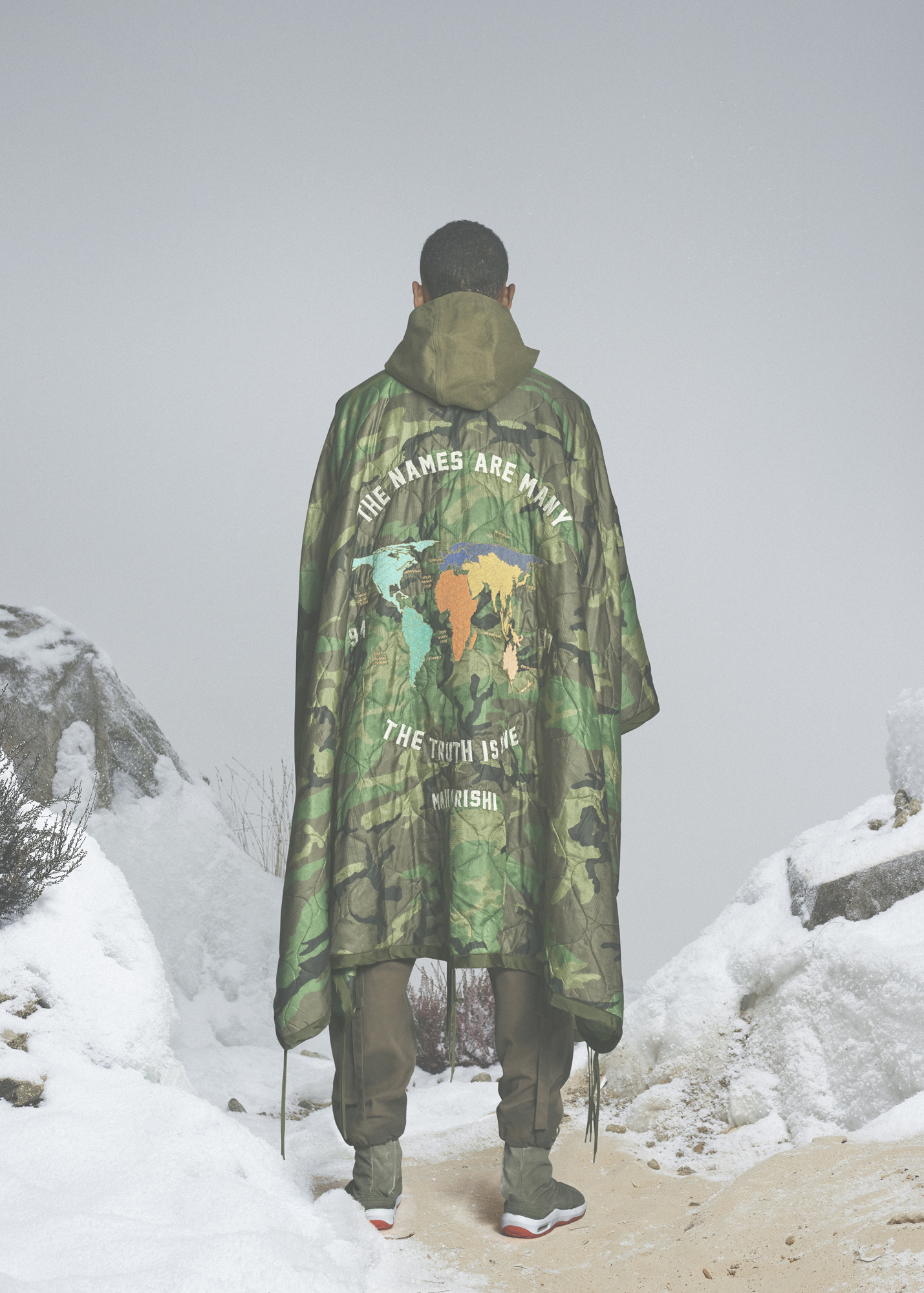
My starting inspiration for this project was the work and design ethos of the clothing company Maharishi. Their work is heavily influenced by military design, often incorporating camouflage elements and reused military surplus, along with natural fibers like hemp or organic cotton. I was also inspired by images of Afghan war rugs, and wanted to produce something using a traditionally military aesthetic (camouflage), in a handwoven tapestry. My color choices were inspired by the “Woodland” camouflage design used by the U.S. military from 1981 to the mid-2000s, with its trademark greens and browns. I also wanted a strong, contrasting geometric shape, for which I used a bright orangey-red wool. My intent with this project was to contrast the often hidden nature of war with its bright, destructive, and obvious violence. I am involved in anti-war activism, and the violence of warfare is perpetually swept under the rug or justified as the cost of doing business in modern society. It took the images of the Vietnam War on everyone’s TVs to really mobilize action against it in mainstream society, and I wanted to bring those associations to the fore.

Process
I used a few different colors of wool/acrylic in my weaving, from the brown, white, and green of the camouflage, to the orange-red of the circle. For the camouflage pattern, I wove it flat, with alternating irregular dovetails surrounded by flat weaving all the across the warp. I wanted the circle to ‘burst’ out of the weaving, so I used rya knots in a round shape, after weaving a (somewhat squished) circlular outline in white. The colors all went well with the sky-blue warp of my weaving, with the peaceful and calming connotations of that color. I ended up using two different greens and browns after running out of the first group, but the switch, coming mostly after the red circle, gave it a nice contrasting effect.
Learning
I came away with a huge respect for weavers throughout time, since the 15ish hours I put into this project ended up pretty uncomfortable and exhausting. It takes a lot of work to keep an image in your head while contributing 1/10000th of it at a time, which I found very difficult. The impressions people had of it as relating more directly to nature were a little surprising, but made sense with the woodsy-type color scheme. I definitely learned that packing the yarn as tight as I did wasn’t one of my best ideas when it came to finishing by the deadline, but I thought the end product reflected how long that took, and I appreciate the positive feedback I got for that. For the next time, I would have liked to have had more time to fully make a circle, since I ended up with more of a lozenge/eye shape, as well as using the same colors of yarn throughout. I could have also done more varied shapes and curves in the piece, but I doubted my ability to plan something like that out and went with an already-tested technique. I like the way it turned out overall, but I think with an extra week it could have really been wild.
-Wilson Ekern
