In this post:
- An inside look at the MoCap sessions,
- New Branding ideas,
- A bird’s-eye view of the Carnival setup,
- And sounds are in the game!
Note: Due to this week being Spring Break, there will not be a dev blog posted next week. We apologize for the inconvenience!
Art
This week marks the start of Beta production for the Art Team — that means a focus on polish, layout, texturing, and animations. As you can see from the Gantt Chart below, that means that a lot of the team will be working in parallel to get everything done on time.
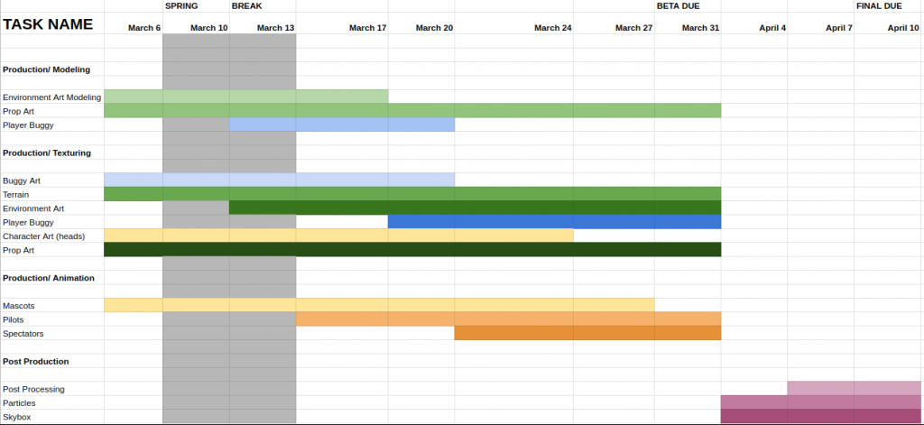
In other words, since a bulk of the modeling is planned to be completed by this time next week (around March 17th), this period marks a transition away from modeling and towards the final stretch.
Characters and Animations
This week, our art team got to set foot inside of CMU’s Motion Capture Lab to get some high-quality animations for the characters in the game. In fact, they received some hands-on experience, with art lead Eric Yu putting on a MoCap suit!
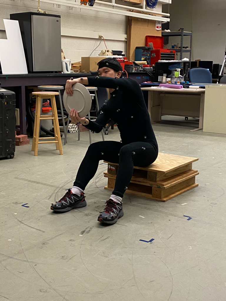
They recorded a variety of animations that would otherwise have been very difficult to create by hand; things like idle animations for drivers and pushers, or even more unique motions like “catching” the buggy at the end of a race!
It’ll be a few weeks before we actually see these animations in the game, as it will take some time for the recordings to get cleaned up to a point that they could be used.
Special thanks to Justin Macey for his help at the MoCap lab!
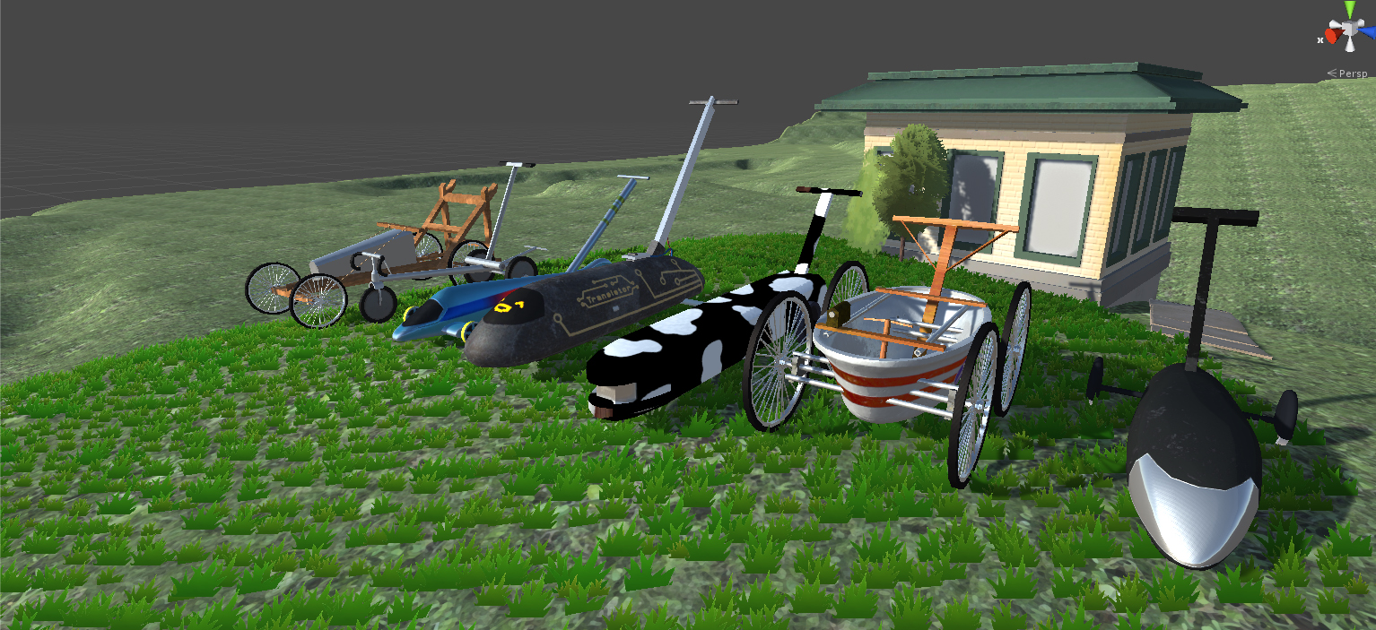
Buggies – Onto Texturing!
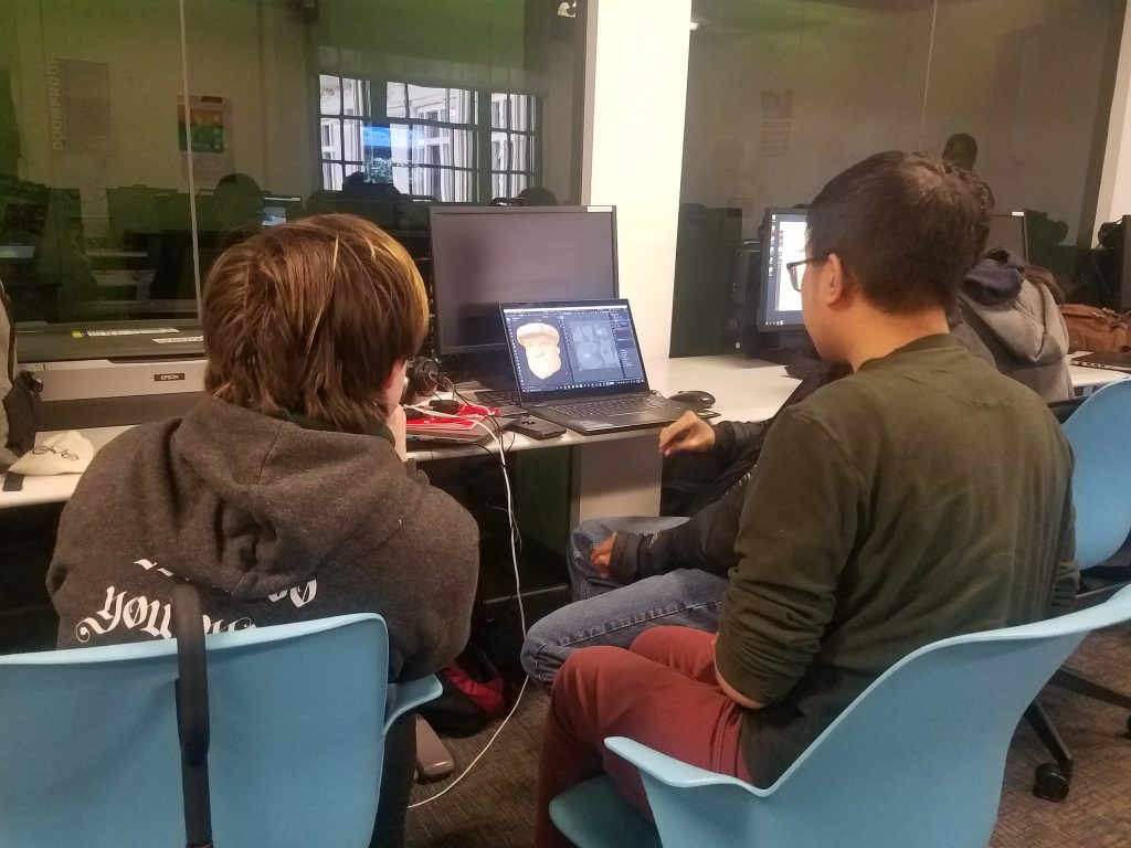
As you might have seen in the headline above, our buggies are almost done! 7 out of 10 have been fully textured, with the rest to come in the following weeks.
Aside from texturing, the next step for our buggies is (of course) to put them in the game! Fortunately, placeholder buggies already exist, so it’ll just be a matter of uploading the correct models. From there, our art team will continue to tweak the buggy models as needed, and the programming team will continue to fine-tune their behavior.
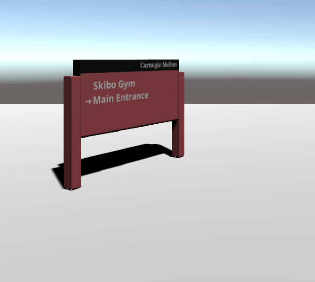
Environment Art – Propwork
Pictured: One of the many signs that dot CMU’s campus, modeled by Sydney Ayers
Design
The design team had two major tasks this week: one, to start building the branding materials that we could distribute to the public. Two, to flesh out what the physical, Disney experience would look like in terms of floor layout and line management.
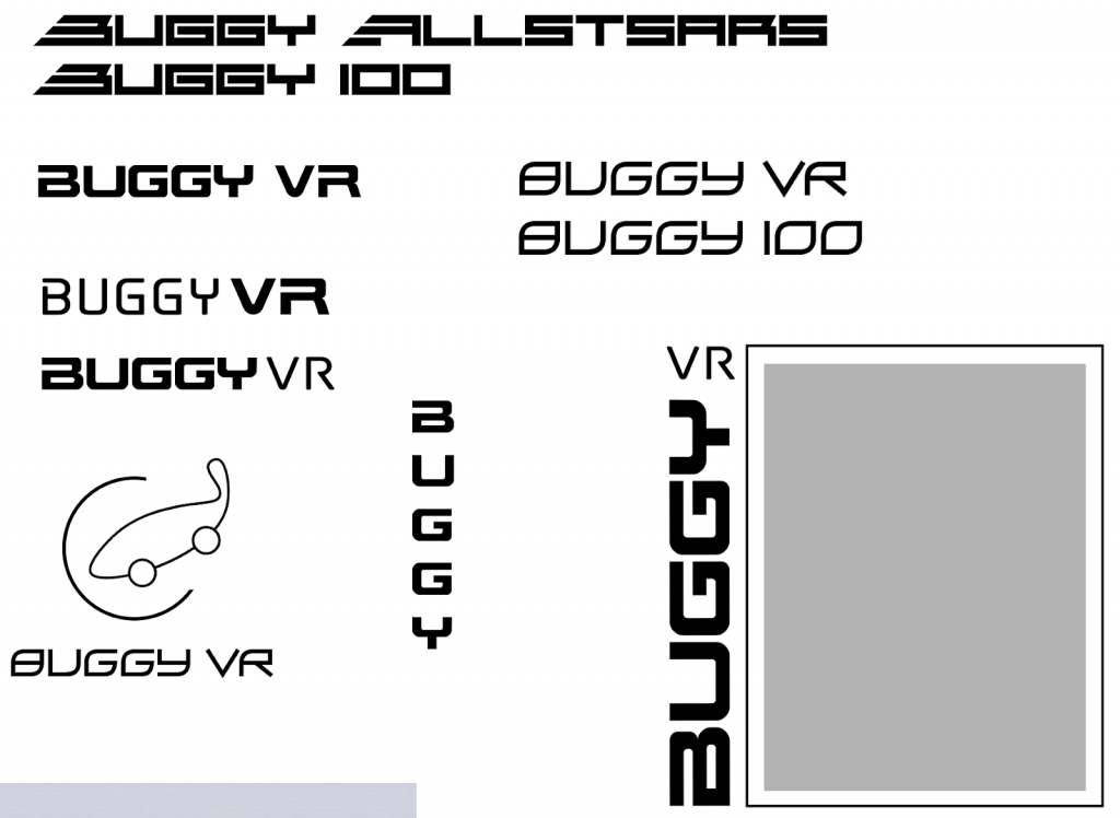
Branding – Introducing “Buggy AllStars”
Pictured: Logo designs by Adela Kapuscinska
First off, let’s take a look at the efforts of the branding team! After opening a voting poll to the class, the top three choices for a game name were a) Buggy AllStars, b) Buggy100, and c) Buggy VR. Armed with that knowledge, the design team created the title fonts you see above, and the logos you see below!
Of course, these are still just sketches, but after some discussion it was decided that we would go with the name Buggy AllStars for the time being.
So, welcome to Buggy AllStars!
The Physical Experience
From the start of this project, we had been aiming to create a physical display that would help the player immerse themselves into the buggy experience. Originally, we had planned for this to happen following a design for the player buggy.
But now, weeks later, we’ve decided to follow a different approach: instead of drawing a buggy and designing the physical experience to match, it would be better (and easier!) to create a physical layout for the physical build, then draw the buggy around that — sort of an extension of the inside-out cockpit design from the last week.
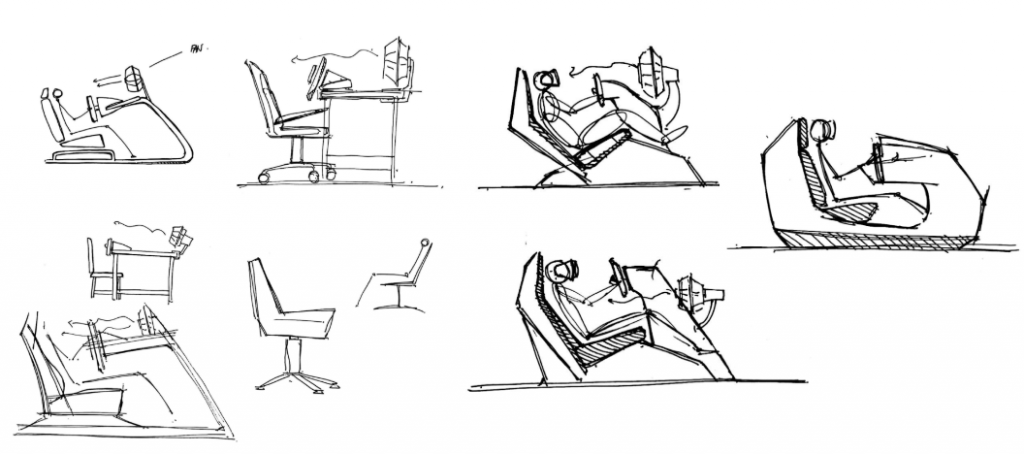
To that end, one of our UI/UX designers, Jaeyon Huh, took the time to develop a few different layouts for the physical setup. Shown above are a number of his design sketches, ranging from bare-bones (with just a chair), to a chair and fan, to a full seated configuration.
Jaeyon took then took a few of the designs he had sketched out and refined them a bit further, creating two designs that could be used depending on scope and feasibility:
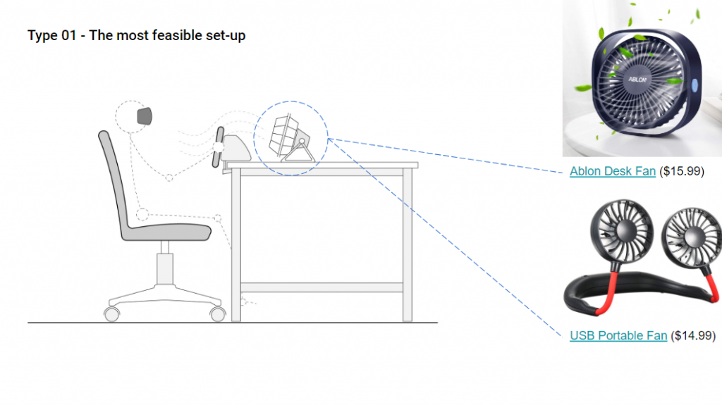
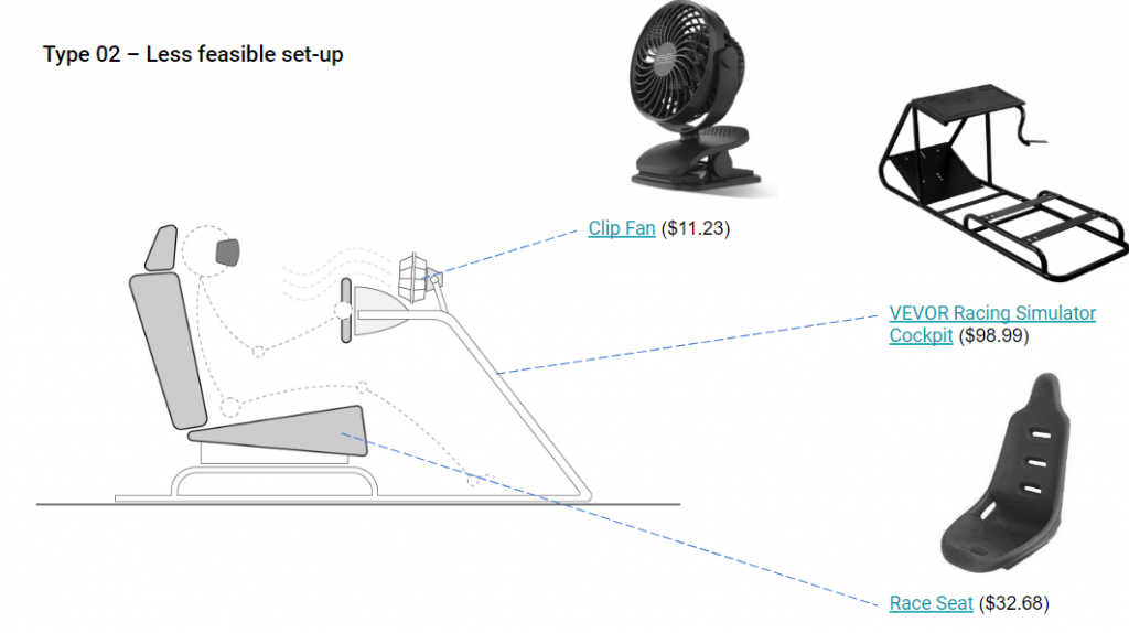
For both of these designs, we’ve toyed with the idea of using a desk fan in combination with an Arduino, which would change speed in tandem with the player buggy — making the player feel the wind on their face!
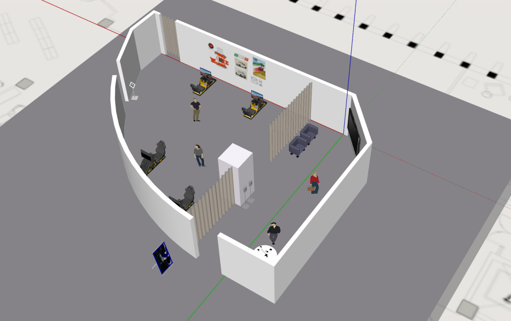
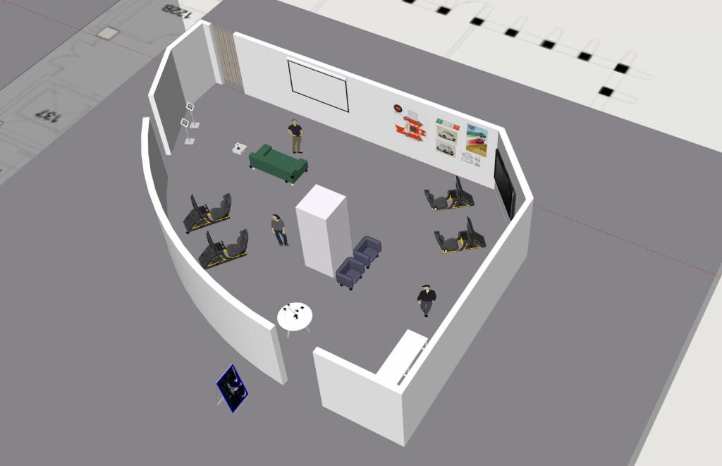
Next up, we have a few views of potential layouts for the physical exhibit. Pictured below is the layout we decided to run with, featuring physical dividers that partitioned the room into two sections. Players will queue up on the rightmost side of the room, where a TV will be set to display content — either the spectator view of actual gameplay, or a cycling slideshow showcasing the development of the game!
This layout was chosen for a variety of reasons, including the entrance’s proximity to the Buggy Museum (which would be set up next door), its direction facing the entryway of the building, and the ability to curate the queued players experience.
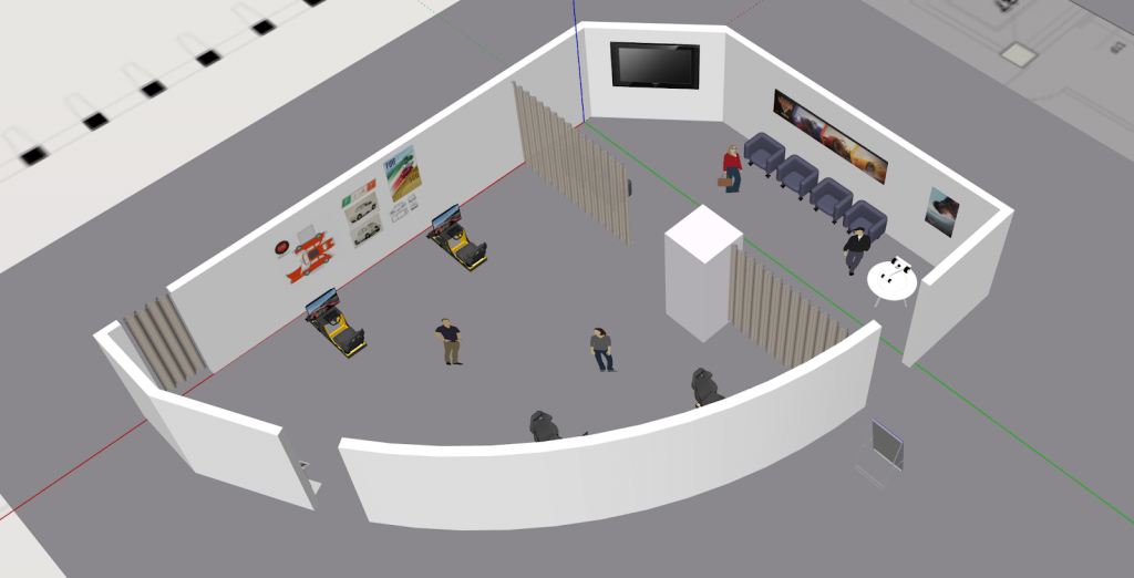
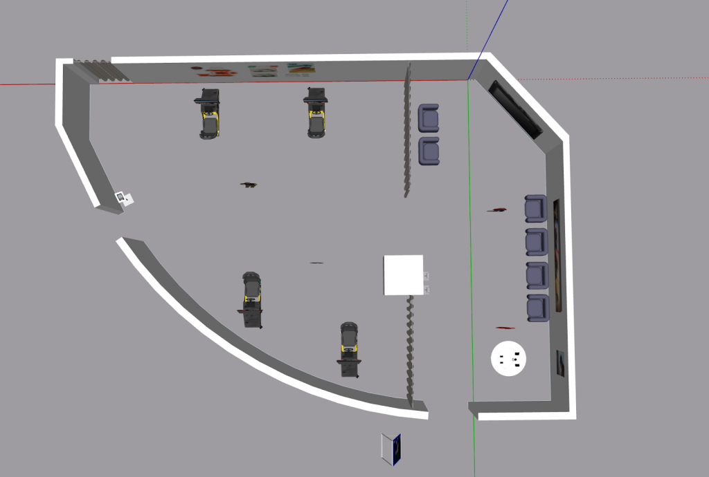
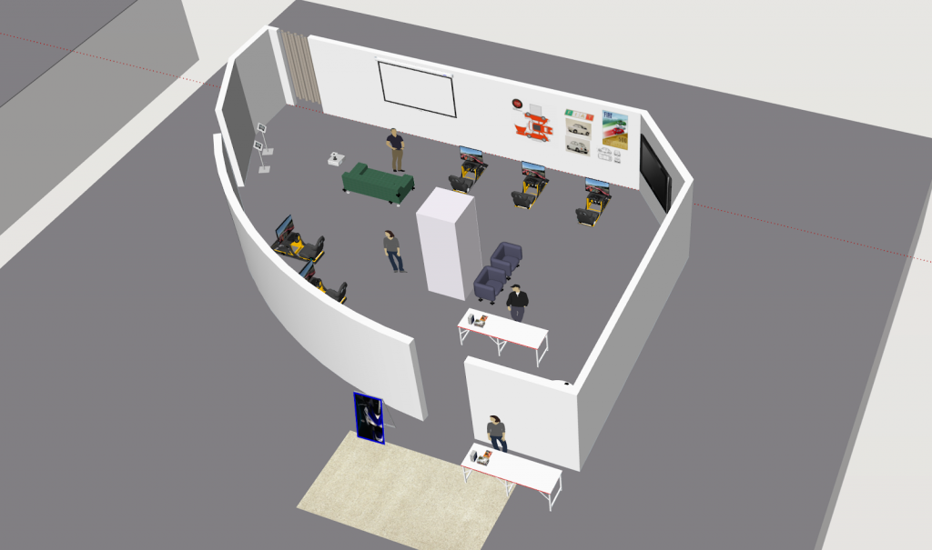
Below are two other layouts, which had interesting features but were set aside in favor of the previous design.
Oh, and speaking of the physical experience, we received something exciting in the mail this week: three USB steering wheels! These wheels are equipped with force-feedback, meaning that (in addition to allowing physical, 1:1 mapping of controls) we can add resistance to the wheel the further the player turns from the center — making the “autocorrect” feature feel even more authentic!
The programming team has been assigned the task of hooking these controllers up to Unity — more on that as it comes along!
Sound
This week was an exciting week for sound, as it marks the first time we got to hear thing in-game! Technical difficulties with FMOD were abundant, but things came together on Friday in the nick of time.
In the video below, you can see (and hear) how the speed of the buggy affects the sound: faster speeds introduce a “whoosh” and the rattling of wind, which gradually falls away as you return to normal speed.
Pretty cool, right?
Gameplay
Gameplay took a few steps forward today, with placeholder UI up and running (which shows both the mini-map and a speedometer), as well as in-world markers that show the player the “ideal path” for their race (the wide blue line on the screen below).
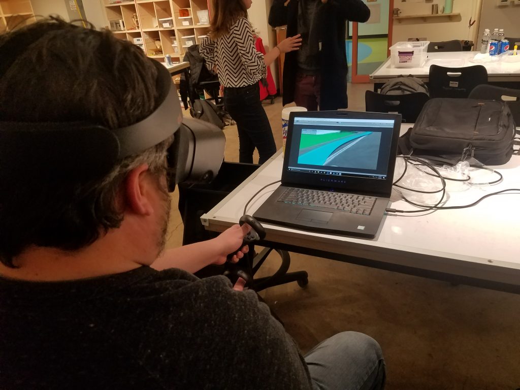
Meanwhile, we got a look at some UI in-game. Seen below, there are two test UI’s in place: one is fixed in the world, while the other is tied to the player’s headset. With the code in place, the design/UI team can work with the programming team to test in-game now, instead of the paper prototypes they had been working with before!
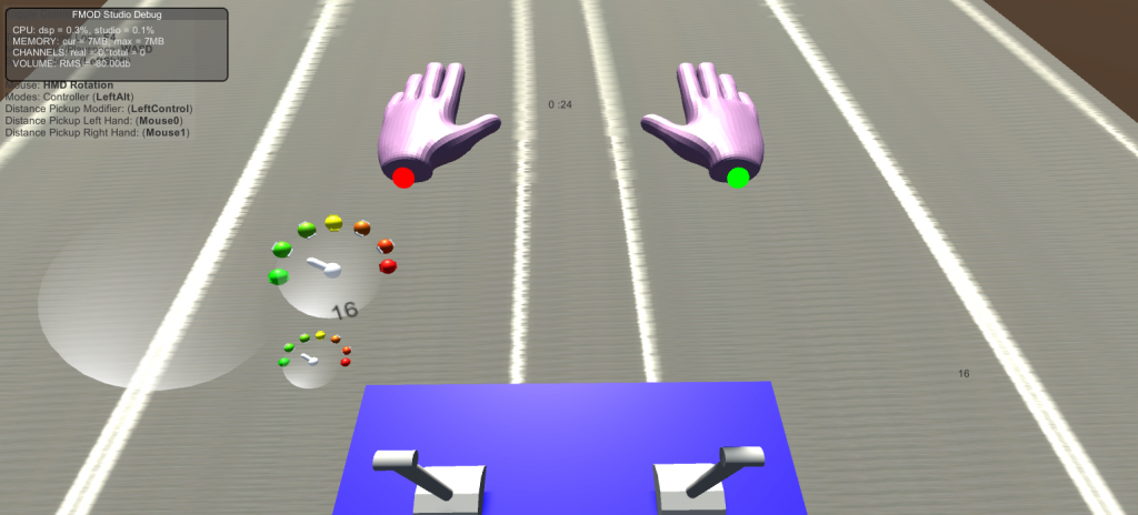
Next on the list will be to anchor the UI to the cockpits you saw last week, grounding them in the game’s world.
Looking Ahead
The coming week will be spring break (starting today, actually) so things are expected to slow while everyone is away. To counteract that, a small subset of the class met one last time before break to get some work done and set expectations.
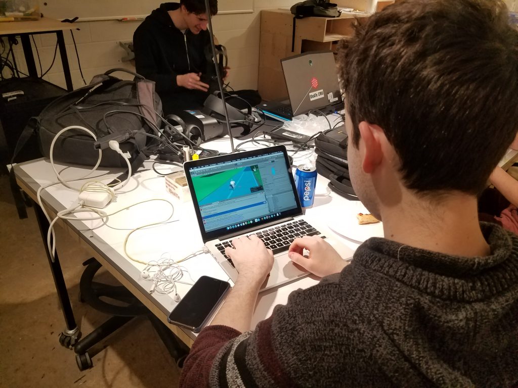
For the coming weeks, we hope to show the following:
- NavMesh
- Hardware Support
- Buggy Designs
- More art and sound!
Lastly, before I sign off, let’s hear a round of applause for the team and all the work they’ve done in the last few months:
See you in a couple of weeks!
