Everybody who’s here get in front of the green screen! Do something funny! Let’s have something to remember this night by! OMG you were so cute! You looked so young! Let’s not let the night end! Let’s not let the night have ever ended! This is never, ever, ever, ever going to go away! Wahoo!

Descriptor
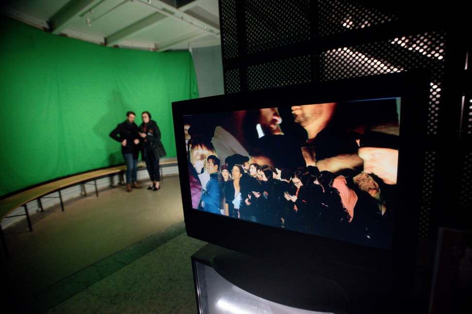
{CE19} is a party-trick video installation. There is a large green-screen with nice lighting and a camera pointed at it. If you walk in front of the green-screen, whatever you do is sampled and looped endlessly on a nearby TV. Because of the green-screen technology, your body is separated from the green background and layered on top of some other backdrop… except instead of a sandy beach scene or something like that, the backdrop here is a ten-second loop of everything that’s already happened in front of the screen, layered endlessly on top of itself. And so, your captured image won’t go away until somebody else’s image is layered on top of yours and blocks you out. Sounds like the internet, amirite?
Process
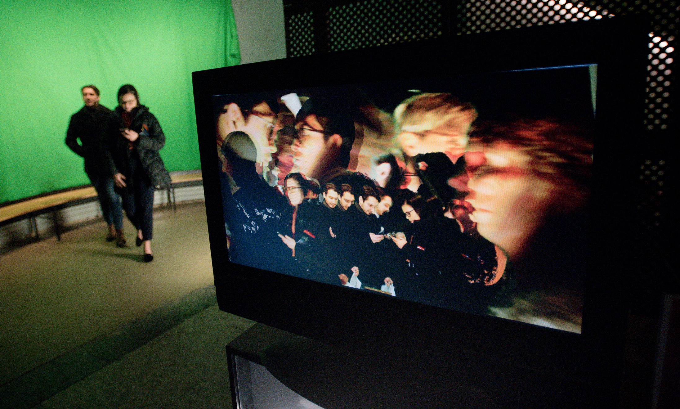
The design of the project is extremely simple: a chroma-key effect takes in two video streams, one of the foreground (human performer in front of a monochromatic backdrop that can be ‘keyed out’), and one of the background (some picture to replace the monochromatic background). The ‘hack’ is simply to plug in a copy of the final output back into the background input, with a delay. I used a ten second delay: so, the last ten seconds of output video becomes the background for the current ten seconds of input. The result is twenty seconds of composited video, which then becomes the background for the next ten seconds of video… et cetera. You can see the effect clearly in this guy, who has been looking at this phone for almost a minute in front of the camera:
I made the video processing patch in Isadora, a live video processing software pioneered for use in dance. It uses a patcher-interface similar to Max:
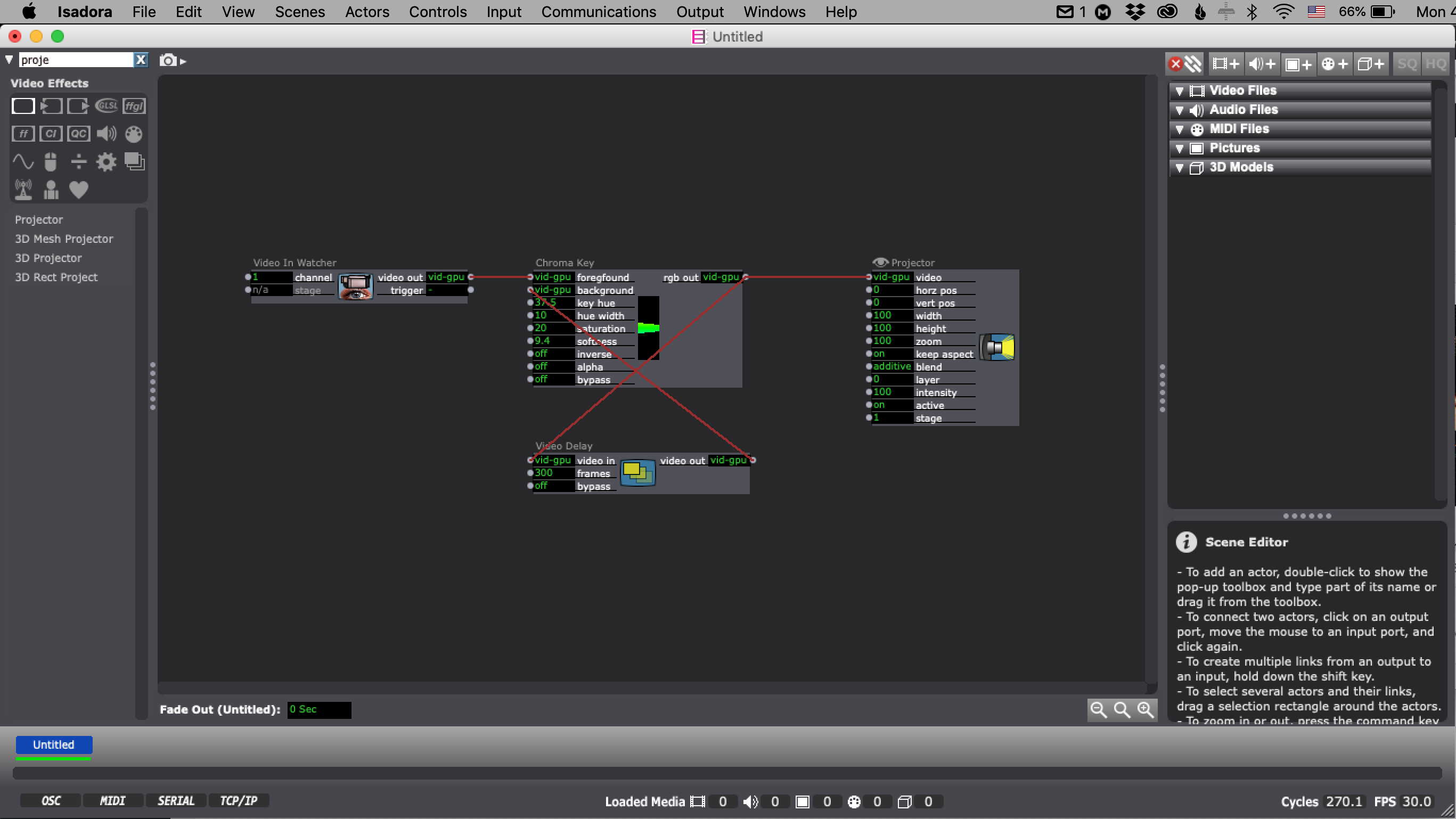
As you can see, the patch really is “that” simple.
Technology
Because this is such a simple idea, proof of concept was fairly quick, which led to the question of quality: how to make it look good (but not too good), how to make it consistent across a long-ish installation, and how to lay out the space so that it would (a) not be an eyesore, (b) would naturally capture enough people for the effect to be visible, and (c) would then be accessible enough to invite the public to play with it.
The first question was capture: analog or digital. It would be possible to run this system with composite video and an analog video delay line. The advantages would be lower latency and a potentially appealing analog grain to the image quality. I decided, however, that a “cleaner” image quality made more sense for a piece that is essentially about social media in 2019. To downplay the latency and frame rate issue (<50ms, as low as 20fps at times), I made the screen out of direct view from the capture area: thus a participant can’t see their lips out of sync as they speak, and it’s close enough for an outside viewer to feel it to be approximately time-aligned.
Having decided on a digital system, I captured from a Panasonic GH4 through a BlackMagic Intensity Shuttle into Isadora, and outputted the media directly from my Mac to a flatscreen. The GH4’s superior image quality, bright exposure, and aperture control made dialing in the chroma-key infinitely easier than my attempts with a webcam and a handheld camcorder. Despite the larger footprint, using a Real Camera ended up being very worth it.
 (analog video feedback noise)
Finally, lighting: to key properly, a green-screen has to be very bright and evenly lit, or else its apparent color will not be consistent across the full field. Luckily, the site had a good amount of track lighting available in the stairwell in which I installed. I used all of the track lighting to illuminate the screen, and added a soft key light by the camera to pick out the public.
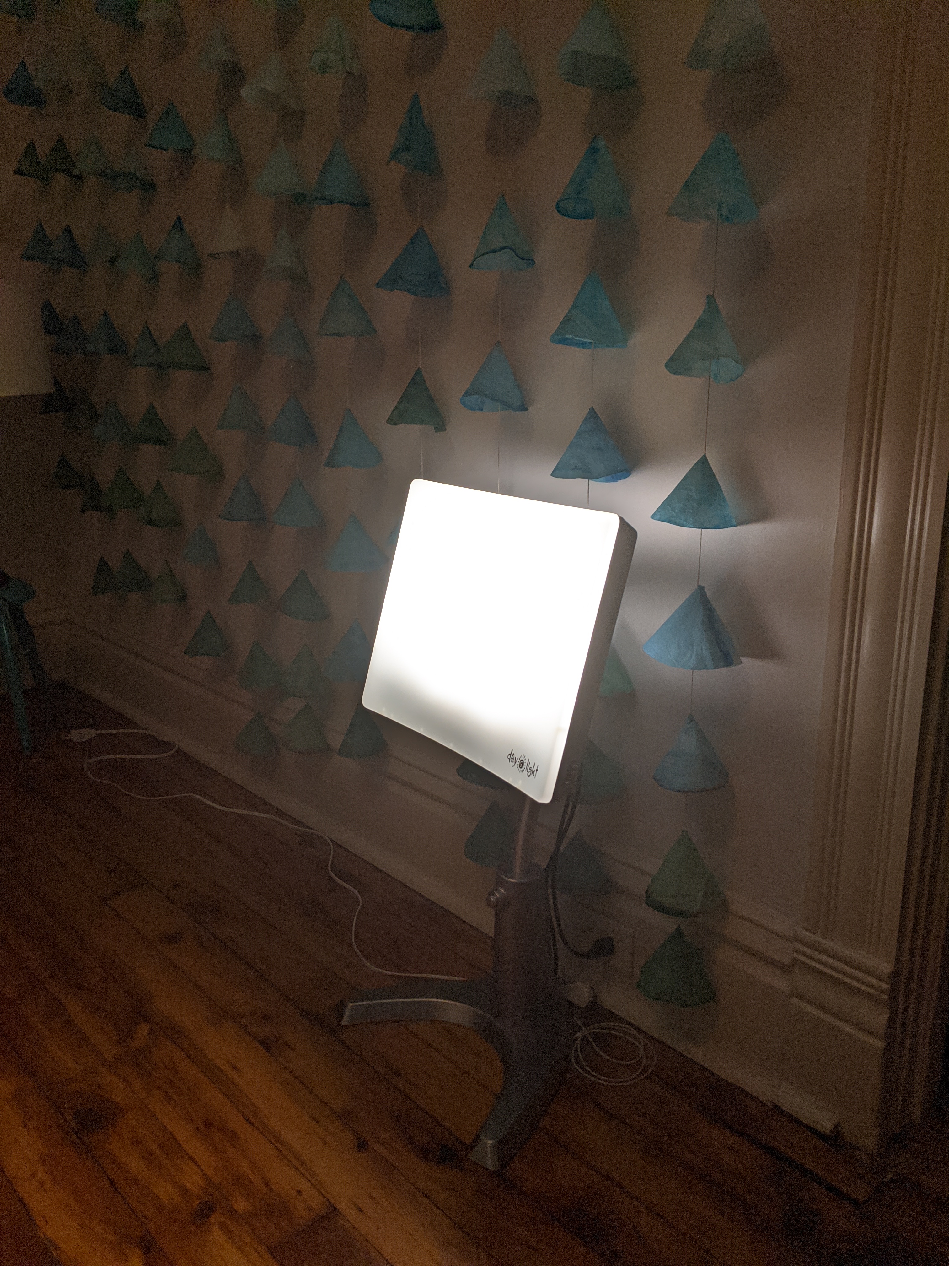
Yes, that’s a fluorescent winter-time happy lamp. Small size, bright light, soft beam. It worked great! And everyone felt better, I’m sure.
Layout
The last question was experience design: how to make this thing viewable, usable, unavoidable, fun, et cetera. By placing in a cyclorama-like space at the top of a stairwell, I felt that it was positioned in an area that was both high-traffic but also enough out of the way to not feel like a major imposition on other works. The “in a corner” quality allowed the lighting to be fairly involved without messing up the dim and moody vibe of the rest of the evening’s lighting. And, it meant that there were always subjects passing by and becoming part of the work, so that more playful types could easily see what was afoot and learn how to use the piece a toy.
I also made the piece be part of my guided tour of the space as the “Total Librarian”, which narratively cohered it to the larger evening in a constructive way (and again, mandated participation). I am happy with the playful way the work was proposed in physical space, paired with a slightly more sinister description in the show documentation. Perhaps some participants became less comfortable with their fun upon reading about it later.
Hi, I’m the total librarian. We’ll now head to the stacks. There’s a remote possibility you’ll completely change lexigraphical meaning by entering the space—so for the sake of safety, please pause in front of this green void so you can be copied for backup. Remember to be yourself. Remember to be funny. Thank you.
I do think that the piece would have been better served by a larger output. The flatscreen I used was a little too small to catch the eye of a playful user in a crowded room and slightly obscured by columns to a passer-by. I also think that projection could have brought the human forms up to a more 1:1 scale, which would have been a better sense of intinitely capturing the body of these people.
All that said, I feel pretty good about it.
Comments are closed.