Looking Outwards 07

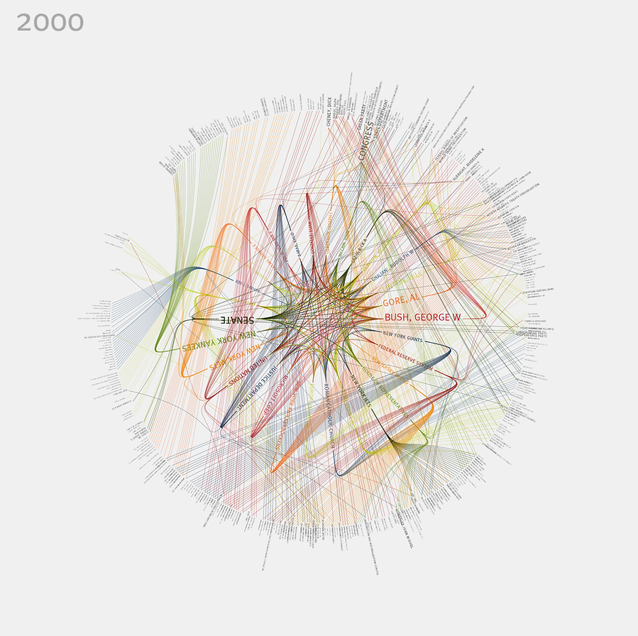
The work I selected is 365/360 by Jer Thorp . The work is a visualization that shows the top organizations and personalities every year from 1985 to 2001. The work was created for the New York Times and links people, organizations and events. I selected this work because I was interested in the way Thorp used color and font size as a form of connection in addition to simply lines of connection. This makes the representation of data feel quite dynamic and life like. The piece of work is also circular which shows just how interconnected seemingly different topics are. The work also gives us a sense of Thorp’s sensibilities when it comes to representation and color and font use.

Looking Outwards 7: Information Visualization – Stefanie Posavec

Writing Without Words

Drawing The Dictionary

Stefanie Posavec is an artist and designer experimenting and researching ways to visualize and communicate computational data to all ages and audiences. What I like and find most special about Stefanie’s work is that it is very colorful, fun, and visually appealing. Usually when I think of computational data, I don’t necessarily imagine something animated, cartoon-like, or age friendly. Stefanie’s visualizations deliver themselves like artwork in a children’s book.
In her work, “Drawing the Dictionary,” Stefanie responds to a theme of collections including parts of speech, syllables, first letter of the words, and alphabet. The words in the collection are specifically the 1000 most frequently used words. And used 1000 different colored index cards for each word. The words paper colors were organized by part of speech, background shape by syllables, placement by how frequently they are used, pattern by part of speech, and the pen color by first letter in word.
In her work, “Writing without words,” Stefanie visually showcased text in order to highlight the similarities and differences in writing styles when comparing different authors. She wanted to create a data visualization that was straight forward and one with a subject that was emotionally connecting to humans. To create this, she focused on a book called “On the Road,” by Jack Kerouac and its themes. She did not want to use expressive typography or imagery but rather a subjective representation of information. She wanted the graphics to be quantifiable. She gathered data related to the english language structure.She wanted to visualize the novel as a living element full of energy and thus the novel is split into chapters, paragraphs, sentences, and words like a plant structure. Shorter sentences mean a choppy text and stiff writing style while longer sentences mean they are more free and leisurely. She gathered all data by hand and used math and a calculator to find final sums. Finally she used a computer graphics program instead of a data information one to watch the data generate bit by bit.

Sources:

http://www.stefanieposavec.com/work

Blog 07: “BikeCycle”

By Ilia Urgen
Section B

This week, I came across a cool app called BikeCycle. It was developed by Nicholas Felton back in 2014, which is a visual display of everything an avid biker needs. However, this app will only work in New York City, as the coordinates were pinpointed on a map of Manhattan and Queens.

When you launch the app, you can see various interactive REAL-TIME visual maps, which are not limited to bike-sharing locations, different bike routes, cyclist demographics, and density of bikers in a certain area.

I find Felton’s app BikeCycle intriguing because I, myself, am an avid biker! Although I’m from Long Island, NY, and not the city, it’s very interesting to see real-time stats for different biking variables. If I were to go to the city for a ride, the app would help me optimize my bike route, see which areas to avoid, and find popular scenic routes in Manhattan!

6 different maps showing 6 different real-time biking variables!