Looking Outwards – 07

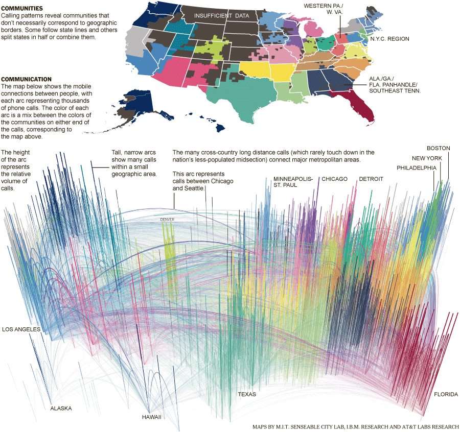
I admire the phone-Call Cartography project by the New York Times in 2011. The aggregate cell phone traffic data from the United States in July of 2010 was analyzed by researchers from M.I.T., AT&T and I.B.M. It shows how cities have become hubs and connect to other parts of the country. These communities shown by different colors on the map have little to do with geographic boundaries. I admire it because it shows patterns of how people are brought together over long or short distances. I think the creators’ artistic sensibilities are shown in the way this enormous amount of data is visualized. For example, the colors used, the areas drawn together, and the focus of the maps. Although, I think it could have been clearer in the second map which lines are connecting different places. Many of the lines are lost because they are too thin, or the colors blend together. Also, it is different to tell where they end because of the angle of the map and because there is no real map underneath, the reader is left with minimal text and shapes as reference. 

https://archive.nytimes.com/www.nytimes.com/imagepages/2011/07/03/opinion/sunday/03phoneimg.html?ref=sunday-review

Phone-call Cartography Map of the US from July of 2010. Many cities are connected together by arcs of different colors and heights, representing different areas and amounts.

Looking Outwards 07: Information Visualization

I am inspired by the project, Unnumbered Sparks by Aaron Koblin. This interactive sculpture installation is a combination of art and technology based on custom software. 

Basically, the sculpture is made up of a complex matrix of hand and machine-made knots and braided fiber, and it’s spanned between the city’s existing architectures. To create a geometric and structural design for the rope network, the artist utilized a custom software, implementing an “adaptive form finding” algorithm. He also used the custom 3D software by Autodesk to model the sculpture and test its feasibility by exploring density, shape, and scale in greater detail. What makes this giant aerial netted sculpture special and admirable is the dynamic interaction between visitors and the artwork; The work visualizes visitors’ physical gestures on mobile devices in real-time through multi-colored light projection on the sculpture. The creator’s artistic sensibilities are manifested in his pattern design of the structural ropes and the aesthetic installation of it that well blends into the city environment.

http://www.aaronkoblin.com/project/unnumbered-sparks/

Unnumbered Sparks

Looking Outwards 07

The Search Clock by Chris Harrison stood out to me because I found the concept very interesting; mapping out data from search engines, Magellan and AOL, over the course of a typical day (from studying trends for nine weeks), and then taking it a step further by mapping the differences in searches from 1997-2000. I admire firstly how visually interesting this project is because it is radially centered and balanced, but with enough variation to keep it interesting and engaging. It makes me want to read into the smaller text, and this demonstrates the artist’s eye for composition and hierarchy. Additionally, it very clearly shows information in a well-organized way. I have been learning about and practicing the visualization of data and systems in one of my design classes, and I know how tedious it is to land on something that makes sense. Furthermore, the content itself is interesting, with a lot of risqué and humorous topics trending at certain times of the day.

Visualization of information collected from the Magellan search engine
Visualization of information collected from the AOL search engine

week 7 blog

Kim Rees visualizes data related to the black lives matters movement. Some of their work includes showing statistics about economic inequality as a city with differently sized sky scrapers and data laid out in the form of the periodic table. Other topics Reez covers include environmental, education, government, health, politics, and technological data and statistics. Most of the work is in an attempt to invoke a feeling for the need to change our current capitalistic and exploitative system. After stalking Kim’s twitter you can really see how decade they are to their work and continuing the thought provoking work they create. One of my favorite projects was about health and the increase in the lifespan of people but the disparity between how accessible health care is and as a result the difference in economic status and health. I don’t know, it’s nice seeing the data visualized, it give it more of an understandable and easier was of being digested.

Information Visualization

One of the projects where an artist created software to visualize data is called “The shape of the song”. Martin Wattenberg created this because he wanted to be able to see music. The arcs go between two sections of notes that are repeated. The software analyzes MIDI files, files that get the notes from a piece, which can be found on the internet. However, since these files are handmade, each file can have different contents even though it might be of the same song, which in return might produce different sequences in arcs. Since the arcs are translucent when they overlap it creates a variety of different opacities within the piece and depending on how big the section that is being repeated the stroke of the arcs are also varied. Wattenberg has an interest in how technologies can provide insight into things that are often overlooked in everyday life. Visualizing different patterns in music shows us a deeper understanding of music and might provide insight into why some people like certain songs compared to others. Additionally, this project reminded me of one of the other projects I looked into for Looking Outwards – Milkdrop. Milkdrop used shapes, curves, and colors to help visualize music. Milkdrop was a more organic, conceptual way of visualizing music, while The Shape Of Song is a more logical structured way of visualizing it. With The Shape Of Sing, it is easier for the audience to see how the music generated the artwork.

https://www.bewitched.com/song.html

LookingOutward 07

Link: https://www.bewitched.com/song.html

\I’ve investigated the data visualization software, Shape of Music, created by Martinez Wattenberg. The software detects rhythm similarities in a piece of lyrics and diagrams similar parts by creating a connection with half discs.

What I really admire about this program is the brand-new way of representing musical rhythms, where instead of noting musical notes through sheet music, the program diagrams patterns. This helps visualize patterns in music, where instead of looking through sheet music to find a similar rhythm in a song, one can look at the connections through the lines, and see what parts of the song are most frequently repeated.

The software is entirely written in java and uses MIDI files to analyze the rhythm, where, unlike other common file types, a MIDI file contains a description of the notes which makes the analysis of the letters much more amendable. The MIDI files can also be separated into different tracks and analyzed separately. The algorithm I suppose is programmed to look for similar patterns in a range of note descriptions and create a connection through an arc diagram as a connection to map the similarities.

It is obvious that the author is keen on simplicities in diagraming, and he has also said on his website that he has taken inspiration from other arc diagrams, which is a simple yet effective form of diagraming to communicate information.

Looking Outwards-07- Section A

I was inspired by a piece by Stefanie Posavec that was made for the Papworth Hospital Inpateints Ward. Specifically, I thought the her “Flows” piece was super pretty. I liked the piece because of how she connected the hospital’s specialty on that floor (relating to blood and vessel) to a calming element found in nature. Not only did she include all these connections behind why she chose the design she did, I was inspired by how the piece was designed to calm patients who had just come out of surgery. I think this is really important because hospitals can be a scary place and it’s cool how she was able to create something really nice from data. I admire these aspects because art has the ability to make places seem less scary and help people though the tough time they are going through.

To generate this work, Posavec used data points from echocardiograms. The, she probably drew many curves connecting the point but had the height of the curves fluxuate a little bit (maybe using something similar to noise) so that it seemed like the lines were flowy.

Stefanie Posavec, Papworth Hospital Inpatients Ward, 2019

Here is the link and here is the image:

Stephanie Posavec’s piece is on each door of level 3 at the Royal Papworth Hospital. This is a sample of what it looks like.

Looking Outward 07 / Dr. Lev Manovich

This week I’m looking at the work of Dr. Lev Manovich, particularly his ‘On Broadway’ project which was inspired by Edward Ruscha’s 1966 unfolding photo book titled ‘Every Building on the Sunset Strip’.
To gather data, Manovich and his team chose anchor points along Broadway to create 100 meter wide ‘slices’ which were combined to create a spine-like shape. The coordinates of the shape were then used to filter all of the data gathered, including Instagram posts made within each 100 meter section, Google images, Twitter posts, taxi pickups and drop offs, average household income, and Foursquare data.

“On Broadway” project display.


The data was organized and presented in an interactive, layered visual with which users could slide around, zoom in on, and learn more about through the various data sections.
I love how this project was rendered in the final presentation to use color palettes and images as means of containing the data. The end result is clean, aesthetic, and easy to navigate as it unfolds into different layers.

lo: information visualization

Gun Deaths in U.S visualization (Periscopic 2013)

Seeing this prompt for this week, I immediately thought of the firm that made the visualization above years ago about gun violence. Periscopic is a data viz firm that emphasizes their artistic foundation in every project. Their website showcases a lot of their hand drawn process behind every final piece, and each project is developed and computed in a unique way for the cause. As a design student, I really appreciate not only their technical and artistic attention to detail, but their cultural awareness and ability to place their work in context of human lives, which often gets lost when talking about statistics and computer generated pieces.

Looking Outwards 07 – Information Visualization

Work Title: The Atlas of Emotions for the Dalai Lama & Paul Ekman — Visualizing the science of emotions

Artist: Stamen Design

http://atlasofemotions.org/#introduction/ (Live data)

This project intrigues me in its aspect of collecting and visualizing relatively intangible data, which are represented by feelings and emotions. In collaboration with social scientists and data designers, the initial idea of creating a single map grew into a collection of maps that analyze different emotions individually (anger, fear, sadness, disgust, and enjoyment). Because there are no preexisting data models of emotions, researchers and designers worked together to draw out many rounds of visualizations on paper first and translated those onto the actual model. 

This project’s primary goal was to resolve the gap between academic findings and personal experiences. The methodology of solving these questions is through data visualization that first had to begin with sketching discussions and first-hand data collection.