![[OLD SEMESTER] 15-104 • Introduction to Computing for Creative Practice](https://courses.ideate.cmu.edu/15-104/f2022/wp-content/uploads/2023/09/stop-banner.png)
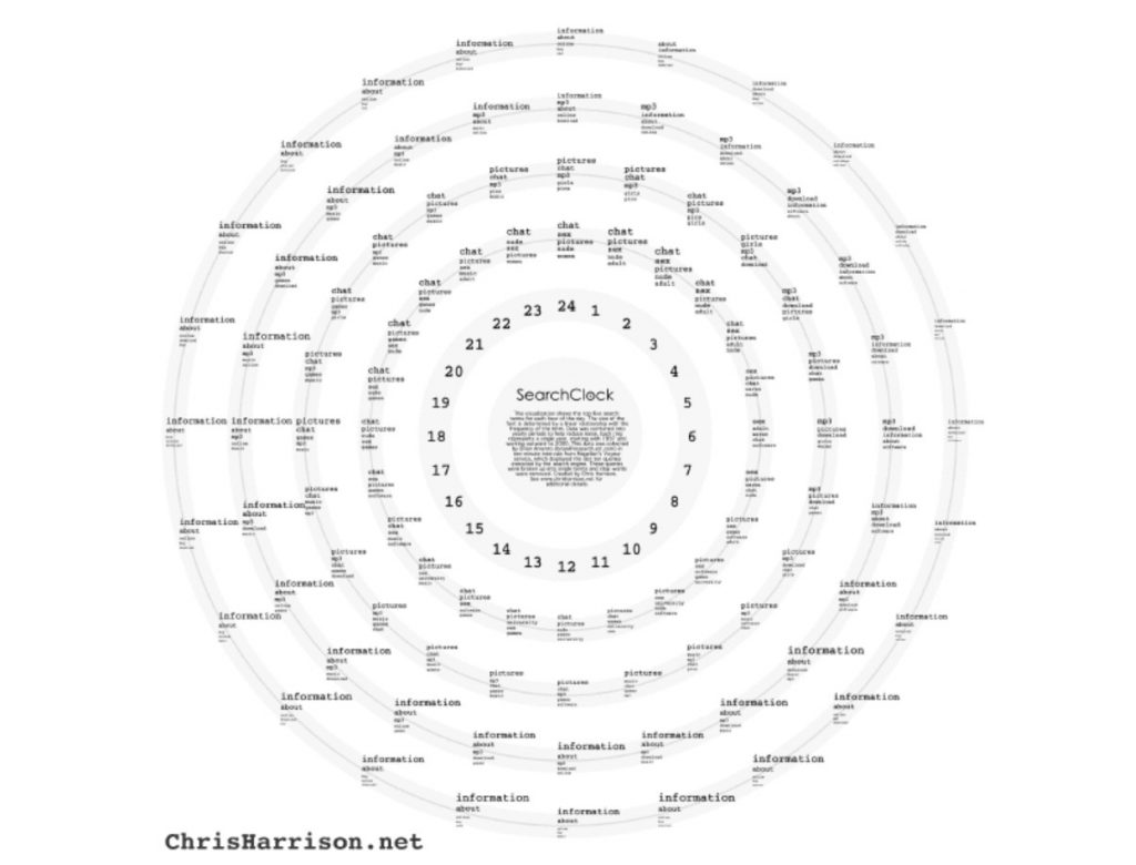
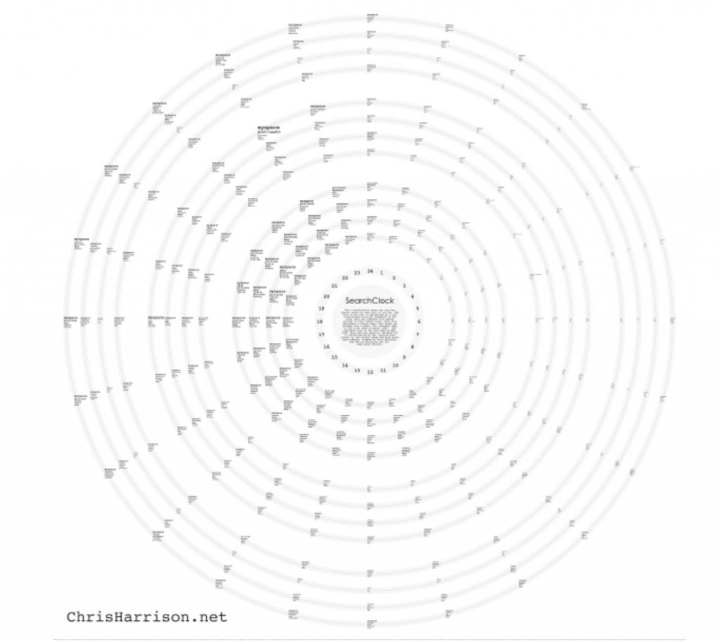
The Search Clock by Chris Harrison stood out to me because I found the concept very interesting; mapping out data from search engines, Magellan and AOL, over the course of a typical day (from studying trends for nine weeks), and then taking it a step further by mapping the differences in searches from 1997-2000. I admire firstly how visually interesting this project is because it is radially centered and balanced, but with enough variation to keep it interesting and engaging. It makes me want to read into the smaller text, and this demonstrates the artist’s eye for composition and hierarchy. Additionally, it very clearly shows information in a well-organized way. I have been learning about and practicing the visualization of data and systems in one of my design classes, and I know how tedious it is to land on something that makes sense. Furthermore, the content itself is interesting, with a lot of risqué and humorous topics trending at certain times of the day.