 Introduction
This week, the team continued working on changing the UI to make the game more cohesive and enjoyable for the player. Artists created mockups of the UI for both the minigame and the monthly panel and finished up making assets for it. Programmers have started implementing that UI and have also added a start and credits scene to the game. To make the monthly panel more complete, programmers have started to change how the UI is displayed and have added the tax and insurance payment options. Overall, the team worked on putting in the minigame and getting everything in the game to look good.
Programming
Programmers work partly on bug fixes this week and partly on adding some new components to the game. The biggest thing that was added was a start scene and a credits scene to the game. In doing so, we could make the game feel more completed in general. Furthermore, it also allowed us to check the automatic save/load functions that were coded into the game earlier in the semester. Other new things that were implemented were some of the UI elements in regards to the main store and the ingredients buying panel. Most of the bugs fixed this week were in regards to the dialogue. We fixed dialogue bugs that occurred during the resetting of dialogue flowcharts for each day and dialogue now progresses as expected. The last big thing that was worked on this year was implementing the tax and insurance payments based on the diagram that we decided on last week. Not only is there a minimum payment for the player now, but failure to pay carries over into subsequent months and the financial advisor gives a reminder to the player that they have to pay a week before the payment is due. In addition, we put in three missed payments as a lose condition. Moving forward, programmers want to finish up the UI and polish the monthly panel.
First pass at a startup screen for our game
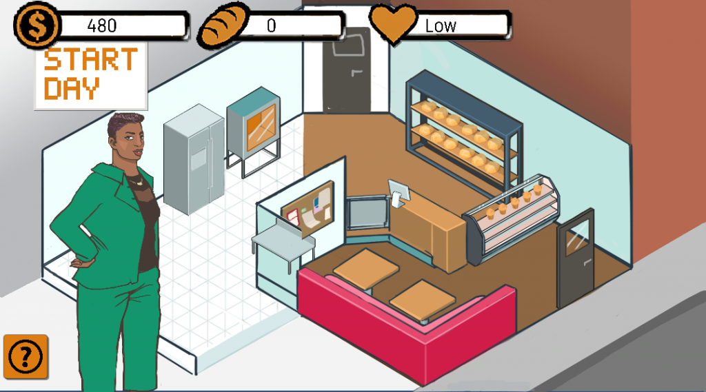
Main screen after implementing some of the UI elements
Minigame
After finding the base project last week (Cake Mania), programmers found that the game had very low reusability. The whole game was made up of one script, which made it too difficult to analyze and modify the code to get what we wanted. Essentially, it was too hard coded to work with in the timeframe we had. Instead, programmers decided to go with another Match 3 game, which is an example project from a Lynda tutorial. Looking at the game and considering the target demographic of BizWorks, we decided to use the highest level out of the three levels in the example project. After going through the code, programmers spent the week reorganizing the UI assets to match our needs. For example, we took out the target score and remaining move elements and took out the replay and “Try Again” buttons, essentially simplifying the game to match the short minigame expectations of BizWorks. Moving forward, programmers want to finish modifying the minigame, add our own art assets, and then integrate the minigame into the main game. Below is a short playthrough of the project programmers are basing the minigame off of.
Art
This week, art finished prototyping the UI for both the main game and the minigame. With both screens being diagrammed, artists moved on to create all the UI assets. Our client had wanted us to implement spreadsheets into the game so that the player could more accurately budget for what they need. We spent this week working on how we could do something similar and came up with a predictive function for the game. Artists made the assets for that feature this week. Other assets added were the minigame title image and the managerial board that buying the ingredients and managing the store takes place. In terms of character work, artists finished the icons, sprites, and full body art for the financial advisor and the fourth character, Miles. Looking forward, artists would like to animate the character sprites in the coming week and make other sprites for characters in the world. Most of the UI was completed this week and now the team just needs to put it in the game to replace the programmer art.
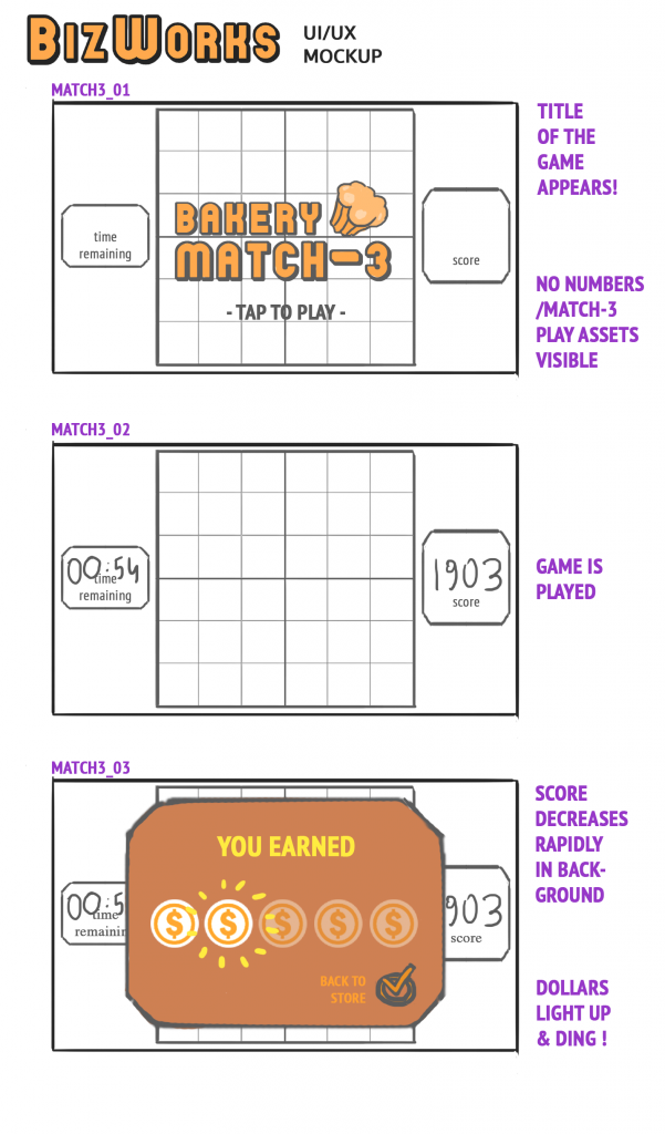
UI mockup for how we want the Match 3 game to look
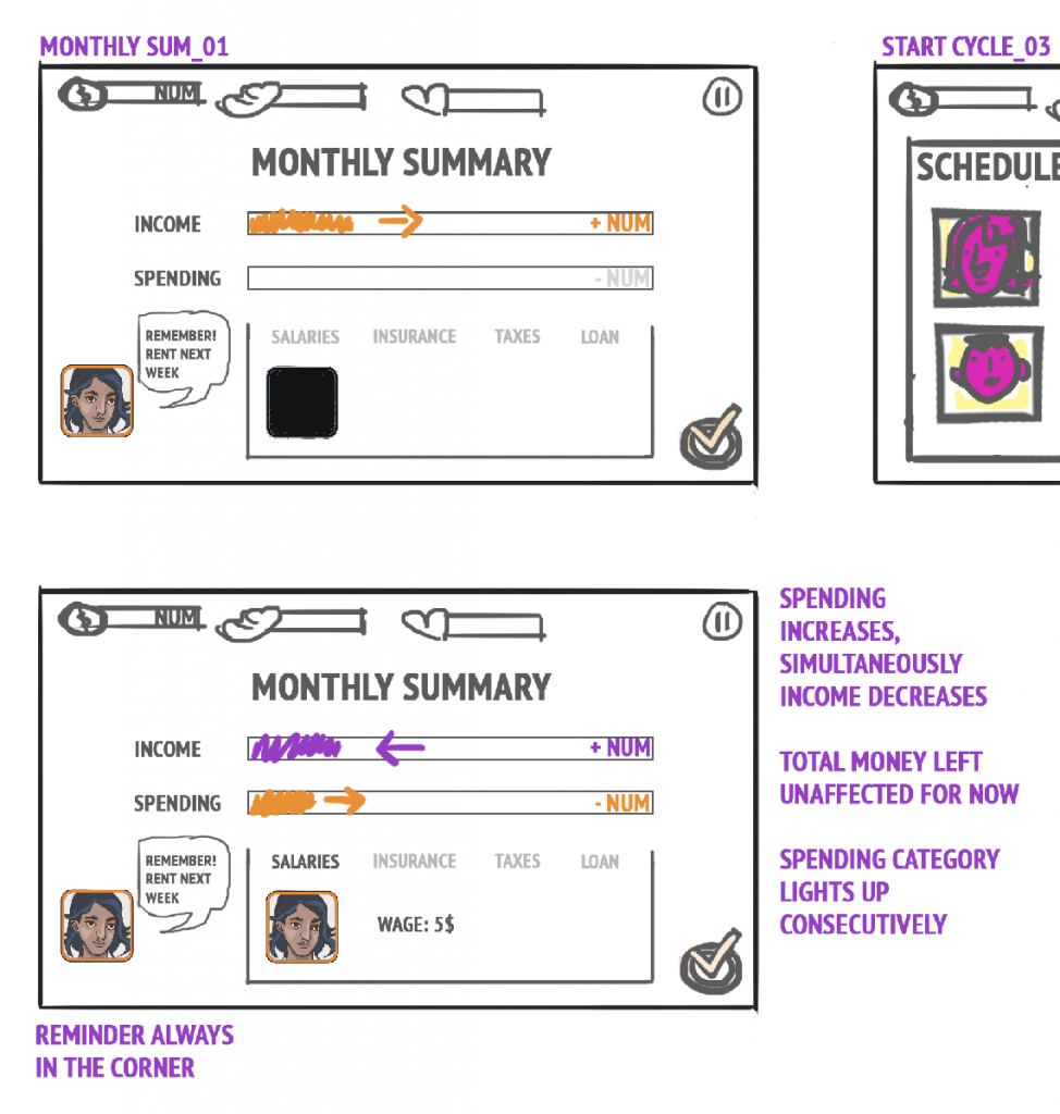
UI mockup of how we want the monthly panel to look
The main logo for the minigame
Next Steps
Moving forward, programmers need to put in all the UI assets that artists have created and then tweak them as necessary. Furthermore, they need to finish remaking the monthly panel and add some animations into the game. Artists will be finishing the UI assets and then start on making the assets for the minigame. They’ll also be animating the characters and adding some more background characters to make the game world more robust. Writers need to finish up the three existing characters and write a tutorial for the game. Then, they’ll be moving on to the fourth character, who won’t come into the game unless they can be written in time. Overall, some of the features discussed last week may be cut, but the team is moving along smoothly in getting a better prototype together.