post

Studio Mar: Final Update

Hi everyone! Sorry again for the late update, I’ve been trying to gather as much of our final deliverables as possible for this post. This will likely be the last post on this project, although I may come back later to update it with more links and documents.

Final Presentation

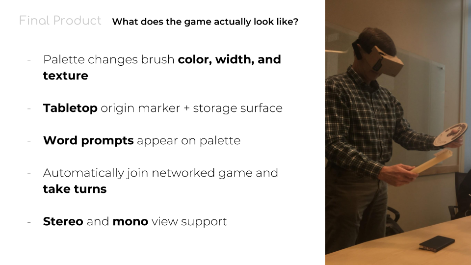
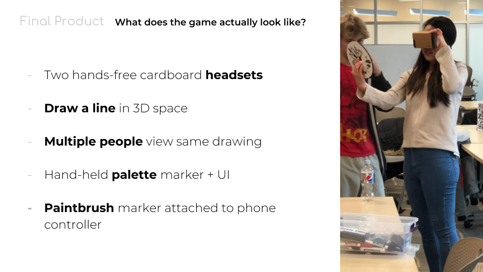
Slide summarizing the final product of LineAR (1/2).

Slide summarizing the final product of LineAR (2/2).

The flat brush marker design.

We gave our final presentation to the class on Friday, May 4th. Here’s a link to the presentation. We spent the week before adding UI assets into the game, like the 3D paintbrush model with a tip that changes color when the user touches it to the color sploosh on the palette. We also created a non-QR paintbrush marker that better matches the rest of the aesthetic of the game, which we ended up just taping to one of our phones that we used as the controller.

We also developed two separate client builds–one for stereo vision, and one for monocular vision. There is a bug with Vuforia: when in the stereoscopic view, if Vuforia is tracking many objects at once that are far away from each other (like the tabletop, marker, and palette), the images attached to them split, making it difficult to focus your eyes. This issue is known to Vuforia, and so while we have no control over it, we are hopeful that future releases will fix this problem. For now, we made sure to have a mono view on hand not only to have a client build that works for a handheld device like an iPad in addition to the headset, but to provide an alternative to the stereo  if/when players get sick or disoriented from the split images.

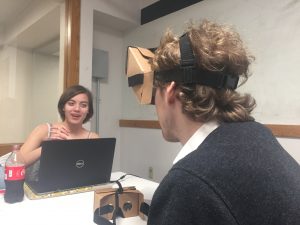
While Tom was our only guest, he was impressed by our final product and the progress we’ve made over the semester. In our final game, you can not only change the color of the brush, but also the brush type to one of six different textures. The word prompts are also functional, and you can view the prompt, skip it, or mark it as completed and go to the next one by pressing the buttons on the palette with the paintbrush. You can also undo brush strokes with another button on the palette. All of the basic UI buttons (skip word, next word, and undo) play a sound as well when they are pressed.

Meeting of the Minds

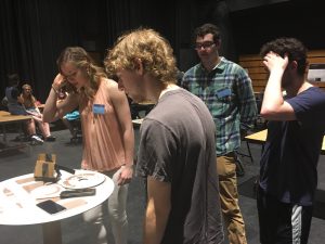
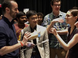
We also attended the Meeting of the Minds on May 9th. We set up our tabletop and devices among the other Ideate projects, and soon drew a near-constant crowd of interested players, from Ideate and elsewhere. We probably had 25 players at least over the two-hour showcase, when the game wasn’t unavailable as we waited for the phones to charge. We weren’t able to have people actually play the game–that is, draw a word prompt and have others guess–due to only having one headset, a slightly jittery brush, and largely the limited time each player got with the game. Still, our visitors were impressed with the quality and craft of our markers and tabletop, the different colors and brush types available, and simply being able to draw in 3D.

Deliverable Links

If you would like to download LineAR to your own devices and give it a shot, here’s the link to the Google Drive folder with the downloadable APKs, as well as printable files for the markers and the post-mortem report. (Note: This folder is only accessible through a CMU account. The tabletop marker file is unfortunately low-resolution, as our artist hasn’t provided us with the original high-quality image file yet.)

You can also check out our trailer and process video below.

Thanks for keeping up with Studio Mar this semester! If you want to know more about the project or would like to request access to our Git repository, please contact me at bsoques@andrew.cmu.edu. Have a great summer!
post

Studio Mar: Week 15 Update

Sorry for no update last week–Studio Mar was busy with Carnival and didn’t get a lot of work done. This week, Studio Mar tried to push to a stable release so we can spend the next week polishing and preparing for our presentation. We originally wanted to have the game to a point where we could install it in the Miller Gallery the week of April 30th, but we fell behind schedule because of Carnival and other conflicts, so we decided not to try to display the game at the Miller Gallery. Instead, we’re focusing on putting in art assets, getting the controller working, and getting ready for our final presentation on May 4th–just one more week away!

Art + Design Update

User interface

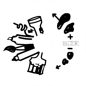
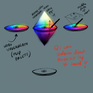
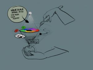
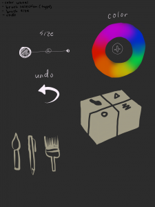
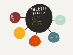
With all of the game features added and programmed in last week, this week we focused on getting in the final art and button assets for the user interface. We decided that, unfortunately, we don’t have time to make a second prototype of the palette, so we incorporated UI elements based on the existing palette design. Several elements are already represented on the physical palette marker (like brush type and size, left), so we added virtual elements that either go over existing elements on the palette, or represent actions that aren’t already on the palette (like the undo button, right).

Paintbrush + Origin Markers

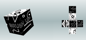
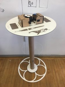
We also created our final paintbrush and origin marker designs, which are made to match the art style of the palette. The paintbrush marker (pictured at left) is inspired by Mergecube, but is our own design. It can be easily printed out and taped together, and will be mounted on the phone controller for the paintbrush. The large origin marker (pictured at right) is a large cylinder, so that players can step away and walk around the marker without losing tracking, but is also designed to function as a table to store the game equipment when it’s not in use. The tabletop can function on its own as a flat marker, if the side of the cylinder (not pictured) fails to track well. The game will include support for flat, 2D versions of each marker, in case the 3D markers are too unreliable during demonstrations.

Sound

Now that we have our button and UI elements, we could create a list of specific actions that need sounds. As an augmented reality game, we can’t direct our players’ view and expect them to see visual prompts or feedback. So, sounds are key to giving users feedback when they do an action–like undoing a stroke or selecting a brush option–as well as when they need to pay attention–such as when it’s their turn to draw. This week, we began finding and editing sound effects to go into the final build, including sounds for each button (undo, skip word, next word), brush option (size, color, type), and a fanfare that plays for a player when it’s their turn.

Tech Update

Bugs with multiplayer and other aspects of gameplay have been fixed–the major obstacle left on the technical front is the phone controller, which is key to gameplay. There are still a few problems to be worked out before May 4th, but we are hopeful that the controller will work well enough for our demonstration then. As far as multiplayer, the server is automatically assigned and all players automatically join it. The turn order is also automatically assigned.

We are looking to acquire an additional phone to use for the phone controller, as well as an iPad for spectators to watch the game without putting on a headset. The game, including the phone controller, should run on any recent phone, but we don’t particularly want to give up our personal devices for, say, the two and half hours the game will be running at Meeting of Minds on May 9th. We believe we can get the extra hardware, but even if we don’t, the game is still perfectly playable for one person with two phones, and players can spectate through a laptop or another device.

Production Update

We’re in the home stretch–one more week until our final presentation! We’re really focusing on finishing the game itself, ideally by Tuesday, so that we can present our most polished version on Friday (May 4th). However, we’re also starting to work on our other deliverables–a game trailer, project summary video, and post-mortem report, which are all do after the end of the semester. To that end, we’re starting to collect images and video of this project, including this clip of your producer hard at work looking up sounds. Watch the clip for a peek into a typical work day at Studio Mar!

(If the video clip isn’t showing up in the post, click here or copy+paste this URL: https://youtu.be/O_8urxy1xho)

After next week’s post, we will make one more post to share our videos and post-mortem report, and then that’ll it be it for the semester. Thanks for keeping up with Studio Mar, and tune in next week for our post-presentation blog post!

post

Studio Mar: Week 13 Update

This week, Studio Mar hosted our client Carl Rosendahl at CMU, to try our game in person! We also continued work on the phone controllers, physical markers, and UI designs.

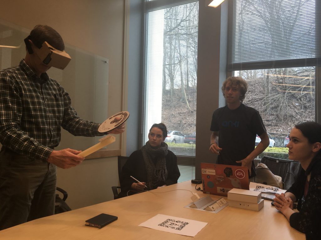
Carl tests LineAR while Adrienne, Jonathan, and Everi look on.

Tech Update

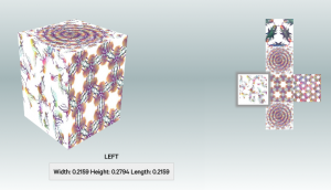
The fractal-patterned cuboid origin marker we tested, with different designs on each face.

We fixed the turn-taking bug we had before, so the multiplayer should work without issue now. We also started working on developing an alternative controller for the paintbrush to run off another phone, as part of the same LineAR app. The phone controller, like our original idea for a handheld controller, would consist simply of a single button the user presses to draw and select menu options.

Origin Marker

We tested another origin marker design, this time using a cuboid with different faces than all the same faces. While Vuforia tracks it, it’s hard to tell whether it works well as an origin marker. We can’t get exact measurements for the Miller Gallery plinths, or guarantee that we’ll get any at all, so Marisa is going to design a custom large-scale origin marker for the installation.

Art + Design Update

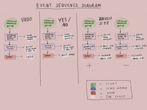
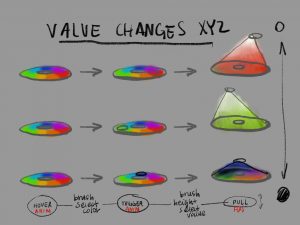
Diagramming the state changes of UI elements as they’re selected on the palette.

This week, we continued improving the palette UI so that it accurately displays and allows the user to select brush colors. We also began working on other parts of the UI, including screens to display on the phones during onboarding to introduce the players to the game and how to play. And, since our final presentation is coming up, we’re also starting work on storyboarding the trailer and project summary videos.

We’ve also sent out our second round of the word prompt survey through Mechanical Turk. Hopefully the results from this survey will confirm our hypothesis about what makes a good “drawing and acting” combination.

Production Update

Unfortunately, Ideate is not sponsoring a booth at Carnival this year, so our next chance to set up the installation is at the Miller Gallery. Any playtesting done before that will have to be on our own. Installation for the Miller Gallery Senior Art Show starts on April 30th, a week before our final presentation is due for the class. Because of this, we need to have our game finished by April 27th, so we can get it set up the following week. Fortunately, this follows our previous production schedule, giving us a week to fix bugs, polish, and work on our presentation, videos, and post-mortem report in time for our class presentation on May 4th. After that, our final display will be at Meeting of Minds on May 9th.


Thanks for keeping up with Studio Mar, and check back next week for another update!

post

Studio Mar: Week 12 Update

This week, Studio Mar gave our midsemester progress presentation! We demonstrated our game, which now has the rest of the main features, including changing brush width, color, and texture. We also presented and discussed our research on word prompts, as well as our progress on marker prototypes, including a new, high-quality palette marker prototype.

Progress Presentation

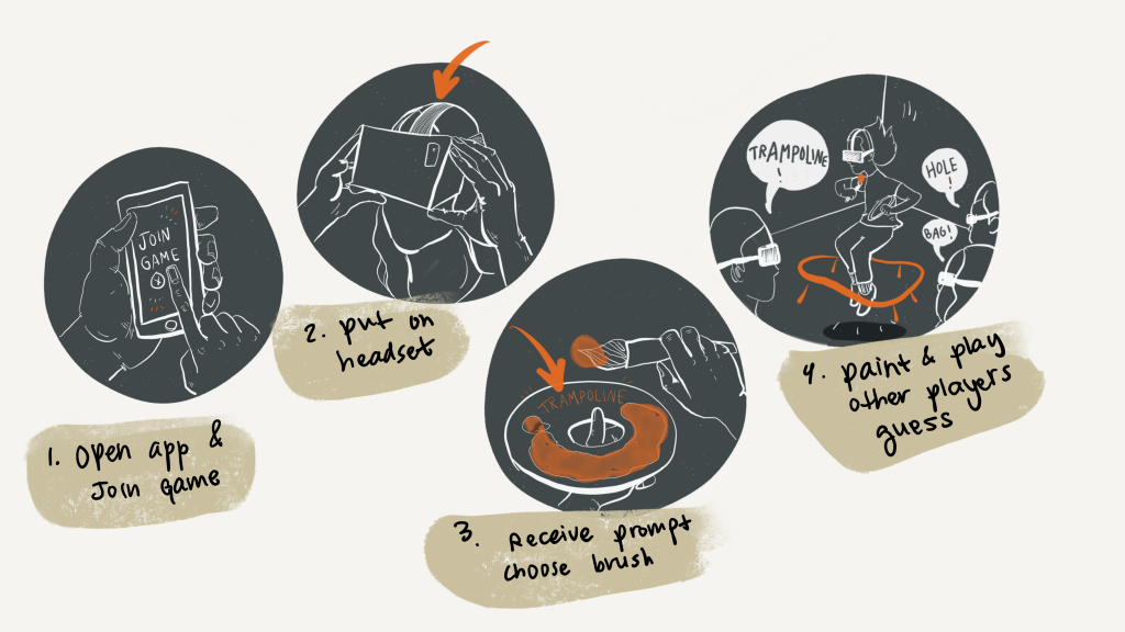
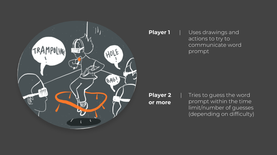
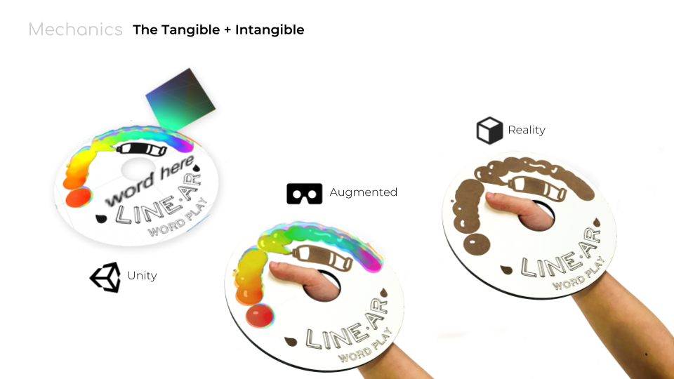
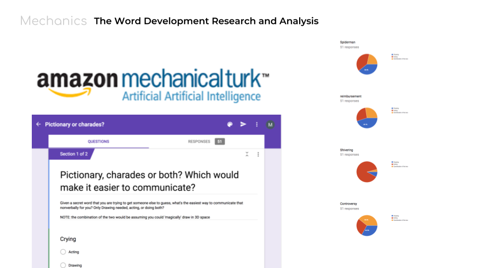
In our progress presentation, we summed up all of the work and research up to this point, including a storyboard visualization of how to play LineAR and some explanation of how markers and UI for augmented reality works. Most of our progress for this week can be found in the presentation slides, which you can find in full here. Some of the highlights from the presentation are included above.

Tech update

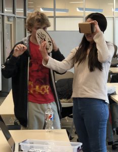
Jonathan helps a classmate test the new palette marker.

On the technology and programming front, we’ve added all of our main features to the game, including all the brush options (width, color, and texture). While not all the features are accessible through a handheld controller, they can be changed through keyboard shortcuts. Marisa also created a handheld palette by laser cutting a disc with a pattern that the game recognizes as a 2D marker. In-game, a basic interface element of a paint blob appears over the marker that lets the player change the brush color by touching the paintbrush marker to the palette marker. In addition, the game now reads in word prompts from a text file and displays them on the handheld palette.

In summary, the game now includes:

  • Drawing a line in 3D space
  • Multiple people viewing the same drawing
  • Changing brush color, width, texture
  • Word prompts appear on palette

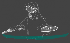
    Concept of the “artist” player, with palette and phone-controller paintbrush.

We also created and tested several new origin markers, including a large 3D cuboid marker. While Vuforia can track our prototype cuboid well, it’s still a little buggy to use as an origin, and we’ll have to keep testing markers to find one that will work for our installation. On top of that, we discovered that neither Daydream nor Bluetooth controllers work with Vuforia, so we need to find another workaround for the paintbrush controller. Right now, we’re planning on developing an interface to run on another phone (as part of the same app) to use as the paintbrush controller, with the paintbrush marker mounted on top.

Art + Design Update

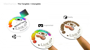
Showing how the UI and markers work across virtual, real, and augmented worlds.

In addition to the illustrations used in the presentation, our artists have been working on the UI, both physical and virtual. The physical and virtual design of the palette are synced together (seen at left). We’ve also been designing interaction concepts and features to include for the palette, beyond just displaying color options and the word prompt (as seen below). Unfortunately, because we’re still struggling to find a working paintbrush controller, we haven’t been able to really start work on the paintbrush UI, but we’re going to do our best to complete the basic UI elements in the upcoming week.

Word Prompts

We are going to send out a second survey based on our hypotheses about what makes a “good” word prompt. Hopefully the results from this survey, which will be formatted much like the previous one, will confirm our list of characteristics of what is an inherently creative prompt to draw and act in 3D space.

Production Schedule UPdate

As part of our presentation, we presented a revised production schedule based on our current progress. The main changes are summed up below:

  • Less focus on artistic/experimental aspects (controversial word prompts)
  • Dropped extended goals (gallery, re-animation)
  • Focus on getting the core mechanics to work (doesn’t have to look too pretty)
Week 12 / Apr 06 Progress presentation due Main features integrated
Week 13 / Apr 13 UI + Markers

Multiplayer fixed

Paintbrush controller

Virtual UI assets (paintbrush, palette)

Origin marker prototype (not skull)

Fix turn taking

Phone controller for paintbrush

Word prompt survey Round 2 results

Week 14 / Apr 20 Carnival Playable game for playtesting

Finish paintbrush controller!!

Word bank for playing

Virtual UI in game

Week 15 / Apr 27 Stable release Pre-final: No new features to be added, bug squashing
Week 16 / May 04 Final presentation due Flex week, presentation/final release prep


Thanks for reading this week’s update, and check back next week for more Studio Mar!

post

Studio Mar: Week 11 Update

Sorry for the delayed update! It’s been a hectic weekend for your producer.

This week, Studio Mar focused on preparing a playable Beta for the presentation on Friday 4/6. To do this, we started getting the Daydream controller working with Unity and making basic UI assets. We also discussed the results from the word prompt survey released last week.

Programming

We started trying to get the Google Daydream controller working with our game in Unity. While we managed to get Unity to recognize the controller, we ran into problems with Unity recognizing when you press a button on the controller. We haven’t figured out a workaround yet, but we’re reaching out to past ETC students who worked with Daydream to see if they can help us.

We also now have the ability for the game to assign turns to players–that is, the game cycles through the players in the game and decides who is the artist. Only the artist can see the palette with the brush options, word prompts, and other options.

Art & Design

UI assets

For this week, we shifted our art focus away from the experience to creating rough UI assets for the presentation on Friday–the 3D models seen in virtual space. Marisa and Adrienne worked together to design the assets. Some of Adrienne’s concept sketches for the palette are pictured above.

Besides the palette, the other assets to make before the presentation are the paintbrush, as well as the join and host buttons that for multiplayer that are pressed before you put the headset on. The palette supports all other UI options: not just the brush texture, color, and width options; but also the undo button and word prompt.

Second headset

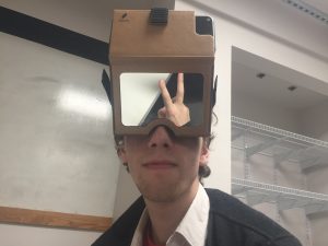
Bobbie donated her personal Google Cardboard headset to the project, and Marisa used the velcro strap and foam that came with it to modify it into a hands-free headset that would support the game like the other headset. The velcro strap is smaller than the buckle strap on the other headset, so it feels pretty tight; we might change that later to make it more comfortable to wear.

Marker prototypes

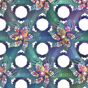
Studio Mar logo fractal pattern by Anna.

With our final marker shapes decided, we started creating prototypes of the final markers. Anna designed some marker patterns based on the logo to test with the paintbrush marker (the cylinder), which we tested. Unfortunately, Vuforia doesn’t recognize different colors, just shapes, so the repeating fractal-like patterns don’t work too well.

By Friday, we plan to have working versions of our final marker prototypes (paintbrush/cylinder, origin/rectangular prism, palette/2D marker).

Word Prompts

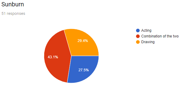
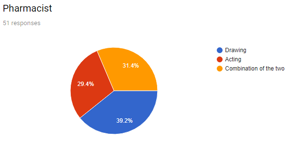
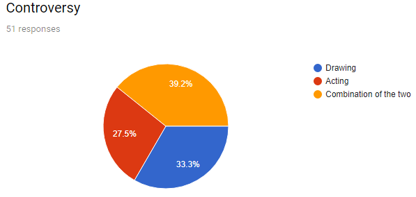
Last week, Marisa created a survey with a set of words like “crying,” “bruise,” and “Spiderman” (among others), that asked, “what’s the easiest way to communicate [each word] nonverbally for you? Only Drawing needed, acting, or doing both?” The survey was completed by fifty people from MechanicalTurk.

Some of the words were overwhelmingly better for drawing (like “house”), and some for acting (like “shivering”). Some of them received a more even mix between the two (like “Spiderman”). Below are the three words that received the greatest number of “combination” answers. These words, as well as the ones with mixed responses, are the ones we looked at as better LineAR prompts–we want the word prompts to encourage both acting and drawing. We want the fun of “Charades with props” to be self-evident, rather than forcing players to try to draw words that they’re more inclined to act, or vice versa.


We discussed the possible shared characteristics among the “good” words (mixed or mostly “combination” responses) and the “bad” words (overwhelmingly acting or drawing). Our list for “good” words ended up looking like this:

  • Complex
    • Multiple/series of actions
    • Specific/specialized
  • More than one actor
  • Abstract
  • Not common knowledge
    • No common symbol
  • Action + object
  • Self-referential

A word or phrase that has many or mostly these characteristics could be considered good for LineAR. For example, “sunburn” is complex (happens over time), involves more than one actor (in this case, the sun is acting on a person to give them sunburn; the person is not the actor), and does not have a common or well-known symbol.

Next Steps

We are a bit behind on our production schedule, mostly due to technical problems (testing markers, trying to get the Daydream controllers to work) which in turn impeded art progress (it’s difficult to design UI assets when we don’t have a good idea of what the physical controllers they’re going over will look like). Our goal is to try to catch up this week, so that we have an as-close-to-final playable beta for the presentation on Friday. That includes:

  • A working Daydream controller
    • Allows player to make multiple strokes, undo the last stroke, and select options from the palette
  • Displaying word prompts
    • On the palette
  • Creating basic UI assets and adding them to the game
    • Paintbrush, palette
  • Making close-to-final prototypes of all markers
    • Paintbrush wand (cylinder, mounted on controller)
    • Palette (flat, held in hand)
    • Origin (large, rectangular prism)
  • Creating a list of basic words/prompts to use for the demo
    • Don’t have to be “good” words (like from the survey)
  • Creating and releasing a follow-up survey testing our hypothesis of what makes “good” prompt words


Thanks for reading, and keep checking back for more updates from Studio Mar!

post

Studio Mar: Week 10 Update

This week, Studio Mar focused on finalizing our markers and getting multiplayer support working. In addition, while moving forward with our installation concept, we decided to showcase/playtest our game at a few different campus opportunities.

Finalizing Markers

We finally finished testing all of Vuforia’s targeting types, including cylinder targeting, which works well as long as we have a distinct enough pattern on the cylinder. Now that we have a better idea of the marker tracking capabilities available to us, we tested all our different options for the origin marker: a big 2D marker projected on the wall or floor, and a 3D marker in the center of the room.

We found that using a 2D marker on a screen causes problems with extended tracking, which treats the moving RGB channels of the screen as part of the background and causes the origin marker to drift. This rules out using a projector or screen for any markers, so we decided to go with a large 3D marker in the center of the play room. This also allows the players to walk around the room, rather than be restricted to facing one direction. This does require that we print out a very large version of the marker design, so that it can be seen from farther away and applied to a large 3D object–we plan on using a rectangular prism, such as the plinth used in museum exhibits (for reasons that will be explained below).

We also plan on moving forward with a cylinder marker for the paintbrush, to create a wand for users to draw with. A cylinder can be easily affixed to the top of the Daydream controller or another handle, and we’re thinking about using PVC pipe or something similar as a sturdy base to wrap the printed marker design around.

Multiplayer

We finally got the multiplayer working! Our main game demo now supports multiple players drawing and seeing the drawing update live. One player has to host and the others join, but visually–in-game–the experience looks the same.

Installation Demos

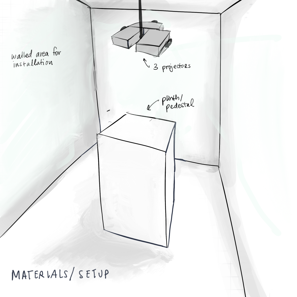
Adrienne’s sketch for a possible LineAR installation setup at the Senior Art Exhibition.

Having decided to lean into an installation rather than a play-anywhere game, we discovered multiple opportunities to host, demonstrate, and/or playtest LineAR. Firstly, Adrienne is excited to show off our game as an installation in the Miller Gallery during the 2018 Senior Art Exhibition, which opens on May 5. We can use one of the plinths used to display pieces as the origin marker, provided we print out the marker designs for the various faces, and place it in the center of the designated alcove.

We also have the opportunity to demonstrate LineAR during Carnival, which is April 19-21, at a booth or other location that IDeATe hosts. While our game won’t be as polished for Carnival as it will be for the art show, we can still demonstrate what we have and get feedback from players. Tom also discussed the possibility of showing the game at Meeting of the Minds at the end of the semester.

With actual spaces in mind, we can consider how to design an installation in more detail. From a technological point of view, our devs are confident that the game can work outside of an installation experience, although perhaps not as well, if anyone would like to play it outside of one of our installations.

3rd-party viewing

With more concrete ideas for installations, we also began thinking about how to show the gameplay experience for anyone watching, but not playing, the game. This is largely important for the art exhibit, since that will be less of a gameplay experience and more of a showcase. We were inspired by Uncorked Studio’s use of projection mapping to show 3D drawing in a VR experience on the walls of a room using perspective tricks, and with Anna’s previous experience with projection mapping we’re confident we could recreate a similar experience.

A problem with projecting the drawings–or any other visual effects–on the walls of the game room is the same problem mentioned above with extended tracking, that it assumes moving parts of the background are stationary and moves the drawings with it. A possible solution would be to create separate viewing and play rooms. Another option is to forego projection mapping and show the gameplay view on a separate screen, or provide 3rd-party observers with a large tablet like a “window” to walk around and look at the drawings. We’re still discussing our options while we work on building our core gameplay.

Word Bank

We are also beginning work on building a bank of prompts for the Pictionary aspect of the game, since we want our core gameplay to demo at Carnival. We’re considering what makes a prompt better to draw vs. act out, hoping to hit the middle ground, as a combination of the two is what we hope to encourage in our game. To that end, we’re curating existing prompt lists and have also sent out a survey with a few example words to see what people are more likely to draw or act.

We’re also discussing curating multiple word banks–not just a generic, family-friendly one to use in gameplay, but also lists that would encourage discussion on more controversial topics or that explore certain themes, like abstract terms that are hard to illustrate (i.e. “ennui”, “angst”, etc.). This would help adapt the game to the different showcase environments, such as the art show vs. Carnival, and would be a good basis to help develop the game past this semester.

Next Steps

For this week, our next immediate steps are:

  • Testing Daydream controller compatibility with Unity and our game
  • Building up the word banks
  • Finalizing our marker face designs and building prototypes

We need to develop a list of materials and equipment for the various exhibitions very soon, so knowing what we need to print, build, use, etc. for our installation is high on the priority list. We are also going to modify a second Google Cardboard to use for playing, since even after lowering the camera aperture on the Holokit, it still feels too distant from the natural point of view.


Thanks for keeping up with Studio Mar, and check back next week for another udpate!

post

Studio Mar: Week 8 Update

This week, we discussed the feedback we received from last week’s prototype and experimented with possible solutions to the origin marker tracking problem. We also continued working on palette/UI concepts and multiplayer support.

Installation

After our presentation, Tom suggested that we consider making our game part of an installation, rather than a print-out-and-play-anywhere game like we’d been thinking about. Creating a dedicated playspace might help circumvent some of the technology limitations, and facilitate the fun of the game–playing Charades with, as Tom put it, virtual props. Adrienne and Anna are particularly excited about the art and gameplay possibilities of an installation, and Adrienne is happy to volunteer her studio for an installation.

Right now, our version of the game mainly has problems with the origin marker, which is small and placed on a tabletop. Because of that, the headset has to be very close to the marker and constantly keep it in view to keep tracking 3D space, which makes the player have to awkwardly bend over the tabletop for the 3D drawing to work. The solutions to this problem that we’ve tried are better suited for an installation than a tabletop print-out-and-play experience, so we are currently moving toward an installation for our final game.

Marker Updates

origin Wall Marker

We tried putting a large version of the origin marker up on a wall, in this case, on a large TV screen. The larger marker can be tracked from across the room, and can be tracked from most angles relative to it, even when the marker’s in the camera’s peripheral version. The downside to this is that it prevents players from walking all the way around the origin, limiting gameplay to a more stage-like experience: one person standing before the origin marker drawing, and the others arrayed around the origin watching them. We haven’t tested drawing with the big wall origin marker yet, but we’re optimistic about its capabilities.

Extended Tracking

We also tried Vuforia’s Extended Tracking, which was surprisingly easy to implement, and works fairly well. The caveat is that the surroundings can’t change too much or else Vuforia can’t track where you are relative to the origin. It works best with a very flat, similar background. For example, if you draw something over the origin marker on a tabletop, look away to a different part of the tabletop, and then return to your original drawing, it’s still there. Drawing something with the origin marker not in view is a little more finicky, as without anything to anchor it to, the drawing can jump around in space.

We plan to keep trying different origin marker methods, like a big marker on the floor or a big 3D marker in the middle of the room, or pairing extended tracking with one of these different origin markers.

Paintbrush marker

Vuforia’s cube tracking seems to work reliably, albeit a bit jittery when it tracks from face to face, and it stops tracking if your fingers are blocking too much of the cube face. We plan to test a “cube on a stick” paintbrush to see if not having fingers blocking improves tracking, and if it’s a viable paintbrush option. We’re also going to test Vuforia’s cylinder tracking, to see if that produces any better or similar results to a cube, because we think a “cylinder on a stick” will at least look nicer than a cube.

We have a Google Daydream controller but haven’t gotten the chance to test how it works with Unity. Our hope is that if it works well with Unity and our game build, we can mount our paintbrush marker, cube or otherwise, on top and use the controller’s buttons for things like turning drawing on and off and selecting options from the palette.

Other updates

Palette Designs

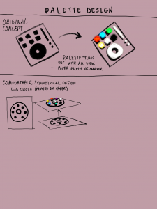
Adrienne sketched some palette and UI design concepts. The main palette concept uses a 2D marker that looks like a blank palette, but when viewed in AR, the blank spaces for colors and other options “pop out” in 3D and color for the player to interact with. She also came up with a list of UI elements we need to include, either in the palette or elsewhere in the UI (for example, on the walls of an installation), as well as some sketches of how they might appear: a color wheel, brush size slider, brush type/texture options, and an undo butotn.

Multiplayer

Everi has continued working on adding multiplayer to the game, and it’s mostly working except for a problematic bug. She’s going to continue tackling the bug, with the goal of having multiplayer working by the end of the next work week.

Next Steps

This week is CMU’s Spring Break, which means it’s not a work week for Studio Mar! If anyone has the time and inclination to work on the game, we’re going to keep working on what we’ve been working on this week. Our goal for the end of the next work week, March 23rd, is to have an Alpha version of our game. The Alpha should include:

  • Final origin marker
    • Supports using physical space for drawings
  • Multiplayer support
  • Drawing with our final paintbrush marker
    • A 3D marker mounted on a controller, not a 2D piece of paper
  • Basic UI
    • Let user make multiple strokes, undo, start/exit game

To that end, what we’re working on this week and next is:

  • Continuing testing different origin marker solutions
  • Continuing work on multiplayer
  • Testing drawing with different paintbrush markers
  • Integrating the Daydream controller into our Unity project
  • Designing and implementing UI


This post should be updated with video and images of our progress later this week. But after that, we’ll see you on March 23rd! Have a great Spring Break!

post

Studio Mar: Week 7 Update

This week, Studio Mar focused on creating a playable demo and revising our production schedule, for the prototype presentation on Friday. We also decided on our game name: LineAR (pronounced “linear”)!

FInal Concept

Our final concept is a mobile augmented reality game for two or more players, that is a combination of Pictionary and Charades. One player gets a prompt like “picture frame” or “pirate,” and has to draw that word in 3D space so that the other player can guess it. The fun of playing this game in AR comes from the ability to use the physical space around you, as well as yourself and other players, when drawing. For example, to illustrate the word “trampoline,” you draw a circle on the ground and then jump up and down on it; for the word “sleeve,” your friend draws a sleeve around their arm. This way, the game becomes a kind of Charades with props that you draw yourself.

Extended features

If we have time, we have a few extended features we’d also like to include:

  • A gallery of saved drawings overlaid on the real world that you can physically walk through
  • Saved drawings are reanimated in the gallery
  • Markers on headsets to track and draw on other players
    • For example, if you get the prompt “pirate”, you could draw a pirate hat and eyepatch on your friend.

Software: Vuforia + Tilt Brush

After exploring all the technology options, we are moving forward with Vuforia and marker tracking for our software. Unity doesn’t support using more than one AR software at a time, so unfortunately we can’t integrate AR Core or any other AR support with Vuforia. We are still exploring Vuforia’s 3D object tracking and extended tracking, to push the limits of what Vuforia supports and allow for the best play experience that uses the whole room.

We are designing and testing Vuforia markers for the origin marker, the point that allows the drawing to be done in 3D, and allows synchronizing across multiple users; the paintbrush marker, which players use to draw; and the palette marker, which players use to select Tilt Brush paint textures and colors. We are moving forward with using the Tilt Brush SDK for players to have different brush options when drawing.

headset

We are continuing to develop for both the Holokit and Google Cardboard, since it is straightforward to make prototypes for both at once. One problem with the Holokit that we discovered during our demo is that the phone camera is placed well above the wearer’s eyes, meaning they have to bend over awkwardly to see something below them that they can see easily without the headset.

Progress update

This week, we:

  • Added adjustable straps to the Cardboard and Holokit headsets, so they can be worn hands-free
  • Developed multiplayer: multiple players viewing the drawing at once
  • Created some palette/non-paintbrush UI design concepts
  • Tested Vuforia’s cube targeting: which works pretty well!
  • Tested the Merge Cube dev kit
  • Made our demo game stereo, so it can be viewed in a headset

We found one major issue with Vuforia’s marker tracking is that it requires the players to keep the origin marker in camera-view at all times, which is awkward, and doesn’t support the use of physical space like we want our game to have. We’ve begun testing potential solutions to the origin marker: a large marker on the wall or the floor, a 3D cylinder or cube marker, and extended tracking.

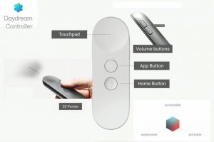
Diagram of Daydream features, from the blog Above AR.

We also acquired a Google Daydream controller, which we plan on testing to use as a paintbrush controller. We hope that we can use the controller to turn drawing on and off, allowing the user to control drawing multiple strokes, as well as selecting options and increasing brush size. Whichever marker we end up using for the paintbrush would be mounted on top of the controller.

Revised Production Schedule

We updated our production schedule, which is mostly the same as before, but with more consideration for working with markers and UI designs.

Week 8 / Mar 09 Multiplayer [Mid-sem break]
  • Other players can see the drawing live
  • Finalize 3D obj
  • Non-paintbrush UI designs: palette, prompts
  • Origin tracking solutions
  • External playtesting (continuing for rest of sem.)
Week 10 / Mar 23 Alpha
  • Stable release of multiple people taking turns drawing
  • Finalized & working physical paintbrush (marker + controller)
  • Basic UI implemented
Week 11 / Mar 30 Prompts
  • Limited set of prompts for player to base drawings on
  • Refined UI
  • Changing turns supported in-game
Week 12 / Apr 06 Progress presentation due
  • Beta: Stable release of drawing + objectives
  • Prompts integrated into refined UI
Week 13 / Apr 13 Brush options
  • If not yet incorporated, color + line width + animated brushes
  • Full palette support
  • Start work on gallery
Week 15 / Apr 27 Stable release
  • Pre-final: No new features to be added
Week 16 / May 04 Final presentation due
  • Flex week: bug fixes, presentation/final release prep

Next Steps

Our next immediate steps are:

  • Find a better way to track the origin that allows for the use of physical space
  • Decide on a paintbrush marker (hopefully 3D, whether cube, cylinder, or other)
  • Design UI (what we see in virtual space, without relying on markers)
  • Implement multiplayer support
  • Test and implement Daydream controllers
  • Create a bank of Pictionary-style prompts (test which ones work better in AR)

And, as soon as possible, we want to begin external playtesting, to help build our prompt bank and test the game concept.


Thanks for checking in, and keep checking back for more updates on Studio Mar!

post

Studio Mar: Week 6 Update

This week, Studio Mar focused on designing and developing Vuforia markers for use in our game, while continuing work on the headsets and playable prototype.

Markers

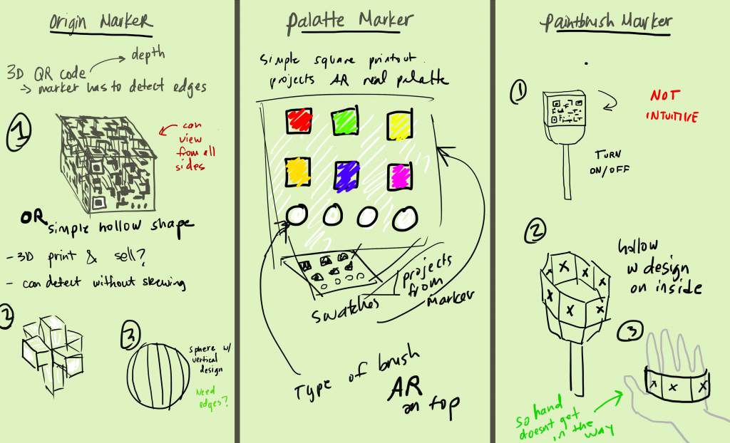
Sketches of marker design concepts by Adrienne Cassel.

We discussed a few different designs for markers: the origin marker, which represents the center and flat plane of the play space; the palette marker, which allows the player to select brush colors and textures; and the paintbrush marker, which the player uses to draw the line in 3D space.

3D Markers

We tested Vuforia’s 3D Object tracking to see if a 3D marker is a viable option for the origin and paintbrush markers. We want a 3D marker to be accessible by anyone who plays the game, and so looked into objects that could be printed out and put together. Vuforia needs multiple points to recognize a specific object, so a complex 3D printed object works better than a folded paper shape. We are also testing Vuforia’s cube recognition.

We hope that a 3D origin marker will be easier to track as players walk around it, and that a 3D paintbrush marker will support natural drawing in 3D space (by rotating and twisting the marker).

Paintbrush Controllers

We discussed possible solutions to a problem we discovered last week–how to turn the “painting” on or off without changing the paintbrush marker, which would require re-tracking. We came up with two different solutions: a gaze-based on/off button in the virtual UI, and an on/off button on a physical handheld controller. To that end, we hope to acquire some Google Daydream controllers to use with our Pixels, since we believe the handheld controller is a better design solution than the gaze-based UI.

Improved prototype

Last week we were able to start drawing in 3D space using Vuforia and 2D markers. This week we added the ability to draw with multiple strokes–whenever the software stops tracking the paintbrush marker, like if the paper is turned over or goes offscreen, it stops drawing the line. When the marker is re-tracked, it treats it as a new line. The brush texture demonstrated above is “Rainbow” from the Tilt Brush SDK, edited to be all red.

We also have begun working on adding multiplayer to the prototype, so that multiple people can view the same drawings at the same time.

Headset

We tested the three-strap headset design and added foam padding to our modified Google Cardboard to make it more comfortable to wear.

next Week

Next week is our prototype presentation! We hope to have working versions of the headset and markers, with designs that we plan on moving forward with for the rest of development. That way, our guests can have an experience as close to the final game as possible.

Keep checking back here for more updates on Studio Mar!

post

Studio Mar: Week 5 Update

This week we continued research and design, focusing on three main aspects: designing UX concepts, playtesting our game concept, and testing the technology we plan on using. We acquired two Holokits as well as two Google Pixels to use for development, and so were able to start playing with those.

Designing UX Concepts

Our designers spent some time researching AR/VR UI design guidelines, and came up with a few guidelines of our own. Chiefly, we want to make sure that UI elements and interactions are anchored in physical space and actions, and avoid 2D menus. To that end, we developed a few concepts for micro-interactions, based on using hands as the primary interaction tool.

Unfortunately, we haven’t heard back from Manomotion about acquiring a license for hand recognition. While we will continue reaching out to them, we also started designing concepts for marker-based interaction–using a marker for painting, as well as a marker in the opposite hand for a palette or prompt card. We incorporated some of the gestures conceived for hand-based interaction into our marker concepts, like attaching a marker to a strap to slip over the flat part of the hand so that a player can flip their hand over like viewing a card.

We tested wearing the Holokit headsets, as well as a modified Google Cardboard headset. The Holokit headsets are top-heavy, because of the placement of the phone, and so we began developing concepts for a multi-piece strap that goes over and around the head to keep the headset on.

Playtesting the game

We also spent some time playtesting our game concept, as much as we can without having developed the game itself. Two of us played Pictionary using Tilt Brush on the Vive, and noted what about the game works well in VR, and what doesn’t. We concluded that the most fun out of playing Pictionary in 3D space involves 1) using the physical space fully, like drawing items of clothing on yourself or drawing a trampoline and then jumping on it; 2) taking advantage of the different brushes and textures available in Tilt Brush, like using the fire texture to draw real fire; and 3) watching your friend draw in the space and the excitement of the reveal of what they’re trying to draw.

Our other concepts–like drawing something that your friend describes–weren’t as fun as straight-up guessing a word that your friend is drawing. As one of our team members put it, what makes it fun is the combination of Pictionary and Charades.

Testing the tech

Since we finally acquired the Holokits and phones for testing on, we were able to start fully testing the capabilities of the different hardware and software we’re considering using.

Tilt Brush sdk

The Tilt Brush SDK supports importing Tilt Brush drawings into AR, not drawing them. Still, it gives us access to the brushes and textures used in Tilt Brush, so we plan on incorporating those into our own painting system.

AR CORE

With the Pixels, we were able to test the capabilities of AR Core, Google’s AR platform for Android devices. While its plane recognition capabilities are far better than Vuforia’s, it doesn’t support markers. Since we need to use markers to draw in 3D space, we have to pass over AR Core for now.

Holokits

We downloaded the Holokit app and tested some of the demos in the headset. As far as we can tell by running the demos, the Holokit app appears to first recognize a plane using the phone camera, place an object on the plane through the phone camera, and then remove the camera feed and switch to a binocular view for the user to finally put their phone in the headset. The result is that the object (or objects) is reflected off the glass in the headset to appear like a hologram projected onto the real world.

Without viewing the world through the camera feed, the projected object is a little offset from the real world, and the in-app plane recognition isn’t that great. While those errors could be fixed by using a different plane recognition and aligning the video reflection with the real world, a more concerning problem with the Holokits is how the edges of objects are clipped by the edge of the phone’s camera. While this wouldn’t be a problem if one was viewing it through the phone directly, when reflected onto the real world the effect is odd.

Regardless, developing the game for the Holokit or a Google Cardboard-like direct view experience will be mostly the same, as will the UI/UX and headstrap design. We plan to keep testing with the different headsets once our prototype is more developed.

Vuforia

Vuforia supports plane recognition as well as marker recognition. While its plane recognition is buggy, it is functional, and its marker recognition works well. Using Vuforia and markers, were able to successfully draw in 3D space!

Granted, the drawing was limited to a small space, as the camera has to be very close to the plane marker for the software to recognize it. On top of that, if the plane marker is obscured in any way, the device loses track of the positions in 3D space and prevents the drawing from being rendered in 3D. Because our paintbrush marker was just a printed-out marker on a sheet of paper, this was problematic–but can definitely be solved by designing a better paintbrush marker.

Summary

This week, we learned that the most fun out of a 3D Pictionary game comes from adding in a Charades-like physical action element to it. We developed some UI design principles and began designing straps to create a hands-free AR headset. We also tested Holokits and were able to do some rudimentary drawing in 3D space using markers.

For next week, we plan to keep pushing on developing this game with markers. Can we make it possible for the fun interactions with physical space that we discovered in playtesting to work using marker recognition? If not, can we make the game fun in other ways? We also plan to continue developing headset and paintbrush+palette marker designs, to make the interactions as straightforward as possible.


Keep checking back here for more updates on Studio Mar’s development!