![[OLD SEMESTER] 15-104 • Introduction to Computing for Creative Practice](https://courses.ideate.cmu.edu/15-104/f2022/wp-content/uploads/2023/09/stop-banner.png)
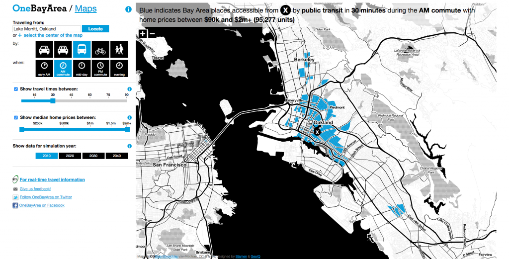
For this week’s blog about information visualization, I found the work by the Stamen Studio very compelling, especially the “OneBayArea Map” that mapps transit ranges around the entire bay area in one program. Besides the eye-catching and interactive homepage, their works include very strategic methods of making useful maps that get straight to the point without sacrificing information. The “OneBayArea Map” not only lets commuters understand commute time and distance, it directly relates this information with housing prices, helpful for homebuyers to find ideal homes to commute from. Moreover, it also encourages commuting methods like bussing, biking, and walking by showing how little time they actually take in some cases, comparable to single person vehicles. It also suggests concepts relating to socioeconomic status and access to public transportation systems. To do so, I think this project includes layering many different types of maps and consolidating the data of these, which is then transferred into codes to revisualize these data into an interactive map. The map’s aesthetics not only generates a nice looking program, but it also creates simplicity and clarity that is very important to an info-packed map.
https://stamen.com/work/onebayarea/
<img source=”https://courses.ideate.cmu.edu/15-104/f2022/wp-content/uploads/2022/10/oakland-30-2.png”>