push and pull documentation
FIRST HEAD
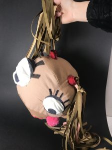
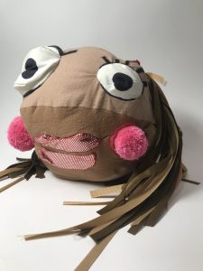
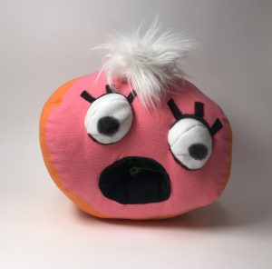
My first object was a face. Before I began creating each piece, I sketched out the original ideas. I wanted to create characters because I like the different facial expressions I can work with. 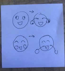
I was inspired by this pen I used to have when I was little. I wanted to find a way to squeeze the object and have its eyes pop out. I realized that this would be hard to do with the squeeze element alone, so I thought of using a strip to connect two parts.
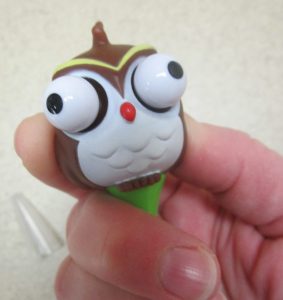
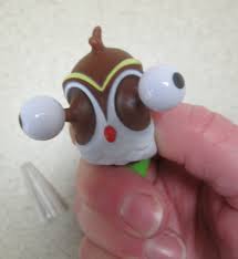
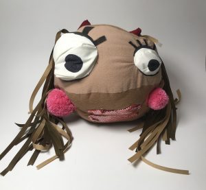
When looking for fabric for this object, I found two pink pompoms with string attached to them. I thought this would be a good element to incorporate into the object instead of having popping eyes.
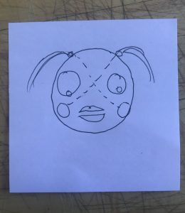
An issue with the pom poms was that they were different sizes, and I didn’t really like the asymmetry, so I made the eyes different sizes too to match it.
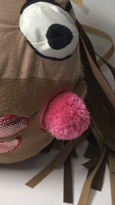
I started with the head, added eyes, then a mouth, and then added the hair and the pom poms.
The reasoning behind my choices.
-I wanted the head to match skin tone, but not one particular persons.
-I wanted the face to look pretty, so I added eyelashes, bows in the hair, and I stuck with a pink color palette.
I thought the pulling aspect was kinda uncomfortable and wanted to counter that/add confusion to the user by making the characters look cute.
SECOND HEAD
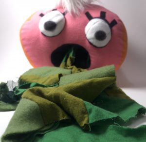
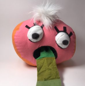
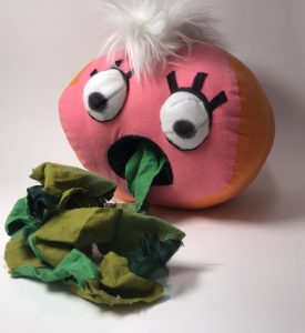
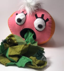
I sketched this head too once I finished the first. I was inspired by this scrap piece in A31. It was a long strip of different fabrics sewn together. It reminded me of a magicians hat, where they pull out a long piece of colorful fabrics.
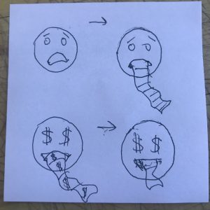
I sketched different versions of what this looked like. I thought about making a head with cash signs for eyes, and cash screaming out of the mouth, but I thought a head just throwing up matched the distress more of the first head.
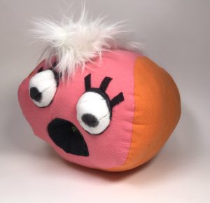
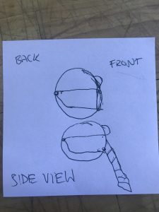
I started with a head, then the eyes again, and then had to think about how the mouth would work. I made a cylinder that would go inside the mouth, and sewed it to the back of the head so that it wouldn’t fall out. I thenattached the vomit to the back of the head
The reasoning behind my choices
-color combo, I wanted it to still look like skin, but I got bored of the browns, so I went with pinks and oranges.
-added hair, because the top of the head looked kinda empty. and I thought it wasn’t fair that the other head had hair.
-the vomit was different shades of green because green is my least favorite color and deserves to be vomit.
THIRD HEAD
For my last head, I had a little more trouble coming up with ideas. I didn’t want to repeat the motions and interactions of the last two but still wanted it to be interactive.
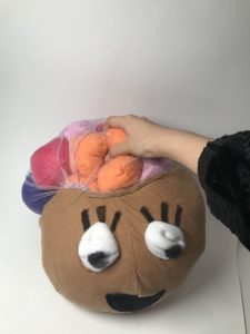
I wanted to play with the shape of the head a little more.
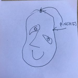
This was my first sketch, the head was a little disfigured, and was pinched on the inside. There was no interaction from the users’ end. I wasn’t really drawn to this one because it just looked like a Picasso painting.
I then thought about combining two spheres together, and enjoyed how funny this looked.
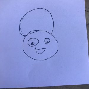
It started to resemble this kid’s head from Jimmy Neutron. His character was really smart and had a big brain to show it. I decided to begin focusing on what’s going on inside of the head, like thoughts and feelings.
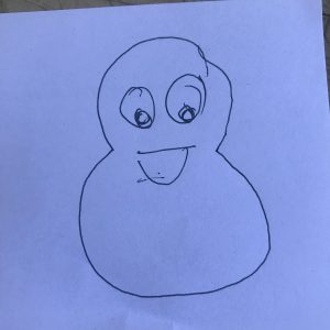
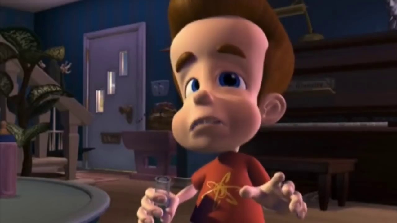
Then it got sad.
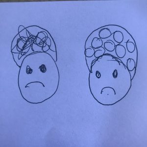
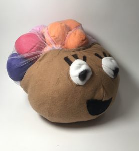
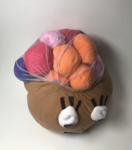
I started thinking about how a person’s thoughts can be overwhelming and consuming. The general feeling with overthinking can feel heavy. I wanted to portray this to the audience, by having a visible representation of these thoughts.
I made about 12 small spheres to represent these thoughts. I wanted to use a see through material so you could see these circles, I ended up using white tulle and had a lot more trouble sewing this together. I couldn’t figure out the correct tension to use so the result felt a little more sloppy than I intended.
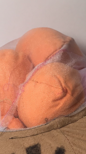
I ended up adding a smiley face to this head, because I forgot it was suppose to be sad, probably because of the bright colors I used for the thoughts.
