anabelle’s blog 02

Although I think I’m defining “generative art” a little loosely, some inspiring works to me include any type of character customization feature in video games. This goes ranges from dress-up games, Nintendo Mii creation, or the Sims. I admire how these games allow the players to have more freedom in how they approach gameplay — some may focus entirely on aesthetics, and thus spend hours creating the perfect avatar, whereas some focus on the game’s actual main goals and minimize on character building. Either way, customization always serves as an enjoyable interlude between long bouts of repetitive gameplay. I think the creator’s artistic sensibilities manifest in the algorithm by how it reveals their style and “instincts. For example, if a creator has to create 100 different options for “eyes,” their habits and preferences will eventually become pretty obvious once the reach the 90th eye design. Similarly, you can feel how they prefer to build their worlds — do they prefer to use arcs or ellipses? How do they approach drawing small, ambiguous details with code? Ultimately, even though the purpose of these games is to give the player a larger creative realm, the artist most definitely imprints their own style in every part of them.

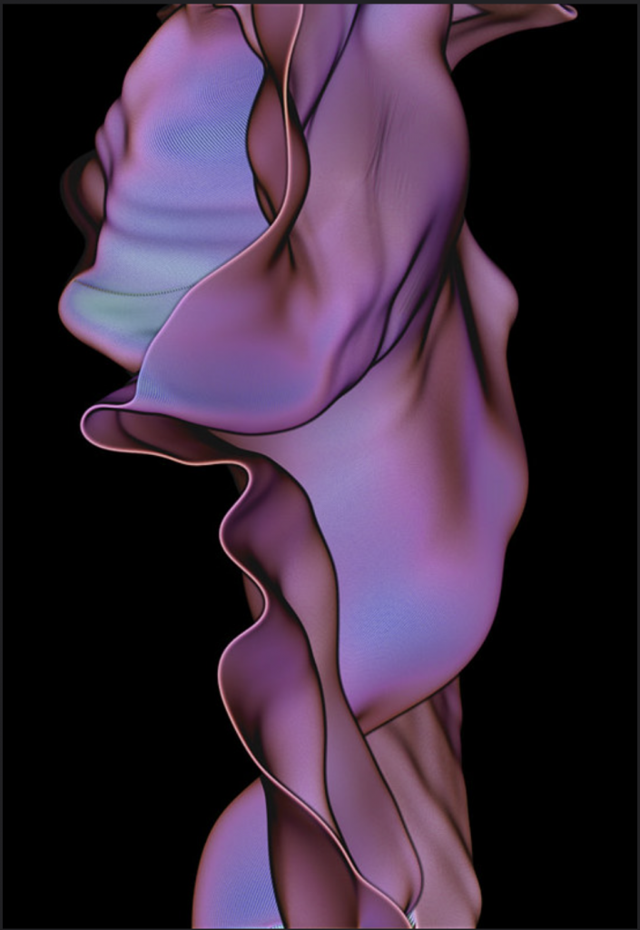
Even Genshin Impact, a game that has nothing to do with building your own characters, has options (albeit limited ones) for customization:

Link to Official Website: https://genshin.hoyoverse.com/en/home

Created and released by Hoyoverse, 2020.

LookingOutwards-02 Section D

Creator’s name: Karsten Schmidt

Title of work: Axis

Year of creation: 2008

One of many postcards

Karsten Schmidt’s generative art titled “Axis” is very admirable for its beauty, the feelings it evokes, along with the impressive process of creating it that involved both the physical and digital worlds. This collection consists of sculptural forms that were created through the use of hanging strings whose motion was recorded over time. His portfolio states that “The local differences in velocity for each point along the string are used as a metric to create the subtle shading and cloth-like texture.” This work became postcards used to advertise an installation. This collection is absolutely beautiful to look at. Each design has a floating, soft, and dynamic appearance that resembles fabric and the way it effortlessly contours to create organic patterns. One of my favorite items to draw is fabric due to its unique texture which is one reason I truly love looking at this work. I supposed that the algorithm used to create this work involved some sort of digital camera or motion sensor that took in the information and translated it digitally on a software program. I am not completely sure what the tools and programs required to create this would be. After looking at Kasten Schmidt’s portfolio, he seems to be very interested in motion which also involves physics. We can see his artistic sensibilities and style manifested in this algorithm, especially when knowing a little bit about how it was created.

Axis | Flickr

LO 02: Generative Art

Form is a Fluid by Leonardo Solaas, October 2016

I looked at the generative art-inspired geometric structures by Leonardo Solaas. I think it’s really interesting how he used code and patterns to comment on the fluidity of form. There wasn’t much information about the code and algorithm itself but I would assume it involved moving through the number of lines that would be in the drawing, ranging from around 6 to 12, and slightly changing the angle and adjusting the length of every repetition to achieve that twisting movement as you look from one side to the other of the collection. When the individual drawings are looked at zoomed in, they are much more detailed and delicately crafted. I assume there was some part of the algorithm that created hatching lines between a point and different edges. The artist’s abilities especially shine through when looking at the chairs placed in front of the generated geometrical shapes– you can clearly connect the chairs to their inspiration and I think the process of studying form in this simulated but really organic way is super cool and inspiring. 

La forma es un fluido

Looking Outwards 02: Generative Art

Project: Purform – The White Box, Audiovisual Performance, 2010

“This cycle metaphorically transposes, into sounds and images, concepts from systems theory related to black, white and grey boxes.”

I admire the aesthetics and fluidity of this project. The combination of the wide range of sounds and dynamic abstract visuals and their harmony of working together allows the audience to be fully absorbed into the piece. I am especially inspired by how the visual and audio components work together and are dependent on each other to make this piece whole. This piece is almost inviting; its fluidity and dynamicism pulls and mesmerizes the audience in and be in synch with the audio and visuals. I suppose the project was made by a looping code that was taught to react to sound vibrations and audio stimuli, and translate it into a random visual or shape. The artists’ (Alain Thibault for music, Yan Breuleux for visuals, and Jean-Sebastien Rousseau and Peter Dines for the program) sensibilities all come together to create one aesthetically and fundamentally cohesive and effective piece.

link to YouTube video

Project: Purform – The White Box, Audiovisual Performance, 2010

Tina Franks “20160815” Project (2016)

A project that I find inspirational, is Tina Franks’s “20160815” created in 2016 with Peter Rehberg on sound.

What I admire about his project is the way combines electronic with a natural phenomenon that humans experience. The project wonders if androids would see phosphenes, which are luminous floating shapes that humans see when we close our eyes tightly and stimulate our retinas (aka rub our eyeballs). She thought that android’s would interpret these as raw liquid crystals, similar to those that are in LCD screens and electronic devices, just more raw and less crystal clear. She combined that with Peter Rehberg’s electronic music, and its a very interesting and cool project to see/hear! I admire the combination of electronics and humans, as our world is very much trying to blur the line between the two and bring us closer to our devices. Thus, Tina Frank’s project is not only relevant and inspiring to other artist during our time, but it is also very beautiful to see.

I am not sure how the algorithm works in this generated work, but I think that the work is based on randomly changing between created pictures of lines. Tina Frank also uses pixels from old video test strips from televisions to create some of these pixel images. The pixel lines are probably also similarly created by random generation of color pixels within a strip of space. Beyond that, I am not sure how this art was made.

The algorithm supports the artists vision as the different generated images are randomly spliced and cut together one after another that is similar to how phosphenes happen naturally. It is also similar to how an old TV would glitch with static or the colorized testing strip. The world she created is coarse, jarring and unfamiliar, something that she wanted to happen, as the thought of a future with HD implants in the brain or with android’s, is something very foreign and remote to many of us today.

A 1-minute preview of the audio-visual project “20160815” created by Tina Frank (video) and Peter Rehberg (audio).

lo: generative art

One computational art project I admire is actually from a previous design professor of mine, Kyuha (Q) Shim. Much of his work operates in the realm between art, design, and technology, but I am really drawn to his experiments with typographic algorithms. What I find admiring is how Q approaches iterations and experimentation. He says the benefit to using computational systems is the themes you can see across a series of iterations that would otherwise take a long time. The ability to find these motifs then allows designers to create more solutions and observe broader systems than we can without technology. I’m not sure of the specifics of how he generated these designs, but I would assume it incorporates some image recognition based on type and qr codes. These experiments reflect the practical nature of Q and have a lot of potential both in technology and artistic aspects.

More info here

Looking Outwards 02

LIA’s work draws me in because it is outstandingly compelling, and every piece has thought behind it. Her “Four Seasons” series is most interesting personally because of the shapes and colors she uses, as well as the details in movement for each season; slow, sharp, and downward movement for a snowy Winter, as opposed to the bright, warm, and growing/spiraling motion for spring, etc. The artistic sense is undeniable in LIA’s projects as her eye for color and composition as stated above is incredible.

In terms of the algorithm that generates her work, LIA’s animations are generated randomly as stated in the beginning of her videos, so there is no repetition. Moreover, it seems that she uses many variables for color, shapes, and motion because the website states that she codes with a fluidity. This implies that she may not have a specific picture in mind before coding, and declaring her own variables would allow for her to make changes to the entire piece in a convenient manner. I suppose this is especially useful in deciding colors, since I know from experience that even the slightest change in value or hue can enhance or mar the product.

“Winter” by LIA, the second part of a four-part series on seasons that showcases her ability to code and eye for shape, color, and motion
“Spring” by LIA, the third edition to the “Four Seasons” series that showcases her ability to code and eye for shape, color, and motion

L.A. Philharmonic Light Show at the “Walt Disney Concert Hall.”

Srishty Bhavsar

One of the first buildings that caught my attention when I was younger was the Walt Disney Concert Hall by Frank Gehry in downtown Los Angeles. I remembered being taken back by its cluster of large metal winged walls that stood out amongst its surrounding buildings. As I walked by the building, I noticed how whimsical, symphonic, and extravagant it was. Today, I admire how fitting these characteristics are to its function of being a hall for orchestras and bands. The building itself was designed using a C++ software package designed and used by aerospace engineers called the CATIA. Through this software, Gehry was able to achieve impeccable acoustics within the concert hall.

In 2018, the L.A Philharmonic Light show had an installation performance which transformed the facade of the Walt Disney Concert Hall at night. The installation was designed by Refik Anadol and Google Arts and Culture. Made up of deep neural connections, Anadol and Google created a data universe that translated data points from the LA Philharmonic’s digital archives into projections of light and color. The installation was designed with a parametric data sculpture approach where music was sorted into thematic compositions by machine learning algorithms. Inside the concert hall, visitors were able to interact with mirrored walls that showcased the philharmonic’s archives. Anadol’s light show is a great example of how visual generative art combined with audio and a computational structure can encapsulate a visceral and immersive experience.

Sources:

https://en.wikiarquitectura.com/building/walt-disney-concert-hall/

https://www.archdaily.com/902277/s-walt-disney-concert-hall-will-be-lit-by-algorithms-in-dream-like-light-show

Looking Outward-02

Goerge Michael Brower – Staggering Beauty

Regarding this project, I really admire its comedic nature as the rapid moving of the worm causes a spastic response with tiled images of explosions flashing very colorfully. It completely violates all contextual expectations of the silly-looking worm and the majestic-sounding website/project name. The worm seamlessly follows where your mouse goes, and there’s a threshold of moving it around enough that it will start generating an absurd amount of colors and images that flash really fast at the user. I actually decided to do this because I was looking at Leander Herzog’s work first, and it really reminded me of this nostalgic viral phenom that is the Staggering Beauty.
I mean, the code for this algorithm can probably be figured out or reverse-engineered pretty easily in theory. Since it is known as a javascript demo, I can definitely conceive of it in p5.js. The shape of the worm flowing is probably the most difficult part, but generally moving with your mouse is using the mouseX and mouseY variables with whatever makes up the shape of the worm. It also hits the walls, so there are bounds involved. Lastly, I don’t know how specifically the algorithm measures the speed at which the user is moving their mouse, but a certain surpassing of a set threshold with an if statement allows for all the flashing colors and images to appear rapidly according to your mouse speed after breaking that threshold.

The artist’s sensibilities just really come alive in this piece by how animated this little guy is. The worm is so minimalistic, but it plays into its weirdly cute and nonchalant nature as its eyes blink intermittently as well. The fact that you can see the dynamic animation of its eyes getting bigger and an “x-ray” look of its simplistic organs as if the worm is getting shocked in the cartoons is really just great, memorable, and deservingly viral.

http://www.staggeringbeauty.com/

LO: Nonsense Library

Nonsense Library – Allison Parrish (2021)

https://artsexperiments.withgoogle.com/nonsense-laboratory/

One of the most admirable things about Nonsense Library, is the way that real knowledge is game-ified, and programming, video games, and knowledge about linguistics/speech interact. It serves both as a learning tool and an experiment, and hence the ways in which one could interact with the program varies greatly. The game aspect makes the site endlessly engaging, and the way in which the program messes with pronunciation quite literally forces the viewer to speak aloud and have a conversation with the computer. I would guess that in order to achieve this, Parrish built an extensive algorithm linking phonetic & pronounced sounds. I would also guess that she, too, spent a lot of time feeling the words in her mouth in front of a computer. Because of the truly absurd speech one can receive simply by inputting a couple adjustments (“Hew hew heish weelhy heelhyy weehly heegy hsewhy heelych…”) I would guess that Parrish has a good sense of humor, and embraces the absurd in her work. 

Nonsense Library phrase pre-modification. “How doth the little crocodile improve his shining tail”
Nonsense Library phrase post-modification. “Haah taahth thae layhai chawahaja aypharh haycha hcheyehaj tahlah…”