This is pretty interesting — a haptic baton created by Human Instruments who work on accessibility for musicians.
Month: September 2020
Class Notes: 8 Sep, 10 Sep
Start Visual
Administrivia
Crits/projects due on Tuesdays. Reading/listening/watching assignments due Thursdays.
Arduino / P5.js configuration
Install Arduino, run test hello world sketch
Install p5.js and serial control: https://github.com/p5-serial/p5.serialcontrol/releases
Dan Schiffman has great tutorials.
Discuss visual feedback
The less types and amount of visual feedback you give the better
Ex: a clock needs hours and minutes, but does it need seconds? Microseconds? Centuries?
What do the clocks in my kitchen need to show me? Why do I have so many clocks in appliances that can set an action for a specific time in the future?
Combining the visual and haptic, the Bradley watch.
Did Susan Kare invent emoji? Her work at Apple
led to her work at General Magic, making “stamps” for the cutting-edge Magic Link “PDA”.
Fundamental types of visual state
- color
- motion
- intensity
- type of display: led, a light, a screen, a moving object in 3 dimensions, metronome
Complex types of visual state
- typeface
- language
- icons
- images
Reading assignment
how many lights do you have in your kitchen?
Make It So: Forward, Chapter 1, Chapter 3. (Chapter 2 if you have time.)
Displaying State
But first, story telling
Tell a story, not a novel, not an elevator pitch.
A story has at least one actor, a beginning, a plot, and an end.
In interaction design “plot” is the interaction.
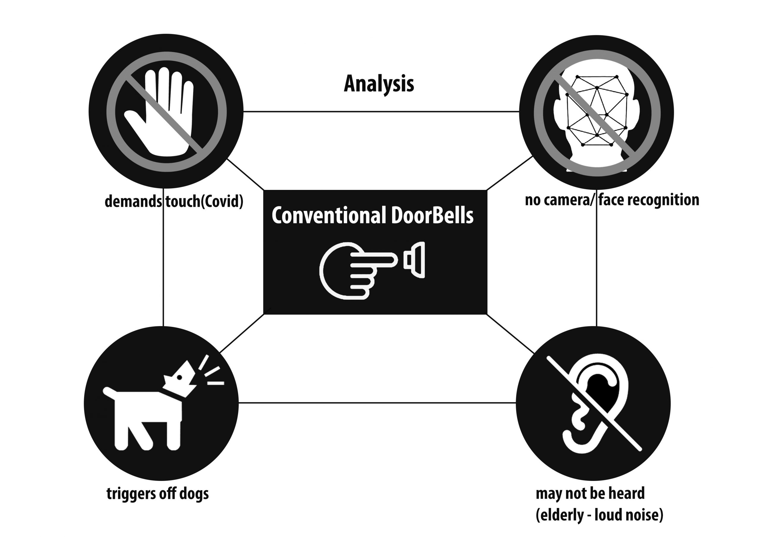
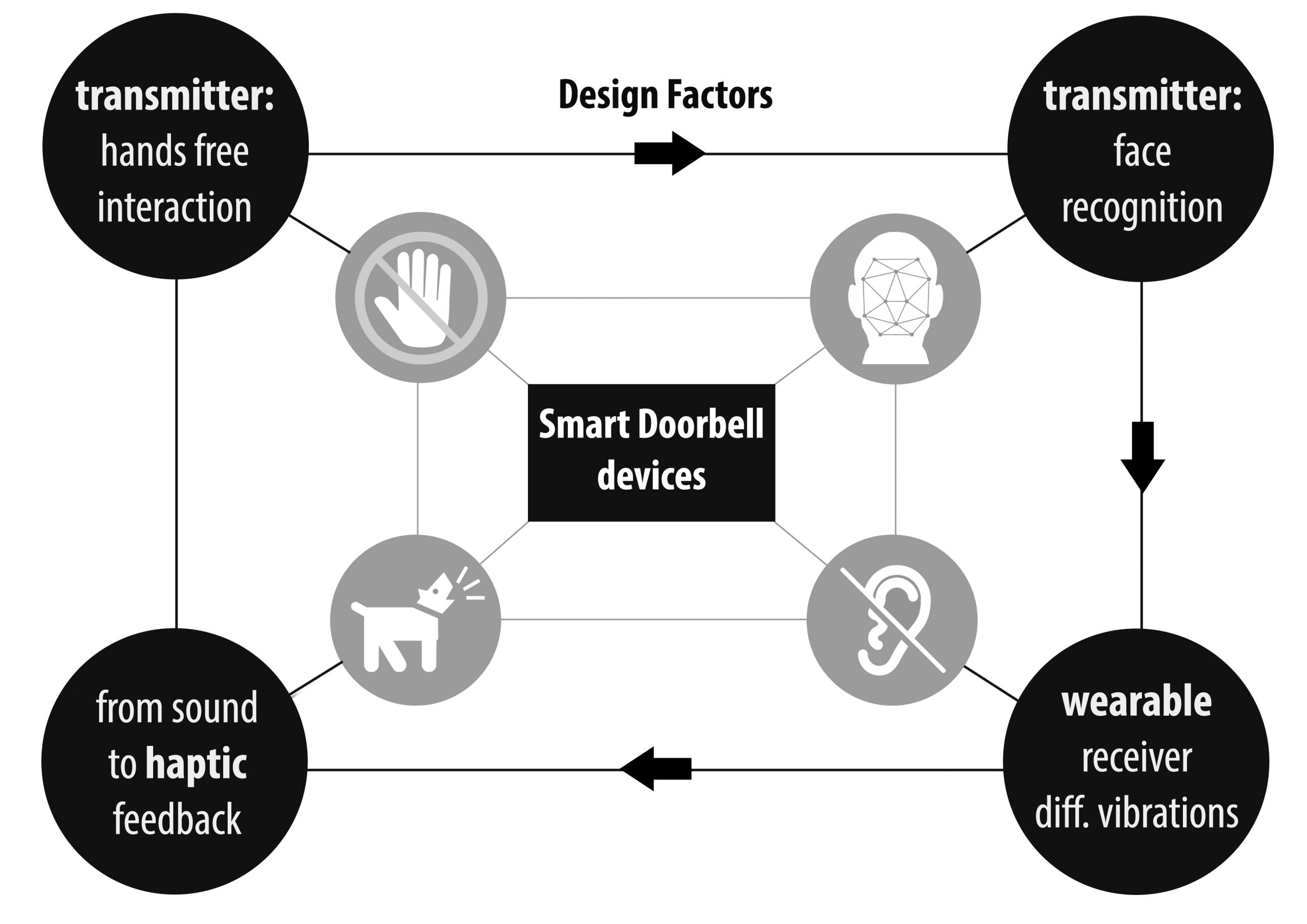
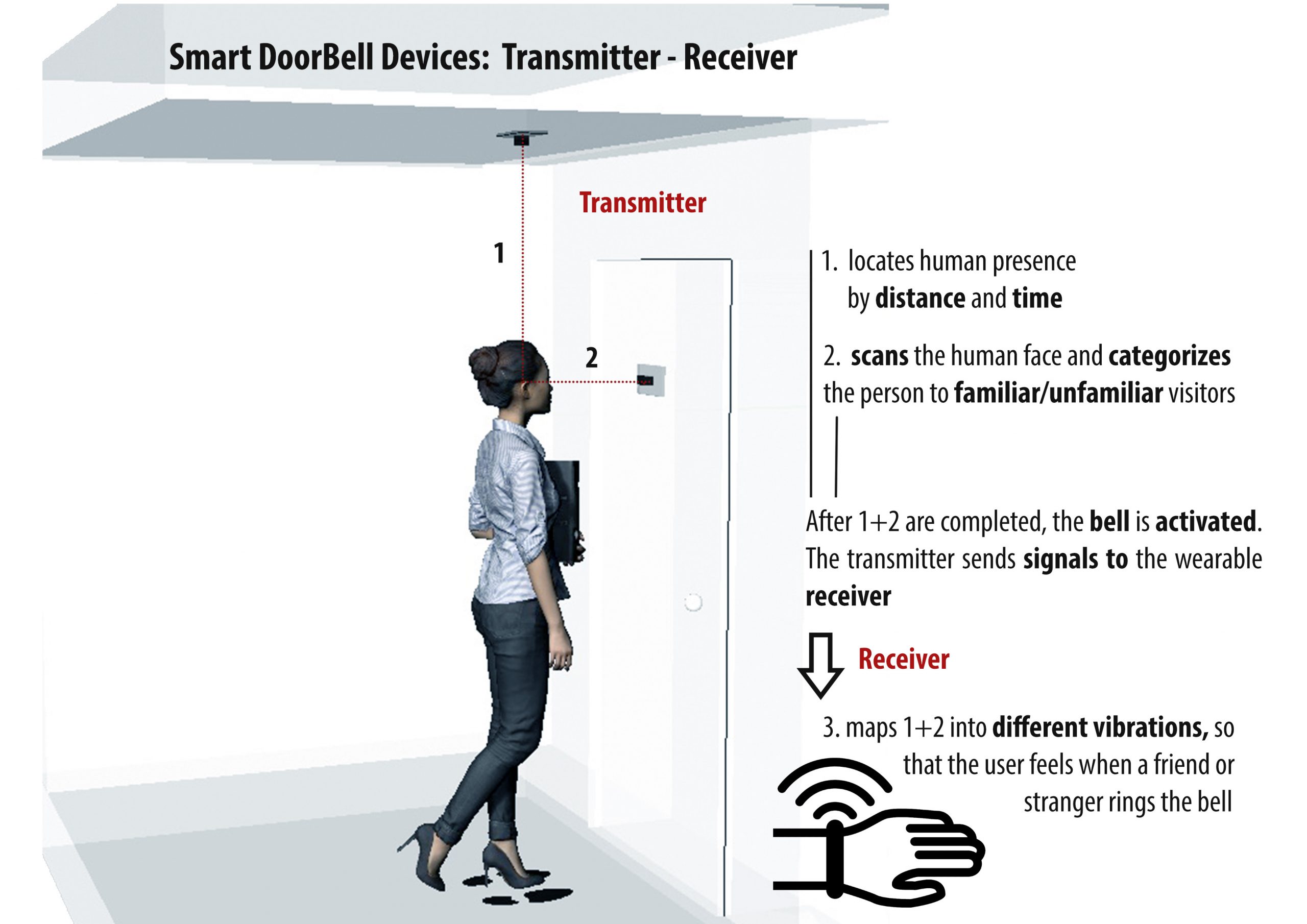
What is the plot of a doorbell? Someone visits, they want to get your attention (as you don’t spend all day staring at the door), they push a button, an action happens, and you know someone is at the door.
How do doorbells work for people without hearing? What did we do before electricity?
A brief aside on visual skeuomorphism
But first, visual skeuomorphism. A skeuomorph is a object derived from past objects and contians past visual cues that have no meaning in current culture. Ex: the “phone” icon on my phone that looks like the physical handsets we stopped using in the 90s.
is a derivative object that retains ornamental design cues (attributes) from structures that were inherent to the original.[3] Examples include pottery embellished with imitation rivets reminiscent of similar pots made of metal[4] and a software calendar that imitates the appearance of binding on a paper desk calendar. Or the “save” icon that looks like a floppy drive, that a Japanese student thought looked like a drink dispenser: https://twitter.com/fea0er/status/1160099135569063936
When you are creating visual representations, are you using your culture’s history of symbolism?
States visualization
Console displays in video games – metadata about your status. health, money, power, speed.
Why do some of the games with great graphics still use bar graphs to display raw data? We could hear our speed. Our character/avatar could change color. Why do we just have bar graphs?
- Wipeout: https://www.youtube.com/watch?v=m43c0OfweM4
- Rez: https://www.youtube.com/watch?v=sMq_XSc3vzA
What do colors mean? What states do they reflect?
- ex: white wedding dress or white funeral dress?
- colors important because they show wealth: purple for royalty, gold, dichromatic glass. Purple as an expensive color to make so only the rich/powerful could afford clothes dyed purple. (“The Secret Lives of Color“, “Why are Jeans Blue?“
- color of money — bills with different colors are easier to sort/find
- color of food, white is good/clean. In the south we have “dirty rice” where we mix leftovers with fresh, “clean” rice.
- the colors of Victorian houses
Assignment #3: Display Sounds of a State Machine
Use visuals to reflect the state of a state machine that normally uses sound to show state. If you have your Arduinos, please use hardware. If not, p5.js or other software on a computer is fine. Show the state machine in your response, a diagram or words are both fine.
If you’re looking for some cues, 99 Percent Invisible has a great, 15 minute podcast on “Deafspace“.
Questions: I rely on my water boiler, microwave, a kitchen timers to beep at me when certain states are changed. What’s a visual mechanism that doesn’t require me to simply stand there and wait? (English expression: “A watched kettle never boils.”)
Due Mon, 14 Sep, 11:59pm.
Thoughts on Making It So
After reading the forewords and the first chapter, I was amazed at first by the idea that we can learn design elements for real-world interface from interfaces in science-fiction and movies. But then as pointed out in the book, everything designers do before the product is manufactured falls into the realm of speculative fiction. Imagination drives the design, and real-world concern controls or withholds the possible and impossible so that the design is doable. I was amazed particularly about the Xenotran Mark II Dynamic Sand Table given as an example that lesson can be learned from X-man or science fiction. First of all, I did not know such a thing exist! A dynamic map that projects up-to-date satellite imagery developed in 2004! Secondly, this makes me rethink the relationship between technology and science fiction. I used to think that new technology is developed due to practical concern for the military, and the technology becomes mature and accessible when the cost falls. But that’s only half of the story, as the military does the same thing as the science fiction writers to find better solutions, only with more resources and commitment to develop the technology.
The best thing I learnt from chapter three is that boundaries of visual interface are wider than I thought. I used to focus more on the function or performance and consider visual interface rather as an mere aesthetic element. However, as shown through chapter three, the combination of elements such as text-based or graphic user interface, typography, color, transparency, and layers not only can convey a feeling for a specific time (futuristic, or a historical time period), but also affect the way users take in information. How to distribute (Overlaying? Spread out spatially?) and present(motion graphics? with glow>) the information has a powerful influence on the utility of the interface. In addition, it is so interesting that some of elements considered futuristic were originally used due to the technical difficulty. Some elements that stray away from the ordinary “future” may also be accepted as futuristic. It shows a dynamic relationships between technology, design, and culture.
Interpreting ‘Make it so’
After reading ‘Make it so’, I finally realised why my dad was always into science fictions movies. Since I was a child, he used to describe to me all the evolutionary technological changes I am going to experience later in life. And I did. I still remember the first motorola cell with the small antenna he brought home, our bulky desktop screens that became gradually thinner and thinner, my first touch cell I got in high school before even iPhones were launched into the market, the video calls I am having with my mum from across the world etc. He also mentioned that one day, matter itself will be able to transform form and identities. The craziest things is that after twenty years I am here in the US, working in the Morphing Matter Lab and I do exactly that. I design and engineer applications out of materials that can transform.
What I found really interesting were the following:
In Chapter 1, it is the different layers of interpretation speculative interfaces have. More specifically, the picture of Dr.Floyd talking to his daughter and the multiple technological readings an interaction designer conducts. 1) Video call itself, 2) minimising the distance between Earth and Space, 3) the smart machine that could sense the presence of a child,(maybe through face recognition or voice analysis) and auto protects the interface.
In Chapter 3, it is the different goals that can be achieved if with the same components you design the same interface differently. And this is the most important principle of synthesis either in architectural and industrial design, or in interaction design. The way you interconnect the components, building sensory cues that bear meaning and make sense in order to guide the interaction. Different intentions may lead to different combinations and hierarchy of elements,colours, scales, motion and so on.
Making It So Reading #1
I read Exploring Science Through Science Fiction by Professor Luokkala when I took his Science & Science Fiction class, and although these two books study science fictions/sci-fis, they look into very different things. It was interesting to see how the authors of Making It So decided to tackle the structure of their research and presentation. I really like how interfaces in science fiction are studied in a inspiring fashion, i.e. the authors don’t criticize what’s wrong/impossible but what we can learn from them and how they have changed real-world interfaces/products.
What was the most fascinating to me was the amount of data they collected and data visualization. For example, when discussing colors, the authors used color histograms and effectively demonstrated that blue is the most popular color. I knew the psychological fact that blue is the universal preferred color, but I didn’t know that blue was used the most in sci-fi movies due to technology constraints.
Make It So reading comment
After reading Make it so, and about science fiction, I both agree and disagree. Yes, science fiction is loaded with imagination and creativity, and it is rooted in what we have in present; however, I think science fiction became not only predictive but also very cliché. The technology we see and feel from Iron Man may be fascinating, yet the technology from those movies always brushes the mechanism of “how” it works under the rug and shows the sci-fi genius Tony Stark. (and it is always the job of modern-day real engineers to figure out the “how” part.) The depressing part of this, though, is that people just glances and walks pass thinking “meh, I’ve already seen Tony Stark doing it.”
And Make it so also goes over about the interface design and interaction. As great as it seems from the sci-fi movies, it may not be as amazing. For example, those holographic screens that moves with the user’s action. Interaction wise, maybe it’s great that it involves natural interaction, meaning that like Wii from Nintendo, the user naturally figures out because it is in their physical movement. However, the user experience wise, it is not great, indeed, it is very opposite to being friendly. Those hologram panels always appear to be exclusive for those nerdy characters in the movies.
Like I mentioned in my bath buddy presentation, users happen to have some sort of mental model in their minds. The mental model for high-tech panels would be those hologram panels; therefore, the designers present something like a laser keyboard. The thought of it was great, and it perfectly matched the users’ mental model; however, it wasn’t quite successful because the user experience of the keyboard wasn’t a good representation of what people sought for other than looking cool. That is why I think the conceptual model should sometimes look away from people’s expectations because it does not always promise that was exactly what they are looking for.
Make It So Forward-Chapter 3 Thoughts
Make It So’s premise of using sci-fi movies and TV shows to inform real-life interface devices is an extremely interesting and useful lens to view these works! I definitely agree that while not always that realistic, sci-fi is widely creative when it comes to technology and so many ideas from them can be used to derive new devices and interactions.
Many of the trends and lessons brought up articulated feelings I’ve had while watching sci-fi, but never took the time to group and think further on. The move to and away from mechanical controls as well as the seamless coupling of them is something on screen that is reflected in our own lives when we look at the evolution of phones especially. Thinking back, most sci-fi things that I’ve watched have glowing screens often with blue and so I automatically think of the feature shown as advanced when I see this; there’s something about glowing that just makes it seem so much cooler. The use of command line and text based computer control, usually in green, is so ubiquitous that when seen it is an easy assumption to know that someone is hacking into something even without any context. I’ve often seen interface layers for heads up displays and holographic boards, but without the glowing effect, it doesn’t quite invoke the feeling of advanced technology for me anymore from its repeated use because fully manipulable holographic 3D displays have been shown in quite a few things now. To me when done with a cascading 3D effect, file management systems can look futuristic, while 2 1/2 D designs actually make an interface look older. The connections and lessons pointed out so far in this book are fascinating and I look forward to reading more of it:)
Assignment 3: Reading and Counting
Reading: from “Make It So“, Forward, Chapter 1, Chapter 3. (Chapter 2 if you have time/interest.) Post your thoughts on the chapters and content.
Counting: Once it’s dark outside, turn off the overhead light in your kitchen (or in your room if you don’t have a kitchen) and count the number of lights. A clock is one light, but if you have status LEDs on electronics, each of those is a light. You don’t need to post this, but have a list to remind you during class.
Wearable Doorbell devices


